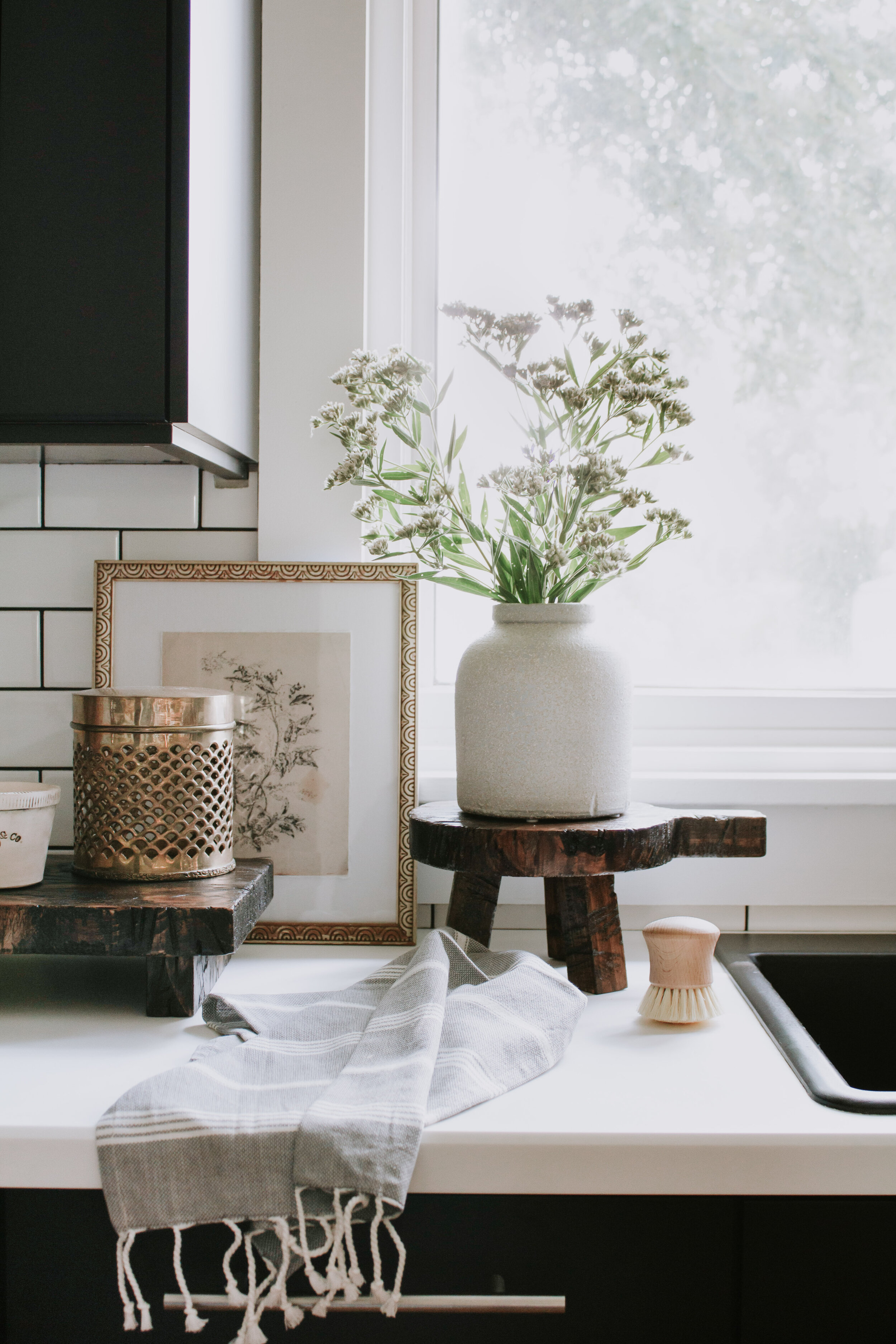
When I first started Nadine Stay, I knew my photos weren’t great. They consisted of poor quality iPhone images, really bad angles, and heavy Instagram filters that somehow made my photos both over AND under saturated in color. Um, hello this was the first photo I ever shared for Nadine Stay. Yikes!

It’s high quality images that highlight your professional experience in design. Or at the very least allude to professionalism even if you’re a novice to interior design. It’s what gets the attention of publishers and editors. It opens the door to people trusting your skills, asking for advice and sources, and it may even prompt people to hire you to design their home. It warrants a $ rate that you know you’re worth and it subconsciously steers your audience into taking you, your experience, and your knowledge seriously. That’s the power of professional interior photos!
For some people, it is worth it to outsource and hire a photographer. If you’re an interior designer, this is especially common and the cost can easily be incorporated into your design rate. If you’re an influencer, blogger, or just enjoy taking interior photos for the fun of it, outsourcing is possible but I have found it’s easier to either have someone in house or just take photos yourself.
I hired a local photographer for a couple years back in the day (who btw is incredibly talented and I love her!), but I always had a desire to learn how to take photos for myself. So I tried a lot and I now have 3 years of practice under my belt. I’m still not a professional photographer by ANY means and I have so much more to learn, but I’ve picked up on a few tips that have drastically helped my photography and editing.
So if you’re in a similar situation and you want to learn a few of the basics, these are the things that helped me take better interior photos.
1 // Get The Right Gear
The new iPhones have incredible cameras now, and yes this can get you by for a while, But if you want really high quality photos, a DSLR camera is a must. The images will be clearer, easier to edit, and you have much more control over the lighting and final image. I still use my beginner camera that I bought back in 2015 and it’s done a good job. I don’t have a lot of experience with different camera brands or lenses so I can’t offer much advice on that, but my Canon EOS Rebel T5 DSLR and my 18-55mm lens works wonderfully for a beginner photographer.
Also, I cannot stress this enough – always use a tripod! For camera stability, for clearer images, and better focus, use a tripod every time! It really does make a difference and it helps with consistency too! I got my basic model tripod when I purchased my camera, but I think I’m ready for an upgrade and I’ve added this tripod to my Christmas list.
2 // Find the Right Light
I’ve learned from experience that lighting is crucial to getting a good, bright photo. I used to think that the brighter the room, the better the photo but that’s not necessarily the case. Believe it or not, it’s best to turn off all the overhead lights and lamps in your home. These cast a harsh light and unwanted shadows on your home and they often have a yellow hue that will negatively affect how the colors of your home are photographed.
Our home doesn’t have a ton of windows so I like to take photos on sunny days when the sun isn’t directly shining through my windows. Direct sunlight can be beautiful but it’s hard to photograph. When I do have sun shining through our windows, I often close the blinds or filter the light with paper. This softens the harshness of the sun and creates indirect light which is much easier to photograph. Sometimes my best (bright) photos are taken when the room is actually quite dark. But I’ll explain how I achieve bright images in dark rooms in tip #6.
If your home has a lot of windows, overcast days are your best days for shooting!
3 // Remove the Glare From Glass
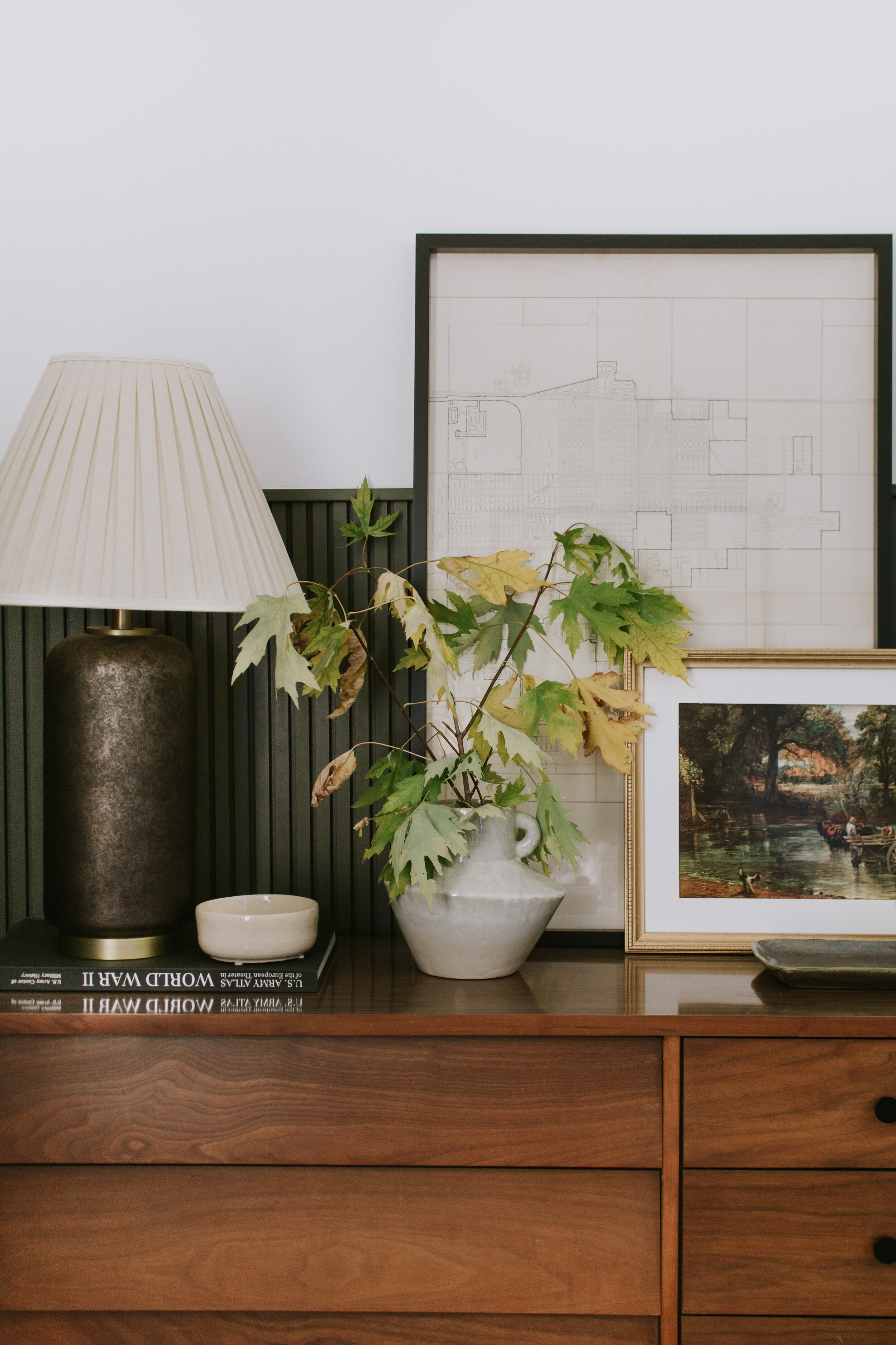
Sometimes artwork can be tricky to photograph because of the glare from glass. Whether the glare is whiting out the artwork entirely or showing your reflection like a mirror, sometimes it better to just remove the glass from frames. It photographs much easier and you can see the artwork better! (That’s what I did for my artwork in the gold frame above and you’d never know the difference!)
4 // Styling for Photos is Different than Styling for Real Life
What looks beautifully styled and decorated in real life may not translate to a photo. I don’t know the science or reason behind this, but the camera brings out “imperfections” that you can’t see in real life. Sometimes the decor looks sparse in the photo, sometimes the furniture is awkwardly spaced, sometimes the artwork looks like it’s floating too high above the furniture. I’m telling you, the camera sees things that we can’t see.
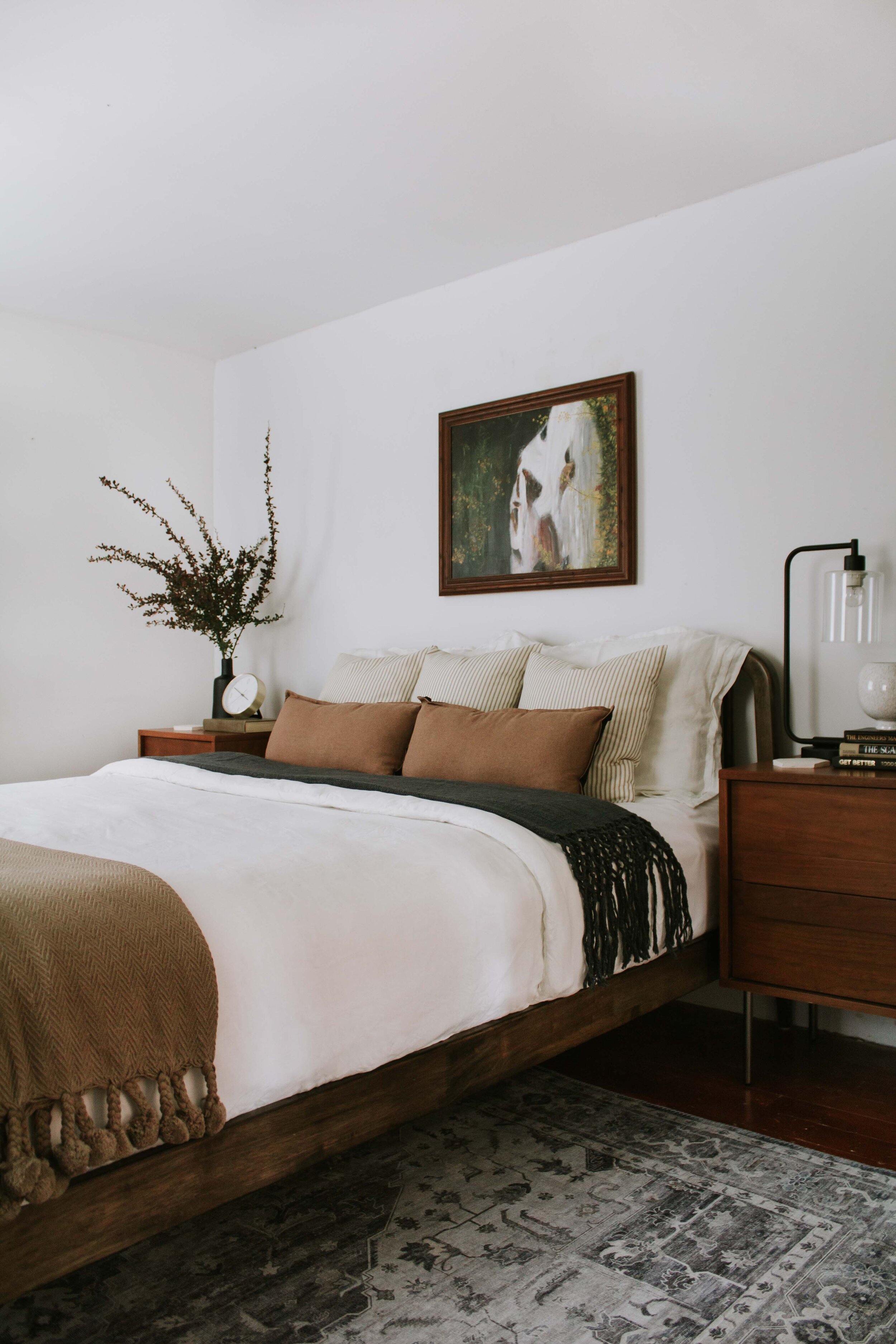
So when I’m tidying up a room for a photo, I always snap a test photo first (or just look through the lens) to see if there’s any dead space or things out of place. Sometimes it’s as simple as scooting the furniture in tighter and sometimes I just need a larger than life bundle of greenery to fill in awkwardly empty corners. It may look funny in real life, but in the photo it looks perfectly styled.
5 // Get Your Camera In Line
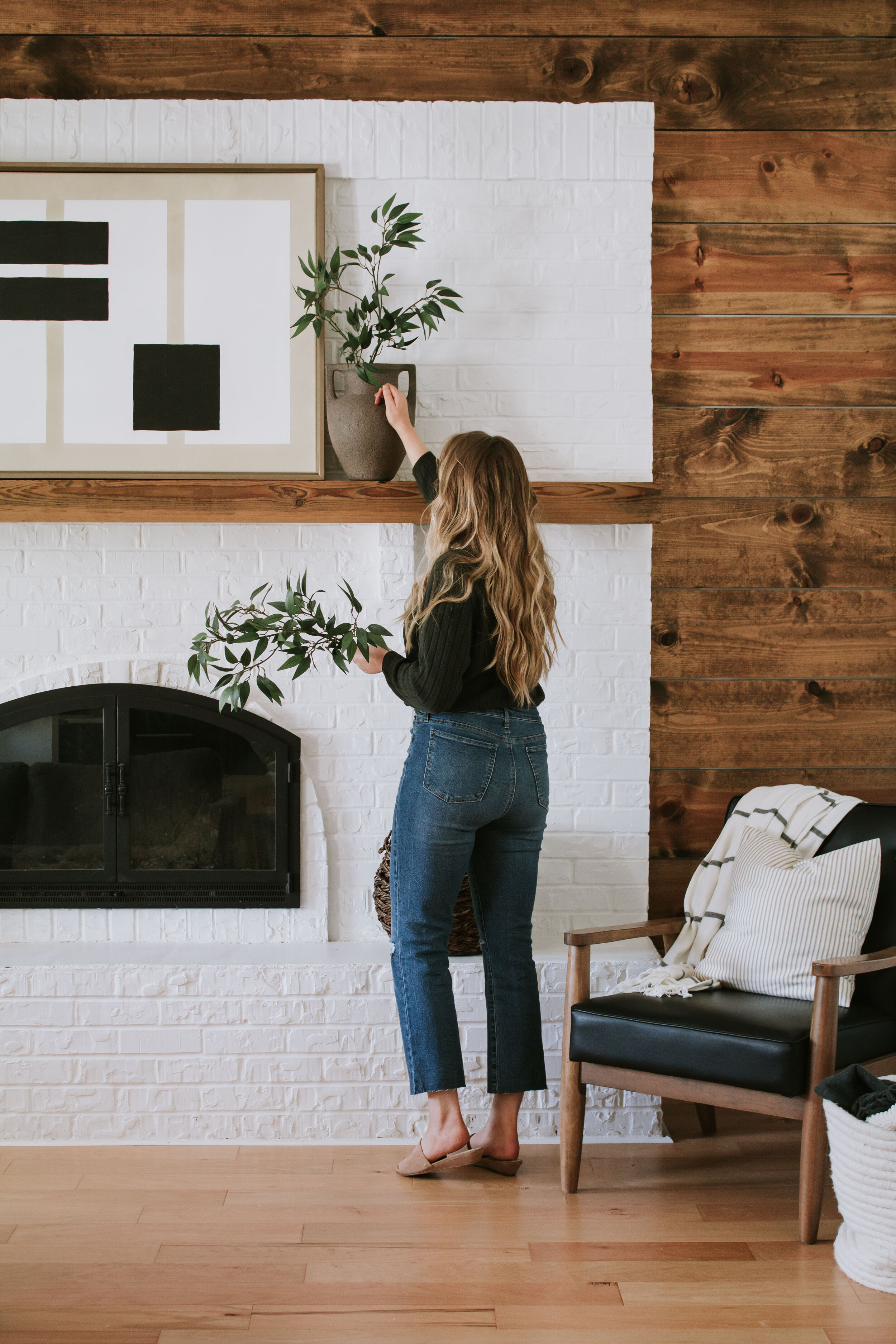
The number of times I used to take interior photos where the camera was up high and angled down at the room…it’s just not a great angle. I like to keep my camera low when taking images to avoid a “birds eye view” angle. I usually position my tripod height at my chest to start and I adjust it higher/lower if necessary.
I also ensure that the vertical and horizontal lines in my home align with the grid in my camera view. Vertical lines (such as the edge of a fireplace or a picture frame, furniture, or window) should line up parallel to the vertical lines of a grid. If not, my camera is either too high, too low, or angled left or right. The same goes for horizontal lines. Notice how the picture frame on the wall (in the left photo above) is angled compared to the grid line above it? Adjusting my camera angle until the lines are parallel gives a clean and professional look.
6 // Adjust Your Camera Settings
I’m not going to pretend that I understand every setting of my camera! It can be quite confusing, but there are a few settings that I frequently adjust depending on the light I’m working with.
I usually shoot in Program mode (since it automatically selects my shutter speed and aperture settings) but if I’m looking for more control I’ll shoot in Manual mode. Within Program mode, I ensure that my settings are set to take “RAW” images. I could get technical about what that means but essentially if I shoot in RAW mode, I’m able to have more control when editing my image later on.
Occasionally I adjust the ISO speed which affects how bright or dark my image is. The higher the ISO, the brighter the image. So if you’re in a dim room, you can adjust your ISO to help capture a brighter image. However, the higher the ISO, the more grainy your image will appear. That’s why it’s best to keep your ISO low if possible. I usually shoot interiors at 200 or 400 ISO.
The Exposure Compensation is another setting that I adjust frequently when in Program mode. With Program mode, your camera will automatically select exposure settings for you, but if you don’t like how bright or how dark the camera is photographing, you can make some tweaks using the Exposure Compensation setting. The lower the exposure, the darker the image. The higher the exposure, the brighter the image. (But don’t go too bright or it’ll wash out the image and you’ll loose details and shadows.)
If you’re shooting in Manual mode, you may need to adjust your shutter speed too. This is another way to take bright photos in a dark room. Raise your shutter speed to take a bright photo in a dark room. (But be sure to use a tripod and don’t move because it will look blurry from the slightest movements.)
Speaking from experience, just play around with your shutter speed, ISO, aperture, and exposure compensation until you find what settings work for your home. Tutorials are great, but experience and practice is going to teach you the most!
7 // Edit in Lightroom & Photoshop
Ok, we’ve taken the photo and it looks good in camera. It’s time to edit it! I like to edit my photos in Lightroom (and occasionally I’ll do tedious adjustments in Photoshop too). Lightroom offers the most control over your colors, highlights, shadows, and overall brightness. It looks overwhelming at first. Believe me, I know! I tinkered around with Lightroom for over a year before I started to understand what all the settings did. You’ll learn best by uploading a photo and adjusting all the settings individually to see what they do. After lots of practice, you’ll start to see how the settings work and how they affect each other. (Keep reading for a few of my favorite Lightroom adjustments!)
I use Lightroom to do the bulk of my editing and 9 times out of 10 it gives me the look I want. Every once in a while I need to edit out unwanted objects in the background or combine two photos and I do this in Photoshop.
The desktop version of Lightroom and Photoshop are a paid subscription, but you can download Lightroom for free on mobile!
8 // Apply a Preset
I use a preset! You could absolutely edit your photos in Lightroom without a preset and get beautiful images. I know many photographers that do! But I have found that I get the best interior photos when I use a preset. A preset is essentially a predefined edit on Lightroom that affects the lightness, darkness, colors, saturation, etc. It’s similar to a filter, however unlike filters on Instagram or VSCO, presets can still be adjusted more meticulously to create exactly the look you want.
I’ve purchased many presets and I’ve learned that it’s worth it to invest in quality presets. Cheap, inexpensive presets often only work in certain lighting situations or don’t translate well to a wide variety of images. So spending $100-$200 on a quality preset from a professional photographer is pretty reasonable.
I use the LXC preset by Archipelago. However, the preset I use is intended for outdoor photography so I adjust the settings heavily to create my own personal preset that works for our home. I haven’t tried these interior presets, but Studio McGee, Jana Bishop, and The Identite Collective also offer interior presets!
9 // Brighten the Photo & Adjust Contrast
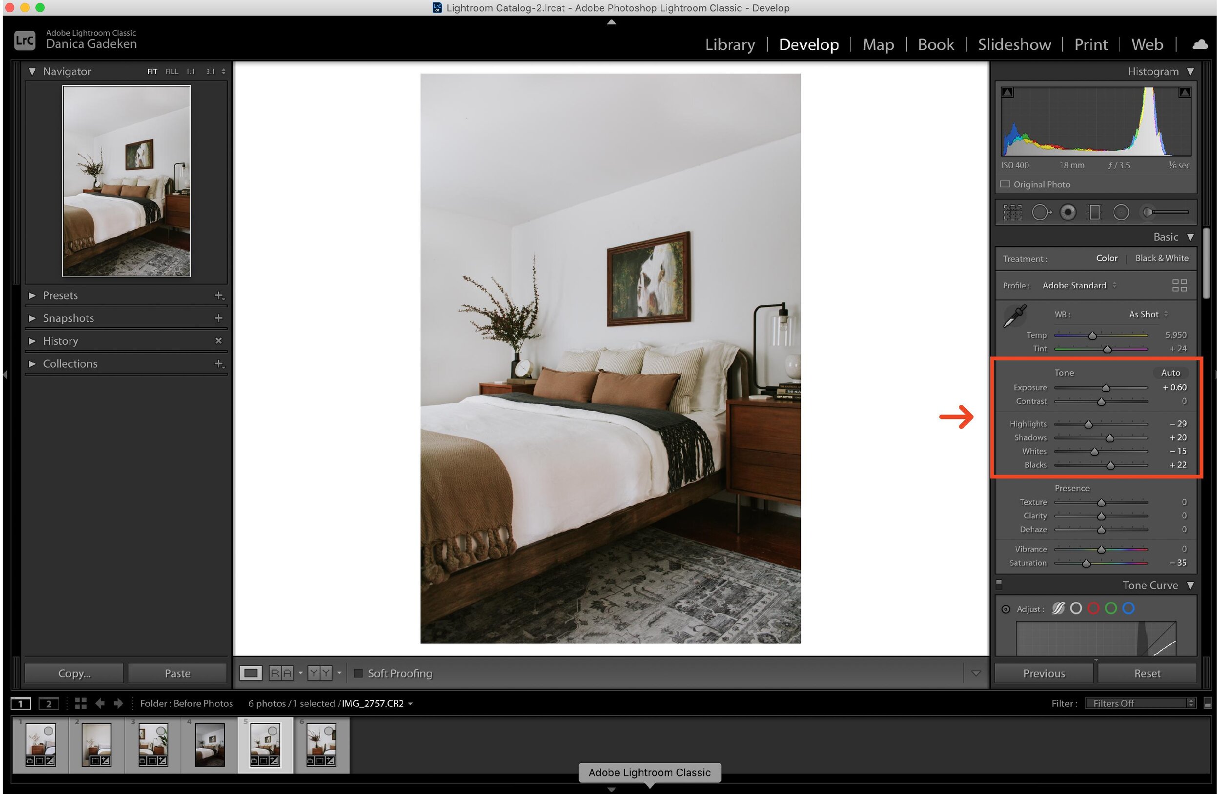
Moody and dramatic interior photos will always have a place in my heart, but when it comes to the bulk of my interiors images, I love a bright image with soft contrast. Whether you need to make some tweaks after applying a preset or you’re starting from scratch, you can do the bulk of your light editing in the Tone panel on Lightroom. This is where you can brighten the photo and adjust the contrast. I like to increase my exposure (make it brighter) and lower my Whites and Highlights. If it starts to look too heavily contrasted (the whites are too bright and the darks colors are too dark), I like to raise the “Blacks” slider for a softer look.
10 // Keep Colors True To Life
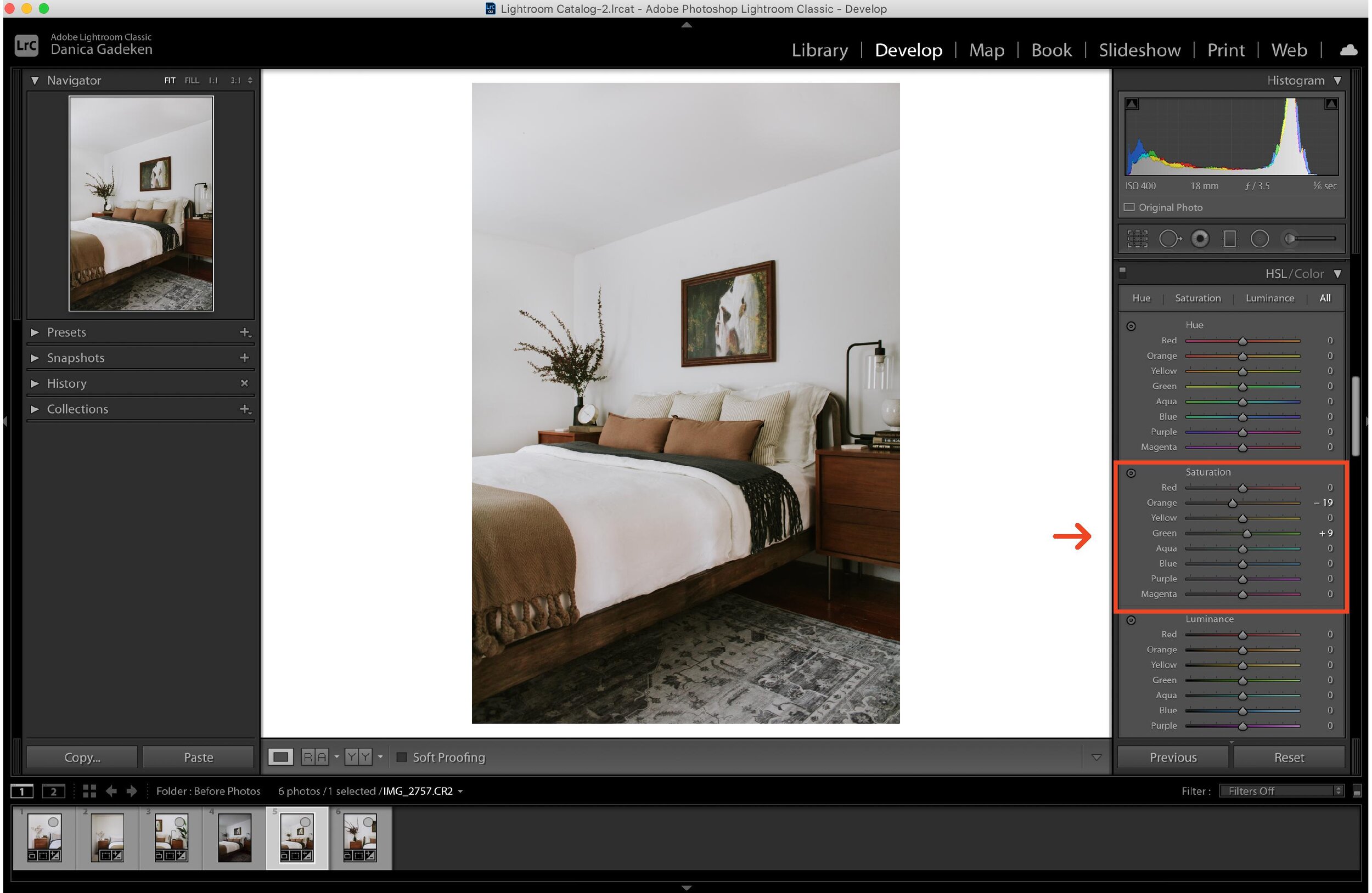
My goal with every photo I edit is to make my home look as best as possible without looking like it’s edited. Yes, I use a preset, but I prefer to make the colors within the photo look natural and as close to real life as possible. Major color differences or heavy “filters” often just look unprofessional. So for example, with the preset that I use, it desaturates all the greens in the photo almost entirely. While this can look great in outdoor photography, it looks dull (even dead) for interiors so I bump up the saturation of all the greens in my photo. Or sometimes my skin photographs extra orange so I lower the orange saturation to make it look less like a “fake bake”. 🙂 You can make adjustments for each individual color in Lightroom and it gives you so much control over the tone of your image.
If you get comfortable with that, try adjusting the Hues (the section right above in Lightroom) to slightly alter the hue of a particular color. I.E. You can make orange look more red or more yellow depending on how much you adjust the slider.
11 / Fix Any Distortion
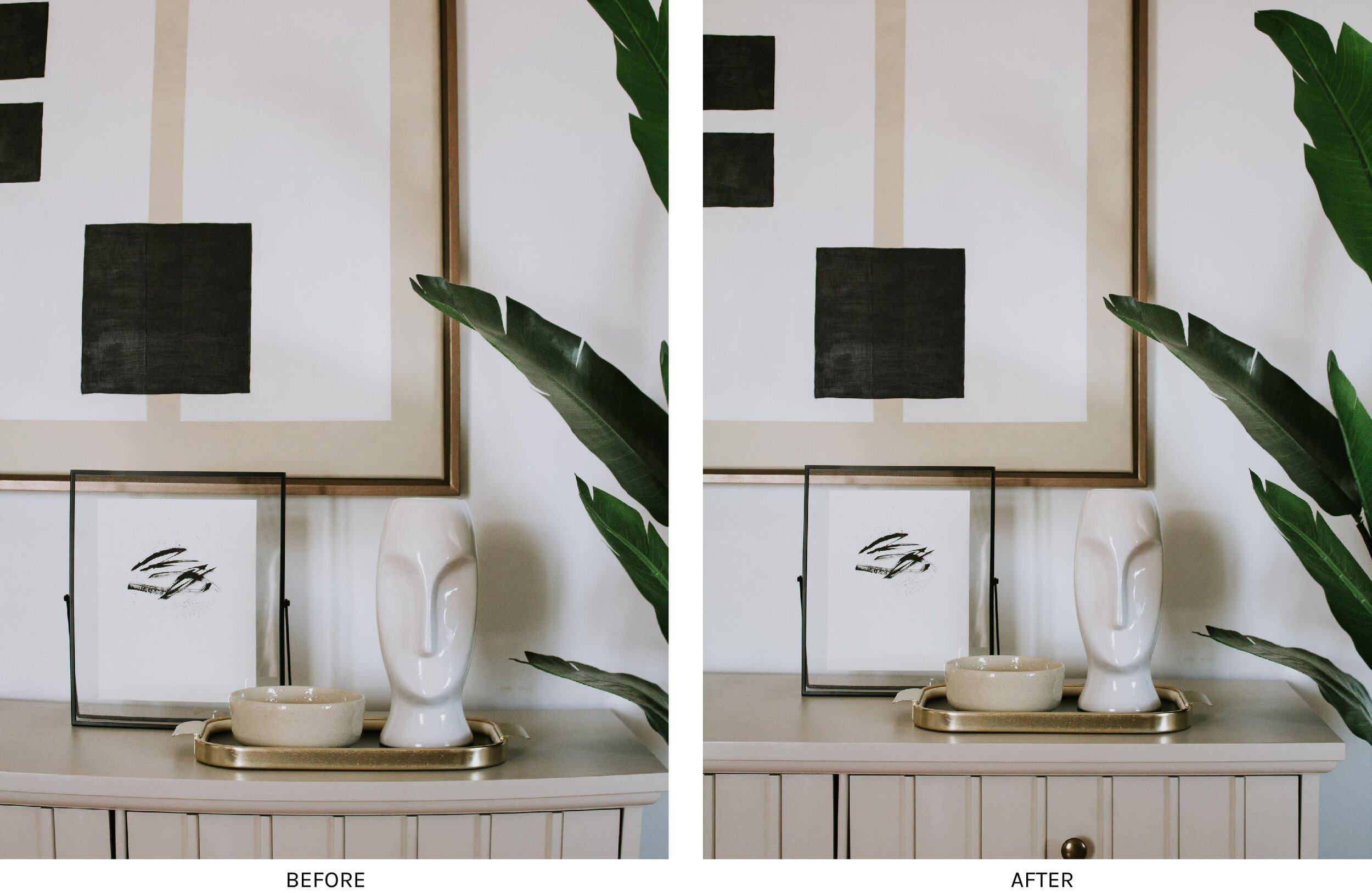
Sometimes when you’re taking a photo, you have to zoom out to get everything in the shot. This is fine, but you may notice some curved lines and bowing in the photo when it comes time to edit. (Notice the dresser top in the left photo above?! Yikes!) This is an easy fix in Lightroom! In the Distortion panel, I like to raise or lower the “distort” slider to straighten out any curved lines or bowed furniture.
12 // Adjust Your Photo
No matter how hard you try to set up your camera straight or at the perfect angle, it’s bound to be a little off. I almost always have to make adjustments in Lightroom afterwards. I use the Vertical and Horizontal sliders to adjust the perspective of the photo and align all the lines to be perfectly level. I also use the Rotate slider to tilt the photo one direction or the other if necessary. I keep making slight adjustments till all my edges are perfectly lined up like I talked about in tip #5.
13 // Make Spot Adjustments
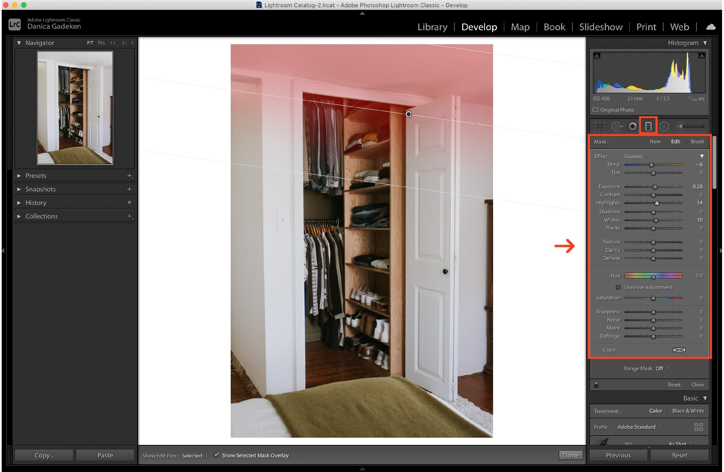
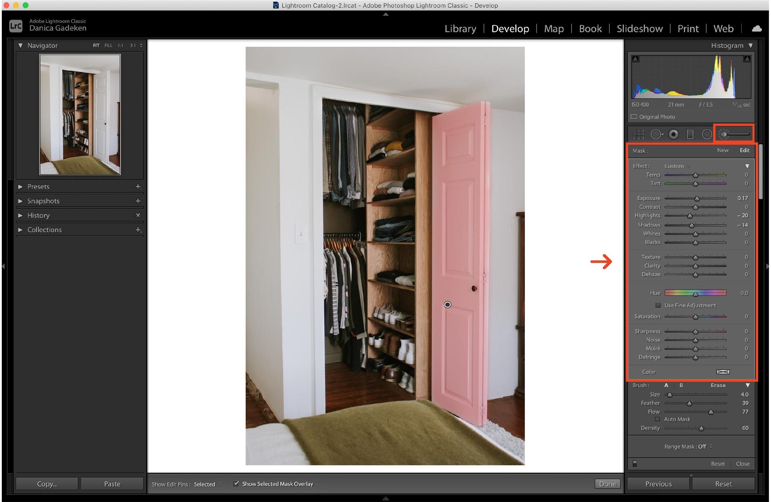
Sometimes you need to make a slight edit in one particular spot – like if one corner of your image is much darker than the rest for example. Spot adjustments can be made with either the Graduated filter or the Adjustment Brush in Lightroom.
The Graduated filter is applied in a linear manner and gradually fades out at the edge. Place the filter where you want to make the adjustment and alter the lightness, darkness, colors, etc for that particular area only.
The Adjustment Brush is similar, however you can apply the filter with more precision….it’s a circle brush and it only applies where you brush it on. So if I wanted to make my door brighter or my green throw blanket a little greener, I can brush the filter on the blanket and/or door and make any adjustments to that object only.
14 // Remove Unwanted Objects
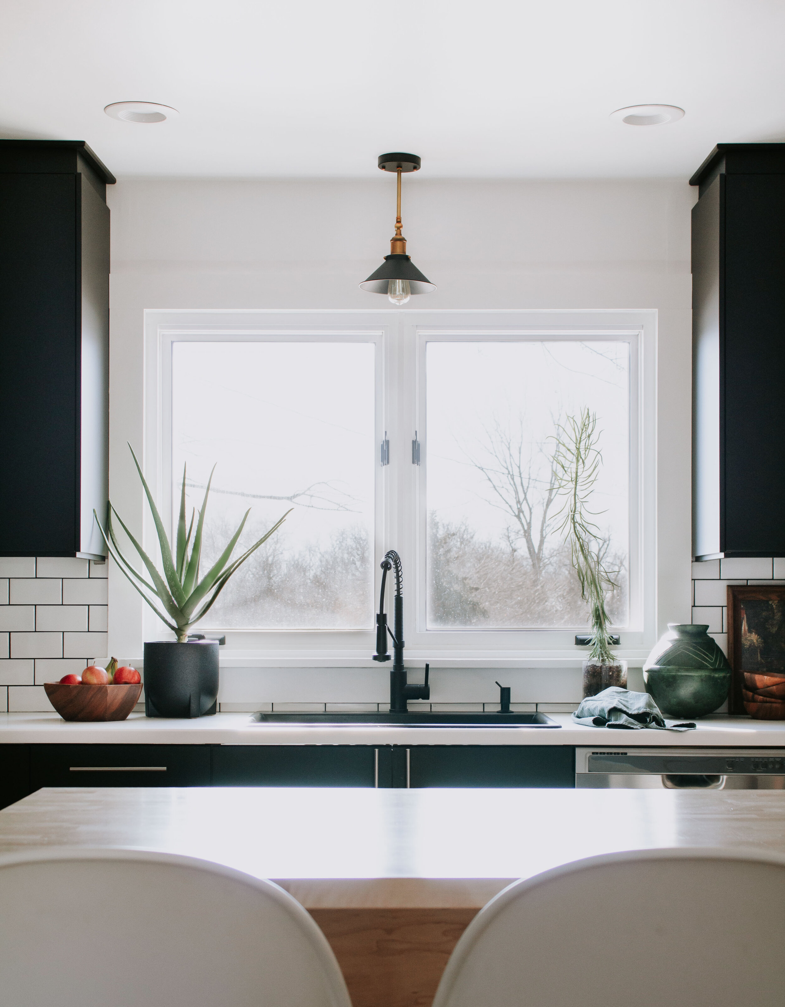
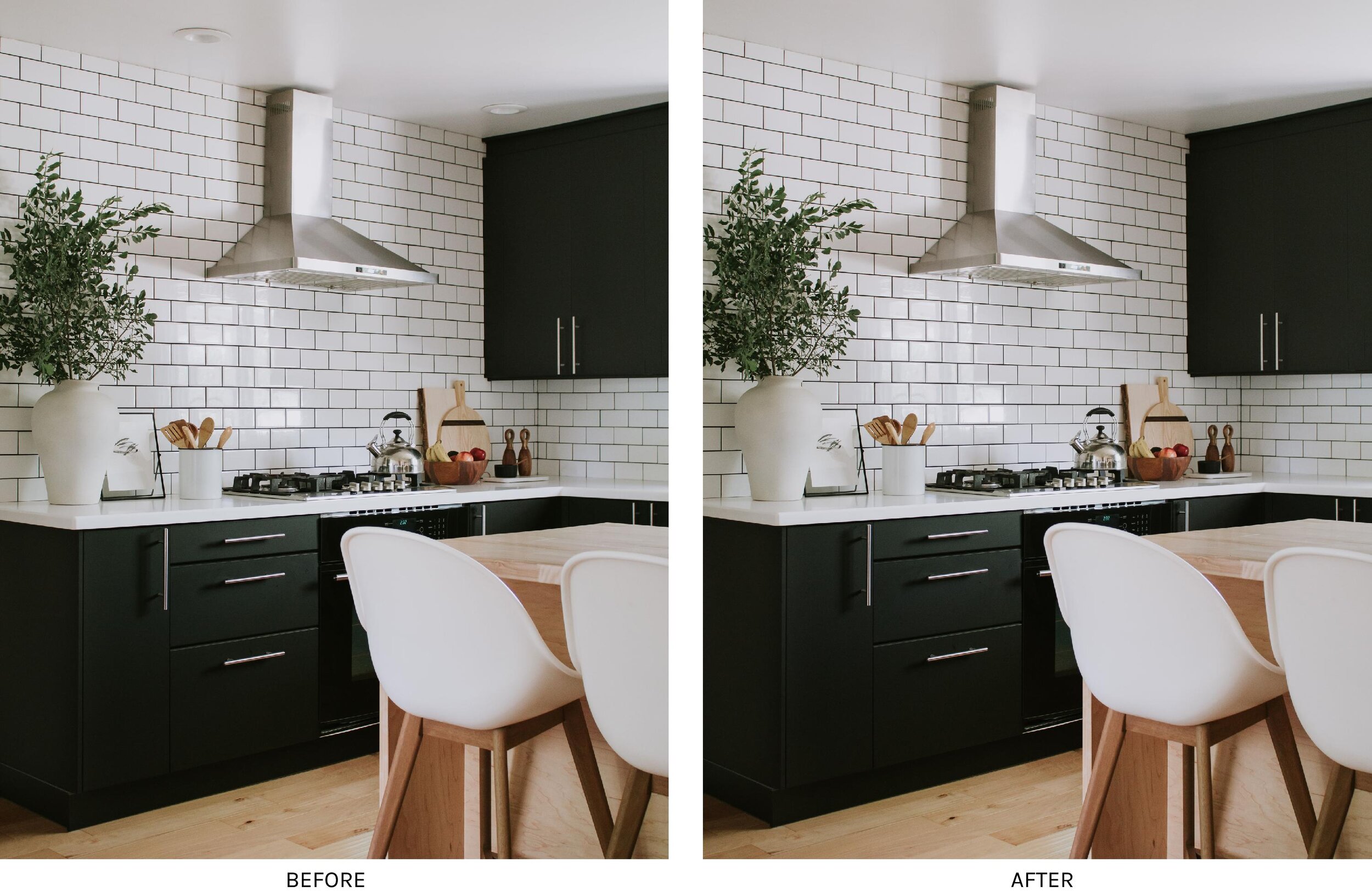
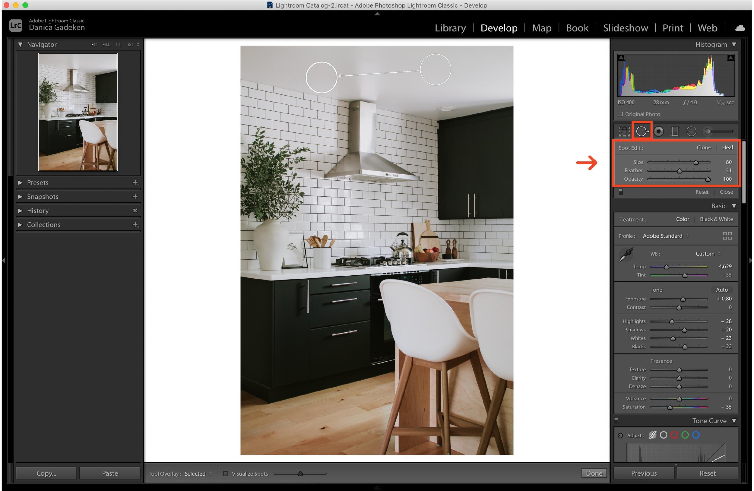
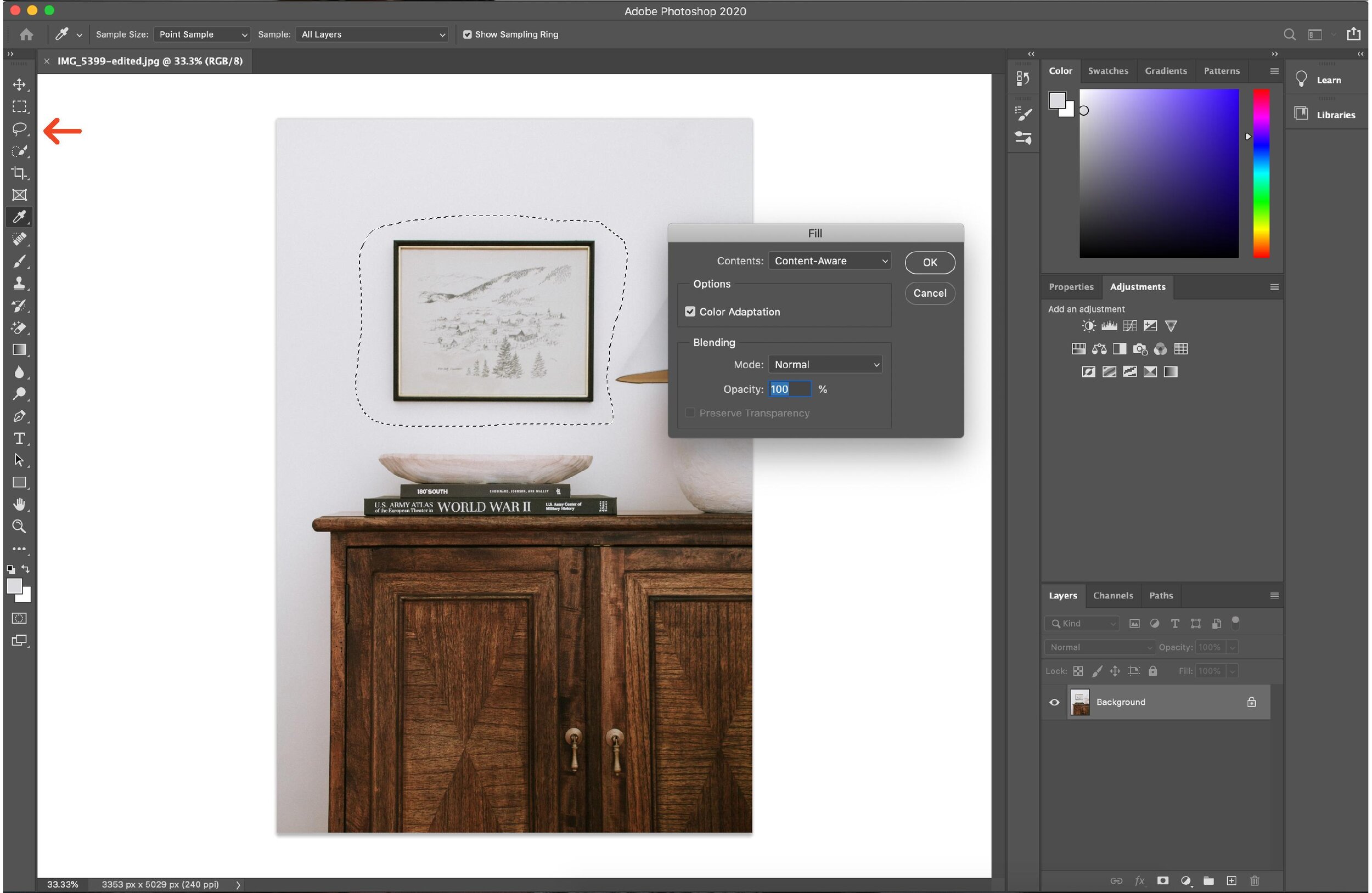
There’s nothing more distracting than an unsightly outlet or a lamp cord hanging off the side of the end table. Although I’m all for “real life” photos, sometimes it’s worth the 2 minutes it takes to edit out the distractions. You can remove the unwanted object from the photo in both Lightroom and Photoshop! (Notice the recessed lights disappeared in the photos above!?)
In Lightroom, I use the Spot Removal. You simply click the object that you want to remove and a second circle will appear. Move the second circle to an area of the photo that you want to replace the unwanted object with.
In Photoshop, I use the Lasso Tool. You just click and draw a circle around the object that you want to remove, Select “Content Aware Fill” or just press “Shift F5” (for mac) instead. Then select the settings as shown in the image above and click “ok.” The object will then disappear!
15 // Batch Edit in Lightroom
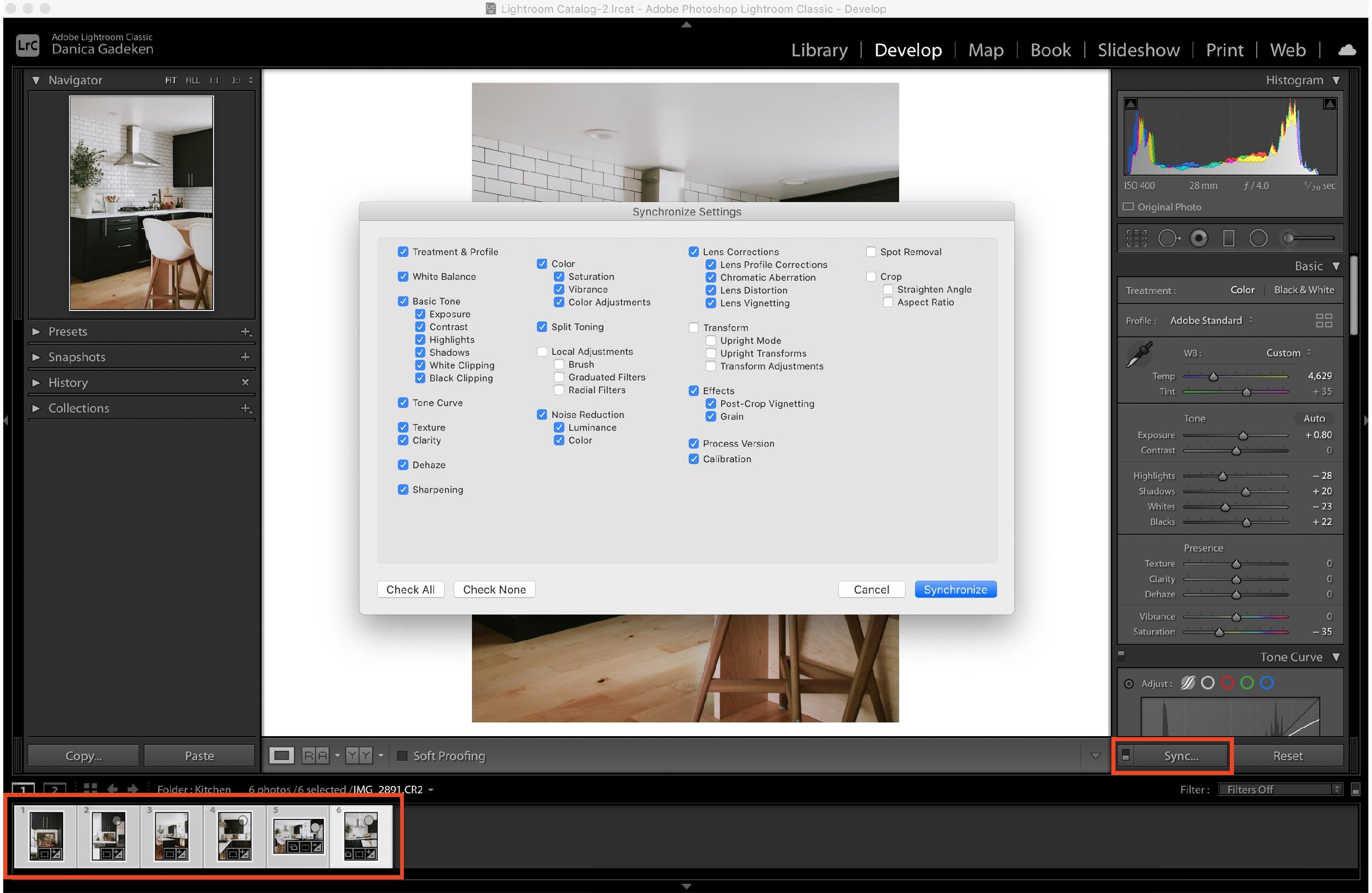
Consistency across all your photos is so beneficial but editing each photo individually is a headache! Thank goodness for batch editing when I’m trying to go through 10-20 photos at a time! Once I finish editing a photo, I can apply that same edit to the remainder of my photos with just one click!
To do this, select the image that you’ve edited, then hold the shift button and select the other photos you want to apply the edits to. Click the “Sync” button and select the settings that you’d like to copy. Click “Synchronize” and the edits will apply!
I hope these tips help your interior photography! The more you practice, the easier it gets I promise!
Leave a Reply Cancel reply
DO YOU WANT
The Inside Scoop
Where behind the scenes, exclusive advice, and candid conversations are sent straight to your inbox every week.




By far the BEST tutorial on interior photography! Great tips! Thanks.. 🙂
So happy to hear this!! Thank you Marie!
Hi Danica, love the article! In reference to point 6, exposure includes shutter speed, ISO and aperture. These make up the exposure triangle. Adjusting any one of these will affect the overall exposure.
Yep, that’s right! I should have clarified…when I said exposure I was referring to the exposure compensation setting. 🙂
Thanks for the tips this was super useful!
So glad to hear that! 🙂