This post contains affiliate links.

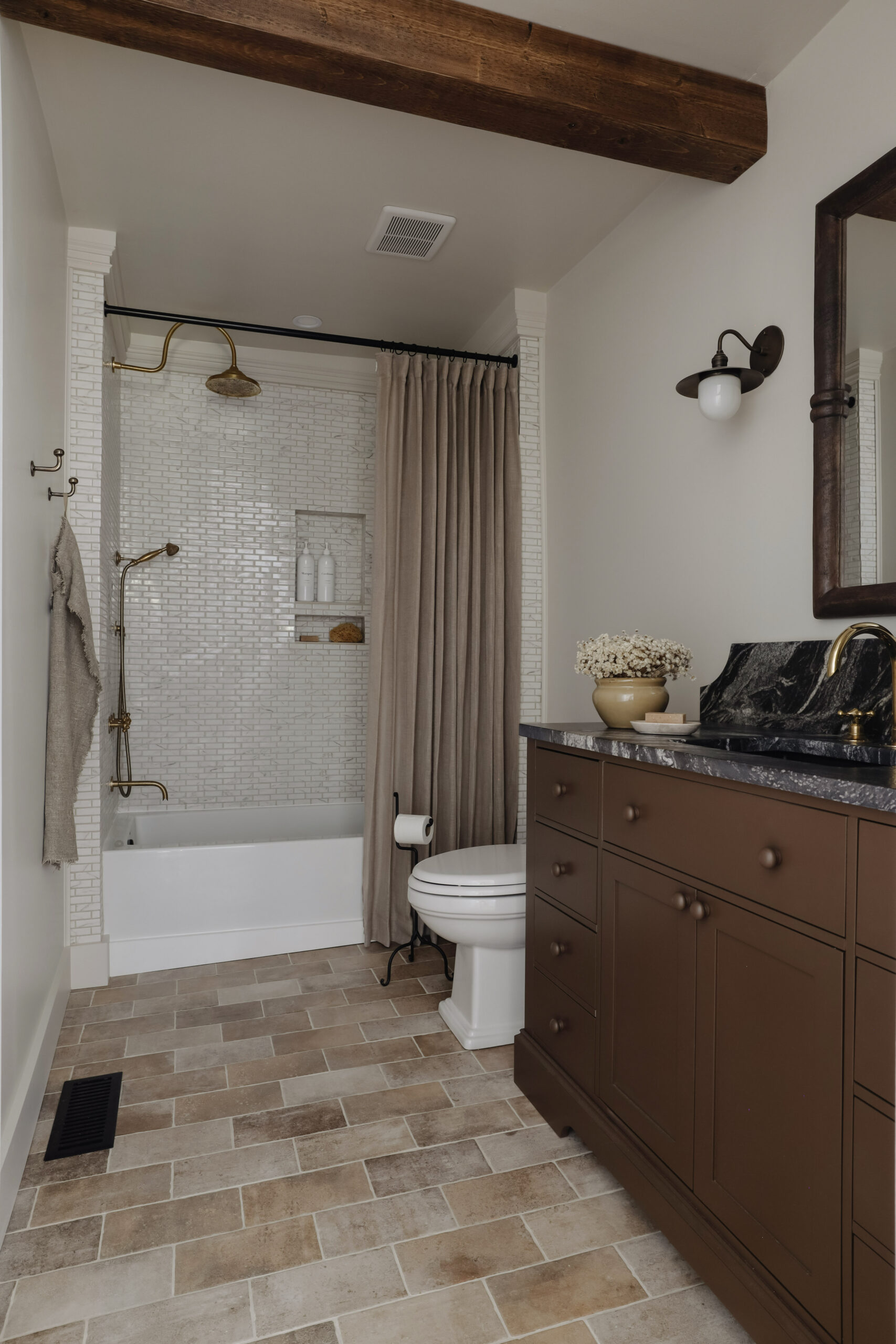
Our bathroom has been a trainwreck since we moved in 8 years ago. It featured a partially exposed subfloor, a grimy beyond repair vanity, and a plastic surround in the shower with built in limescale. We’ve been so eager to remodel it and after years of playing around with design ideas, we finally landed on a design that we loved and fit with the style of our home. I’m thrilled to share our dramatic bathroom before and after.


PAINT COLORS:
Walls: Custom Mix
Vanity: Muted Mahogany from HGTV Home by Sherwin Williams
The biggest pain point of the bathroom was the placement of the toilet and the dividing wall. The toilet faced the shower with 5 inches of leg room..and I’m not exaggerating for dramatic effect. We had to side saddle the toilet every time and it was annoying to say the least. The dividing wall on the other hand made the bathroom feel really small. We believe the wall was once the original exterior wall before our home was added onto decades ago. It no longer served a purpose so we were eager to remove it and add a beam for support.
Once demolition started, we completed this project in 5 weeks….our fastest project to date!

The Design Plan
The style I wanted to achieve was “naturally dramatic.” Natural elements with strong color variations.
I started the design concept with the one thing I was certain of – a black and white heavily veined countertop with a tall scooped backsplash. We looked at several material options including quartz and soapstone, but after doing more research we decided to go with granite. We were lucky to find a granite remnant in the exact style we wanted. It’s the clear star of the show.
Countertop Specs
Our countertop is Nero Argento granite with a brushed finish. The backsplash is 8″ tall.


Tile Selection
The tile selection was the most difficult part of this project. I wanted a limestone floor and a complimentary cream tile for the shower. But after looking through all our limestone options, we found a porcelain alternative for the floor that looks convincingly natural.
For the shower walls, I picked a mosaic ceramic tile that features gray and brown veins with a soft cream grout color. It’s a subtle compliment to the rest of the room and a perfect backdrop to the unlacquered brass shower fixtures.


Hardware Finishes
I mixed a variety of hardware finishes within the bathroom to create layers of interest. I chose unlacquered brass for the shower head system, tub filler, sink faucet, and towel ring. I selected a pair of sconces (which are my all time favorite lights) and towel hooks in an antique brass finish. And for the toilet paper holder and door handle, I chose matte black.
With the completion of this project, we have officially finished our whole home remodel. It’s an accomplishment we have dreamt of for years, and it’s a special moment for us to reach this point.
Keep scrolling for all the bathroom links!


Leave a Reply Cancel reply
DO YOU WANT
The Inside Scoop
Where behind the scenes, exclusive advice, and candid conversations are sent straight to your inbox every week.


Gorgeous! What paint color was used to transform the vanity? The color used is rich and luxurious.
Can you go into a little more details on how you hung up the 2 panel curtains for your shower with the shower liner? I’m struggling to understand the mechanics.
Definitely! Instead of a shower curtain, I used 2 curtain panels that had heading tape so I could use hooks to hang them. Since shower curtain hooks wouldn’t work with a regular curtain, I hooked both the liner and the curtains onto these pleating hooks. And I hung those hooks onto these curtain rings. I hope that helps clarify it a little!
Would you mind sharing the custom mix color code? I love your bathroom renovation!
Hi Aisha! Yes, I shared the custom mix color code in this article!
I love how your bathroom turned out. It’s been fun to watch the progress on IG. The solution for the unlevel ceiling was so smart. And kudos for hanging your shower curtain as high as it will go. That’s something I’ve been doing for over 30 years. It still surprises me when I see high end designers using a standard size curtain.
Now that your house is done what will you do with your free time?
Thank you so much Mary! Haha we’re going to have to learn what it means to sit still…may take some trial and error!