This post contains affiliate links.

TAKING NOTES FROM THE PAST
How To Add Character To New Build & Cookie Cutter Homes
7 Examples To Follow
SHARE THIS ARTICLE:
These architects, designers, and homeowners have expertly designed new homes with old world charm, infusing character into the architecture of the home. Follow their lead and take notes. Here’s how to make a new build and builder grade home look old, brimming with character and originality.
If I were to tell 100 people to close their eyes and picture a newly built home, I’d venture out to say that nearly 100 different styles, shapes, and formations would be pictured. Yet I’d be willing to bet that nearly none of those imagined homes would look old or historic. Newly built homes often look that – new. Whether it’s because the architect is following the trends and affordable housing necessities of today or the builders are missing the mark on classical elements that form the foundation of historic architecture, it is hard to make a new home look old…but not impossible.
Today let’s reimagine what a “new construction” home can look like. Let’s discover how you can make a new construction, builder grade, and even a cookie cutter home look old, saturated with character and charm.

A Playful Girl’s Bedroom With Whimsical Wallpaper
DESIGN BY ADORED HOUSE
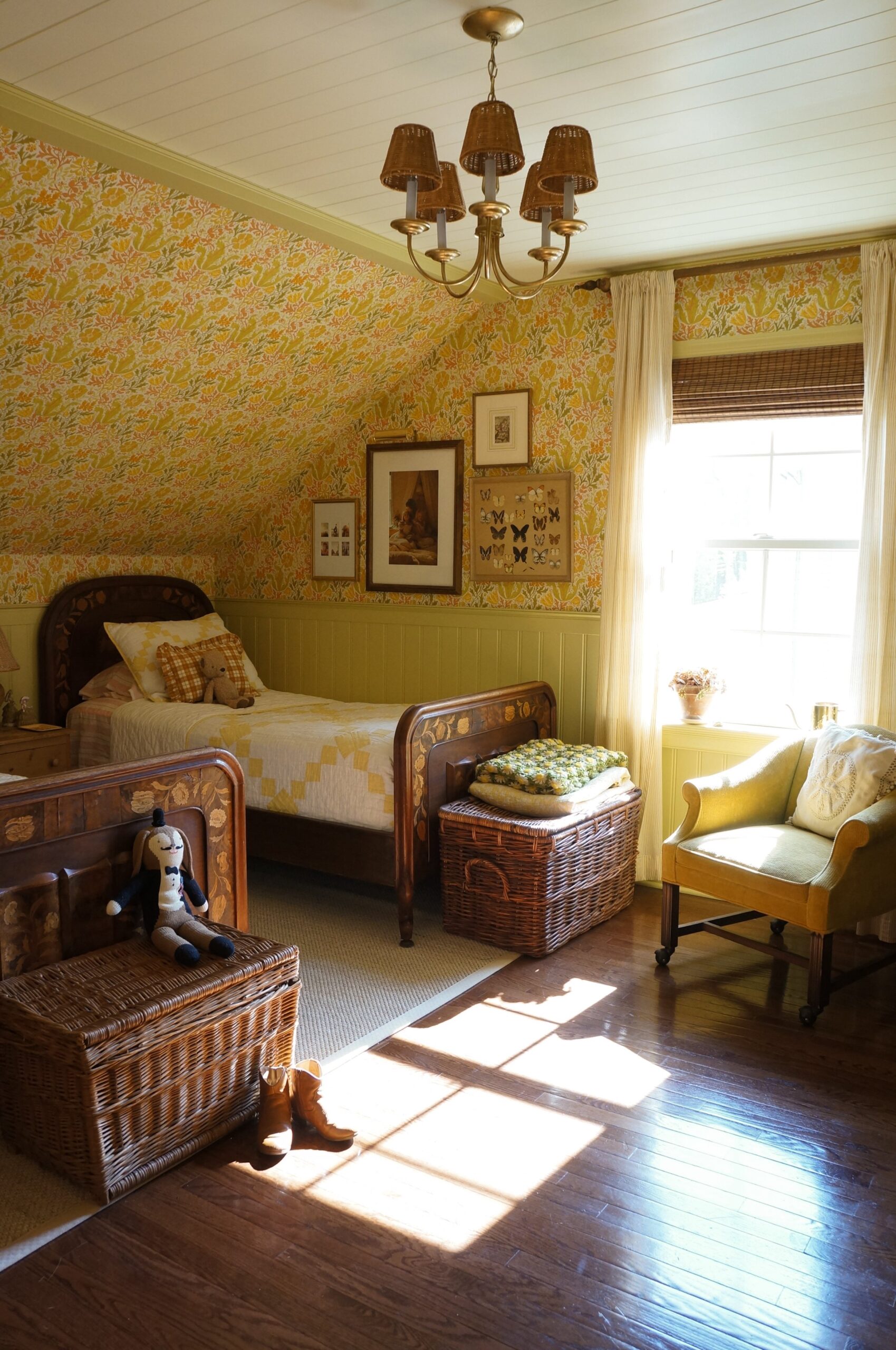
There’s wallpaper that lends itself to modern day designs and then there’s wallpaper that feels historic because of the pattern, color combination, and size of the motif. This builder grade bedroom was re-designed by Dana Dore, now featuring wallpaper that is reminiscent of historic wallpaper. Extending the wallpaper over the slanted ceiling is precisely what you would see in 100 year old homes and pairing that with pale green beadboard wainscoting exudes charm.
But beyond the wall treatment, this room is full of antique furniture such as the twin beds Dana found on Facebook Marketplace. I cannot stress this enough, if your home is lacking character, it may be because all your furniture is new or mass produced. Antique furniture single handedly brings so much character and originality to a space.
Playful Girl’s Bedroom


A Quirky Hidden Bathroom Feature That’s So Unexpected
DESIGN BY ADORED HOUSE
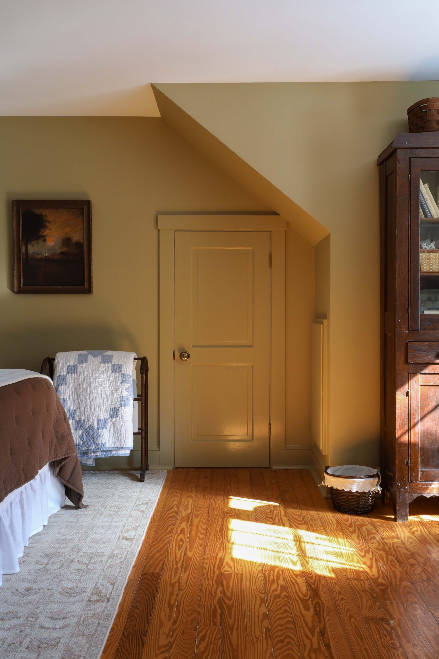
Old home charm can look like many things, but one of those things is quirkiness. For example, see that mini door disguised in the beadboard wall? Builders today would never take the time to do something so unique as this in a cookie cutter home, but old homes have quirky things like that everywhere.
Yellow is a very historic color, so it’s no wonder this pale yellow-green paint color looks as though it has been here since 1920. This room just wouldn’t have the same feeling if it were painted white.
Of course the beadboard walls and crown moulding play a big role in the charm of this once builder grade bathroom rebuilt by Dana Dore, but an added layer of character is brought in through the artwork hung by a picture rail.
Shop Similar Bathroom Pieces


Old World Stone In A New Dining Room
DESIGN BY SALINA MARIA HOME
Natural materials such as stone and wood are such prominent features in old homes. So why not replicate that? Stone veneers with irregular shapes add a sense of history and charm. But that’s not the only character that Salina infused into her builder grade kitchen and dining room. An antique ladder, rustic wood dining table, brass salt and pepper mill, and weathered vases make this dining room look anything but new.
It’s the layers of character that make a new home look old, not just 2 or 3 pieces scattered in a room.
Old Style Kitchen & Dining


A Living Room Peppered With Texture
DESIGN BY ALEXANDRA EIDENSCHENK
Unlike orange peel textured walls, which are an unfortunate popular characteristic in builder grade homes, the texture of the walls in Alexandra’s new construction home resembles that of plaster in an old home. Plaster and lath is a quintessential old home characteristic that isn’t appreciated enough in new build construction. The textured walls in this sitting room, paired with the buttery white paint color, creates the charm of an old home. But if plastering your walls is out of the question, consider wall finishes that add movement to the wall such as lime wash or roman clay. And when it comes to paint colors, a warm white lends itself to old homes much more than a pure bright white.
Of course the hand hewn beams, antique hutch, and the historically inspired wall sconce play a role in the old home feeling.
Stylish Sitting Room


A Moody Maine Cape Cod
PHOTO BY NADINE STAY
When we spent a month in Maine, we stayed in a cape cod home built by the family who rented it out and the common thread throughout was few overhead lights. When you think about it, old homes didn’t have 6 can lights in every room. They had lamps and sconces and perhaps one overhead light per room. Shy away from recessed lights and opt for historically inspired sconces, lamps, flush mounts, or chandeliers.
Historically Inspired Lights


A Builder Grade Kitchen Turned Modern Victorian
DESIGN BY ERIKA FROM PEONY AND HONEY
When Erika redesigned her builder grade kitchen, she drew inspiration from Victorian homes. The before and after of this kitchen is one you have to see to believe. Erika didn’t just focus on eye level upgrades, she went floor to ceiling! Tin ceilings are a quintessential architectural feature of Victorian homes and the antique gilded picture frame surrounding the window is such a beautiful unpredictable surprise. A gallery wall above the kitchen sink? A thousand times yes!
In addition, natural materials are peppered throughout the kitchen with the brass hardware and faucet, the soapstone countertop, and the marble countertop on the island. Natural materials such as these have natural wear that in itself generates character. With all of these elements combined, this kitchen leaves no trace of builder grade behind.
The Kitchen Of Your Dreams


Furnishings By: W Design Collective, Marianne Brown, Georgia Barnes, Paige Hille
Stylists: Annie Desantis, Sara Ronna
Photographer: Malissa Mabey
A New Construction Home That Looks Anything But New
DESIGN BY J. SCOTT ANDERSON, W DESIGN COLLECTIVE, MARIANNE BROWN, GEORGIA BARNES, PAIGE HILLE, ANNIE DESANTIS, & SARA RONNA
Once again we see a beigey pale yellow paint color on the walls and it instantly feels historic. Pair that with vertical tongue and groove planks throughout the entire room (ceiling included) and elaborate crown along the perimeter for a tease of the past.
You can also create a nod to the past with built in bookshelves. Decorate them with collected knick knacks opposed to mass produced decor. Or even better, fill it with antique books. Beyond that, consider the fireplace. A wood burning fireplace or wood burning stove will always trump a gas or electric fireplace if you’re going for authentic old home charm.
A Classy Classic Living Room

THREE THINGS TO THINK ABOUT:
• WALL TREATMENTS: In every example above, there was some form of wall treatment. Whether it was wainscoting, wallpaper, beadboard, tongue and groove, or simply just plastered walls, drywall was not once the primary focus of the walls.
• NATURAL MATERIALS: New construction homes that attempt to look old begin to stand out like a sore thumb when the materials and colors don’t reflect that of historic architecture. Reclaimed wood walls, solid wood floors, natural stone countertops, and stone flooring will lend themselves to an old home much more than faux alternatives or “lookalikes”. After all, authentic patina simply cannot be mass reproduced.
• LAYERS: If you look back at all the photos above, you’ll notice that there are layers upon layers of historical character in each room. Unfortunately incorporating just one or two elements of character won’t produce the results you’re looking for. Address the walls, infuse character into the architecture, integrate natural materials, look for lighting, pepper in antiques, and THEN you’re home will look as though it came from the past.
Leave a Reply Cancel reply
Where behind the scenes, exclusive advice, and candid conversations are sent straight to your inbox every week.


Hi Danica,
I appreciate how you break it down & simplify it for us,