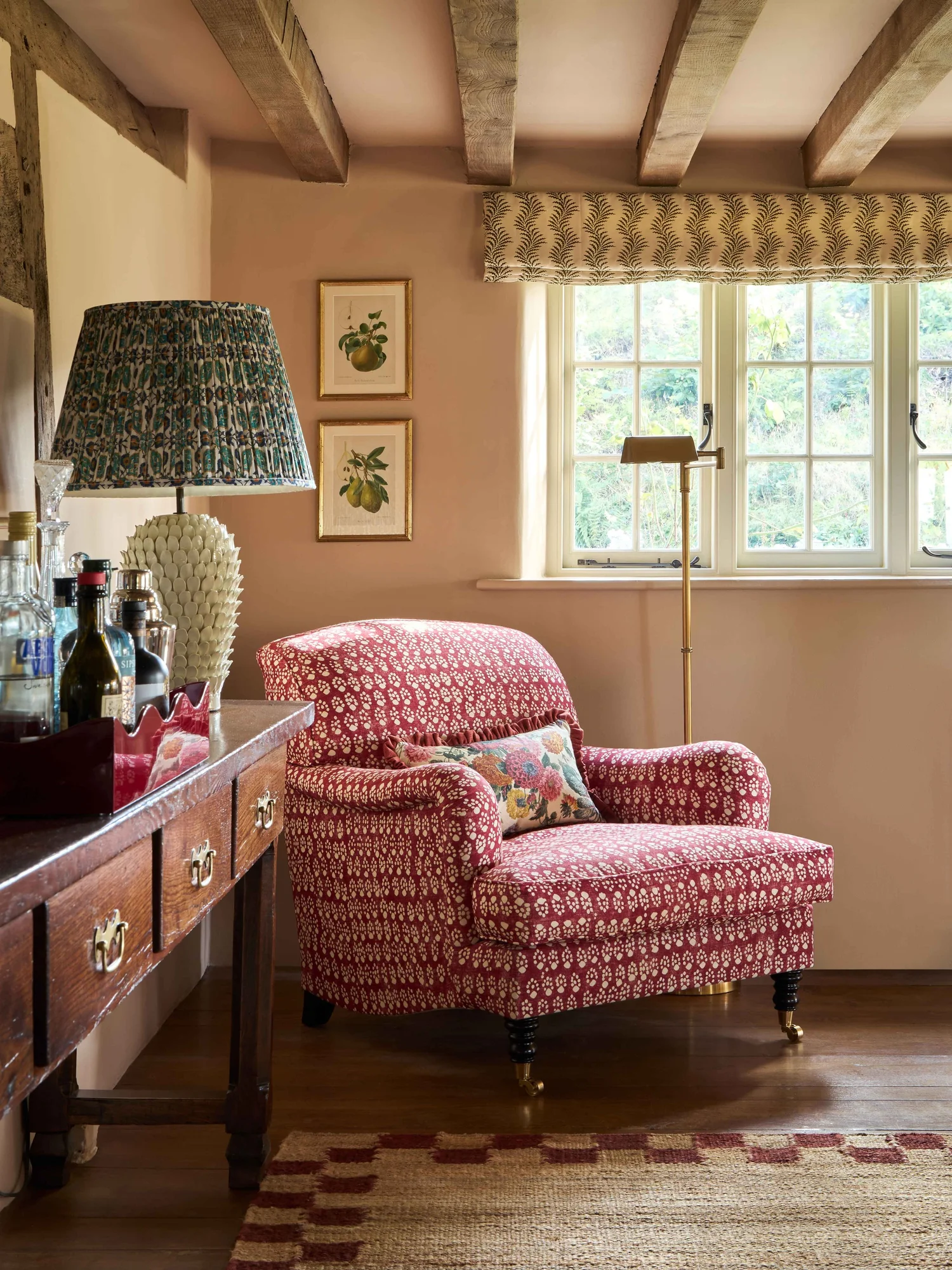

When I painted our guest bedroom, I was met with many opinions on my decision to leave the ceiling white. “Oh…paint the ceiling too.” “Have you considered painting the ceiling the same color?” Color drenching has become so popular that it’s often considered standard procedure, but is this bold design choice suitable for every scenario? The answer is…complicated. But there are certainly recommendations on when you should and shouldn’t color drench a room.
COLOR DRENCHING DEFINITION:
When the walls, trim, and ceiling are all painted the same color.

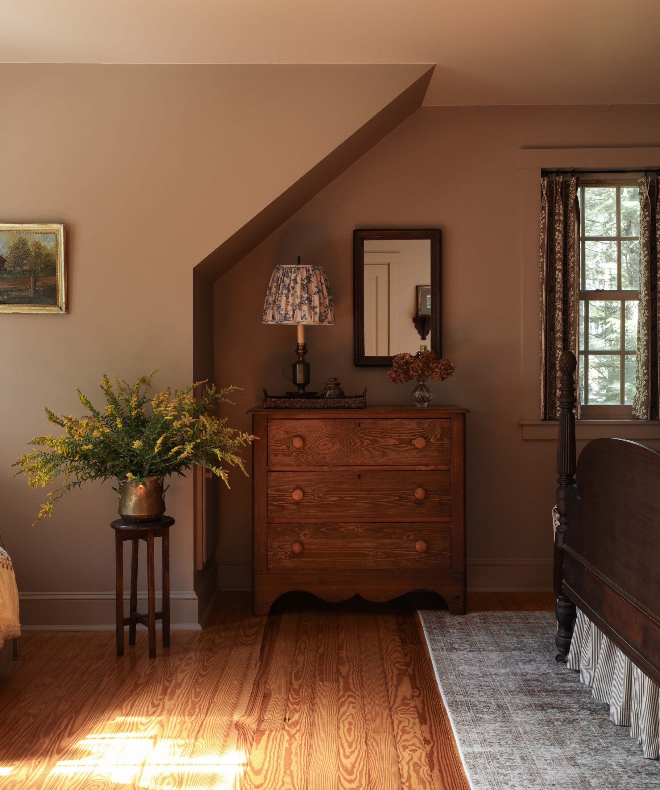
Everyone told me I should have color drenched this bedroom, but the ceiling color wasn’t an afterthought. I left it white intentionally. Here’s why…
When Color Drenching Is The Wrong Choice
When Light Is Limited
Our bedroom receives great morning light, but by afternoon it’s quite dim. I wanted it to feel bright for as long as possible, and a white ceiling allows the light to linger a little longer. It almost acts as its own light source because white reflects significantly more light than dark colors. That light illuminates the upper portion of the walls, and subsequently the rest of the room.
While there are many instances where a color drenched ceiling is the right choice, if you’re worried about the room feeling too dark, a white (or off-white) ceiling can combat that.
When Architectural Details Deserve Emphasis
What color drenching does is put everything on an even playing field. Nothing takes precedence. While this can be incredibly beneficial in some circumstances, it can also cause important details to go unnoticed. Intricate door casings, crown moulding, or millwork are emphasized when there is *some* contrast. Whether a little or a lot, contrast gives attention to the details that deserve it.
For Better Or Worse, Color Drenching Reduces Undertones
If you’ve ever tested a paint color, I’m sure you’ve been told to paint the wall white before sampling the color. The reason for this is because it’s much easier to see the undertones of a color when you compare it to a white backdrop. Suddenly, a color you thought was neutral may show strong yellow or purple undertones.
For better or worse, color drenching reduces the intensity of a color’s undertones. In some instances, this may be desired. For example, in our last home, I chose a custom cream paint color that was beautiful, but against white it looked pink. The solution was simple: eliminate white accents. We color drenched the room – painting the ceiling, walls, and trim the same color. The pink undertone vanished, and we loved it!


We used that same custom cream color in our current house, but it read so neutral that it simply looked white. The solution again was simple: leave the ceiling white to highlight the contrast and showcase the undertones. Suddenly it became abundantly clear that the wall color wasn’t white, but rather a rich cream. Color drenching is meant to make a bold impact, but it can have the opposite effect if the depth of color is lost.

The undertones of lighter colors are especially susceptible to being emphasized or subdued. If you want to reveal the full depth of the color, a white ceiling can help. If you’d rather soften unwanted undertones, color-drenching is a great option.
KEEP IN MIND:
If you choose to keep your ceiling white, it doesn’t have to be a pure white. If your walls are a midtone or dark color, a crisp white ceiling may be too harsh a contrast. A warm white or cream can soften that contrast while still emphasizing the undertones.
When Color Drenching Is The Right Choice
In addition to downplaying a color’s undertones (as mentioned above), there are many examples where color drenching IS the best solution.

Design: Ashley Montgomery Design | Photography: Lauren Miller
To Camouflage Architectural Distractions
Color drenching is a great way to disguise unwanted focal points. If the roofline is jarring, a window is off-centered, doors have various heights, or your baseboards are less than exciting, painting everything the same color minimizes those visual interruptions by reducing contrast.
Color drenching is also a great way to unify a busy room. Spaces with a lot of doors, cabinets, openings, or various ceiling heights can look fragmented. But a single color unifies everything.
When The Contrast Is Too Strong
Sometimes pure white against a dark color is hard to ignore, putting emphasis on the ceiling or trim rather than the walls. In this case, you can choose a cream color, you can color drench the room, or you can paint the ceiling/trim a shade or two lighter than the walls. All three of these options soften the contrast and prioritize the wall color.
To Envelope A Room In A Feeling
When you want to *feel* something the second you walk in the room, a bold design choice is required. Color drenching creates spaces that feel calm, intimate, and deeply inviting. This uninterrupted wash of color creates a cocoon-like effect that people crave so deeply.

Consider Partial Color Drenching
There’s always a third option – partial color drenching. Think of a room as three elements: walls, ceiling, and millwork. You can paint two of the three the same color, while using a second color on the third element. Take Anna Hewitson’s living room above. The walls and ceiling are the same color, but the window sashes are white. You could also paint the walls and millwork (windows, doors, casings, baseboards) the same color, leaving the ceiling white – as I did in our guest bedroom.
I hope this provides some clarity on when it is and isn’t a good idea to color drench a room. And remember, it’s only paint. You can always change your mind later!
Leave a Reply

Where behind the scenes, exclusive advice, and candid conversations are sent straight to your inbox every week.
The Inside Scoop
DO YOU WANT

Hi Danica,
My original plan for my guest room was to paint all the trim, doors & ceiling a pale blue-green-grey. I wanted to leave my walls the warm white that they were. I got all the trim painted in satin & proceeded to paint the ceiling in flat. The ceiling looked awful. It looked dingy grey. I then got another gallon of flat paint but had my color lightened a bit. The ceiling wasn’t improved.
My solution…I mixed the leftovers of my flat paint & painted the walls with it. And wallpapered the ceiling in an entirely different color.