Reject The Plastic Suburb: How To Build Beautiful & Quality Affordable Homes
·
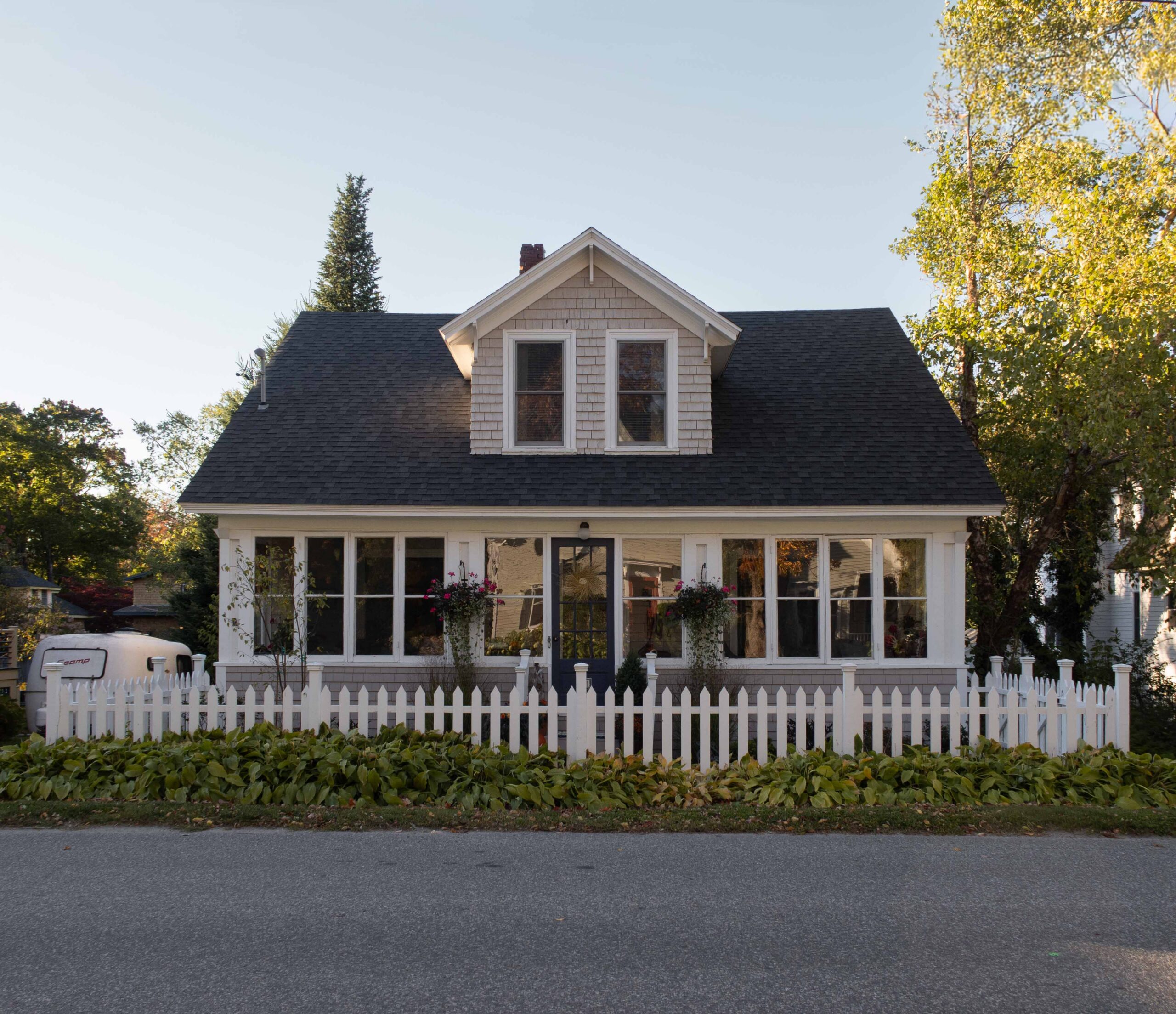

I’ve been thinking a lot about today’s approach to building affordable and entry-level housing. Nowadays, a 3,000 square foot home is being built out of plastic…literally. Vinyl windows and vinyl siding cover poorly designed structures. In the past, wood siding and wood windows graced 1,000 square foot cozy cottages. One approach deteriorates rapidly, both in function and fashion. The other stands the test of time.

This post contains affiliate links.
Henry David Thoreau built his famous Walden cabin in 1845 for $28.12. In 2026, that equates to $1,251.97. For that price, you’d think it was made of Legos. But the walls were formed with salvaged pine studs and clapboard. The chimney was constructed with roughly 1,000 old bricks and reclaimed lime mortar. The wood door was handmade, and the windows were reclaimed. He did this to prove that flash and flair were unnecessary, but I’ve taken away a different point. He didn’t sacrifice quality to construct an affordable home. He got creative and smart.

We’ve become so accustomed to massive homes that the first thought when building affordable housing isn’t to decrease the size, but to downgrade the materials.
We’re sacrificing longevity for faster installations. We’re eliminating craftsmanship for convenience. And we’re cutting corners for extra square footage. In the end, these shortcuts always come to light.
Solution #1 For Building Affordable Housing: Decrease The House Size
Brent Hull shared a fascinating story about the post-WWII housing crisis. More specifically, how William Levitt, a private developer, solved the housing shortage. In the 1920s and 1930s, the average house size was 1,400 square feet. Levitt built homes that were 600-800 sq. ft. At first, this dramatic decrease in size was ridiculed, but ultimately the percentage of homeowners increased from 40% to 60%.
Today, “the average size house is over 2,000 square feet. Applying Levitt’s model, we should be building houses that are 1,000 square feet. Millennials and baby boomers both, are willing to live in smaller houses,” says Hull.
It’s important to recognize that a bigger house doesn’t necessarily equate to more rooms or more usable space. A bigger home typically results in each room becoming far too big for its own good. It’s very common to see a living room with seating spread too far apart or an 8-foot-wide walkway along the permiter. It’s not unusual for primary bedrooms to be 400+ square feet, when the ideal bedroom size (as suggested by seasoned interior designers) is closer to 200 square feet.


Design: Hageman Homes | Photography: Will Reid
When you buy or build a home with 3,000+ square feet, you’re not paying for more usable space; you’re paying for dead space. It doesn’t feel cozy, it’s hard to furnish, and you feel like you’re floating in a large empty room. We don’t need big homes; we need better homes.
We would greatly benefit from building smaller houses, not just to create affordable housing, but to allow for the return of craftsmanship.

A Smaller House Allows You To Build With Quality Materials
Poor quality materials don’t age with grace; they deteriorate. Vinyl siding doesn’t wear well; it warps and cracks. Particle board cabinets don’t patina; they peel and swell. When these materials inevitably fail, they can’t be repaired; they need to be replaced, requiring even more money.
Wood siding and wood windows can be restored. Wood cabinets can be sanded and repaired. And when we repair quality materials, we extend their life another 100 years.
Reducing the size of a home leaves room in the budget to choose better building materials. Materials that will last, materials that will require less money in the long run, materials that are better for the environment, and materials that are proven to be more desirable by homeowners.
Not only does a smaller house allow for the use of quality materials, but there’s opportunity to add some ornamentation too! Stylistic details are rarely considered for entry-level homes because builders view them as a waste of money. But architectural interest, attention to detail, and a respect for craftsmanship have proven to be preferred by consumers.


Let’s Look To The Past For Architectural Inspiration
If there’s one thing we’ve learned from recent architecture, it’s that new ideas aren’t always better. (Talking about you Modern Farmhouse & McMansions.) Between builders that only care about the bottom dollar and builders that simply lack the knowledge of good craftsmanship, nearly all new homes today lack the fundamentals of good architecture. Regardless of whether it’s a new luxury home or a starter home, neither has an ounce of craftsmanship anymore. And the funny thing is, we already have the blueprint to a well-designed home…so why aren’t we using it?
From 1908-1942, Sears sold mail-order kit homes through their catalogs. You could flip through the pages to find a home you liked, and Sears would send everything you needed to build that house. From pre-cut lumber and kitchen cabinets to the exact number of bricks needed, everything was delivered to you.
One would think that such a convenience like this would have a downside. Perhaps lower quality materials? No. These kit homes were built with solid wood windows, solid wood floors, brick, and extra clear red cedar shingles. Perhaps architecturally, they were bland or lacked craftsmanship? No. The designers of these kit homes didn’t invent their own styles; they copied the forms and figures of historic architecture. In fact, nowadays it’s often hard to spot a kit home from an “original” home without investigation.
Today’s new builds and affordable homes don’t need to be bland, nor do builders need to create their own designs. Starter homes can easily have charm and a sense of nostalgia by copying the past. A historic cottage, Bungalow, Cape Cod, or Tudor Revival is the ideal blueprint for good architecture. Shrink the square footage, and it becomes affordable, without sacrificing quality or craftsmanship.
Below is a perfect example to follow –


Two Entry-Level Homes. Same Budget, Different Results
Brent Hull & his team were tasked with the challenge of designing a new, entry-level home in an existing development. Above is a side-by-side comparison of two homes in that neighborhood. The first (left) house was designed by an undisclosed architect; the second (right) house was designed by Hull. Both houses had the same budget, the same contractors, and abided by the same HOA regulations, but the difference is night and day.
The first home does not have a sense of order or symmetry; aesthetically, it’s a mess. The garage is emphasised because it juts out past the house; there’s an excess of unnecessary gables, the windows are disproportionate, and there is no clear hierarchy. The second home (elevation sketch) has symmetry, a sense of hierarchy (the gable on the left has bigger windows than the gable on the right where the garage is), and architectural interest through the lintels above the windows and the gable trusses.
The second home didn’t require a bigger budget or special materials. Hull simply reorganized the elements and the layout of the home to create a proportionate house with historical precedence. While these are large entry-level homes, the same concept can be applied to smaller affordable homes.
This is a masterclass on designing an affordable home with intention.
Further Reading On Affordable Housing:
Where behind the scenes, exclusive advice, and candid conversations are sent straight to your inbox every week.
The Inside Scoop
DO YOU WANT