Last week on my Instagram page, I took a day to answer your design questions and share my opinions on your design dilemmas. That was so fun and there were quite a few questions I couldn’t get to, so today I’m addressing more of your burning design questions!
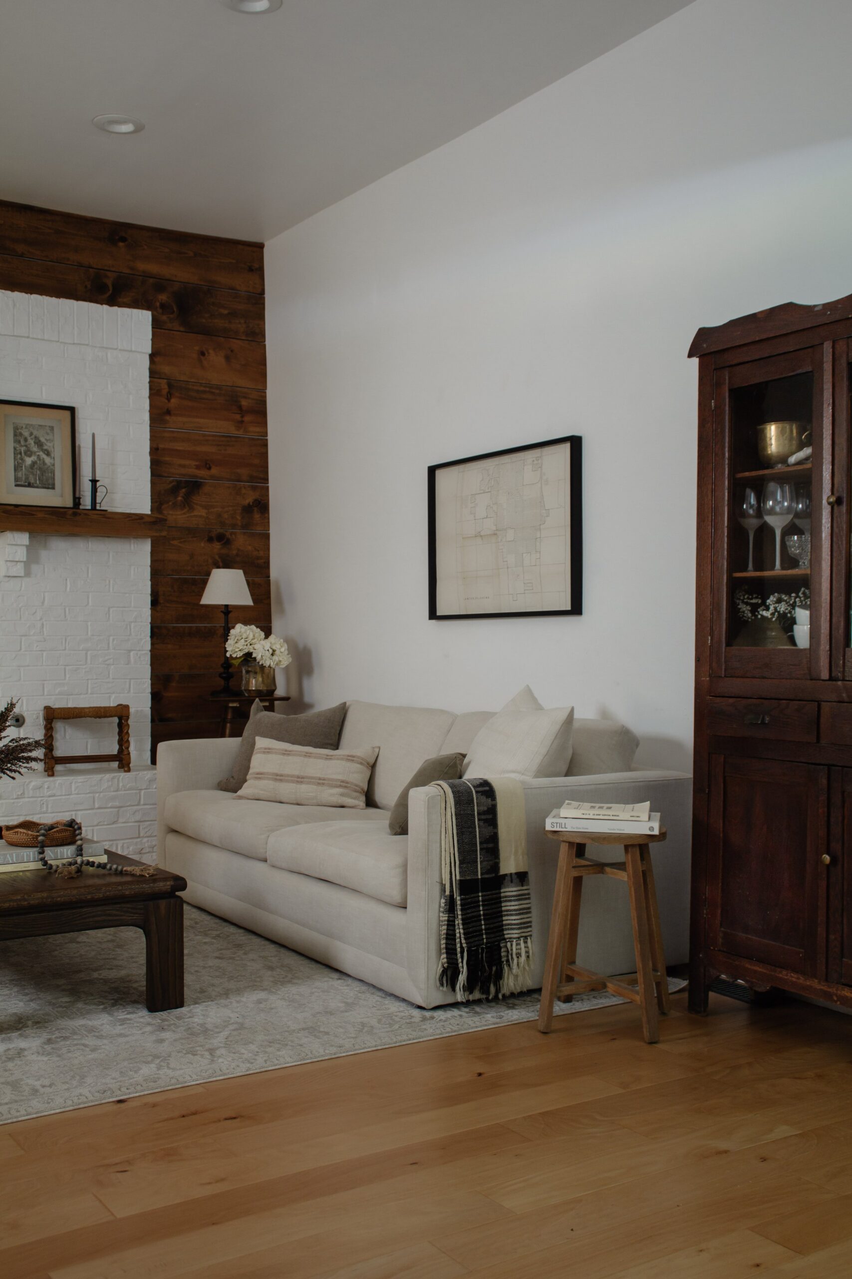
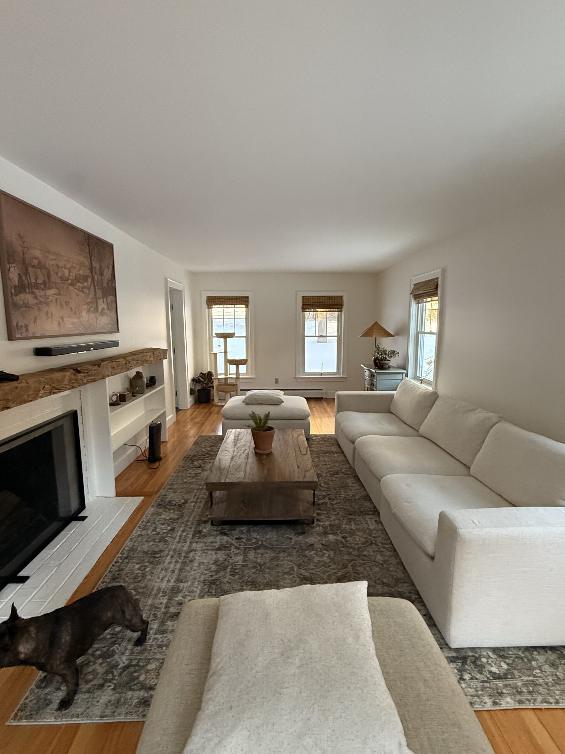
SOURCES: Sofa | Ivory Pillow | Lumbar Striped Pillow | Rug | Scallop Basket | Authentics Book | Still Book | Lamp Base | Lamp Shade | Hydrangea Stems | Tree Art | Tapered Candles
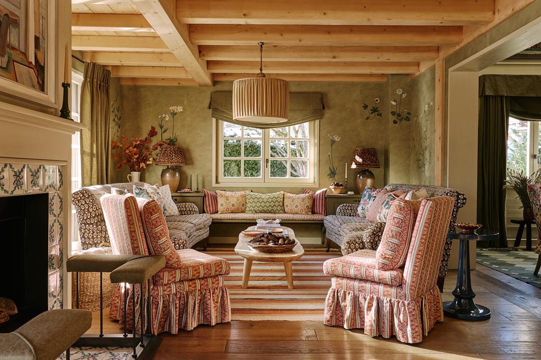
My advice is to pick a main wood tone/color. That’s the color that’s seen/used the most. If you have wood floors, that is most likely the main wood tone throughout your house.
To add additional colors of wood, you’ll need to figure out the undertone of your main wood color. It either has a warm tone or a cool tone. The best way to describe the difference between warm tones and cool tones is that warm wood tends to look more red, orange, or yellow. Cool undertones tend to look slightly gray. Whatever the undertone, all additional wood colors or species that you incorporate in your home should have the same undertone.
I like to mix light, medium, and dark wood colors and I try to keep the number of wood colors to no more than 3. Three looks properly layered without being too mismatched. For more examples of mixing wood tones, check out this post.
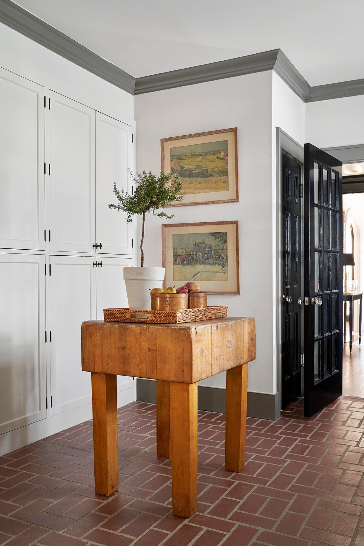
Both make a solid case! It depends on what you’re going for. If you want the ceiling height to feel taller, keep the crown the same color as your ceiling. If you like symmetry and want to emphasize the details of the crown moulding, or if your ceilings are really tall and you want to bring them down a little, paint the crown the same as your contrast trim!

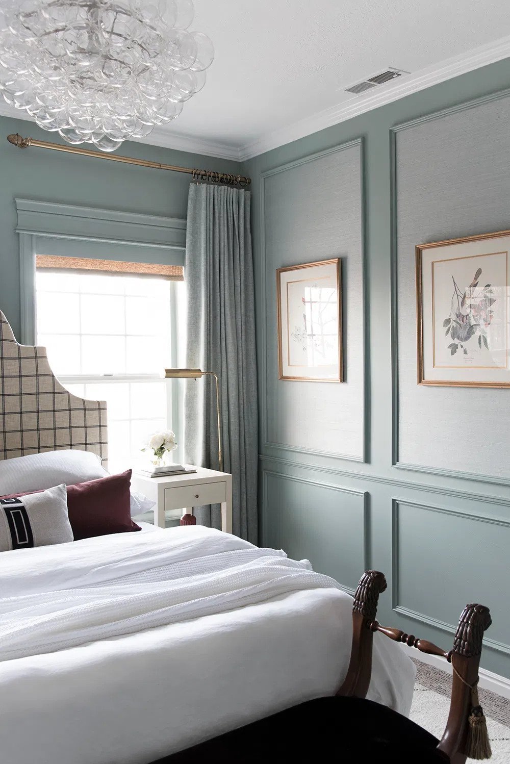
Picture frame, or box trim, mouldings are timeless! This look has been used for hundreds of years in various formats and it’s such a classic look. It leans more traditional, but it’s versatile enough to blend with a wide variety of styles.

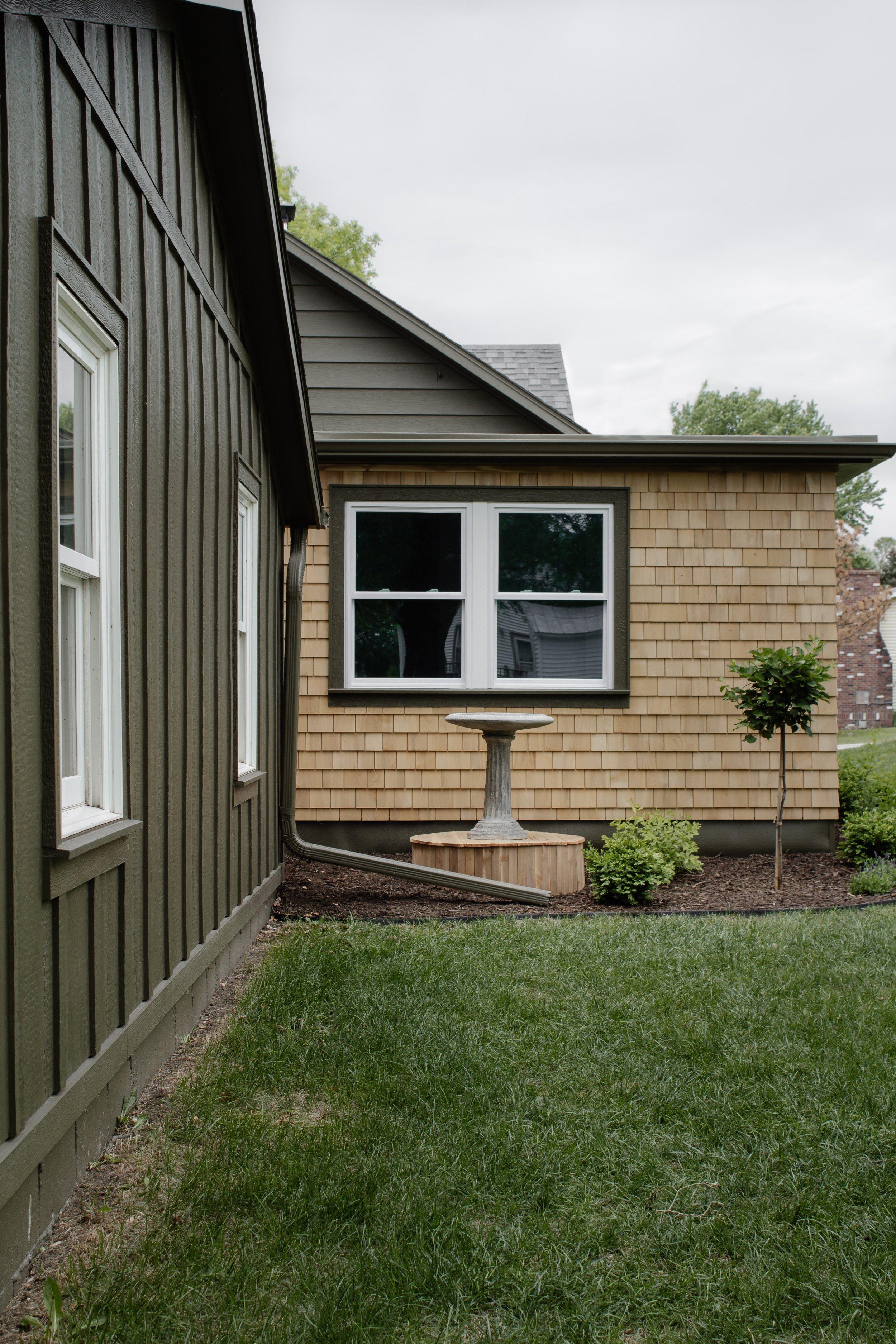
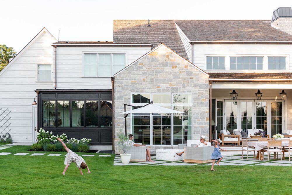
I’ll be the first to admit that I’m not an expert on exterior design, but when I see an exterior that I like, I make notes of what I like and why I like it. I love an exterior that has more than one siding material. I really appreciate a variation of texture and a pop of interest. When mixing siding materials, I focus on texture, lines, color, and location.
Texture – Combining two materials with opposite textures adds visual layers. Smooth lap siding paired with brick or stone is a great example of that.
Lines – If your siding has lines (i.e. lap siding or board and batten), I like to pair siding with opposite lines. We have board and batten (featuring vertical lines) with lap siding (horizontal lines) painted in the same color to bring in a new layer without it being too “all over the place.”
Color – Sometimes a second siding material may look stunning in a contrasting color. Perhaps the second siding itself could be a different color (i.e. stone, brick, cedar shakes). Or maybe the second siding material could be painted a different color. Now this might require some trial and error, because you don’t want to go too crazy with a bunch of different colors in a bunch of random places. But a pop of contrast in one or two locations can be a great way to add curb appeal.
Location – This is a big one for me. The perfect place to add a second siding material is on portions of the house that “stand out” from the house. If there’s a room that protrudes from the house, if there’s a section that recedes from the house, if there’s room that protrudes and has a different roof line, those are great places to consider a second or third siding material.
A perfect example of mixing siding is the McGee home above. The front features brick on the main portion (textured) with lap siding (smooth) and stone (textured in a contrasting color). The additional siding materials are on the two recessed portions of the house. The back features an additional third siding material in a contrasting color on the portion of the house that has a flat roof line.

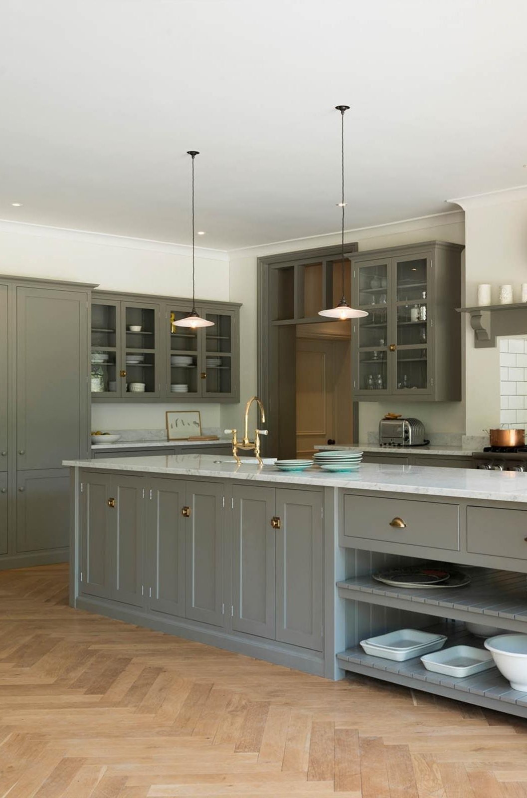
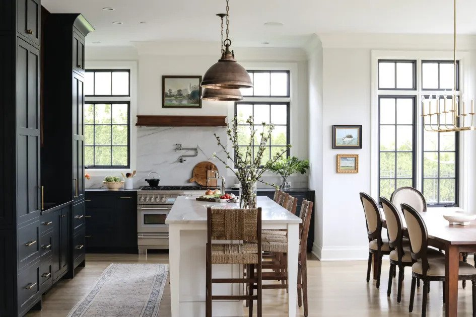
My vote is no! Play around with shapes, mix metals, get a chandelier with several lights to contrast nicely against the single light pendants. Design is all about layers, and this is a great opportunity to add just that.

Where behind the scenes, exclusive advice, and candid conversations are sent straight to your inbox every week.
