Dear Danica, How Can I Update My Retro Pink Bathroom Without Changing The Tile?
·

Dear danica,
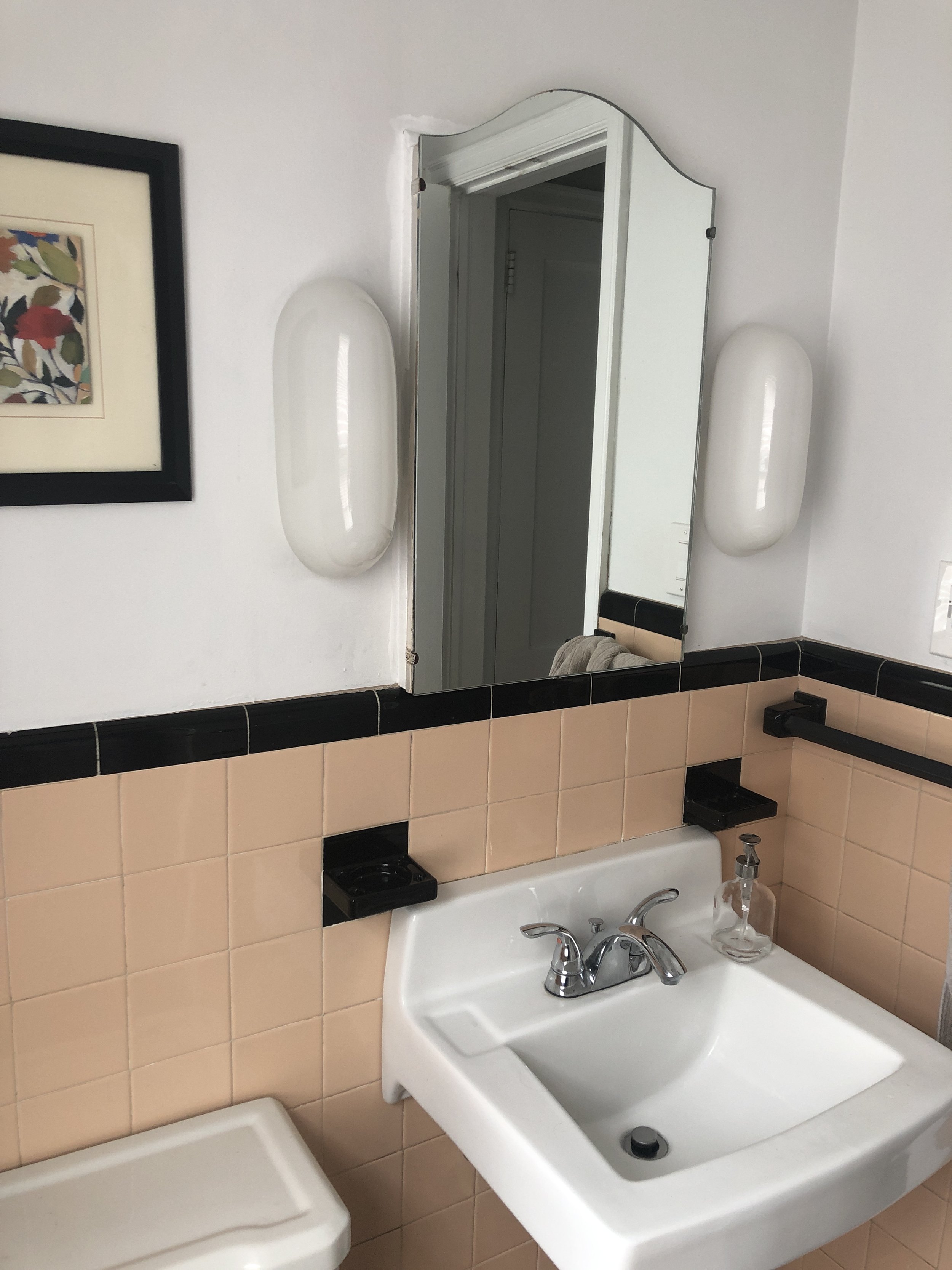
I need help with my retro pink and black bathroom! I would love for it to feel more modern and spa-like, but getting rid of the wall tile is currently not an option for us. Do you have any design tips to help it along while still keeping a bit of the charm and character? I’m open to new paint, new floors, new bath mat, window treatments, mirror, etc. I am partial to the lights though 🙂
– Lydia
Ok so cute! Pink may not be everyone’s cup of tea, but I find this bathroom to be so charming! I did some research online and as it turns out, pink and black bathrooms in this exact style were a bit of a hit in the 1920’s. I found quite a few photos with this same square pink tile, black border, mosaic floor tiles, medicine cabinet, and black towel bar. In fact, this historic home in New Orleans is a prime example of that. (Flip through to photo #36)
I’m so glad you’re keeping the pink tile! Rather than trying to disguise the pink…let’s lean into it and make it a wow moment. I would keep as much of the original pieces as possible including the pink tile, floor tile, wall sconces, medicine cabinet, and sink. But I’m fully on board with updating some elements to blend it with today’s style.
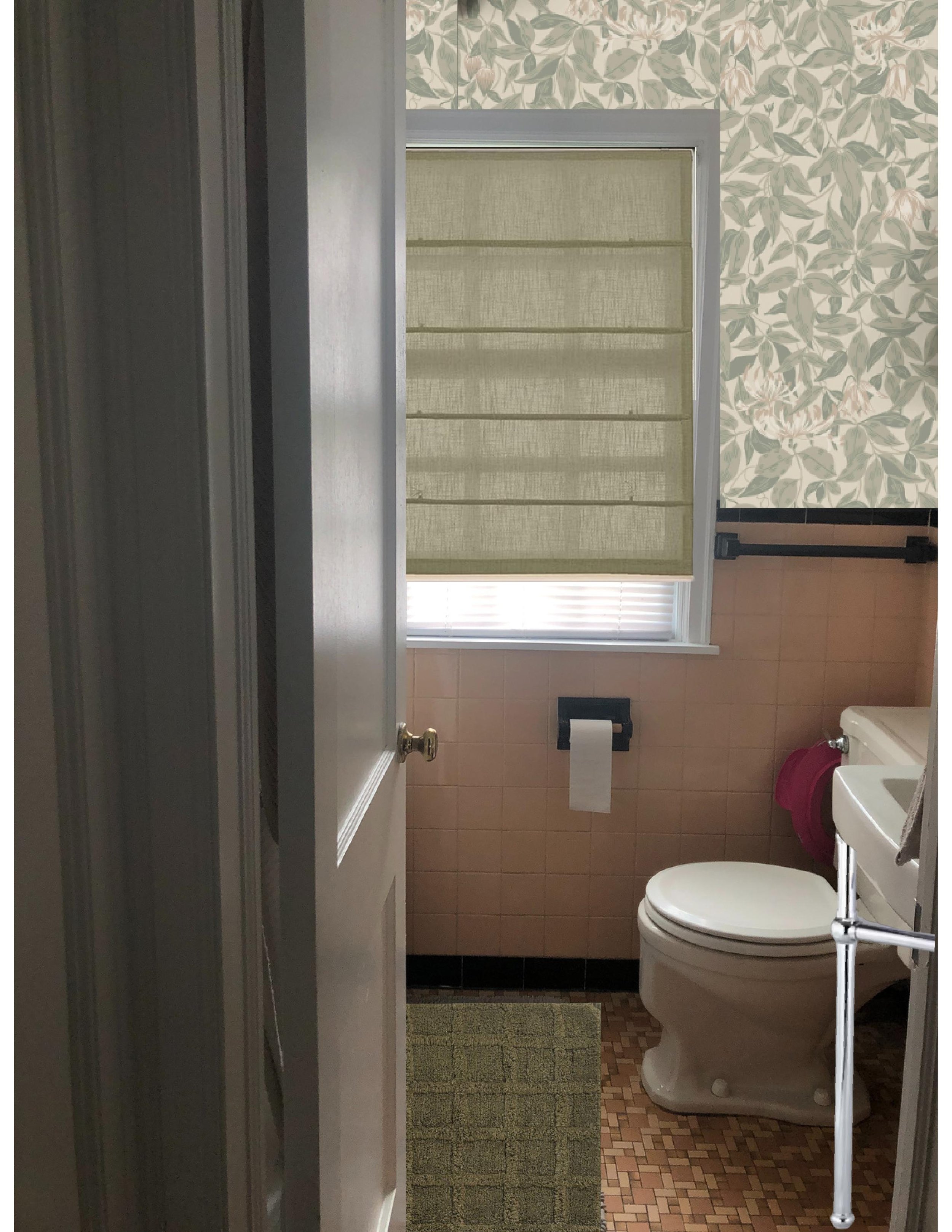
It seems as though white walls was pretty common with these pink and black bathrooms, so if you want to keep it as original as possible, leave the walls white. But if you’re open to changing that up, I’d look into wallpaper. I love the idea of incorporating a complimentary color through the wallpaper. This sage green botanical wallpaper compliments the peach tile beautifully and the peach flowers in the wallpaper tie in with the tile. But also, this wallpaper bridges the gap between the 20’s and 2023 without being too much of a style contrast.
Currently all the attention goes straight to the peach tile, and all the color is chest height and below. Adding wallpaper will balance the visual weight between the top half of the room and the bottom.
As for the sink, how do we feel about adding chrome wash stand legs to the base for a little something *extra?* Purely cosmetic, but it would add to that “spa” feel that you want to achieve. And while you’re at it, replace the plastic p-trap with the chrome p-trap that comes with the legs. And since we’re making changes to the sink, this vintage inspired faucet would be so charming too.
Last but not least, the cosmetic touches. I’d swap your mini blinds with a linen roman shade. Either a fabric that has hints of green to tie in with the wallpaper or beige to act as a neutral. This olive green bath mat compliments the color palette of the room without being too busy. Or maybe go for this scallop white and green mat for a touch of playfulness.
Because envisioning the end result can be so difficult, I pieced together what my thoughts are –
That’s all I would do! Simple updates that use the existing tile and color scheme as a starting point. It won’t take much to turn this retro bathroom into a colorful oasis.
SHOP MY THOUGHTS

Leave a Reply Cancel reply
DO YOU WANT
The Inside Scoop
Where behind the scenes, exclusive advice, and candid conversations are sent straight to your inbox every week.


Love this series!
Yay! That makes me so happy! Love doing it