Dear danica,
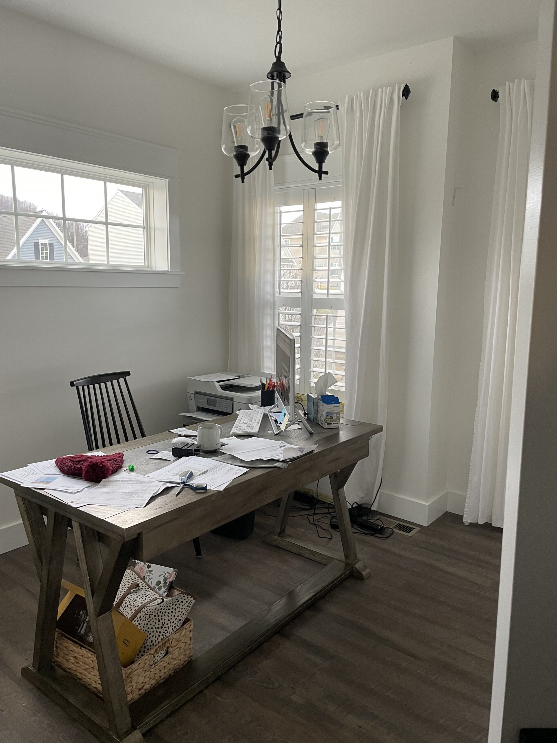
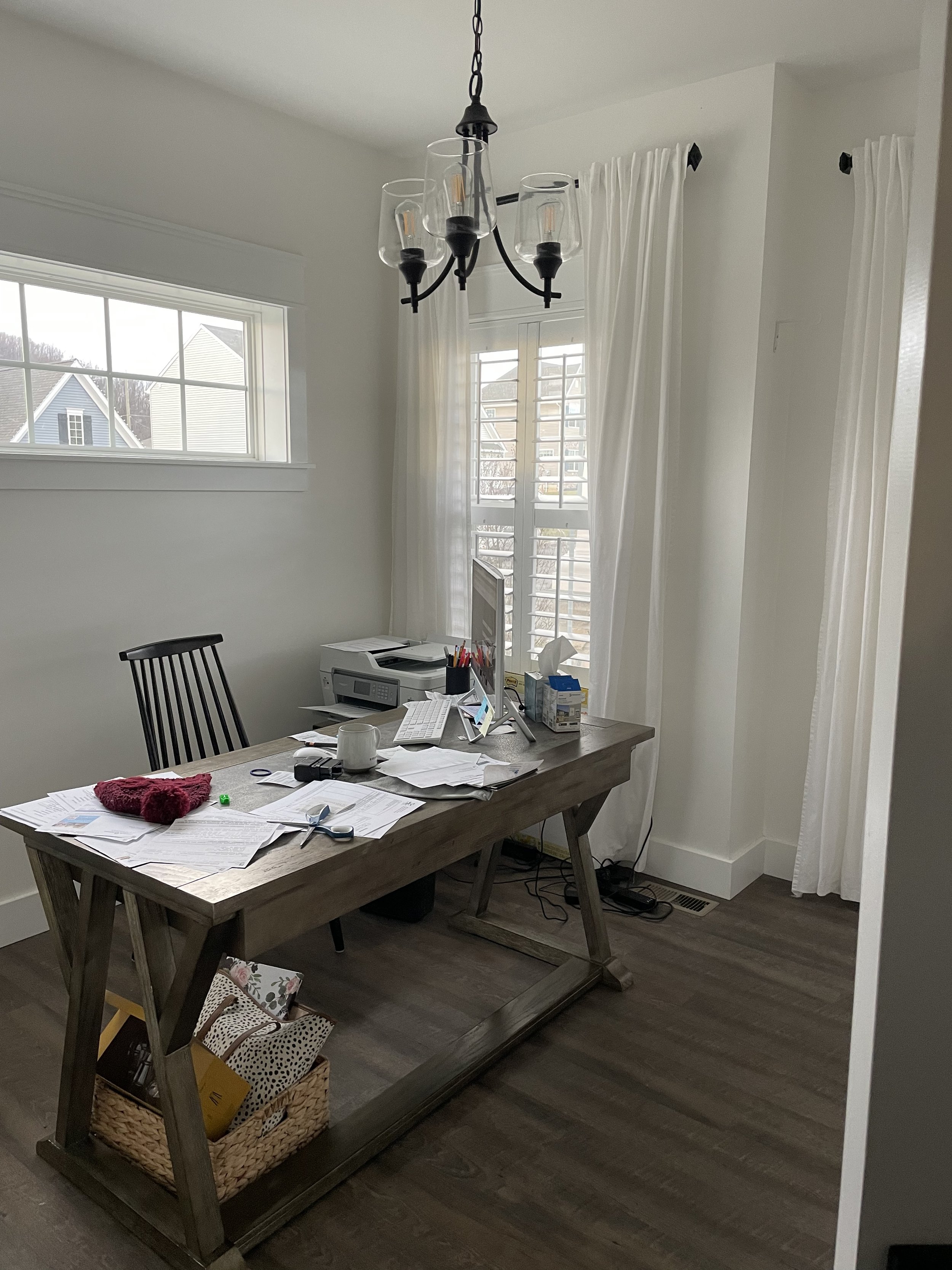
I’m in my office everyday. I am completely stumped on what to do to make it functional. Do I come up with a way to turn my desk around and face the wall? Where does the printer live. It’s big. File storage and the printer are the only to needs.
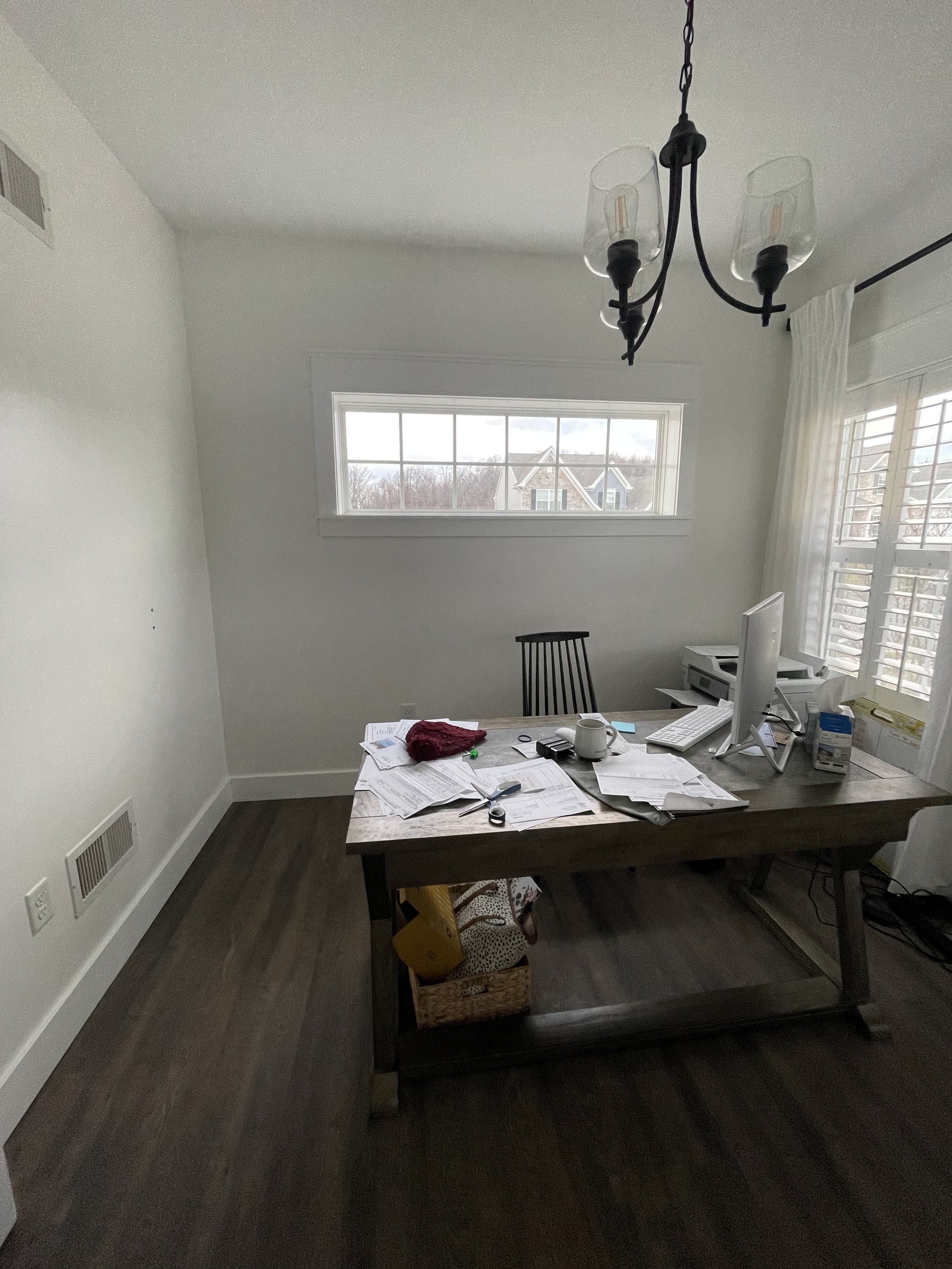
It’s an awkward shape room with windows in all the wrong places. Help?! Clearly I didn’t try to tidy it. Bc #RealLife
– Lauren
First and foremost, the bones of your office are absolutely amazing! I know the shape of the room and window placement feels awkward to you, but what’s awkward to you is so charming to me. Let’s do a little “What I Love” and “What I’d Change” list to break down how I’d make this office space more functional for you.
WHAT I LOVE:
I love the window placement actually! So much natural light! The two taller windows create symmetry on an otherwise quirky bump out wall. Love that you hung matching curtains on both to further accentuate that symmetry. But also, most everything in this room is a hard surface so curtains do wonders for softening the look. (PS so glad you hung the curtains high and wide….your ceiling looks so dang tall.)
As for the long and narrow window behind your desk, it solidifies the focal point of this office. Your desk is the focal point but the window above it helps draw the eyes up to create a focal wall. It’s like a picture above your desk and I love the window panes within it…so charming!
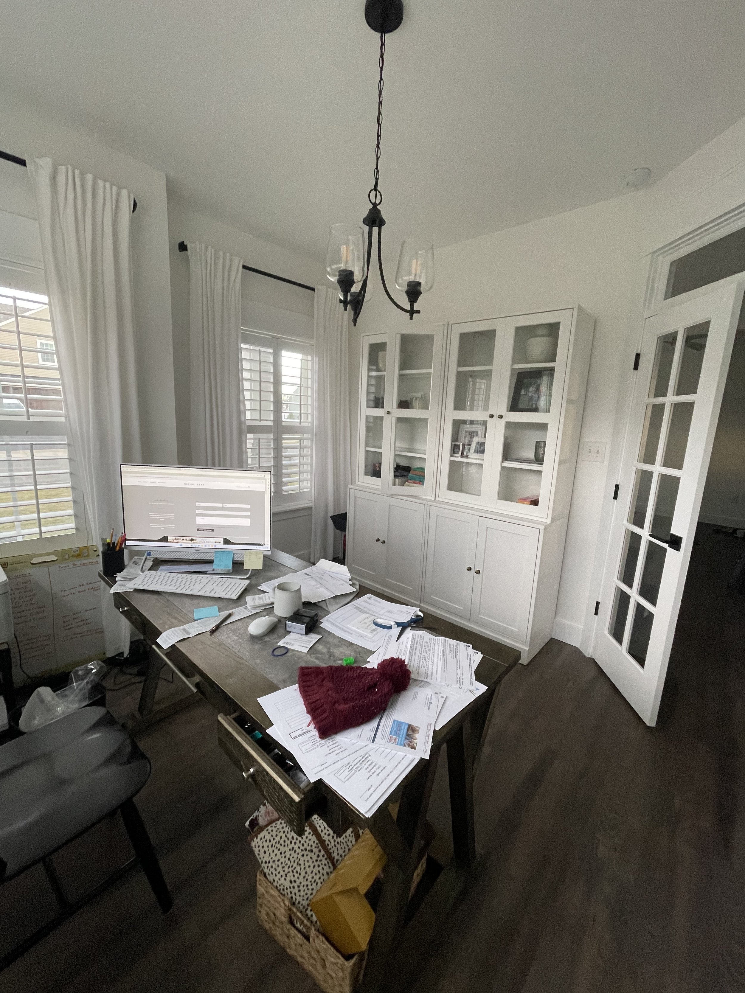
You mentioned turning your desk around to face the wall, but I’d keep your desk exactly as you have it. I don’t love when all the furniture is touching the wall in a home office and you have a big open space in the middle. That middle space becomes dead space that’s no longer functional and the room feels empty. Instead, I’d much rather put the desk in the middle of the room facing the door just like you have it. And speaking from experience, working at a desk that’s facing a wall can feel really claustrophobic.
“Rather than putting all your office furniture against a wall (which leaves a big unusable space in the middle), place your desk away from the wall, facing the door to create a focal point.”
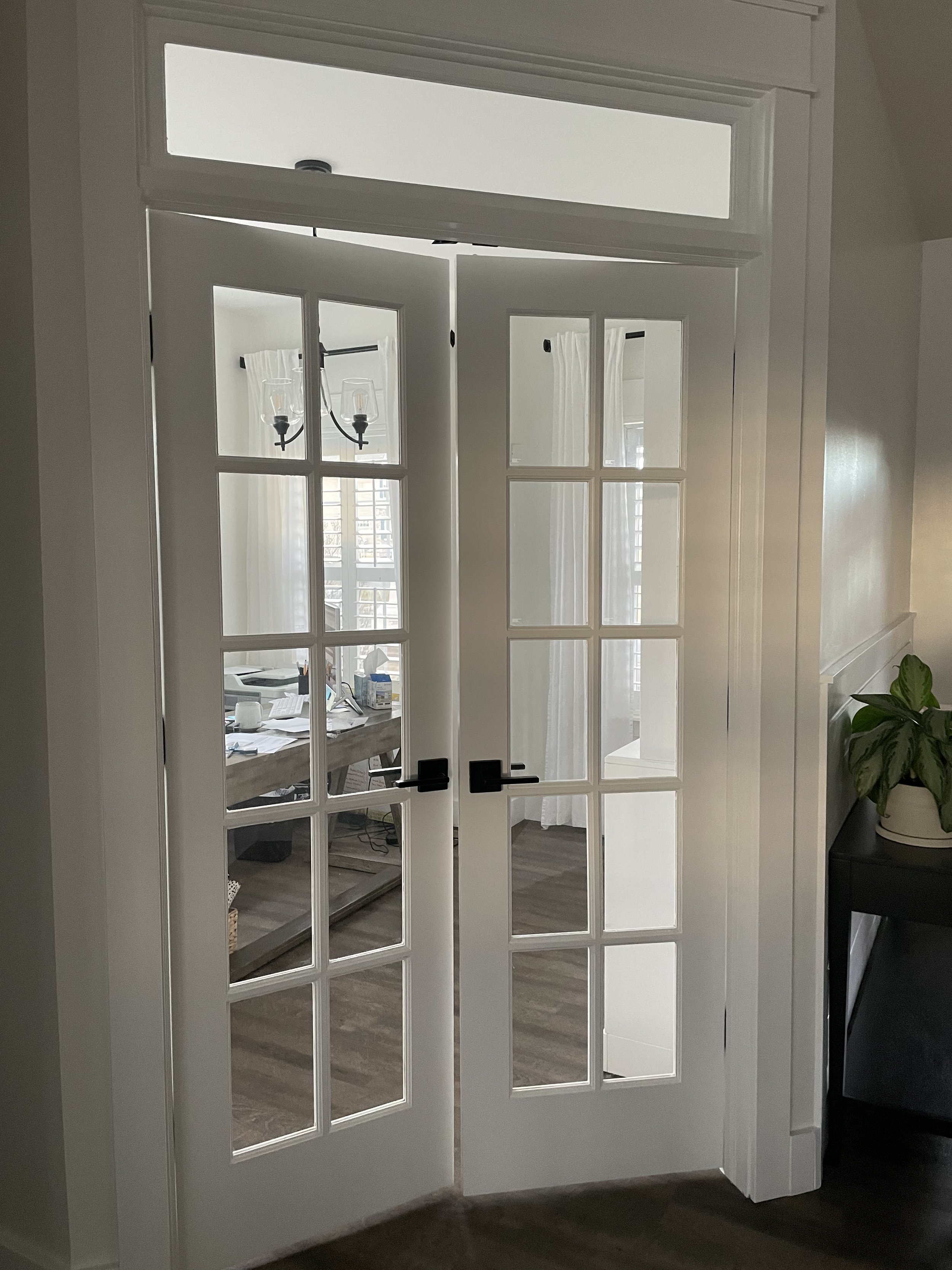
And let’s talk about those french doors!! What a dream to have glass french doors with a transom window above that leads to your office. Do you feel better than everyone else? Cause you should.
WHAT I’D DO TO MAKE IT MORE FUNCTIONAL:
The two main concerns are file storage and finding a place for your printer. And I think utilizing your hutch cabinets would address both. Is there enough space to tuck your printer in the bottom cabinet? Maybe you could drill a small hole through the back of the cabinet to plug it in and if it’s a wireless printer, there shouldn’t be any cords running across the room to your computer.
As for file storage, have you seen this base cabinet file storage organizer before? This can do wonders for hiding files without a clunky file cabinet! I’d tuck that into one of the base cabinets in your hutch.
I like that your desk has an open base because it doesn’t feel too big or bulky for the space, but I know how useful a few extra drawers of storage can be. If you feel like you need more storage, a desk with a few more drawers may do wonders for hiding away the little trinkets.
Now let’s just have some fun! I’d throw a rug down to add more soft surfaces to the room and it would create a bit of contrast between your wood floors and your desk with a similar wood tone.
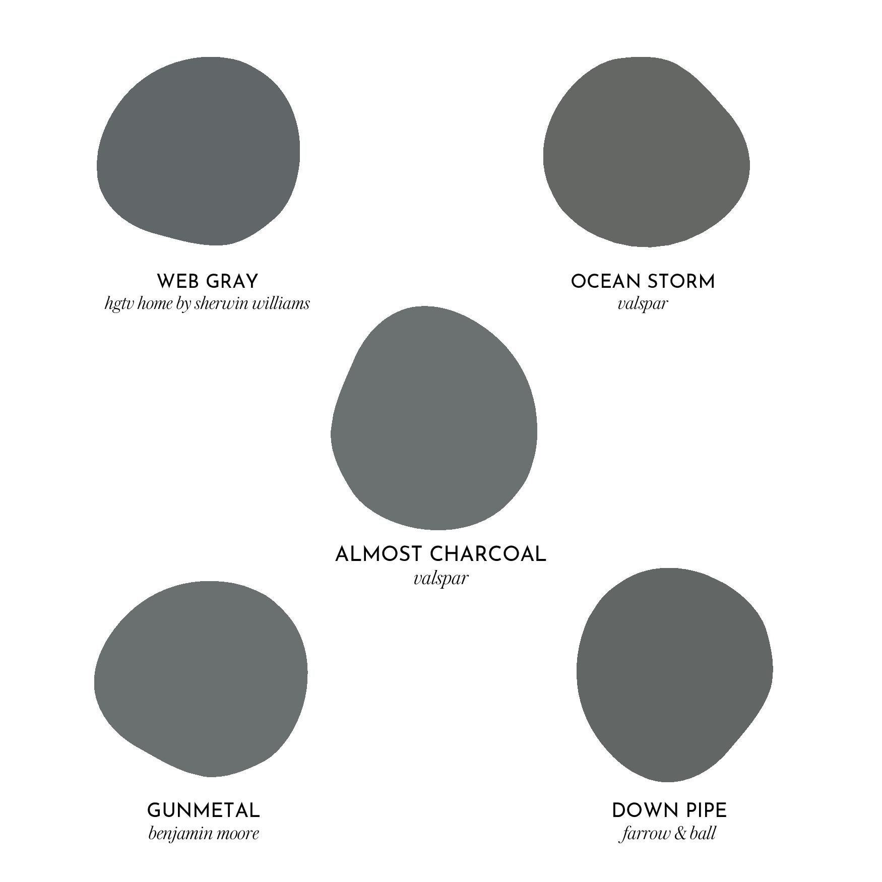
A small room closed off by french doors is a great spot to play around with colors, patterns, or contrast. So…I’d go bold with a dark paint color. These are a few that came to mind-
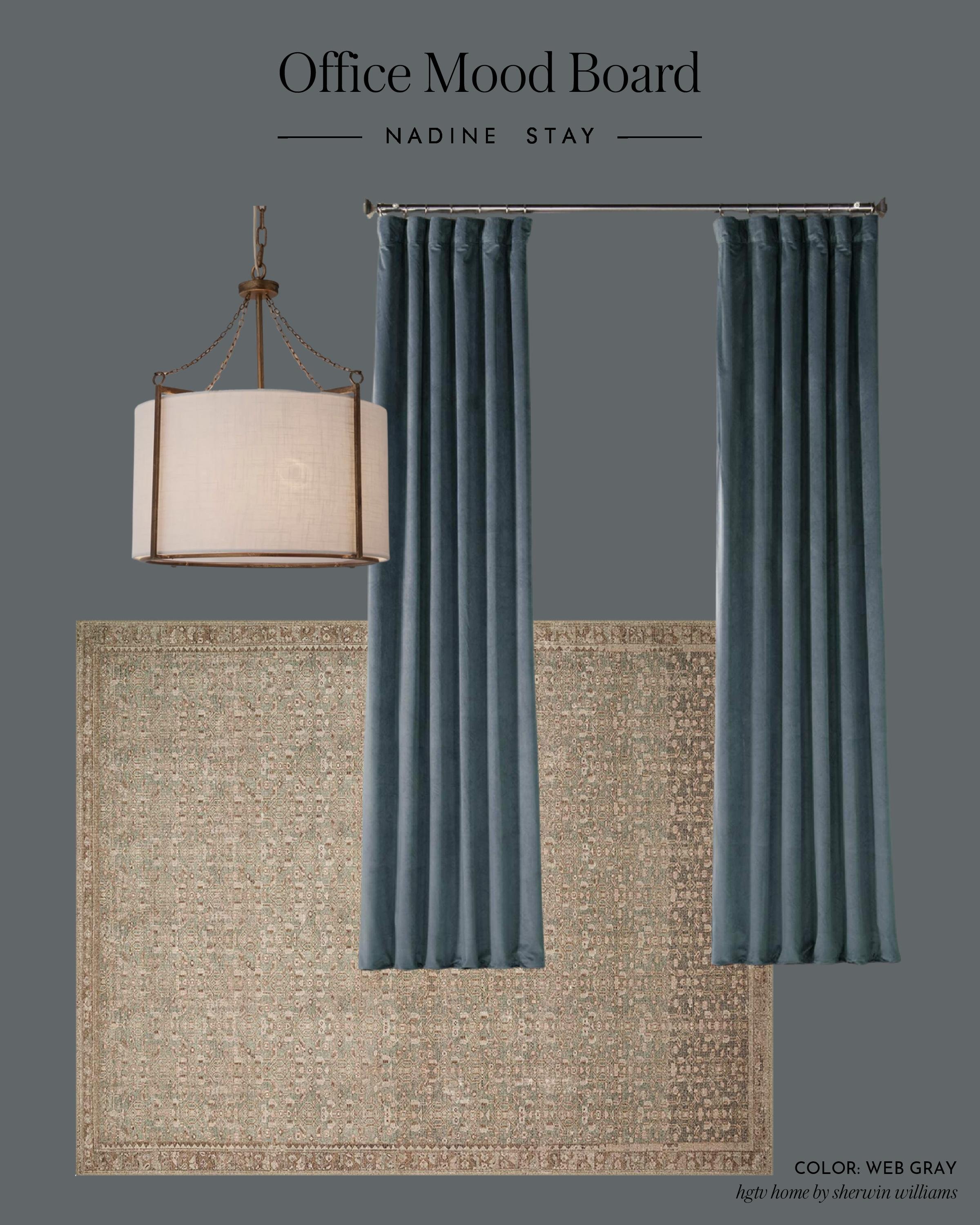
These lean gray and some have hints of blue, some have green. A desaturated blue would pair beautifully with the rug. Paint the walls, baseboards, window trim, and shutters for a monochromatic look. Better yet, go tone on tone with blue curtains to add more texture to the space without going too high contrast in color. I’m picturing velvet curtains with the slightest movement in color and it screams luxury. But my tip would be to pick curtains first and then pick a paint color that coordinates after.
I’d also spice things up with a brass pendant and linen shade. I love the one I shared in my mood board above because the antique brass pops against the blue, but still pairs well with the natural beige tones in the rug. That, plus the linen shade adds another soft surface AND a third texture to the room.
The white Ikea hutch you have would be really high contrast from the rest of the space, so I’d recommend either painting it a creamy beige color that coordinates with the rug or go a shade darker than the walls to soften the contrast. We’re going for drama. We’re going for moody. We’re going for luxury but cozy.
When painting IKEA cabinets, always use this shellac based primer to ensure the paint won’t chip, scratch, or peel.
So my shopping list would be:
-
file cabinet organizer
-
paint
-
curtains in a tone on tone color
-
rug
-
light fixture
SHOP MY THOUGHTS

Where behind the scenes, exclusive advice, and candid conversations are sent straight to your inbox every week.
