Dear Danica, How Can I Update My Breakfast Nook Without Removing The Character?
·

Dear danica,
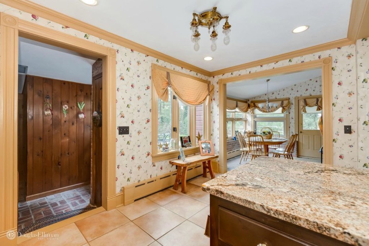
We purchased this home built in 1890 and I want to keep the character while still updating it. I’d like to transform this area right off the kitchen it into a breakfast nook. Any ideas?
– Carolyn
First and foremost, I can’t get over all the character in your home! It’s oozing with personality and I’m so glad you want to preserve that! There are two elements dating the room the most – the wallpaper and the silver light fixture. I don’t hate the swag shades, but those could be updated too.
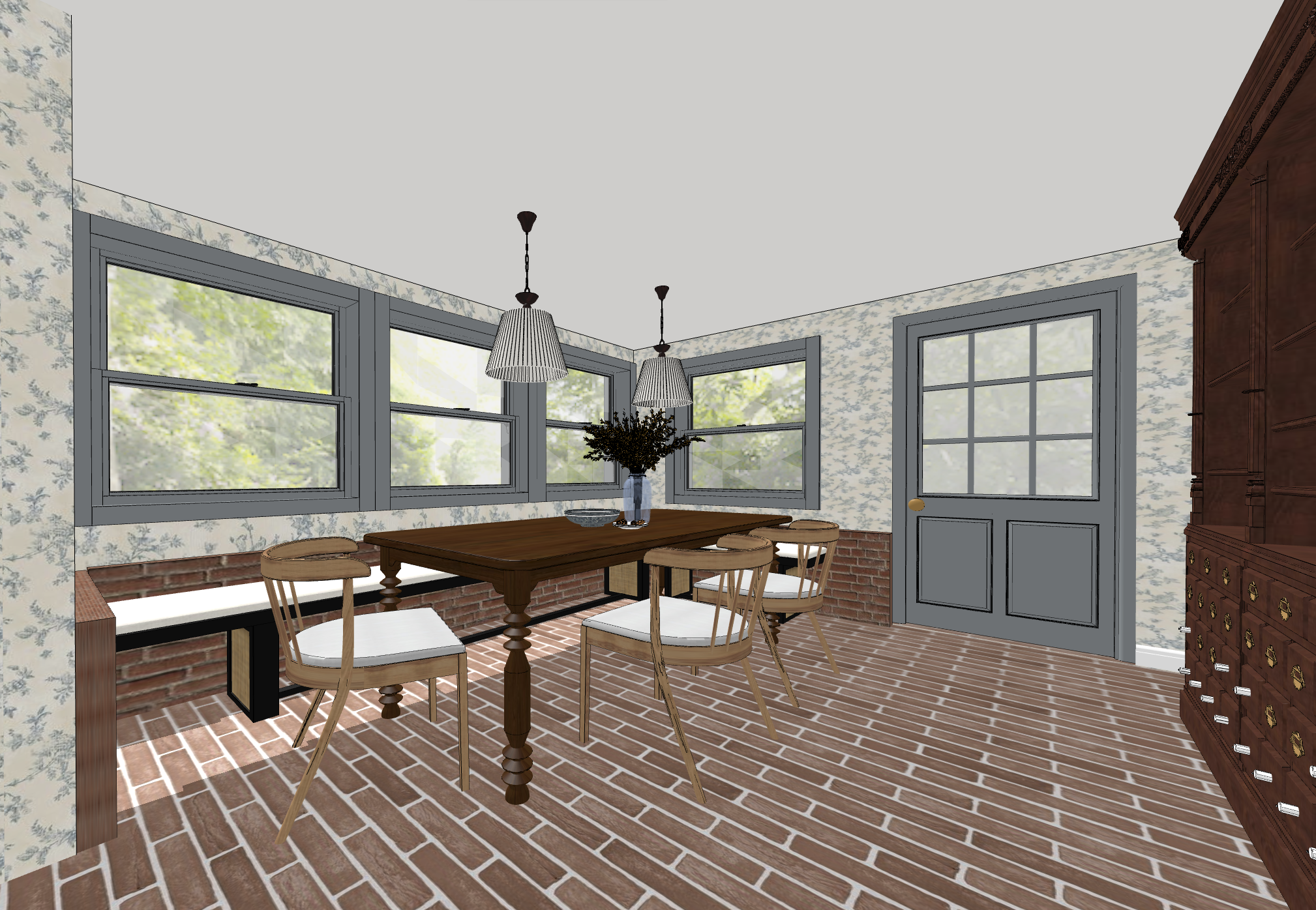
I intended to just give you a rundown of the things I would do if this were my home, but somehow I ended up putting together a full rendering instead! So, without further ado…
And here’s what I would do –
Keeping with the character of your home, I’d start with the wallpaper. Swapping the red, green, and yellow flower wallpaper for a blue chinoiserie wallpaper instead. You have lots of red brick in the room and it just makes sense to go with a complimentary color – blue. I’d find a wallpaper that was a creamy white background with a blue print to ensure the room stays bright amid all the dark brick.
As for the trim and the door, I’d coordinate with the wallpaper and paint it all a soft, undersaturated blue.
For the floors, I’d keep your existing basketweave brick floors (assuming their real and not laminate)! (My design program didn’t have a basketweave brick pattern, hence the switch up in my renderings.) But your current brick floors are beautiful and the basketweave pattern is so underrated!
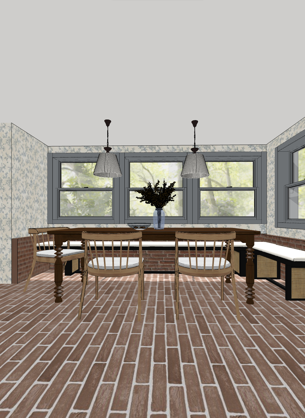
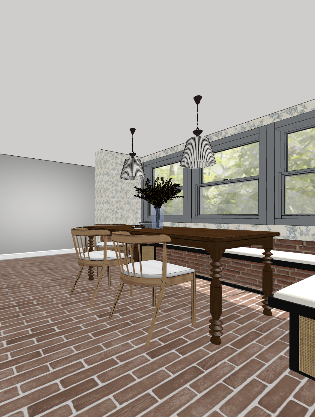
You mentioned that you want this room to be a breakfast nook and I’m fully on board with that idea! The brick half wall that lines the three walls under the window is screaming “turn me into a nook!” I’d add a custom built in bench under the windows, something black with an open base. Because you have a heat register under that big window, I’d keep the bench base open with supports every 16” or so to ensure airflow and a sturdy seat. And of course, a fabric cushion along the top would soften the look.
Add a traditional dark wood table with turned legs and three white oak chairs in a modern shape to make an unpredictable pairing.
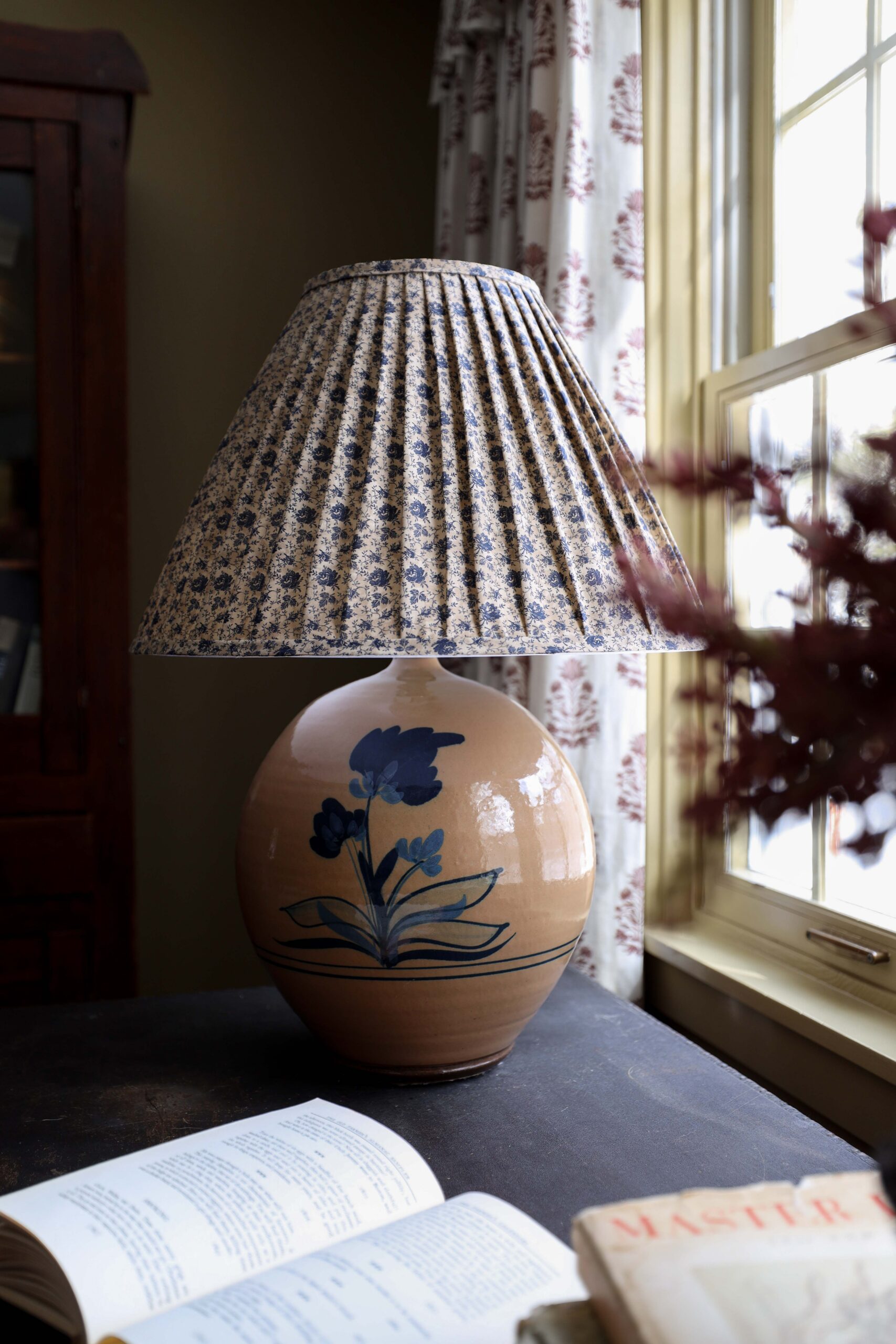
Instead of one overhead light in the center of the room as it is now, I’d opt for two pendant lights above the table with a unique shade. Something that leans English cottage or traditional.
And last but not least, I’d throw a giant antique hutch in the room too. I couldn’t quite see what was on the opposite wall of the windows, but if it’s a blank wall, I’d keep it simple with just one large piece of furniture. Antique would be my recommendation to keep with the style of your home.
Please oh please send pictures if you decide to make these changes!
Leave a Reply Cancel reply
Where behind the scenes, exclusive advice, and candid conversations are sent straight to your inbox every week.



great job! it looks so good on the renderings!
Thank you so much!! 🙂
great job! it looks so good on the renderings!
Thank you so much!! 🙂
These are great ideas! I hope she takes your advice.