Dear Danica, How Can I Update My Golden Oak Cabinets? (Plus Other Design Dilemmas)
·

I’m always so amazed, inspired by, and grateful for all the Dear Danica submissions I receive every month. It’s such an honor that you would seek my advice for something so personal to you – your home. As I read through your dilemmas, I often pick the ones where a solution comes to mind quickly. But this month, I decided to select a few dilemmas that didn’t have an obvious solution. These required some brainstorming. A 1930s bathroom needs that finishing touch. A kitchen with golden oak cabinets needs a refresh. An awkward fireplace and cabinet combo is smooshed in a corner, and a corner fireplace is drawing too much attention. Let’s dive in.
This post contains affiliate links.


Dear danica,
Dear Danica, I am half way through a bathroom renovation. The previous owner spackled over old wallpaper in this 1930’s bathroom and we decided to redo the drywall to start with a clean slate as well as add subway tile and faux wood floor tiles to make cleaning easier. I bought the tiles years ago before install on a small budget and they are quite light and a different vibe than the rest of my house and I’m having trouble choosing a wallpaper (or paint color) for the upper portion to bring warmth and cohesion to the space after adding so much white and light tiles. Please help because I can’t figure out how to finish this bathroom!
– Mimi
Hi Mimi, I love your choice of the subway tile wainscoting! It has such a charming cafe feel that fits really well with the pedestal sink and wood toilet seat cover! Without knowing the style of the rest of your home, my initial thought is to choose a wallpaper that coordinates with the sink skirt. The dusty blue pairs well with the orange tones in the tile floor, and if we add more of that dusty blue to the upper portion of the walls, our eyes will naturally be drawn up. If you’re drawn to florals, a small-scale blue and cream floral wallpaper would be beautiful. If you’re drawn to geometric shapes, a crosshatch would do well too.
SOMETHING TO NOTE: When doing two tones on a wall, generally you want to do the darker color on the bottom portion of the wall, and the lighter color on the top. This creates visual balance, so the room doesn’t look top-heavy. This is especially true when pairing a very light color with a very dark color. But there are some opportunities to break the rules when pairing two colors that are closer in shade. (i.e. a light color with a midtone color or a dark color with a midtone color.)
Because your subway tile is white, we don’t want to go too dark with the wallpaper or paint color up top. A pale dusty blue (one that matches your sink skirt) is the darkest I would go. You could also go with a cream colored wallpaper – one that is similar in tone to the floors. Regardless of what color you choose, I’d recommend a wallpaper with a pale base color. That will preserve the visual balance while still adding color and pattern! Sharing a few of my picks below –
Wallpaper Favorites
SCROLL RIGHT TO VIEW FULL LIST →

Dear danica,
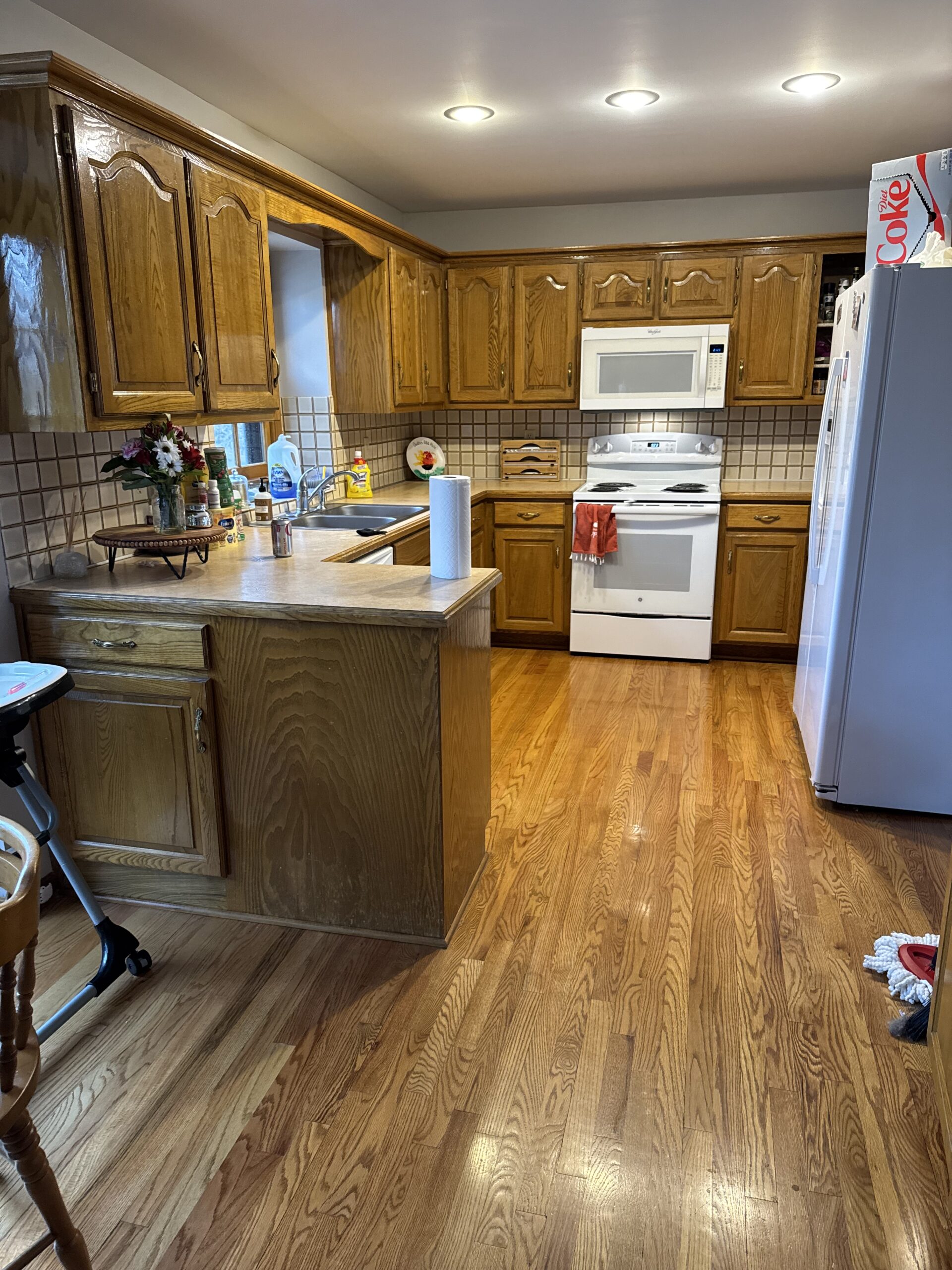
How do I update my kitchen without getting rid of the current cabinets? We are refinishing and staining the hardwoods so I need to know what color would look best. I love Taj Mahal counter tops but not sure it would look good with our current cabinets… help!!!
– Katherine
Golden oak cabinets have been a major topic since they peaked in the 90s. Those who have them have all asked the same question: “How can I update my golden oak cabinets without replacing them?” There are hundreds of articles online about this very topic, and most recommend painting them. But the reality is that 90s golden oak cabinets have a very recognizable look, and regardless of whether they are wood or painted, they still come across as dated. Yes, paint can help, and it’s an excellent temporary solution, but if you truly want an updated kitchen, paint unfortunately won’t solve the problem.
Updating the countertops, replacing the backsplash, refinishing your beautiful wood floors, and (if it’s in the budget) replacing the appliances are all great steps to updating your kitchen. But I fear that doing all that while simply painting the cabinet will leave the kitchen feeling a bit disconnected and unfinished.
Keeping budget in mind, I would recommend replacing the cabinet doors. This will drastically improve the aesthetic while minimizing construction. Filling in the gap above your upper cabinets will also do wonders. Incorporating decorative crown and trim on the filler piece will elevate the kitchen as well. Cass Smith replaced her cabinet doors and filled the gap above her cabinets, and it’s probably the best reuse of cabinetry I’ve seen. Watch that process here.
Of course, you can simply paint the cabinets if refacing them is not in the budget at the moment. In that case, Taj Mahal is a versatile countertop that would work with a wide variety of colors. I’d stay away from white, as that tends to accentuate the dated profile of the cabinet doors. But a moody green or brown would be my recommendation for paint colors.


Dear danica,
My husband and I are buying our first home and doing the floors, paint, & mini renovations prior to moving in. One of the areas I need help with is the fireplace & built in! I would love to remove both & fill the gap with matching bookshelves or something. But I’m not sure it’s in the budget right away. Please help! It’s outdated & such an awkward space.
– Amanda
You’ve got yourself a quirky little fireplace situation, but you also have lots of great budget-friendly solutions that can tide you over until you’re ready to do your dream solution. Ultimately, I like your idea of removing both to do one large built-in. I rarely recommend removing a fireplace, but since this isn’t a full wall, and it doesn’t appear to be a focal point wall, the fireplace location feels a bit out of place. So built-ins that fill that wall are a great solution down the road!
Until then, there are a few low-cost solutions that can make this corner less awkward.
- Paint the built-in. Depending on your preferences, you can either paint the built-in the same color as the wall to minimize attention or paint it a contrasting color to distract your eyes from the fireplace. Both are great options.
- Paint the mantel. Perhaps the most awkward part of this setup is the fireplace smooshed against the wall. Painting the mantel the same color as the wall will reduce contrast and visibility.
- Reface the fireplace. The stone on the fireplace is dating it, so refacing it with something like brick veneers would do wonders. While you’re at it, removing the mantel and adding a fireplace surround would make the fireplace feel more intentional.

Dear danica,
Help me make this rental home corner fireplace beautiful instead of an eyesore! I hate everything about it, but as it’s not my house, I’m unwilling to do anything that won’t benefit us when we move into our new home.
– Jana
I’ve talked about corner fireplaces in the past and the best way to furnish around them. For those who haven’t seen that, you can catch up here. Essentially, the key is to make the fireplace NOT the focal point of the room. You’ve done a good job of that in how you’ve arranged your furniture, but with the scale of the fireplace and the contrast between the white walls and the stone, it’s still the strongest visual element in the room.
Given that it’s a rental home, my best advice is to continue de-emphasizing the fireplace. If you can (or want to) paint the walls a midtone green, as that would downplay the orange stone. White will always accentuate color, whether you like it or not. So that’s option #1.
The second option to de-emphasize the fireplace is to add more layers *around* the fireplace. Large canvases or a collage of art on the right wall will naturally garner your attention. Hutches, bookshelves, or large-scale furniture on the left wall will create a point of interest. The more color and layers you add to the surrounding walls, the less your eyes will be drawn to the sole object that literally stands out. While these are not perfect long-term solutions, they are great short-term options for rental spaces!
Do you have a design dilemma you want help with?
Every month I help readers find solutions to their dilemmas, for free!
Where behind the scenes, exclusive advice, and candid conversations are sent straight to your inbox every week.
The Inside Scoop
DO YOU WANT
