This post contains affiliate links.
Dear danica,
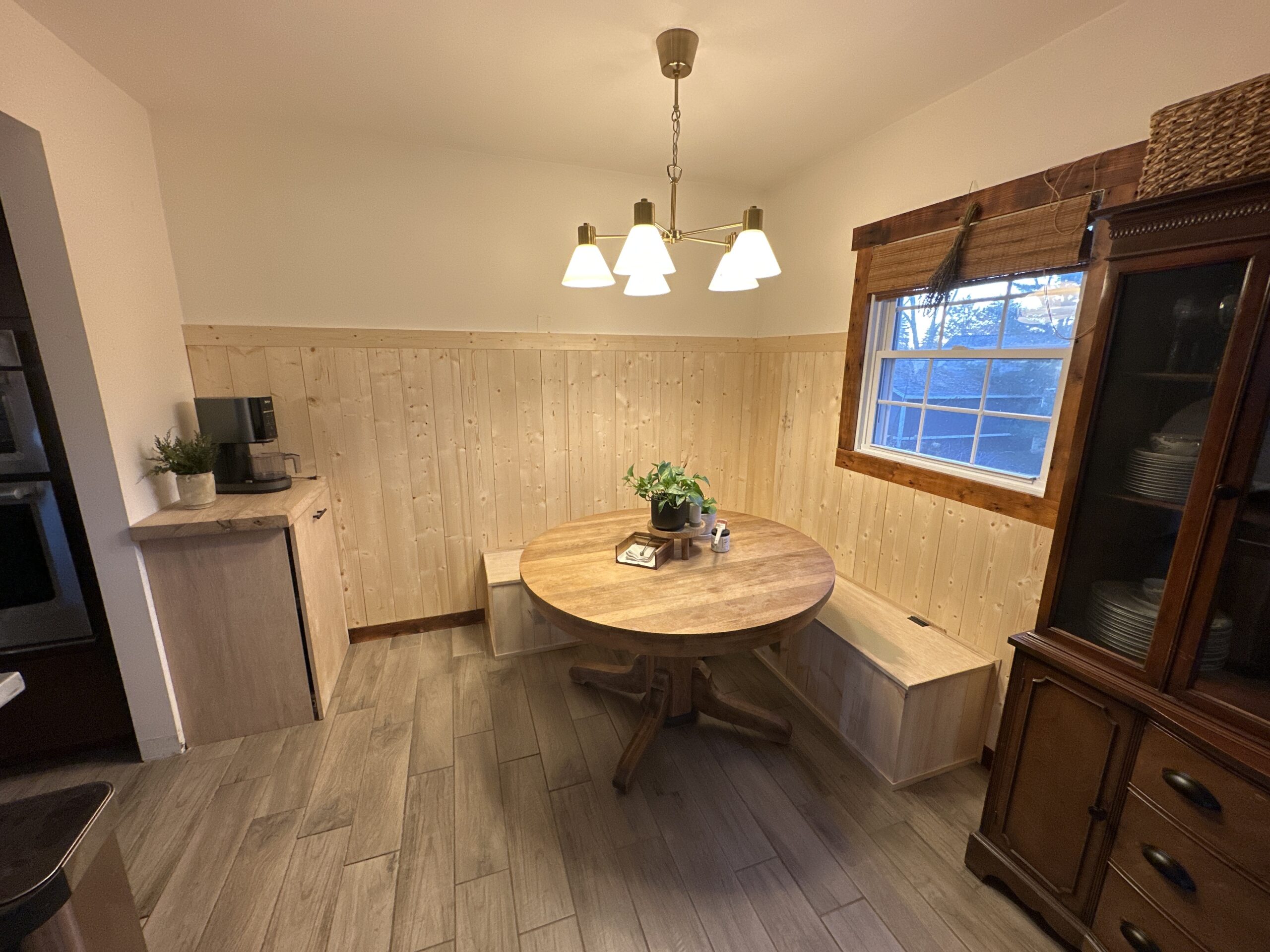
My husband built this banquette in our small kitchen dining nook and we added some vertical shiplap, but I’m stuck on what to do next. I’m torn between doing a darker statement color or keeping everything light and fresh. I’m not sure how to finish this space and make it feel warm and inviting, but not cramped. Help!
– Kellee

First and foremost, love the wood wainscoting and bench! It’s charming, it’s cozy, and the wainscoting is at the perfect height on your walls. 10/10 execution!
I think first I’d like to address your concern that a dark color would make the space feel cramped –
Do Dark Paint Colors Make A Room Feel Small?
For your dining room, I wouldn’t worry too much about that. Since the wainscoting only goes 1/2 to 2/3 up your wall, you still have plenty of space above the wainscoting to provide some lighter relief to the space. Take our office for example. We have really deep green wainscoting with white walls above and it doesn’t feel one bit cramped or dark.
So let’s go over some options, the pros and cons of each, and my overall pick.

OPTION 1: PAINTING IT A LIGHTER COLOR
I really like this option. It would highlight the wood grains in the wainscoting while also putting emphasis on the surrounding wood fixtures such as your hutch and window trim. It would be light, airy, and fresh.
If you were to go this route, I’d recommend going a shade or two darker than your white walls. Creating just the slightest contrast between the two will draw attention to the beautiful wainscoting you created while also preserving dimension within the space. And because you have other dark elements in the room, the space won’t fall flat.
Option 1 is a good one. It’s my second overall pick.
OPTION 2: PAINTING IT A DARK COLOR
I love a moody moment and I’m always drawn to spaces that carry a lot of depth through color. The cons with a dark color on wood wainscoting are:
1. You loose the ability to see the wood grains and the small gap between each board because shadows disappear into dark paint colors.
2. Dark wainscoting paired with your white walls would create a stark contrast. Some love that, and I have no ill will towards stark contrast. But through experience, I have found that darker colors, paired with lightish colors that are a shade or two darker than pure white, tend to be softer on the eyes. In the end, painting the wainscoting and the walls just creates more work for you.
Option 2 is my third pick overall.

OPTION 3: PAINTING IT A MID-TONE COLOR
I know this wasn’t one of the options you listed in your question, but let me do my 3 minute spiel on mid-tone paint colors and then you can be on your way.
A mid tone color encompass the good elements of all three options above! It’s light enough that the space still feels bright and fresh. It’s dark enough that it feels warm and inviting. It’s soft enough of a contrast with your white walls, and it still highlights the wood grains and gaps. It’s honestly a win-win in every way which is why this is my #1 overall pick.
I would walk around your house and take notes of all the colors you currently have in your home. Is there one color that you’ve used several times? Let’s put that color aside for this space. Is there another color that you’ve only used once? This could be a perfect place to repeat that color. (I always like when there’s at least two applications of one color in your home.)
I’d recommend looking at paint swatches that have several colors on one page. Generally the colors go from lightest to darkest. Look for colors in the middle of that range.

Remember, light colors appear even lighter on a larger scale and dark colors appear even darker.
Green, blue, red if you’re bold, or even beige mid tones would be great places to start. Good luck! You’re doing great! Love the wainscoting! Your home is cute. YOU GOT THIS!!!
Leave a Reply Cancel reply
Where behind the scenes, exclusive advice, and candid conversations are sent straight to your inbox every week.


Pomegranate and grapefruit