
The psychology behind interior design is a powerful force.
We’ve all experienced that discouraging feeling while designing a room – that feeling when a room is…fine. The pillows coordinate with the curtains, the paint color is nice, and the sofa is the right style. Nothing is objectively bad, yet the space feels off and unfinished. Sometimes, it’s more than just a decorating issue; it’s a perception issue. Our brains process spaces by scanning for balance, rhythm, alignment, and predictability. And when those invisible cues are off, the room feels subtly wrong.
Interior design is deeply psychological. We’re constantly responding to proportion, symmetry, visual weight, and repetition on a subconscious level. When a space lacks these grounding principles, our minds read it as unresolved, even if we can’t quite explain why. If you find yourself familiar with this unfortunate feeling, these are some of the most common psychological reasons a room looks and feels off:
This post contains affiliate links.

Design: W Design Collective | Photographer: Jared Kuzia | Builder: Payne Bouchier | Architect: Ann Frances
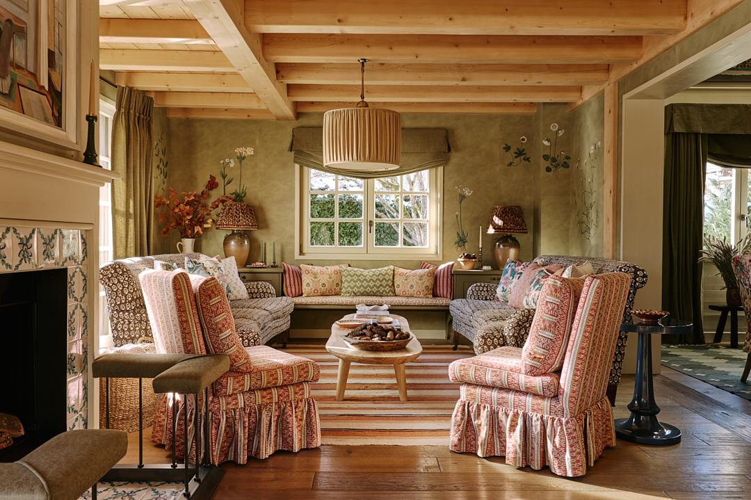
Visual Weight Imbalance
Everything in a room carries visual weight. The lamp in the corner, the bowl on the coffee table, the dresser, and the chair. Dark colors feel heavier than light colors. Solid forms look heavier than leggy furniture. Tall objects feel heavier than short ones.
If one side of the room has a large sofa, a side table, and a table lamp, while the other side has a leggy chair, no pillows, and nothing on the wall, our brain reads that as a tilt.
If one end of a sideboard is styled with a tall vase while the other side has just a stack of books, the sideboard will look imbalanced.
Similarly, if the bottom portion of your wall is painted white and the top is painted a dark color, the room will feel top-heavy, possibly even upside down. If all your furniture is waist-high with little to no artwork, curtains, or lights occupying the upper half of the walls, the space can feel bottom-heavy.
Understanding what objects and colors feel heavy vs light helps us determine how to style a space. This doesn’t mean that everything needs to be repeated equally to create a sense of balance. Rather, it requires an understanding of how to pair light and heavy objects strategically to create balance.
If one side of a sideboard has a tall vase with flowers, and the other has just a stack of books, hang a piece of art above the books to balance the visual weight. Paint darker colors on the bottom portion of the wall and lighter colors up top. Solid form furniture requires fewer filler pieces while leggy furniture requires more.

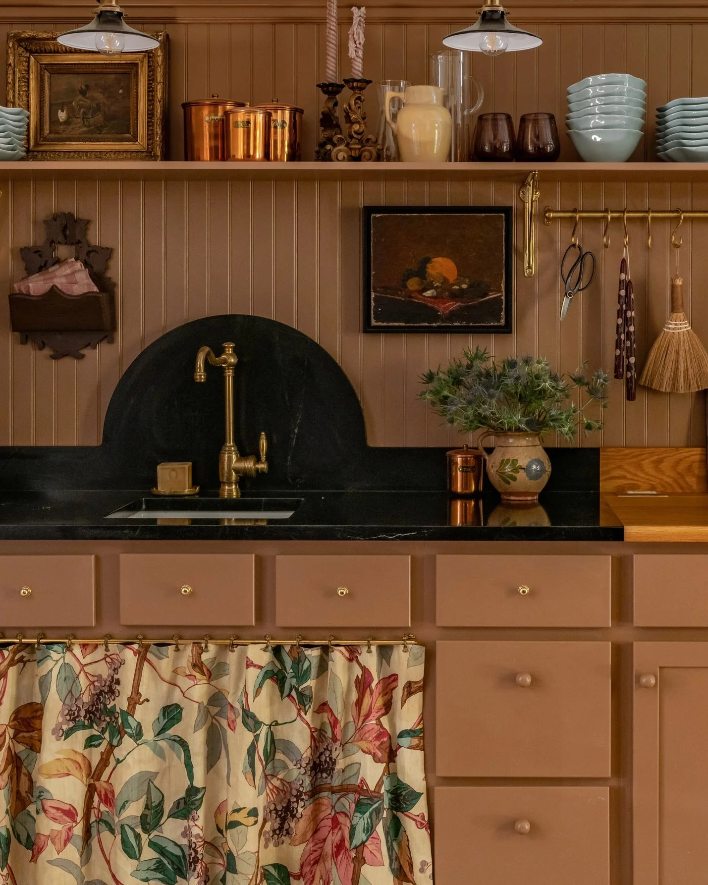
Design: CHU Interiors | Photography: Yanglin Cai
Sightline Interruptions
Rooms feel calm when the eye (and body) can move through them easily. If a chair, kitchen island, lamp, or coffee table blocks the natural path, your brain notes that as friction. Physically, it’s bothersome to re-map where to walk, but visually, it’s a mental disruption.
Walkways are important, but sightlines are vital. Ensure that when you look down the hall, into the kitchen, through a doorway, or into the living room, your eyes are met with a vignette – not the back of the sofa or a protruding object. Nothing should distract you from, hide, or partially cover the focal point.

Design: Salvesen Graham | Photography: Christopher Horwood
Furniture Float
Furniture float (i.e. when furniture appears to be floating in the middle of a room) is especially common with open-concept homes. When walls don’t define spaces, rugs should. Rugs serve as the boundaries of a zone and they ground the furniture that sits on them. Without a rug, your mind feels unsettled. When it comes to rug sizes, the bigger the better.

Design: Jessica Nelson Design | Photography: Carina Skrobecki
Cool Lighting Temperatures & Mismatches
Lighting temperature inconsistencies are very common in homes where lights have been swapped out over time. This can happen from room to room or from overhead lights to accent lamps. If your overhead lights are 4000K (cool), your sconces are 3000K (neutral), and your table lamps are 2700K (warm), your brain gets an inconsistent read on the space.
Your home should have a consistent lighting color temperature throughout. I prefer 3000K for all overhead lights and 2700K for all accent and task lights.

Design: Nicola Harding @nicolahardingandco | Photography: Paul Massey
Repetition vs. Randomness
Repetition builds rhythm, rhythm builds predictability, and predictability feels calm. Our brain likes to detect a pattern to organize the information within the room. Having a common thread from one side of the room to the other, and from one room to the next, creates continuity.
If one room is painted green, add green accents in the adjoining room. If one side of the bedroom has a brass light, add brass hardware to the nightstands. It’s not that mixing finishes or colors is bad; it’s that mixing them without repetition feels random instead of intentional.

Design: W Design Collective | Photographer: Lauren Wilcox | Builder: Grove Homes | Architect: Clayton Vance
Pattern Scale Conflict
Pattern mixing is an art. The general rule of thumb is to pair organic patterns (florals, vines, paisley, etc) with geometric patterns (stripes, gingham, diamonds, etc). And that’s often where the advice stops. But there’s another layer to pattern mixing that is just as vital, and that’s scale mixing.
Mix large-scale patterns with medium and small patterns. If your curtains feature a large floral motif, a throw pillow with medium stripes, and a pleated lamp shade with small florals will make a successful scale combination. If you were to pair a large-scale floral wallpaper with a large-scale floral or geometric sofa, the patterns suddenly compete for attention.
Mix organic patterns with geometric patterns. Mix small, medium, and large scales too.

Design: Park Interiors | Photography: Yanglin Cai
Scale Without Heirarchy
When entering a room, our eyes look for a visual pecking order. What’s the focal point? What’s supporting it? If everything in a room is the same height, the same size, the same wood tone, and has the same visual intensity, nothing stands out, and nothing recedes.
Without hierarchy, your eye keeps searching for structure and never finds it, which is why a room can feel both cluttered and empty at the same time.
Every room should have a focal point. Ensure that the space has interests both low and high. Add hutches and cabinets to break up the monotony of waist-high furniture. Hang artwork, sconces, or curtains that draw attention. Create a scene that people are instantly drawn to, and then create supporting vignettes that encourage the eyes to wander.

Design by HÁM Interiors for Atlanta Trevone | Photography: Will Slater
Everything Is Too Styled
There’s a strong push for perfection in the interior design industry, and it’s a big reason homes feel too stiff. If everything is styled to perfection, it becomes a museum, not a home. While perfection may look pretty, it doesn’t feel comfortable. A home is much more inviting when it looks and feels lived in. When the sofa cushions are slouched, and the wood furniture shows wear. When the artwork looks collected rather than mass-purchased, and the lamp shade is ever so slightly crooked, THAT is when a home feels best.
Leave a Reply
Where behind the scenes, exclusive advice, and candid conversations are sent straight to your inbox every week.
The Inside Scoop
DO YOU WANT

i love this article. such practical tips. do you know who the header photo belongs to?
Yes, Salvesen Graham designed that home.
A crooked lampshade makes me twitch. Same with a piece of art that’s hanging crooked. 😜
haha fair enough!