
This post contains affiliate links.
Perhaps the #1 most consistent question I get is about our house paint colors. What color we used for our exterior. What white paint we chose for our main living areas. What putty neutrals I recommend. And it wasn’t until this week that I realized a proper blog post with ALL our house paint colors would be a great landing page for all those questions.
Our house palette has mostly muted colors in the white, beige, and green families. I love color and saturated hues, but our house thrives with more of a neutral palette and faded colors.
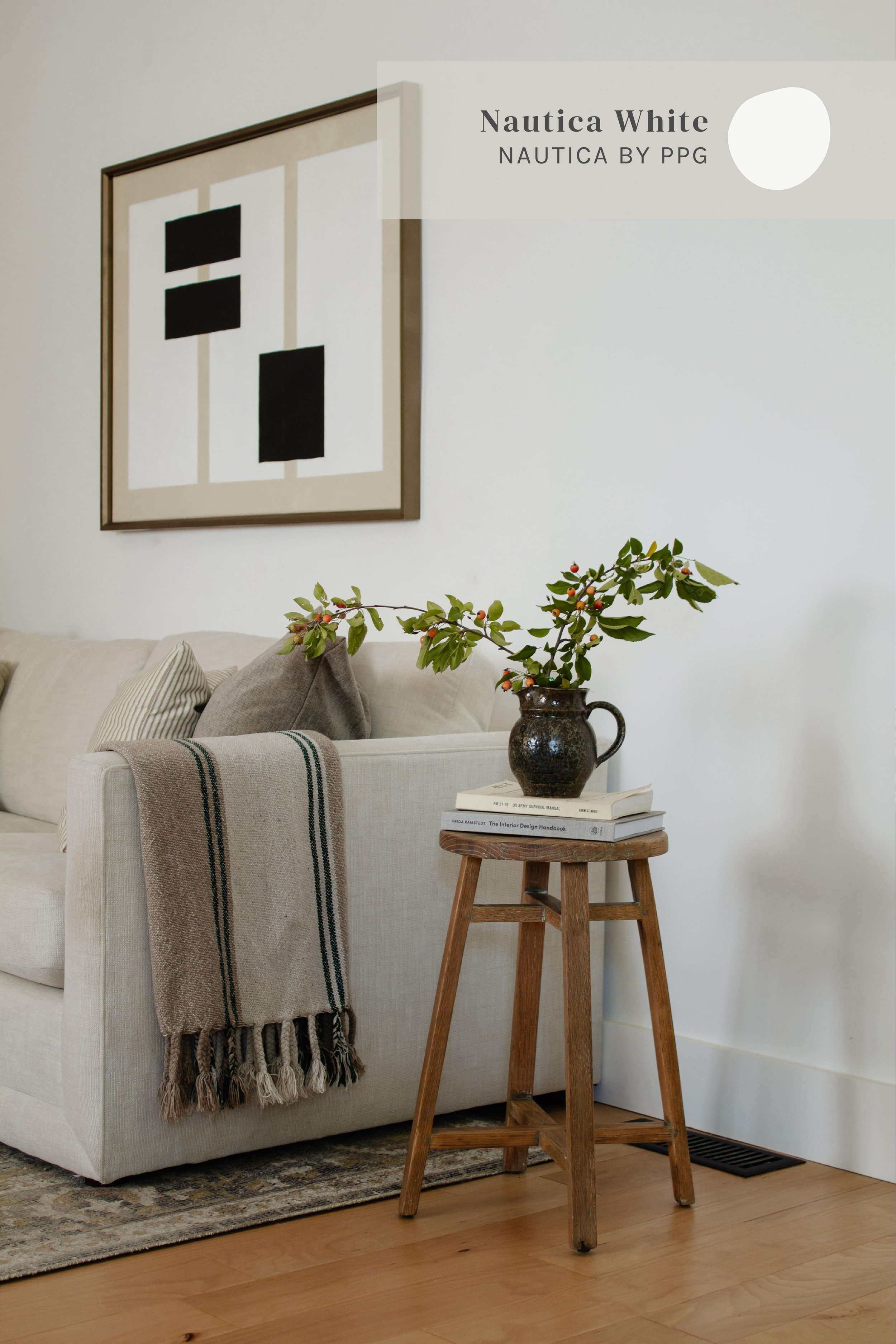
The Living Room
Paint Tip
Amber Lewis is the queen of picking the perfect white paint color. Here’s what I learned from her:
FOR HOMES WITH A LOT OF NATURAL LIGHT:
If you’re going for a white white feel, consider a warm white color. It sounds counterintuitive but if you have a lot of sunlight streaming in the windows, cool white (and sometimes neutral whites) may feel cold and blue. Instead, choose a white color with warm undertones. Sunlight helps to wash out the yellow undertones making it appear more of a neutral white. Warm Undertone = Colors that have a yellow, red, or orange tint. Cool Undertone = Colors that have a blue or green tint.
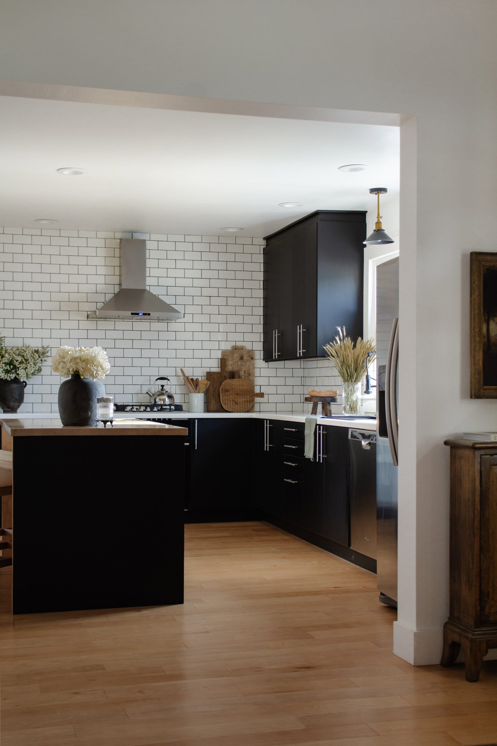
The Kitchen

“NAUTICA WHITE” FROM NAUTICA BY PPG
Because our living room and kitchen are connected, we carried the same white color into the kitchen. We also used the same color on our ceilings and trim for a completely cohesive look.
“ANTHRACITE” STOCK CABINETS FROM IKEA
We ordered our kitchen cabinets from Ikea and the doors are part of their stock collection. It’s a beautiful matte sheen in a true black.
The Office
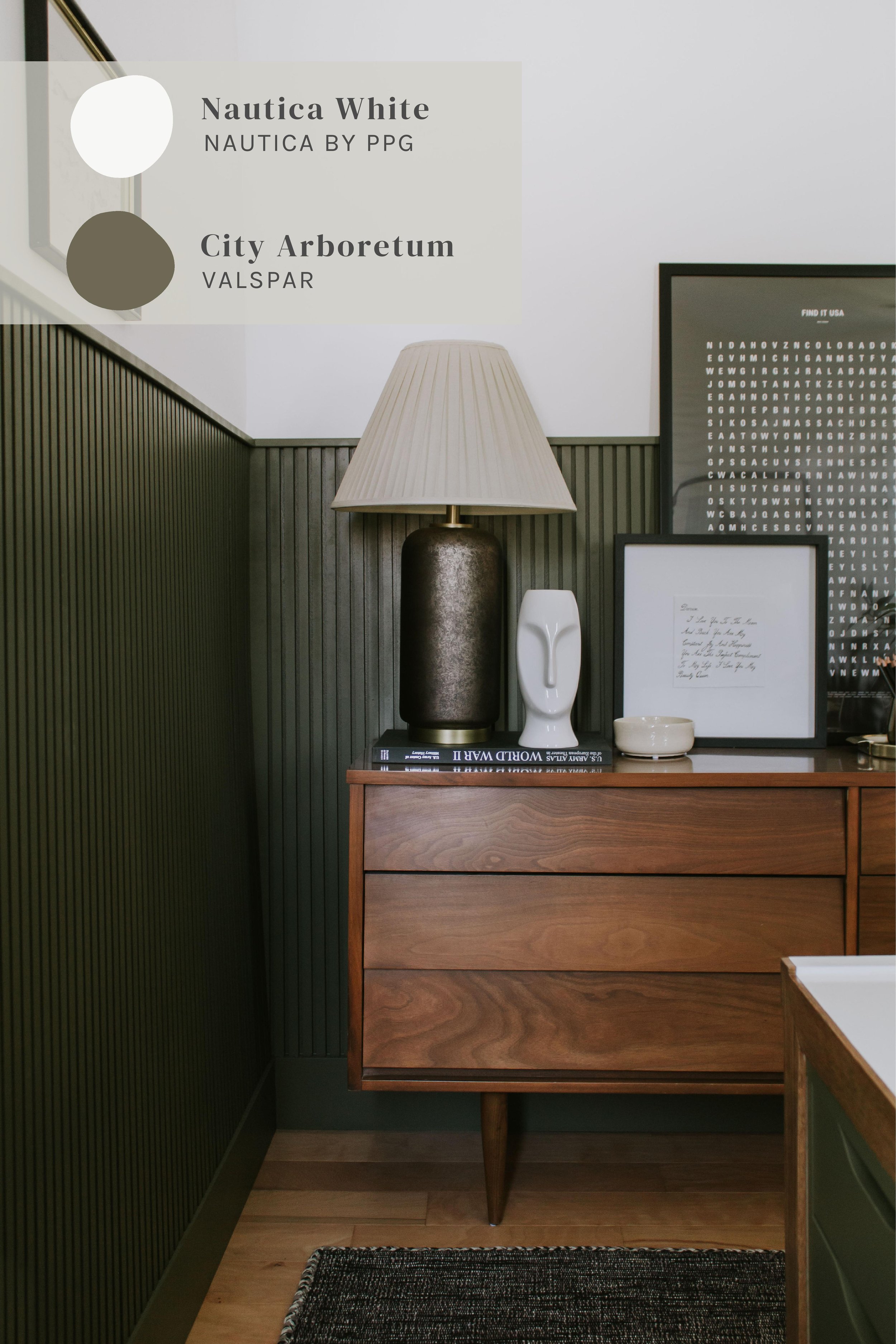
“NAUTICA WHITE” FROM NAUTICA BY PPG
We carried Nautica White into the office as well and white we loved the white, this room lacked dimension without a second color.
“CITY ARBORETUM” BY VALSPAR
We added vertical slat wainscoting on the lower half of the wall and painted it a moody green color to ground the space since this room has taller ceilings that the rest of the house. It’s green, but not too green. It feels warm, yet it doesn’t lean yellow or brown.
Good To Know
Everyone loves tall ceilings, but sometimes it can feel like the scale of your furniture is off because of that…as if it’s all to short for the room. There are many remedies to this and one way is to create a horizontal line on the walls where you want your eyes to stop. This illusion shortens the walls with loosing the grandeur of tall ceilings. Wainscoting, thick mouldings, or even a picture rain can do wonders for tall ceiling scale problems.
The Primary Bedroom

Custom Mixed At Home Depot
Picking a warm & creamy color for our bedroom was a task and a half to say the least. We landed on a custom color we mixed at Home Depot. In our home, it reads as a perfect putty white that’s bright enough to not feel moody, yet warm enough to clearly not look white. Someone once referred to it as a vintage white and that’s a perfect description!
Because it’s custom, I’ve include a photo of the Home Depot color code below. Just take that photo to a local Home Depot store and ask them to mix a gallon (or sample) with the code.
Putty White Paint Tip
Struggling to find the perfect white color? The white accents in your home (such as your baseboards and window trim) could be throwing you off. White reveals the undertones in paint colors and while I always recommend sampling colors again white for the most accurate color representation, when it comes to putty white and beiges, white may also bring out the undertones that you otherwise wouldn’t see if the white accent wasn’t there for comparison. Consider painting your trim the same putty white color as your walls and see how it looks.
We had this very issue when we put our white closet door against the bedroom wall color. Suddenly our perfectly putty walls look pink. But as soon as we painting the closet door the same color as the rest of the room, the pink tint vanished.

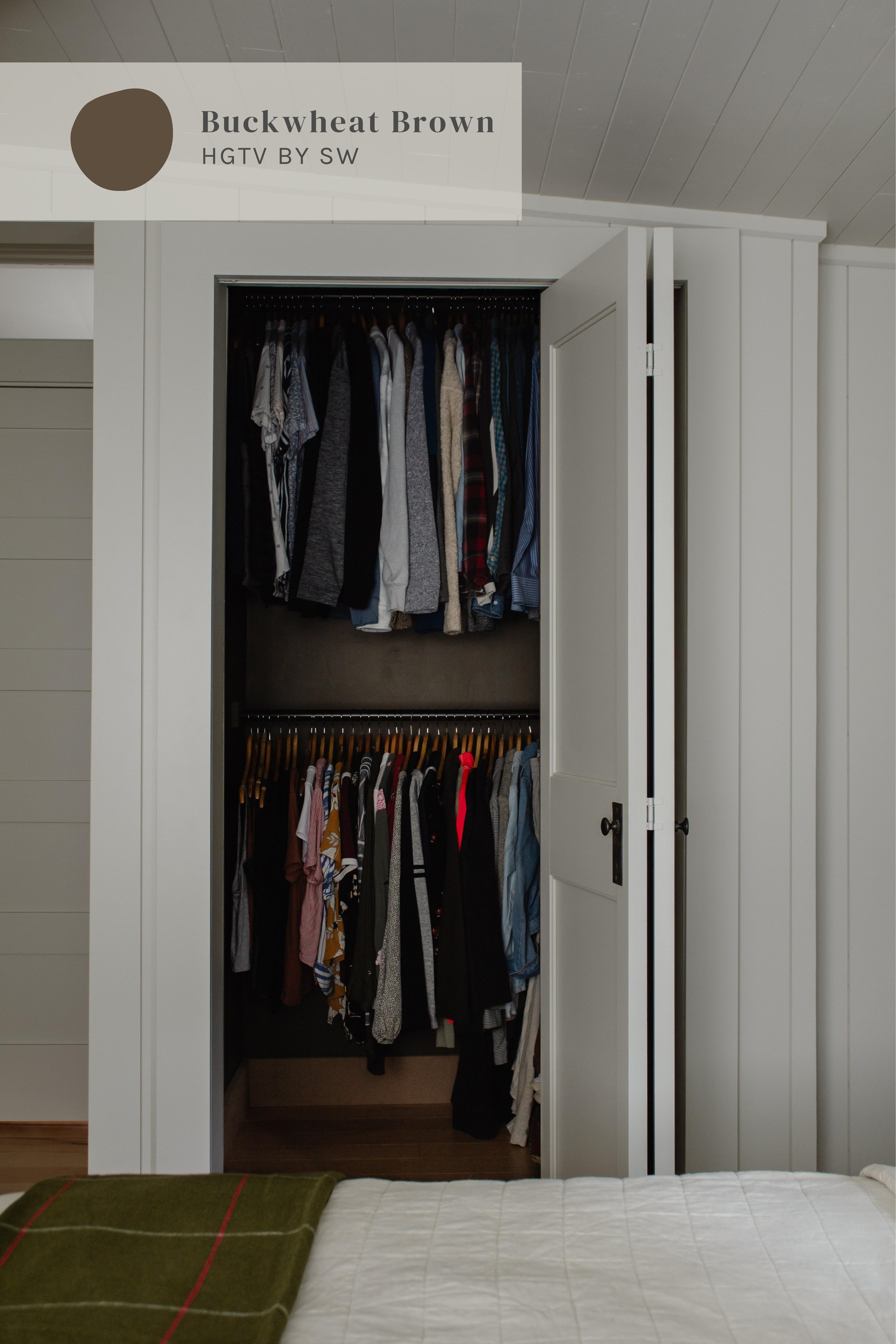
The Primary Bedroom Closet
The Exterior
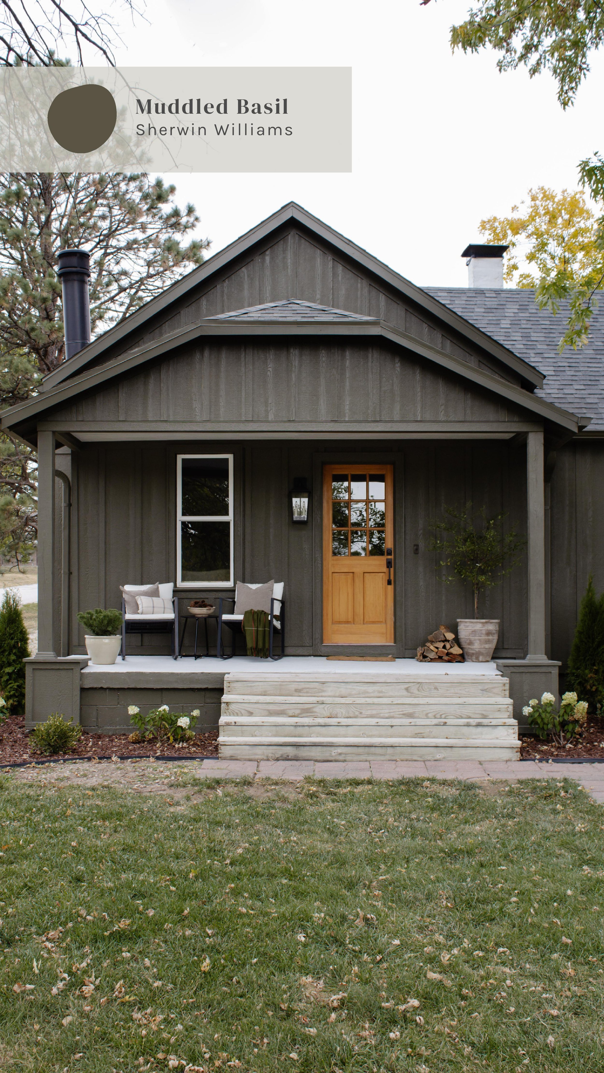
“MUDDLED BASIL” FROM SHERWIN WILLIAMS
Of all the colors I get asked about, our exterior receives the most requests by a landslide. Between you and me, it’s just as beautiful in person as it is online. The only word I can use to describe this color is “velvet”. The butter soft green is stunning from morning to night. It’s just as beautiful in the harsh non sun as it is on an overcast day…which is something I really struggled to find. Keep in mind, this color has a strong brown base and so I recommend sampling it on your exterior to see if the colors leans green or brown.
NOTE: You can find this color at both Sherwin Williams and Lowe’s in the HGTV Home by Sherwin Williams paint section.
Sheen Tip:
Lowe’s sells exterior paint in flat and satin sheens. While I like the look of flat, satin is much more forgiving when it comes time to hose off the dirt on your exterior. Plus the satin sheen adds a luster that feels so luxe.
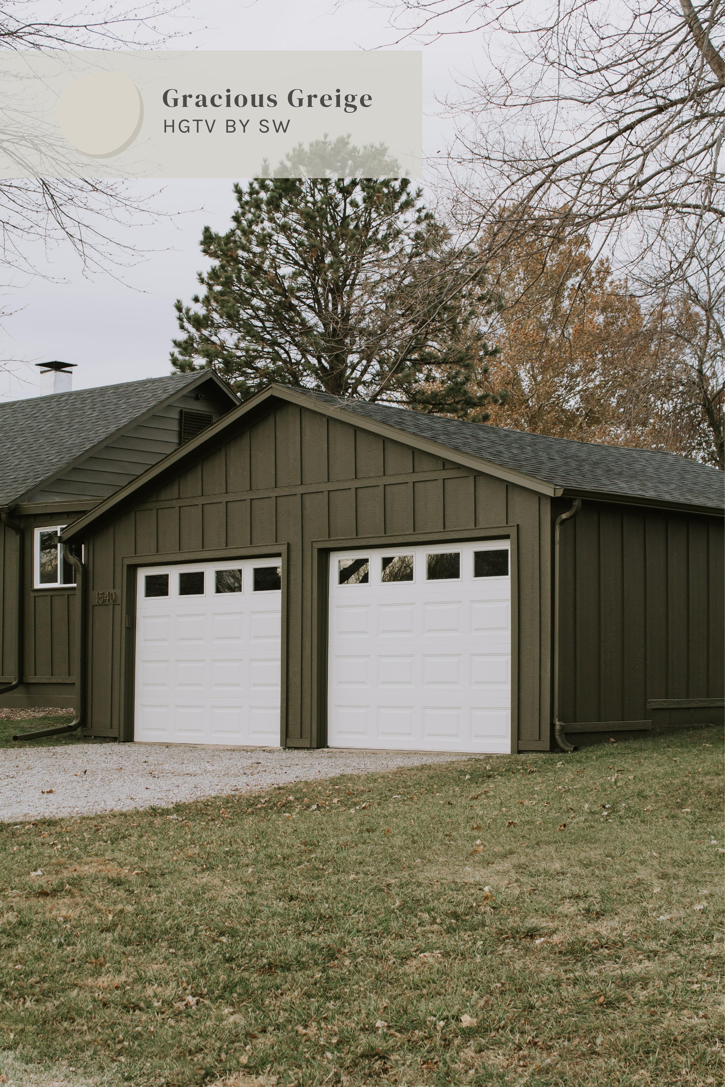
The Garage Doors
Leave a Reply
Where behind the scenes, exclusive advice, and candid conversations are sent straight to your inbox every week.
The Inside Scoop
DO YOU WANT

Will the Home Depot “putty white”i used in your bedroom , work in a bedroom with not much light ( one south window). ? ( cool or warm undertones?
Hi Marilyn, the color has warm undertones. I would definitely recommend sampling it in your room to see how you like it since there are so many factors that effect how the color looks!
Do you know what color your shingles were for the exterior of this house?
Yes they’re "Charcoal Grey" shingles in the Cambridge collection from IKO!
Danica, I have a room downstairs without any windows. I want a clean neutral color. The carpet in there is a deep emerald green right now. And, yes, it will be in there for awhile. It is just an extra room that doesn’t get used very much. One concrete block wall, 2 sheetrock walls and one closet with bifold doors. HELP!
Thank you for this post! Will you explain a little more what you mean by “create a horizontal line on the walls where your eyes stop” when dealing with tall ceilings? Where is the point “where you’re eyes stop?” We have a front room (formal living room?) that has double-height ceilings and I’m struggling with the height in this room. Thank you!
Ah, good question! What I meant is you can create a horizontal line where you want your eyes to stop. You can place that however high or low you need for your space – 8ft, 10ft, or ever 4ft like our office wainscoting. Does that help?
Yes, very helpful. Thank you!