OUR BEDROOM RENOVATION PLANS, TROUBLESHOOTING, + THE IDEA THAT SAVED US $15K
·
Well this post is a bit unexpected! A few weeks ago I was sweating my way through a workout in our living room when Chris came to me with a million dollar idea! “I think I figured out a way that we don’t have to build a new roof over our bedroom!” But before I get into the logistics of that…let me back track a bit.
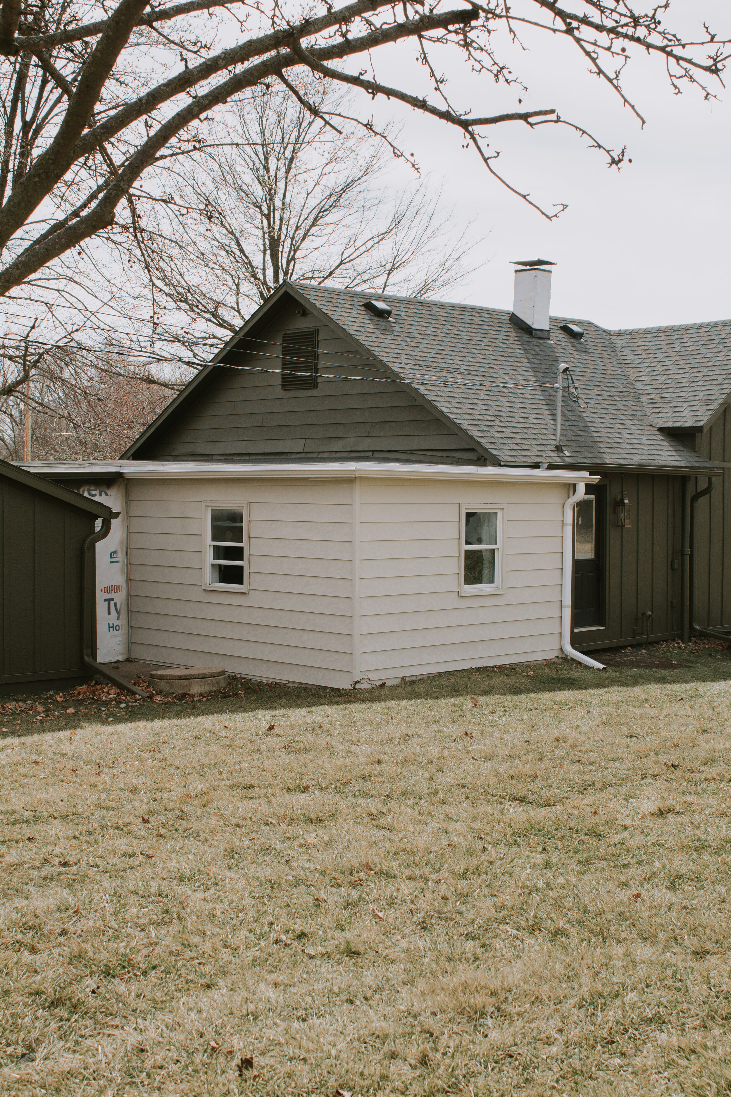
From what we can tell, it appears that our bedroom was an addition. The roof over our bedroom is a flat roof and if our assumptions are correct, it used to be an outdoor porch. The ceiling is only 6ft 8inches tall and with Chris being 6’5”, the ceiling just cannot stay as is. Plus for resale, it’s not a great selling point.
We’ve looked over the roof in the past and from what we could tell, there wasn’t any room to raise the ceiling. Which meant that we had to build an entirely new roof over our bedroom to match the rest of the house in order to get standard 8’ ceilings. Hello $$$$. Not only that, but with how the bedroom connects to the house, it’s been nearly impossible for us to think of a roof pitch that aligns well with the rest of the house. We’ve talked to so many people & contractors to brainstorm ideas and every time the conversation ends with “hmmm…..well we’re not sure what to tell ya.”
Hence why this project has been delayed for nearly 4 years now.
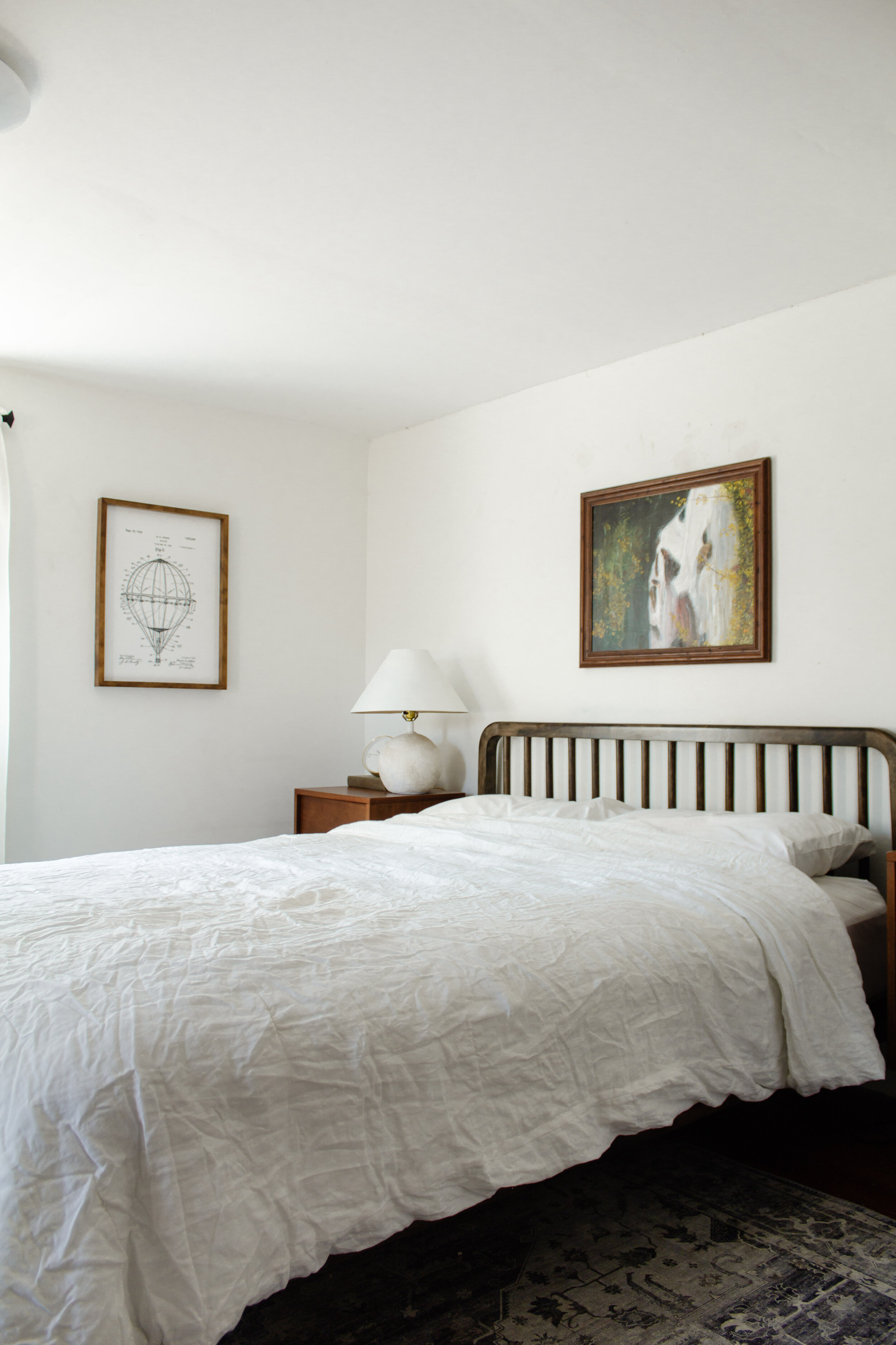
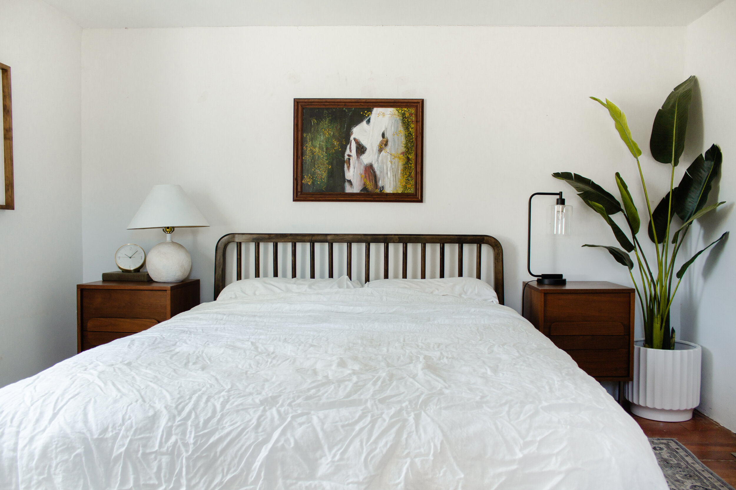
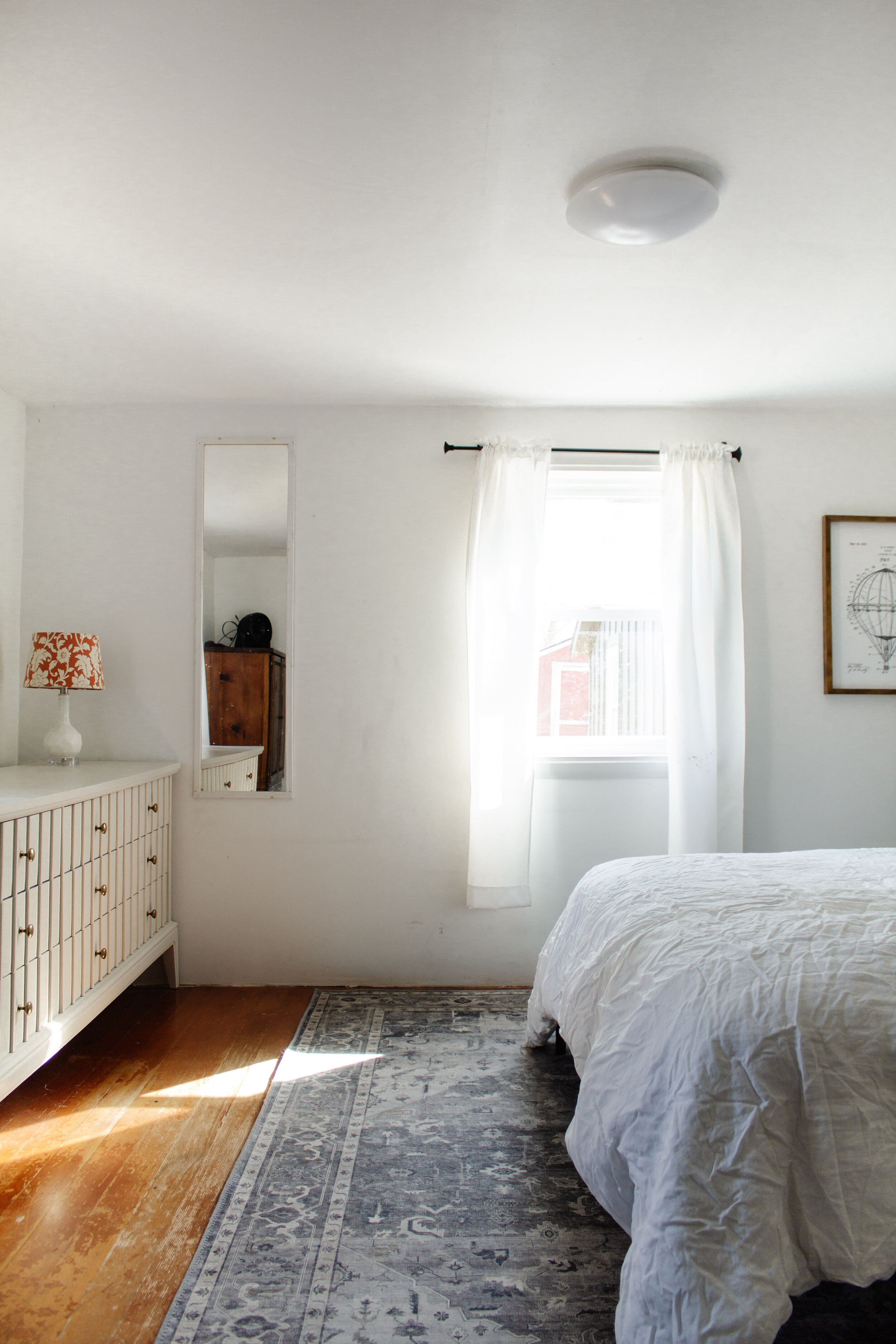
Please don’t judge the wrinkly comforter…this is real life! 🙂
Now let’s fast forward to a couple weeks ago when Chris had his light bulb moment. After poking around, he discovered that the rafters actually slope up ever so slightly leaving somewhere between 4-8 inches of dead space between the ceiling and the rafters. So if we were to follow that slope with our ceiling, we may just be able to get 7’+ ceilings at the highest point. Now I know that’s still not ideal, but is it worth it to have 7’4” ceilings or spend an additional $15-20k for 12 extra inches of space? For us, the answer is no.
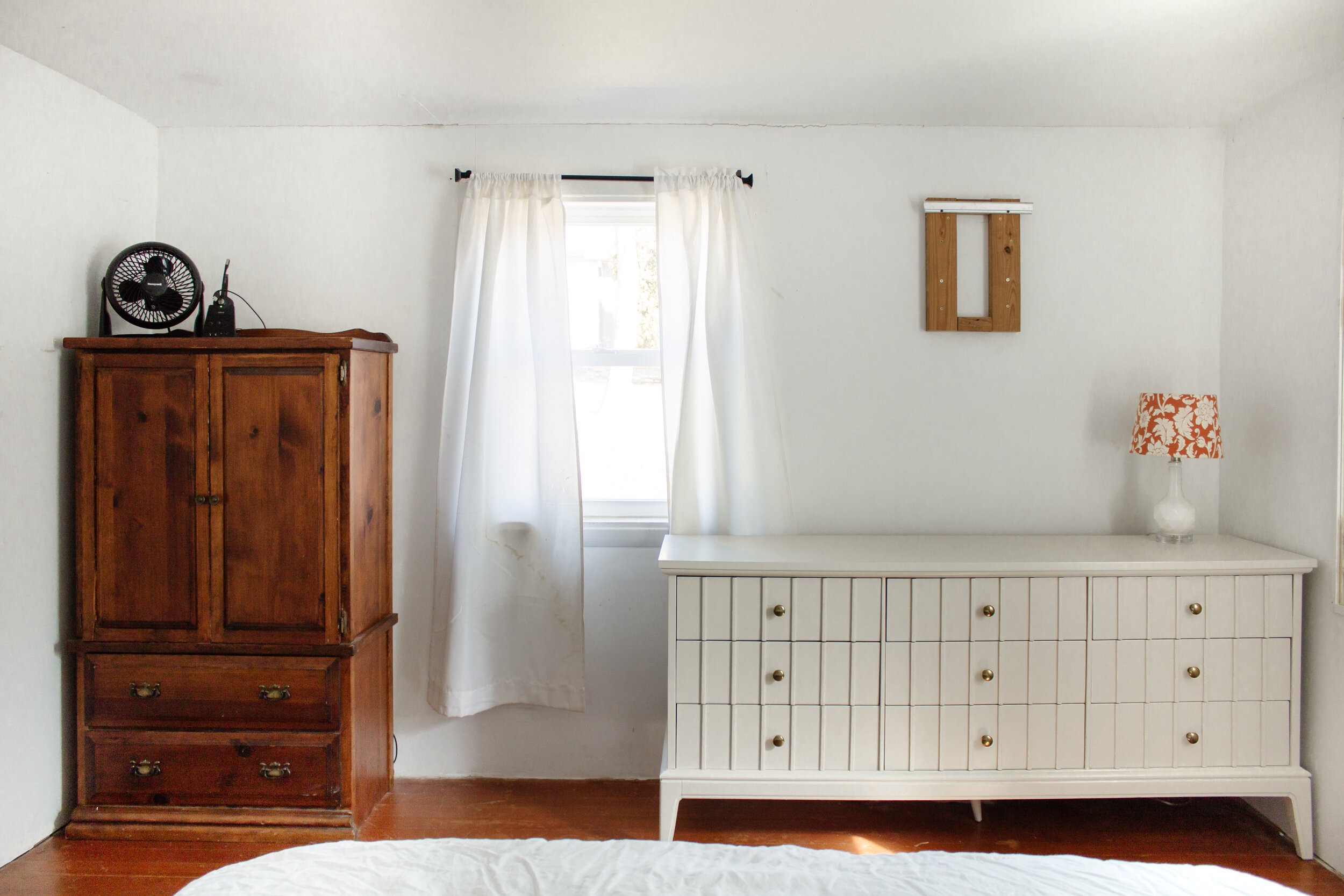
Showing our mismatched furniture, water stained short curtains and “decor” is so embarassing! 🙂
Chris’ idea got my brain spinning and suddenly I had my own light bulb moment. I’ve been trying to find ways to make our bedroom look the same as the rest of the house…like it was never an addition. But rather, what if I focus on highlighting the differences? Maybe the low ceiling and quirky size are the exact characteristics that will make this space special! Maybe I can lean into the cabin vibe that this home is becoming and bring back some of the original character that was hidden behind the drywall.
So the new game plan –
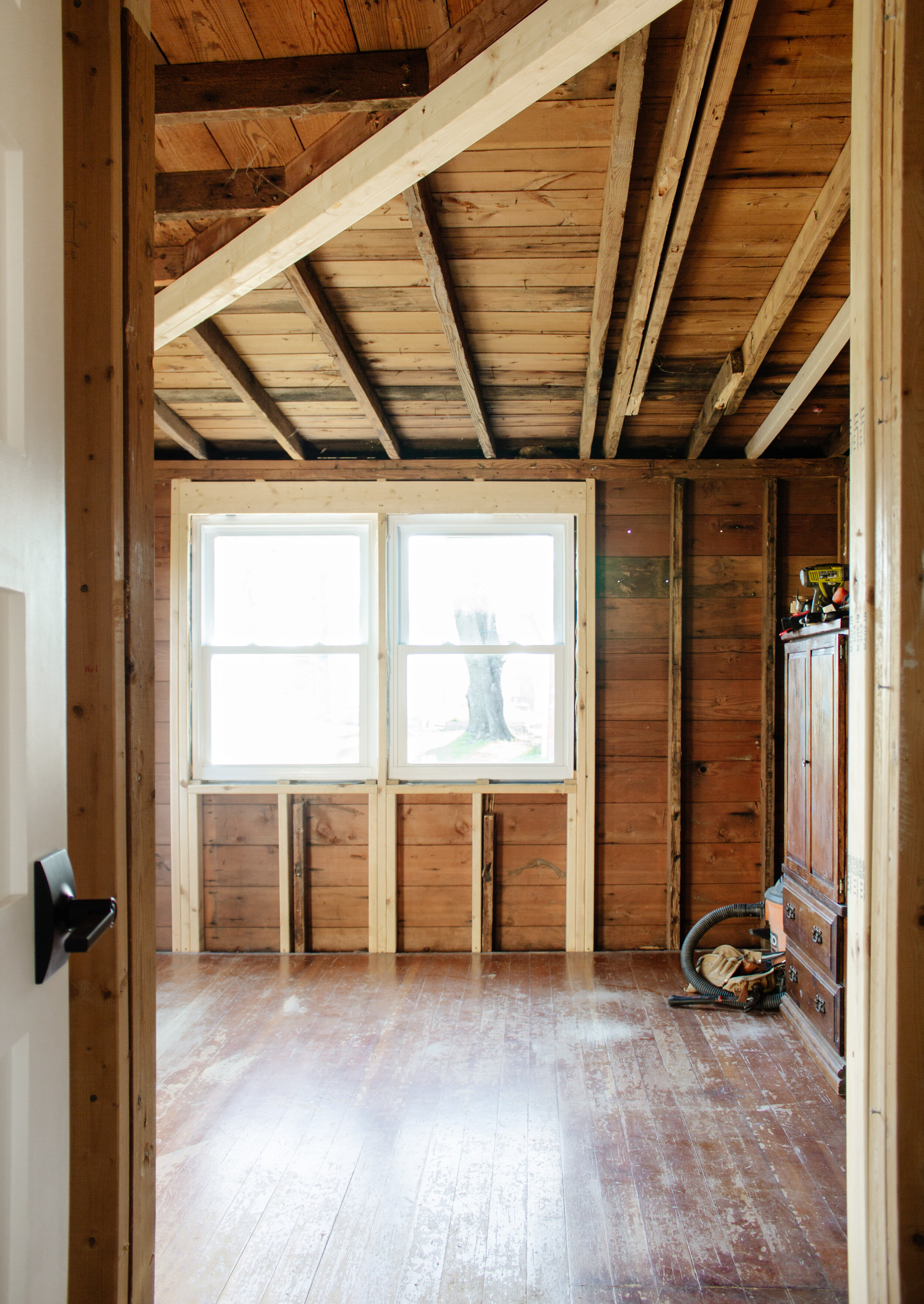
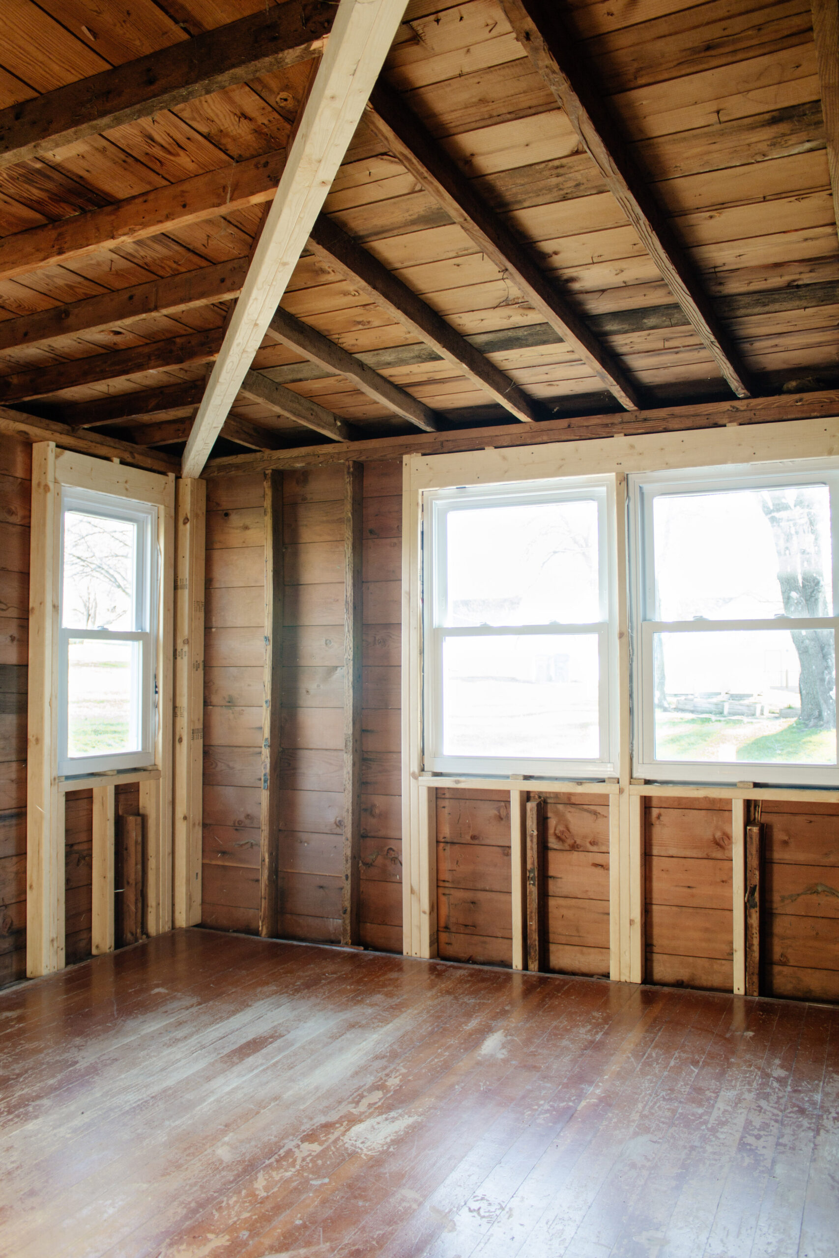
We’re still starting from scratch on most fronts. Last week we tore out the drywall, ripped off the lap siding on the exterior of the bedroom, and installed new windows. In the coming weeks we’ll add insulation, replace the electrical, continue the floors from the rest of the house into the bedroom, and raise the ceiling as high as we can go.
After ripping out the drywall we ran into a snag so we spent a day troubleshooting the problem. Our roof is considered a hip roof with a low pitch and because of that, it flexes more than we feel comfortable with. This meant we had to install another header to support the roof and although it’s not ideal (being that it hangs down on an already low ceiling) …it has to be done. I feel like I keep saying that phrase, “it’s not ideal, but we can make it look good.” In addition to that, a few 2×4’s on the walls and ceiling need additional supports so we’ll soon be adding 2×4’s where needed.
With the header up, we can focus on moving forward. Instead of putting drywall back up, I want to bring back some of the original character that we believe was in this room by incorporating beadboard on the ceiling and vertical nickel gap planks on the walls. I want to punch as much intentional character into this room as we can for a few reasons. 1) I want it to feel like a bonus room with loads of personality. 2) Vertical panels will elongate the walls making the ceiling feel taller than it is. And 3) Adding long wood panels to the ceiling will further highlight the upward slope and ideally make the ceiling look taller than it is.
The #1 demand I had (if we are to have lower ceilings) was to add lots of windows. It’s the best investment you can make in your home and it’s my absolute favorite part of any renovation. Plus, it was the only way we can make this room feel bigger without adding to the footprint.
I like when windows flank the bed so we added two windows in each corner of one wall and two large windows side by side on the other wall (which we’ll frame to look like one window).
Aside from that, it’s mainly just finishes and furniture. Some of which we already have but I’m still working on an overall vision for the space. I’ve been using Pinterest as a major resource for inspiration and it just further confirms everything I’m thinking.
This is the photo that made me realize that low ceilings don’t need to be seen as a negative. In fact, sometimes it’s a low ceiling that MAKES the room so unique! Very drawn to what appears to be weathered wood panels that were painted as opposed to smooth MDF. And I’m also taking notes on the headboard…a solid headboard with fabric would further highlight how low the ceiling is, but an open headboard with rungs allows the room to breathe…visually speaking.
Design by J Miller Interiors. Photography by Amanda Marie Studio.
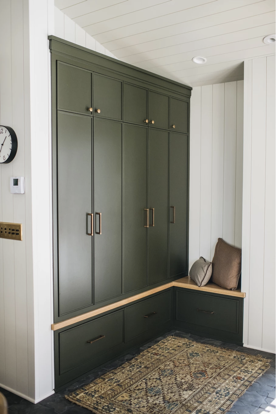
Another instance of paneling on the walls and ceiling! I’m loving all that texture!
Design by Jean Stoffer Design. Photography by Stoffer Photography.
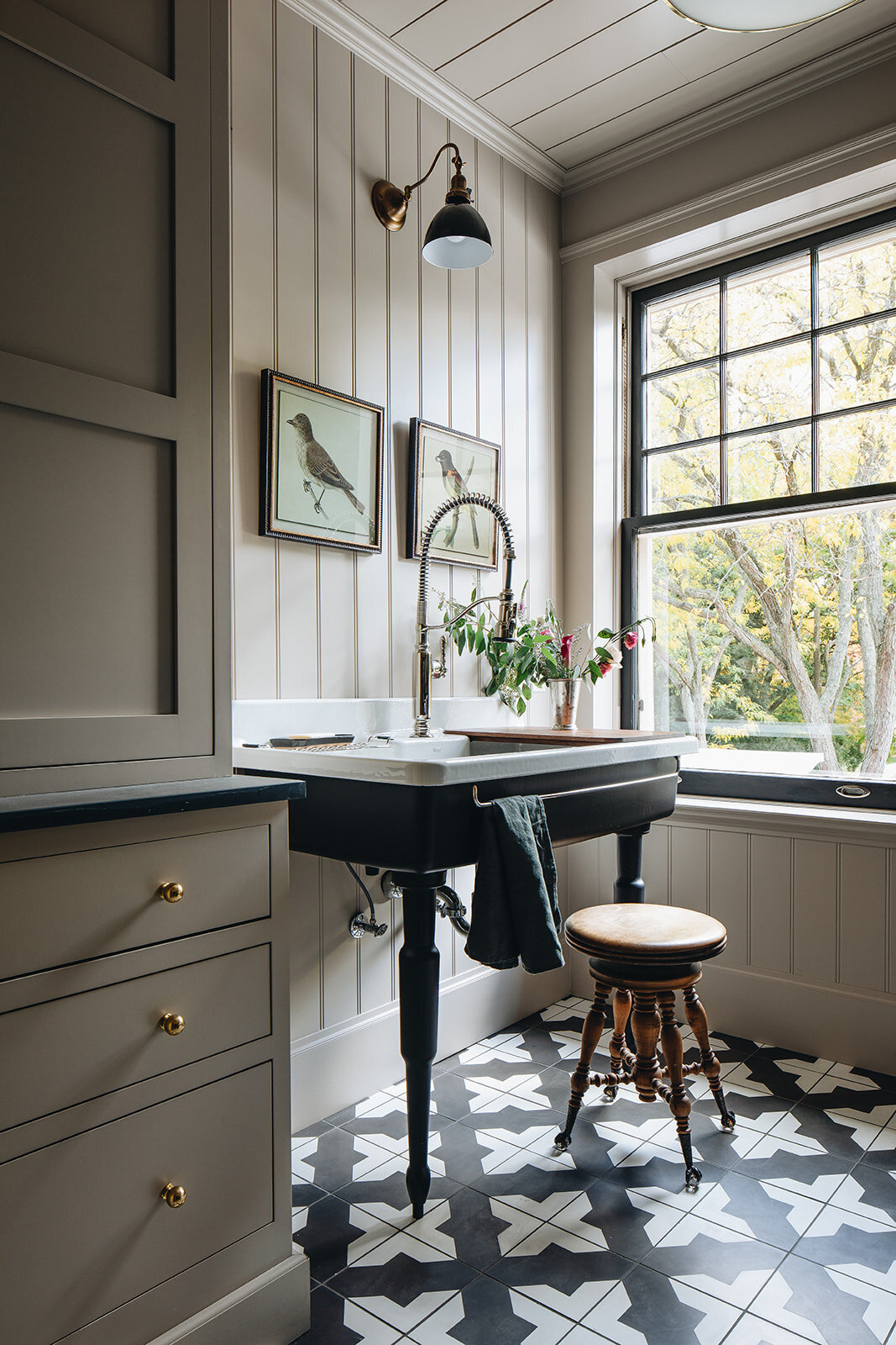
This color is intriguing me and I like the combo of beadboard with smooth MDF. I think I want more of a distinct size different between the ceiling and wall planks which has me thinking skinny beadboard (with a wood texture) on the ceiling and wide plank smooth MDF on the walls.
Here’s my vision for the room. I’m using my moodboard as more of a starting point rather than a final selection collage. But I’m really liking where this is headed. Stay tuned…we’ve got lots to cover in the upcoming weeks!
SOURCES:
Vertical MDF | Beadboard | Leaf Art 1 2 3 | Nightstand | Bed Frame (Similar) | Floral Pillow | Rug | Dresser (DIY Project) | Octagon Ottoman | Wicker Hamper
Where behind the scenes, exclusive advice, and candid conversations are sent straight to your inbox every week.
