This post is sponsored by Foyr Neo and contains affiliate links.
All good things must come to an end which means that today marks my last Reader Room Virtual Makeover! Thank you to my followers and readers for sharing your spaces with me and allowing me to dream up ideas for your home! And thank you to Foyr Neo for having the greatest Interior Design software out there that I can use to design floor plans, furniture layouts, and realistic 3D renderings! This program has allowed me to showcase other people’s homes in ways they didn’t know was possible!
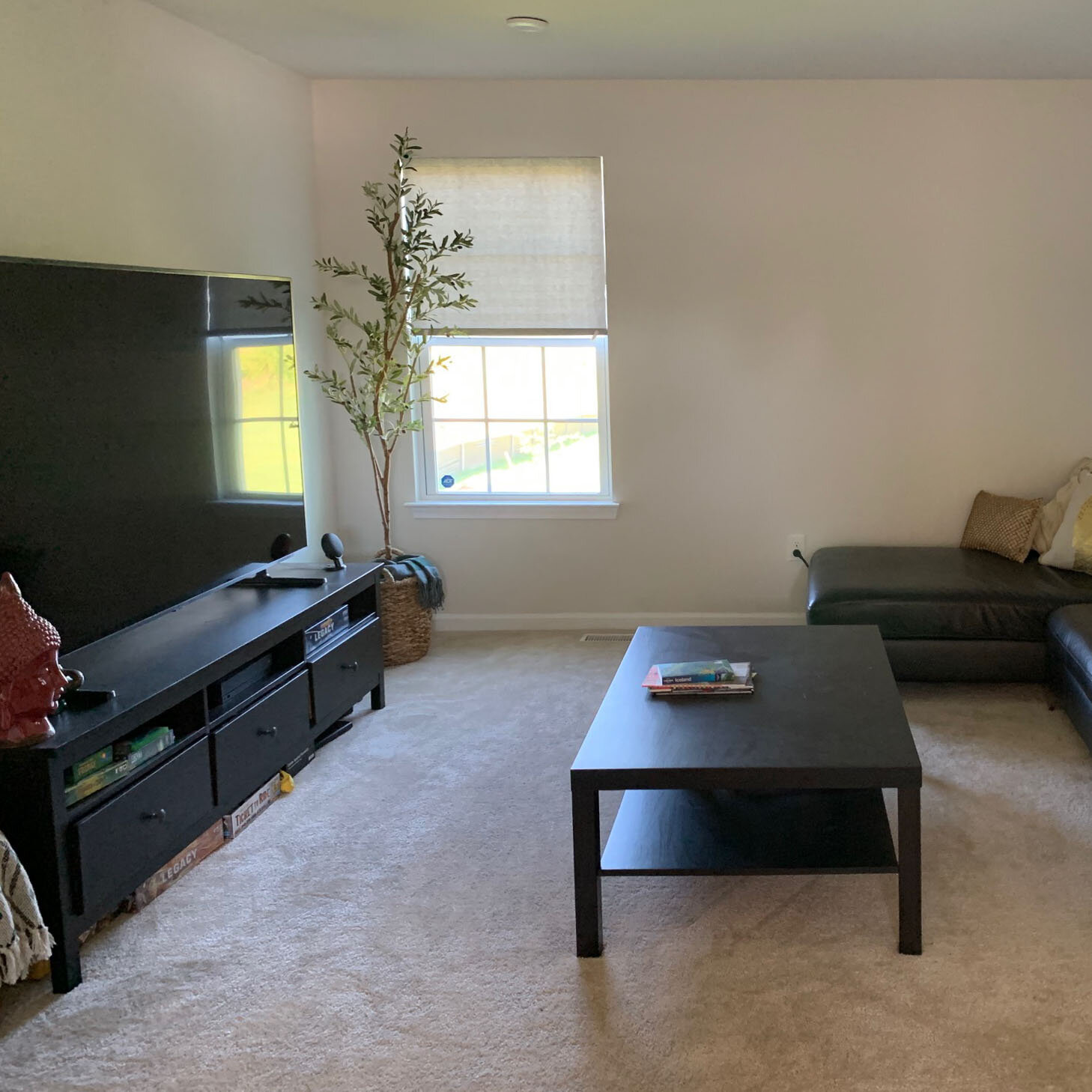
I got a little picky when I was selecting my last room to makeover because it needed to be special. And then I saw this living room submitted by @linattruong and it was perfect! Not because it had stunningly tall ceilings, or a natural feature wall, or a fireplace that I could base my design around…but because it’s a normal home.
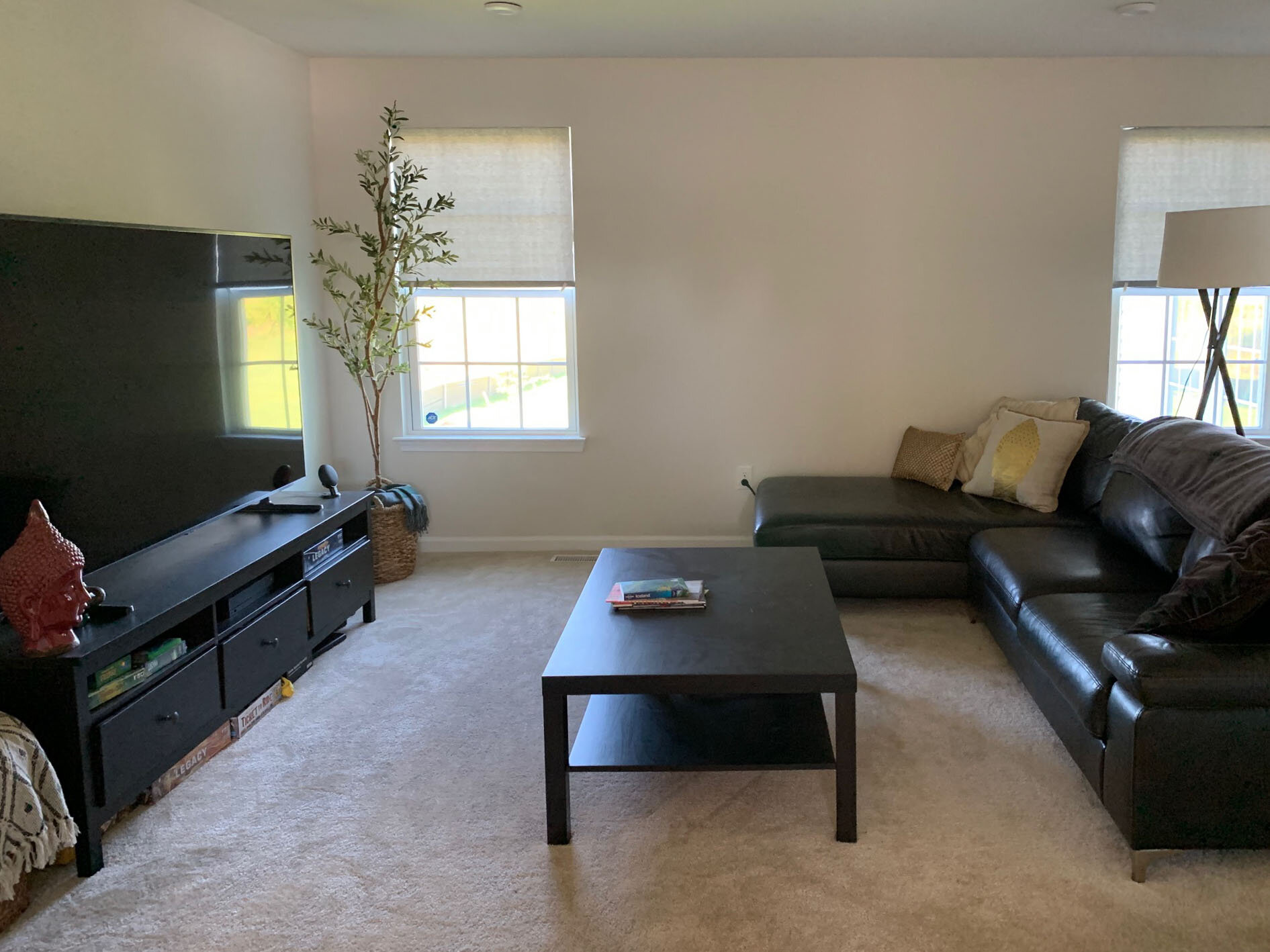
For many of us, this is what our house looks like….somewhat of a blank slate. I get so many questions from readers asking how you can turn a basic room, or a cookie cutter home, into a uniquely designed space. So that’s exactly why I chose Lina’s living room…because I want to show you how you can turn a basic space into a designer room without gutting your home or making any massive changes. It’s all about adding character and being intentional with the design choices we make. So shall we get started?
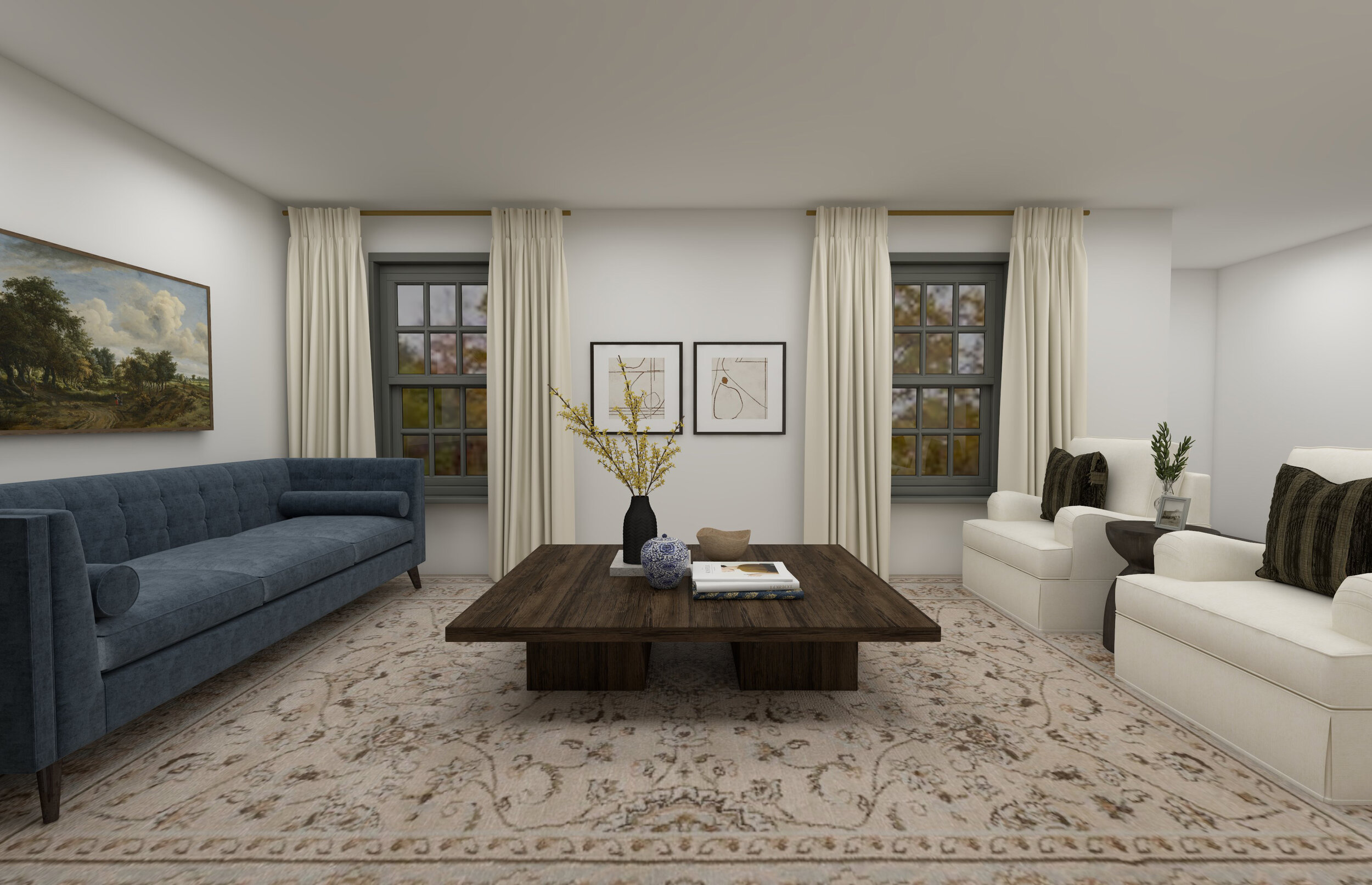
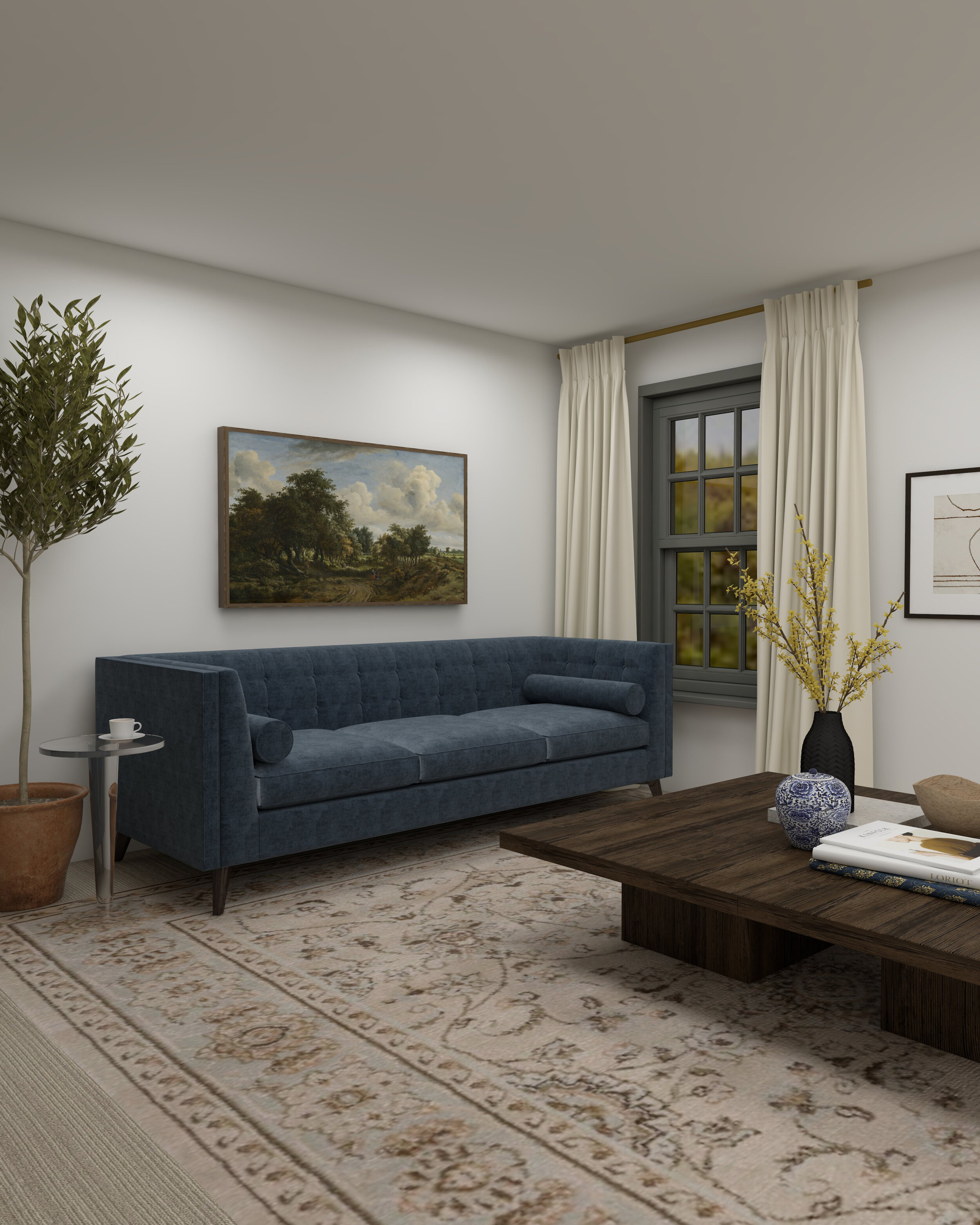
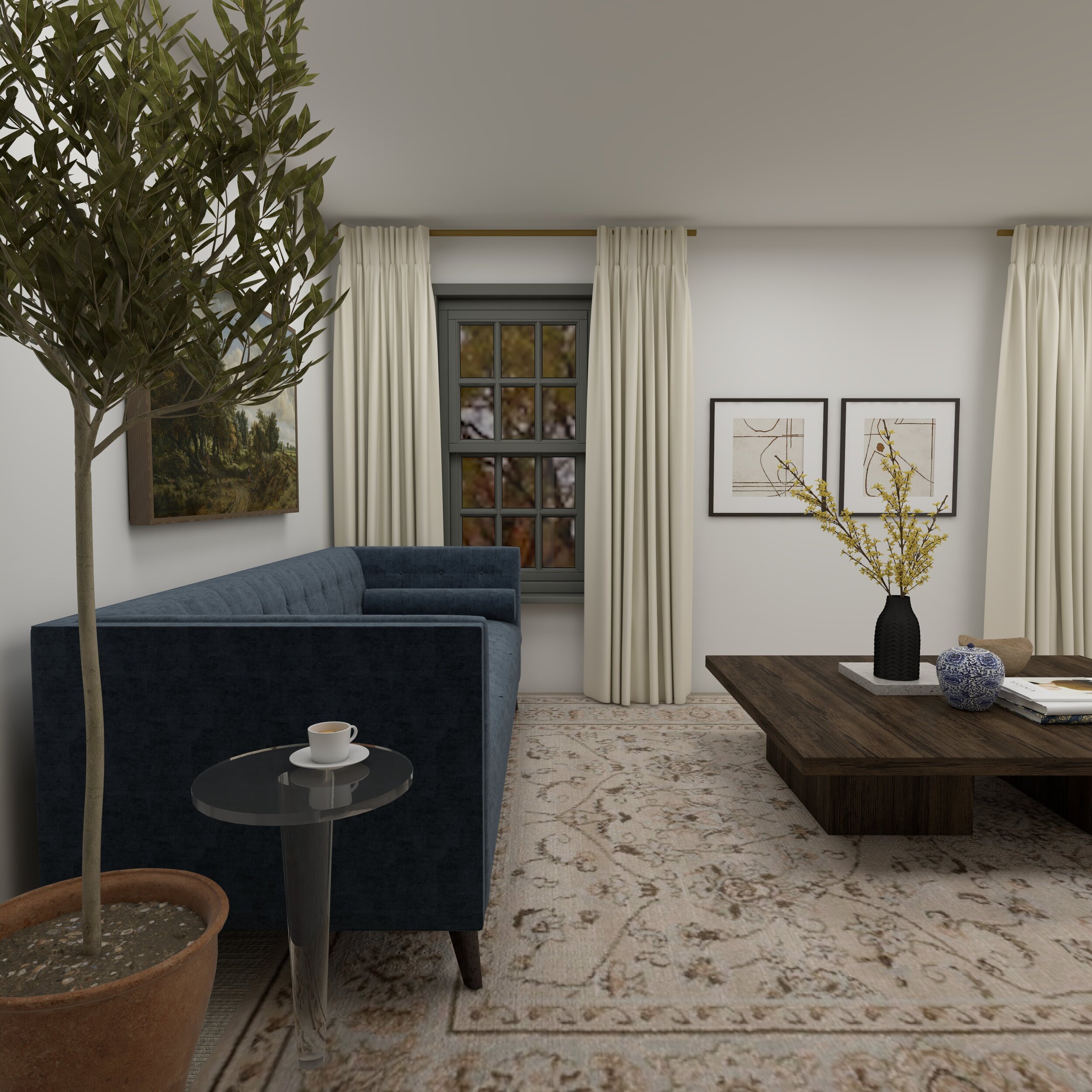
Here is my vision for the living room –
Designed by Nadine Stay using Foyr Neo.
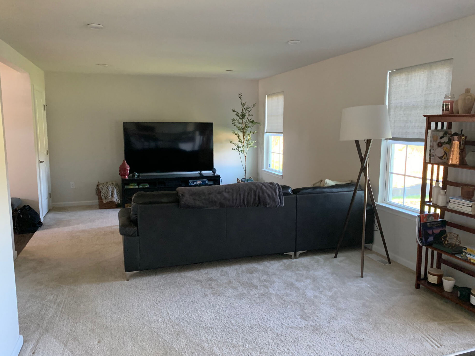
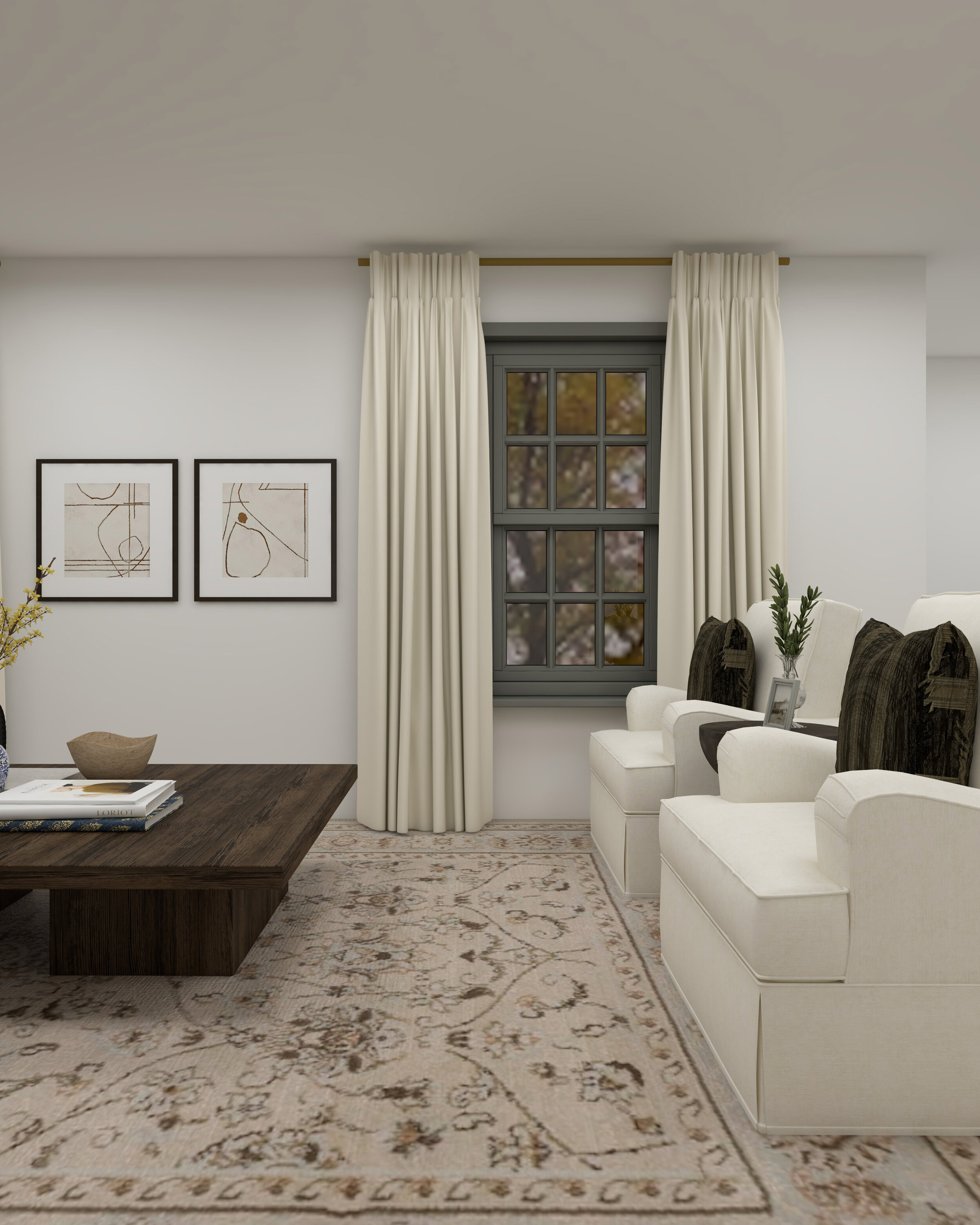
Let’s start with the layout. This living room sits right off the entryway and it has a quirky floor plan with doorways and walls cutting in and out. That gave me a bit of a challenge and I played around with the furniture layout for a while on Foyr Neo. After some trial and error, it became apparent that the wall with the two windows needed to become the feature wall. It’s where the eyes naturally go and it’s the first thing the homeowner’s see when they walk in the house.
The ceilings are normal 8’ ceilings but one way to instantly make them feel taller is by adding floor to ceiling curtains. Mount that rod all the way at the ceiling and make it wide enough so that when the curtains are open, they don’t cover any of the glass.
Since the windows are becoming the focal point, they need to stand out. Currently they don’t have any trim so I would recommend adding trim along the edges to not only add character, but to define the windows more. With that added trim, you can then paint them in a contrasting color to really make them pop against the cream curtains! (Rock Bottom, Coastal Dusk, or Almost Charcoal would be great color options to try.)
And speaking of color, I think this room would feel bright and big with a simple white wall. Nautica White or Ultra White are my go-to’s!
Designed by Nadine Stay using Foyr Neo.
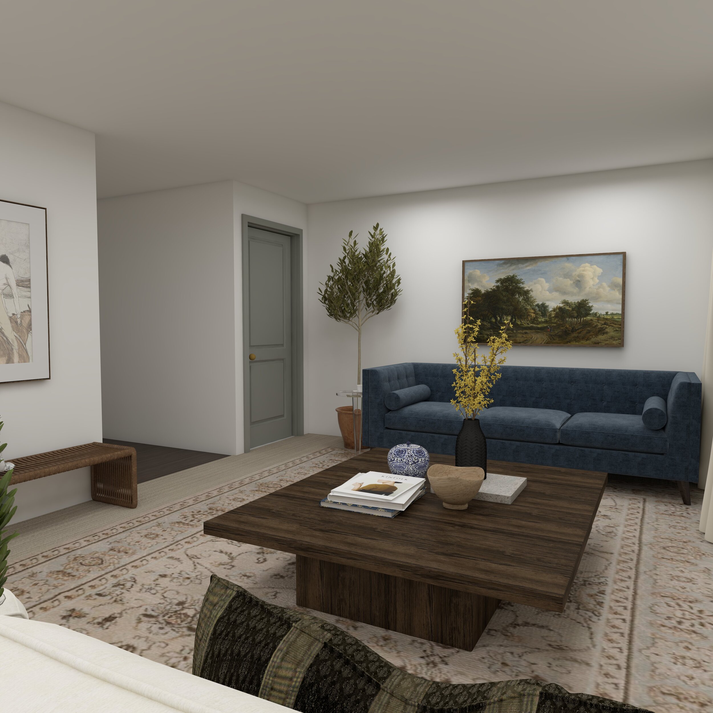
In the photos below you can see the full room layout a little better.
In order to center the windows in the room, I put a couch on the far wall where the TV currently is and two accent chairs across from it with the windows in between. When pulling the seating further apart and centering the windows in between, the living room instantly feels MUCH bigger and there’s no dead space behind the seating anymore. Due to the wall cutting in, it will be a tighter walkway between the living room and the kitchen behind it, but if we make sure the accent chairs aren’t too bulky, you should still have a 3’ walkway.
Designed by Nadine Stay using Foyr Neo.
Now for the color and fabric of the furniture, I loved the idea of adding a bold couch in a bold color. A navy blue velvet couch just felt right for this space while also making the room feel rich and luxe. I tested a few different fabric colors for the accent chairs (which is super easy to do on Foyr Neo) and a creamy/ivory looked best because it doesn’t feel like the chairs are closing the space off to the adjoining rooms.
Designed by Nadine Stay using Foyr Neo.
There’s a large open space between the seating so it’s important to fill that void. One coffee table just wouldn’t do it so I’d suggest bumping TWO coffee tables together and decorating them strategically to make them look and feel like one unit. (If you’re handy, building these plinth style coffee tables could be a fairly easy DIY project.) And to ground the room, I’d add a large beige traditional rug to define the space.
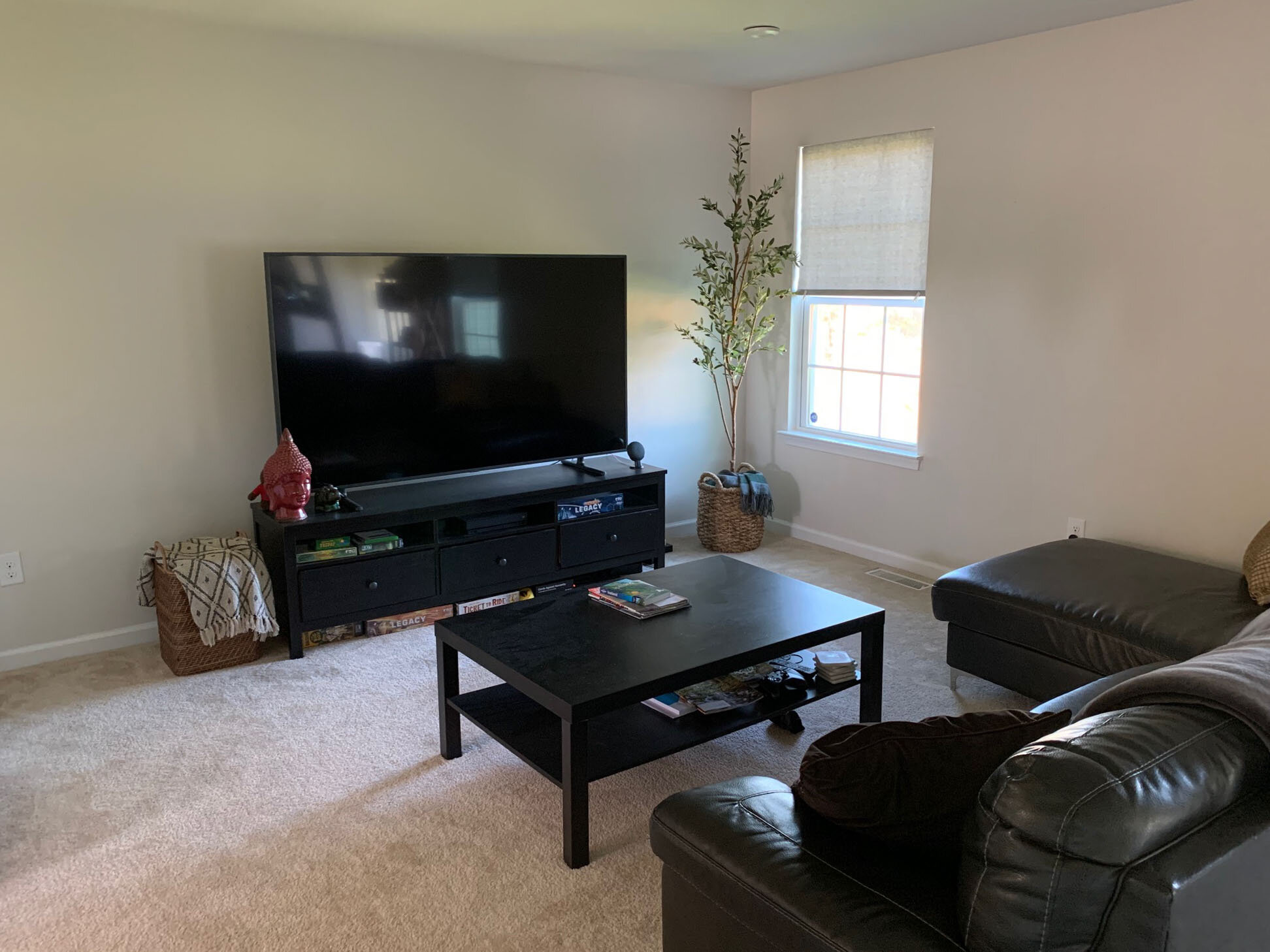
There’s one thing I haven’t discussed yet…the TV. While I know that the TV is often the center of the room, I’d love to mount it on the wall behind the couch…and even better…save up and get a frame TV so that it looks like artwork!
Designed by Nadine Stay using Foyr Neo.
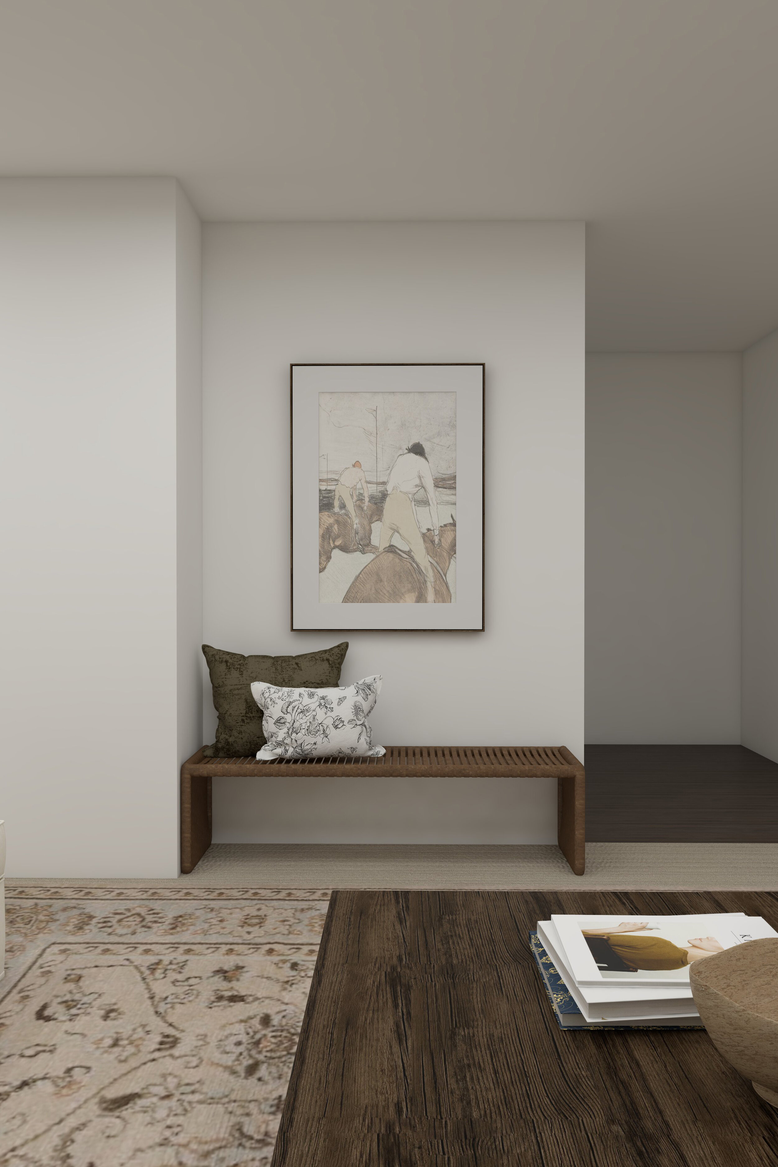
And last but not least, the wall that cuts in and out. I’d fill this blank wall with a leather strap bench and an oversized piece of art. It’s simple but it fills the void and it and doesn’t distract from the rest of the room.
Designed by Nadine Stay using Foyr Neo.
And that’s it! You don’t need to move walls, add in vertical planking throughout the whole main floor, or rip out the carpet…although you certainly could! I simply suggest adding character strategically, creating a focal point, and selecting a few luxurious furniture pieces. I hope you can see how doable it is to turn a standard blank space into a show-stopping room!
One more before and after just for fun! 🙂
COPY THIS LOOK
Scroll to see more →


To start designing your own home and to see what’s possible, create your first 3D rendering on Foyr Neo! Test out design styles, colors, furniture layouts, and create your dream home from the ground up! It’s my favorite design software and it’s incredibly easy to learn! Start a 14 day free trial and use code “NADINE35” to get 35% off your subscription when you sign up! (Discount valid thru 9/30/20 for the first 10 users who sign up.)
DO YOU WANT
The Inside Scoop
Where behind the scenes, exclusive advice, and candid conversations are sent straight to your inbox every week.
