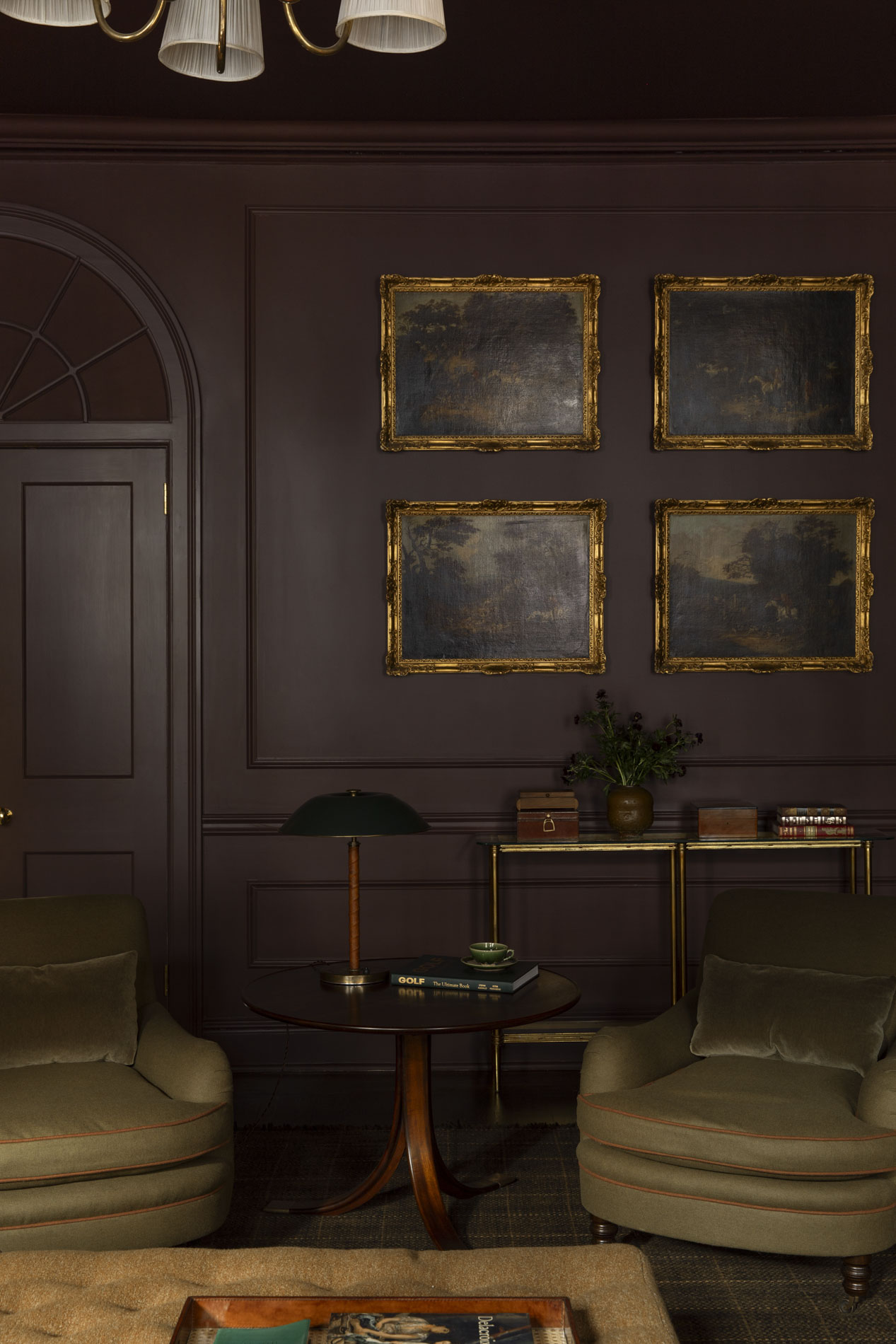

When one thinks about the elements that create a powerful point of interest, a large motif wallpaper, an original oil painting with a gilded frame, or a striking slab of marble might come to mind first. But sometimes the most powerful play is simply a saturated color. Burgundy and plum are known for their elegance, passion, and strength. On a large scale, these colors immerse you in a world of class and romance. On a small scale, they command attention, even while playing a supporting role in the room’s overall design. Below, explore a few of my favorite burgundy and plum interiors and bookmark the 6 paint colors that designers turn to time and time again.
This post contains affiliate links.
Distinguishing Burgundy From Plum
Both burgundy and plum are blends of red, purple, and brown, but the dominance of one hue vs the others determines how the color is classified. A deep red with purple or brown undertones is considered burgundy. A deep purple with red or brown undertones is considered plum.
Burgundy is a rich, stately color while plum has a restrained sense of dignity. Both are equally captivating. Both have specific roles they play.

Paint Color: Townsend Harbor Brown by Benjamin Moore
The beauty of burgundy and plum is that their depth provides energy without overstimulating the nervous system. They exude elegance and sophistication with a sense of maturity. Because of this, burgundy and plum are wonderful color choices for rooms with little architectural interest. These richly saturated colors make you notice the feeling of the room instead of the absence of intricate millwork and mouldings.
In rooms *with* architectural interest, burgundy and plum further enhance those details with a sense of sophistication. Incorporating multiple sheens (matte or eggshell on walls, satin on millwork, and semi-gloss on doors, trim, and windows) creates depth even when a room is color drenched. These finish variations are highlighted beautifully when light illuminates the walls.


Paint Color: Rojo Marrón by Sherwin Williams
Red As An Accent Instead Of The Main Event
Perhaps a room fully enveloped in burgundy is too bold for you; a red accent is a beautiful alternative. In fact, the “Unexpected Red Theory” suggests that a pop of red in a neutral space adds energy and cohesion. As Rebecca Kerry so brilliantly put it, “It punctuates the calm with a little thrill.”

*THE* Color Designers Use Time & Time Again
Perhaps the most popular color in the burgundy and plum family is Brinjal by Farrow & Ball. In some lights, it reads purple, and in other lights it reads red. This complex depth and inability to define the color is what makes it so beloved. See Brinjal on the kitchen cabinets of this Colorado home, the paneled walls of this bathroom, and in the three spaces below –

Paint Color: Brinjal by Farrow & Ball

Paint Color: Brinjal by Farrow & Ball

Paint Color: Brinjal by Farrow & Ball
Color Pairings For Burgundy & Plum
Plum is especially captivating when accented with gold, green, and yellow. Burgundy pairs beautifully with green, yellow, blue, and even pink accents.
Brass hardware complements both colors wonderfully.


Paint Color: Etruscan Red by Farrow & Ball

Designer Favorite Burgundy & Plum Paint Colors:
- Preference Red – Farrow & Ball
- Etruscan Red – Farrow & Ball
- Rojo Marrón – Sherwin Williams
- Brinjal – Farrow & Ball
- Carnelian – Sherwin Williams
- Townsend Harbor Brown – Benjamin Moore
SCROLL RIGHT TO SHOP ALL PAINT COLORS →
Leave a Reply
Where behind the scenes, exclusive advice, and candid conversations are sent straight to your inbox every week.
The Inside Scoop
DO YOU WANT
This is certainly timely for me. I have a bathroom with mauve beadboard 2/3 up the wall. The current wallpaper above it needs to be replaced. I ordered a sample of Heritage Stripe in dark plum from Chasing Paper. It’s a bit out of my comfort zone but I’m so tempted to take the plunge.
No risk no reward, right?