Design Planning & Styling Advice From Interior Designer Sarah Birnie
·

This post contains affiliate links.

DESIGNER INTERVIEW
Discover How To Design Unpredictable Spaces With Timeless Charm
With Sarah Birnie
SHARE THIS ARTICLE:
Designing a home is hard, let alone designing a home with a perfect balance between timeless elegance and unconventional charm. This balance is achieved during the planning process, when space planning, material selections, sourcing, and visualization all take place. To learn more about design planning and creating unpredictable spaces, I spoke with the incredible interior designer Sarah Birnie.
After a quick glance at Sarah Birnie’s design portfolio, it’s no surprise that her work has been featured in dozens of esteemed media outlets such as Rue Magazine, House Beautiful, and Vogue Arabia. Sarah founded her interior design firm, Sarah Birnie Interiors, with a focus on fusing classic and modern elements, creating “polished, personalized and comfortable interiors.”
With her years of experience in residential interiors, I turned to Sarah to get her best advice on the design planning process. Today we have the honor of learning from Sarah about designing unpredictable spaces, creating a cohesive home, and the tools and resources she uses to plan her projects. So without further ado, let’s chat with Sarah!

So often, homeowners don’t know where to begin when thinking about re-designing their home or a room. When you’re starting the design planning process, what are the first things you do and/or the first decisions you make?
“Before making any selections or decisions, it’s really important to nail down your vision for the space. Then, as you start to make selections you can ask yourself whether your choice aligns with your vision. It should help to keep you on track. Without a guideline the decision making process can be totally overwhelming.
When looking through design books, magazines, or Instagram, determine what it is about certain images that you’re drawn to and also what doesn’t appeal to you. Are the spaces you find yourself connecting with soothing, neutral and monochromatic? Or are they more layered, colourful, and filled with pattern? Light and airy or cozy and moody? Find a through line in your favorite spaces. Maybe jot down some key words to keep you on track.”


In a world where homes can so easily look like carbon copies of each other, how do you design unexpected and unpredictable spaces?
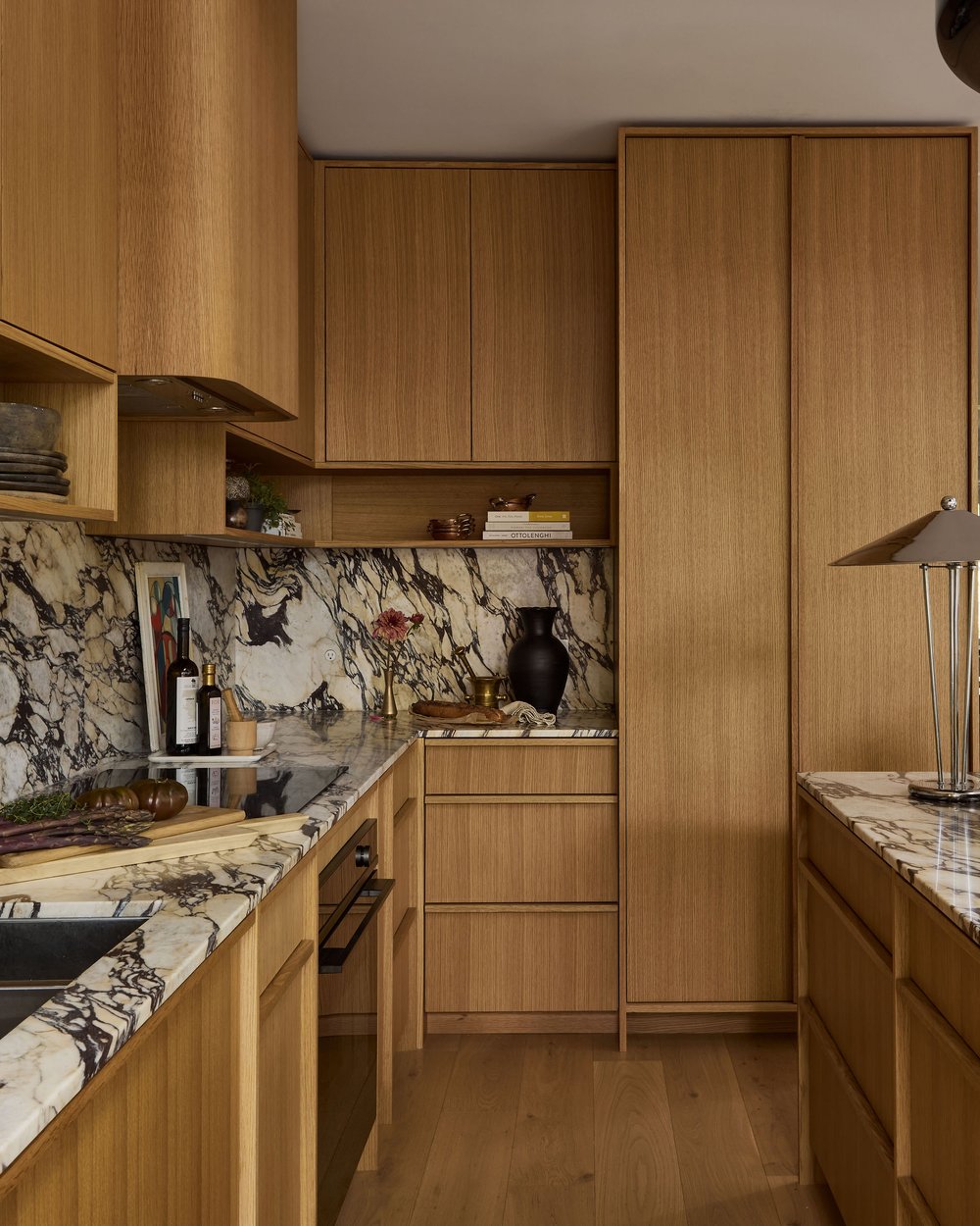
“There are so many factors to consider when you’re designing a home – geographic location (no barn doors in the city!), style and era of the house, and the client’s lifestyle as well as their background. It’s so important that the concept you create resonates and makes sense to the people who live there. If you’re tailoring a space to the client (or to yourself), and truly being thoughtful about each selection, then you’ll inevitably create a unique space. Ignore trends. Follow your gut!”

How do you find the balance between timeless and historical pieces vs unconventional, eclectic, or out of pocket pieces?
“Generally any large investment pieces or things like millwork should be a little more timeless- you don’t want to have to change these things out every few years. Paint, light fixtures and styling are less of a commitment and are places where you can (and should) have a little more fun.
I think every room needs a little curveball or a quirky element to shake things up and keep things feeling fresh, unique and personalized. The same goes for antique and vintage elements. The gravitas that history and patina bring to a space cannot be overstated. Incorporating these elements in decorating and styling is a non-negotiable for me in every design concept.”


How do you recommend designing a whole home that feels cohesive from one room to the next?
“This goes back to the idea of a through line. The whole home should flow via an overarching concept, stylistic elements, and colour palette.”
Do you use a program, software, or method for visualizing the design ideas in your head?
“I have a soft spot for Sketchup. Being such a visual person, 3D renderings are a great way to help both me and my clients visualize the potential of their finished space.”
In your opinion, what best pulls a room together?
“A great colour palette and an appropriately sized rug.”

Rapid Fire Questions!
FAVORITE METAL FINISH:
This evolves regularly and they’re all great in different applications so I can’t name just one! Chrome has been really fun to play with lately, especially in styling. Can’t go wrong with unlacquered brass- big patina fan. I’m interested in stainless steel lately- in various applications- and even brushed nickel (GASP!) has been catching my eye. Burnished bronze hardware is delightful. I think the key is mixing metals so the space feels dynamic and interesting.
LIGHT OR DARK WOOD FLOORS?
Love versions of both, it totally depends on the home and the vibe we’re after. We’re definitely seeing mid-toned and darker floors again after years of white oak dominating.
RECESSED LIGHTS OR FLUSH MOUNTS?
Flush mount all the way. Functionally I do get the appeal of a pot light, but really only when necessary- like when you’re cleaning.
FAVORITE LIGHTING COMPANY:
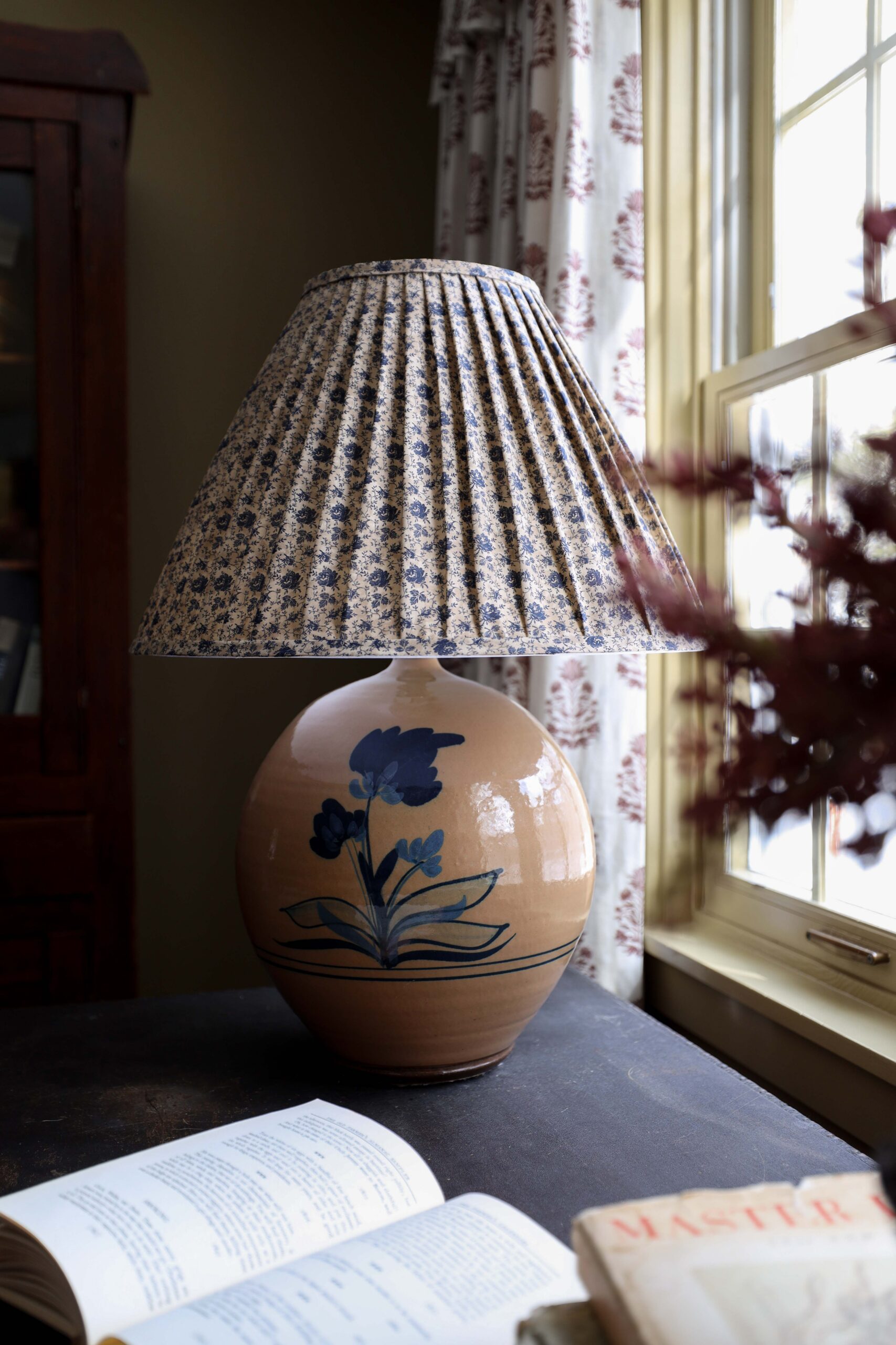
For me, it’s vintage lighting. Huge impact, always brings uniqueness, never boring. I’m always on the hunt for lighting at antique shops, flea markets, and on Facebook Marketplace!

SARAH BIRNIE INTERIORS
hello@sarahbirnie.com
@sarah__birnie on Instagram
For inquiries about Sarah Birnie design services, or to see more projects –
Shop The Looks

Where behind the scenes, exclusive advice, and candid conversations are sent straight to your inbox every week.

