This post contains affiliate links.
Last month I started a series on how to create a color palette for your home and I kicked off the series by talking about complimentary colors. Complimentary color palettes consist of just two colors and I’d consider them the easiest of the palettes to master. So if you’re new to playing around with color, that post is a great place to start.
If you feel like you have a good grasp on complimentary colors and want to veer towards a more unconventional color palette, today’s post is for you! Let me introduce to you, Triadic Colors. What are triadic colors?
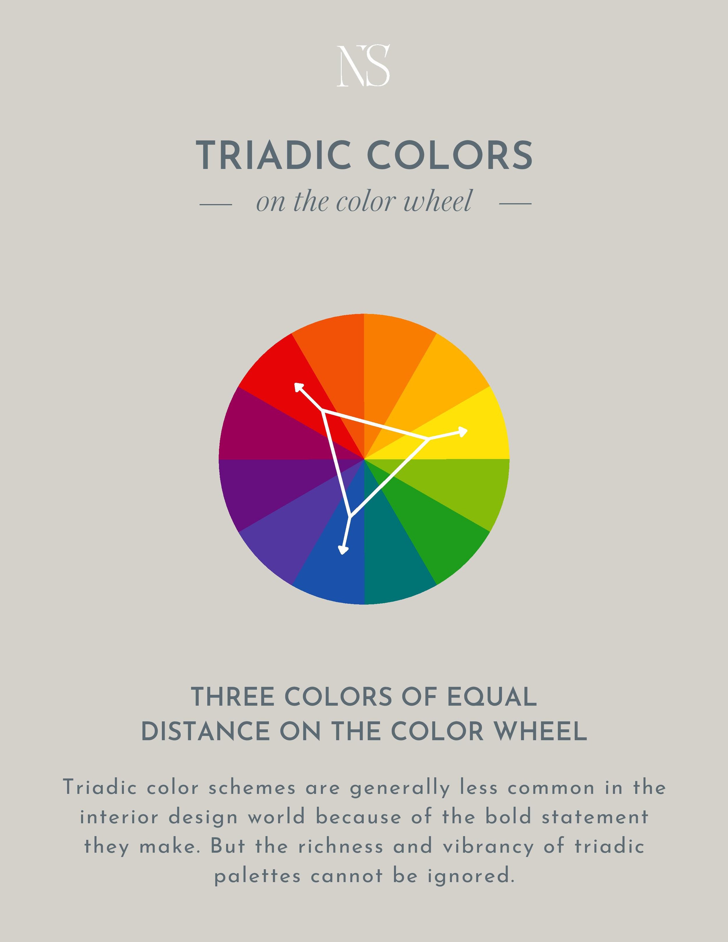
A triadic color scheme consists of any three colors that are of equal distance on the color wheel. The most common triadic color schemes are red, blue, yellow & green, orange, and violet. But you can also create a color palette of mixed hues such as blue-violet, red-orange, and yellow-green.
Let’s take a look at a few triadic color schemes in homes –
Red, Yellow, & Blue
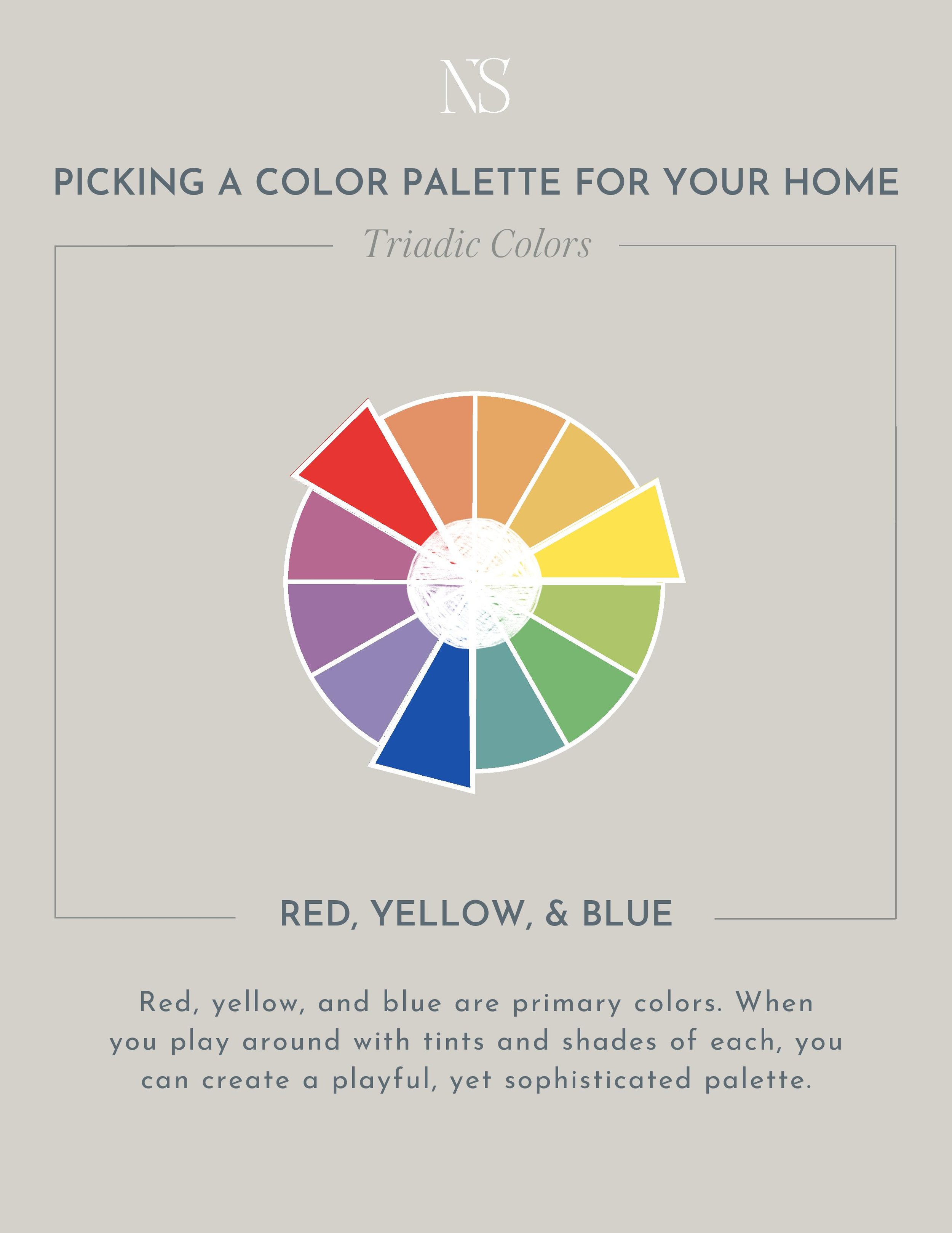
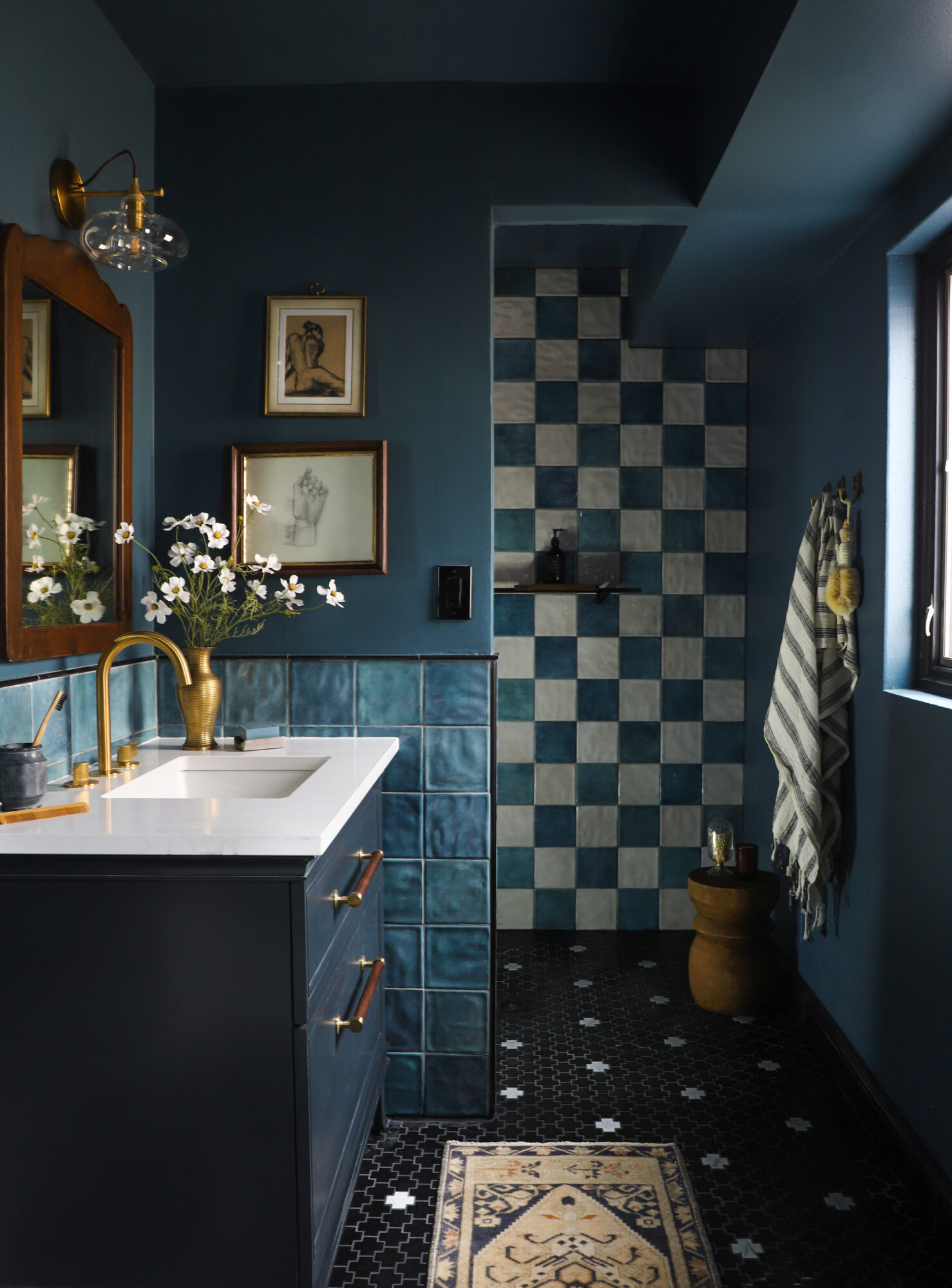
Red, yellow, and blue are considered primary colors. A lot of people shy away from using primary colors in their home because they are reminiscent of children’s toys. But when you play around with shades and tints of each color, you can bring in pink, maroon, navy, or gold for example, while still maintaining a red, blue, and yellow triadic color scheme. Take these homes for example –
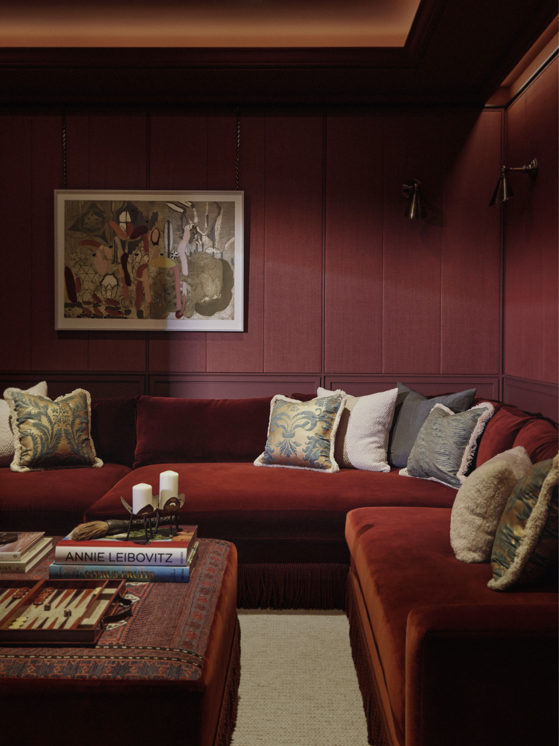
Design by Albion Nord
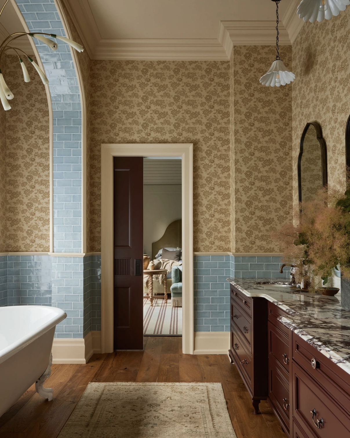
Design by Ashley Montgomery Design | Photography by Lauren Miller

Design by Ashley Montgomery Design | Photography by Lauren Miller
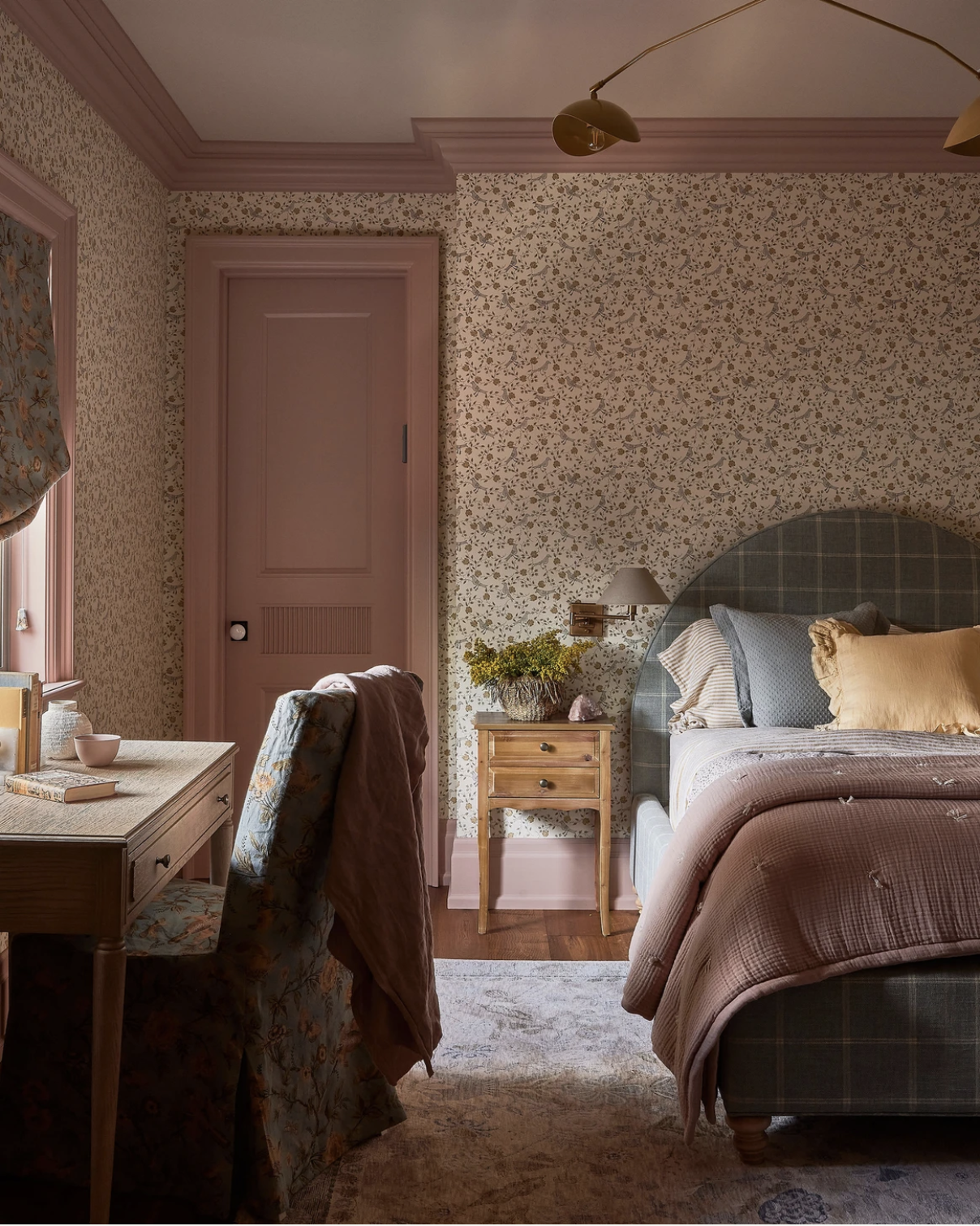
Design by Ashley Montgomery Design | Photography by Lauren Miller

Design by Ashley Montgomery Design | Photography by Lauren Miller
Orange, Green, & Violet
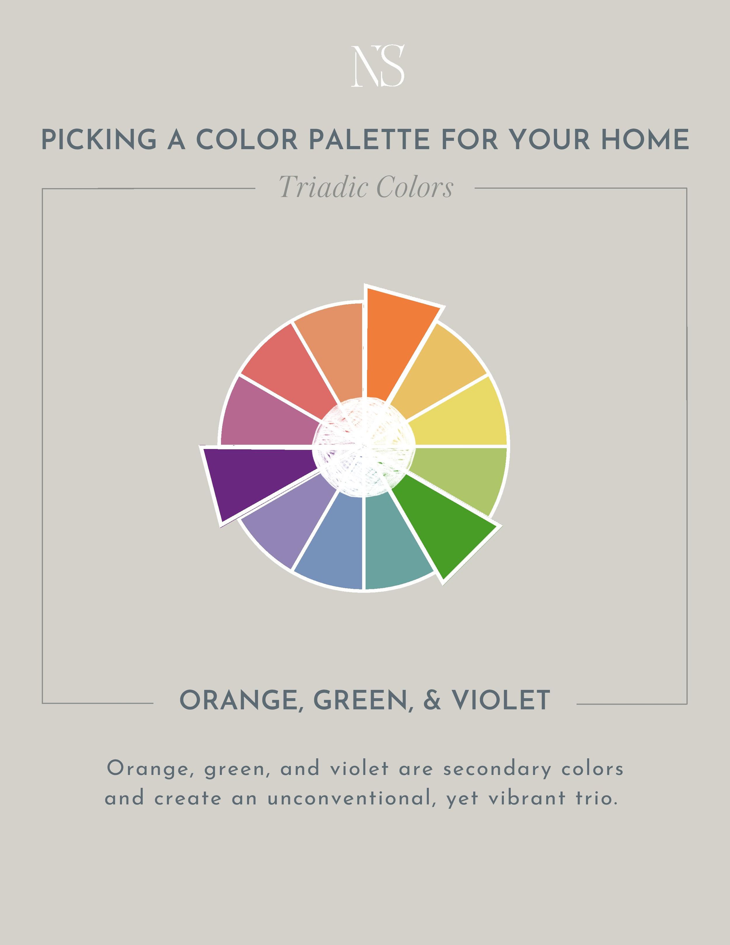
Green, orange, and violet are considered secondary colors. An uncommon color palette for sure, so if you like to be unique, this one is for you! You can incorporate this color palette using pure hues, or you can play around with tints and shades to soften the look.
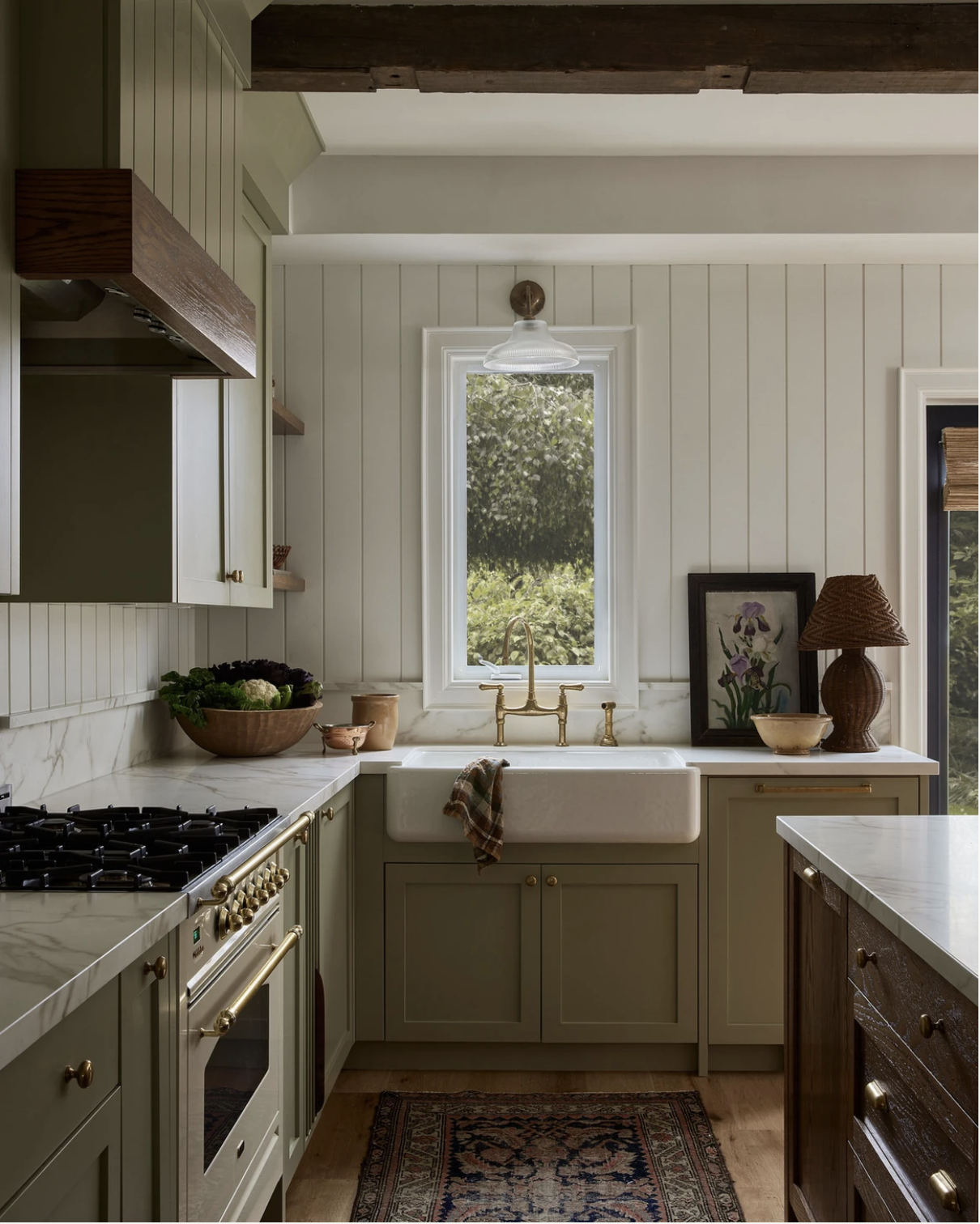
Design by Ashley Montgomery Design
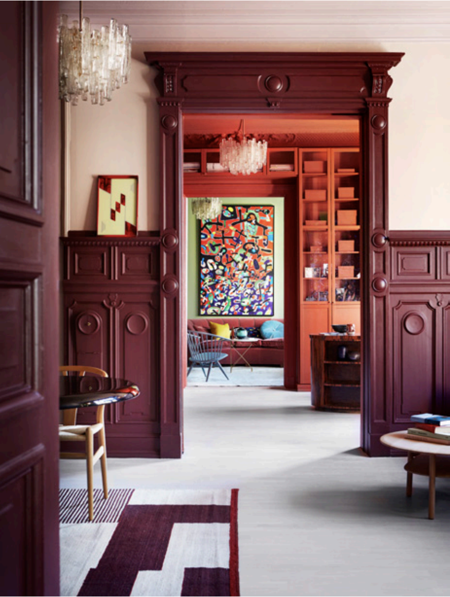
Image via Pure Original
Perhaps you keep the color palette subtle with green cabinetry and a small pop of violet and orange through artwork and gold or copper accents. Or perhaps you go bold by engulfing connecting rooms with each color of the palette.
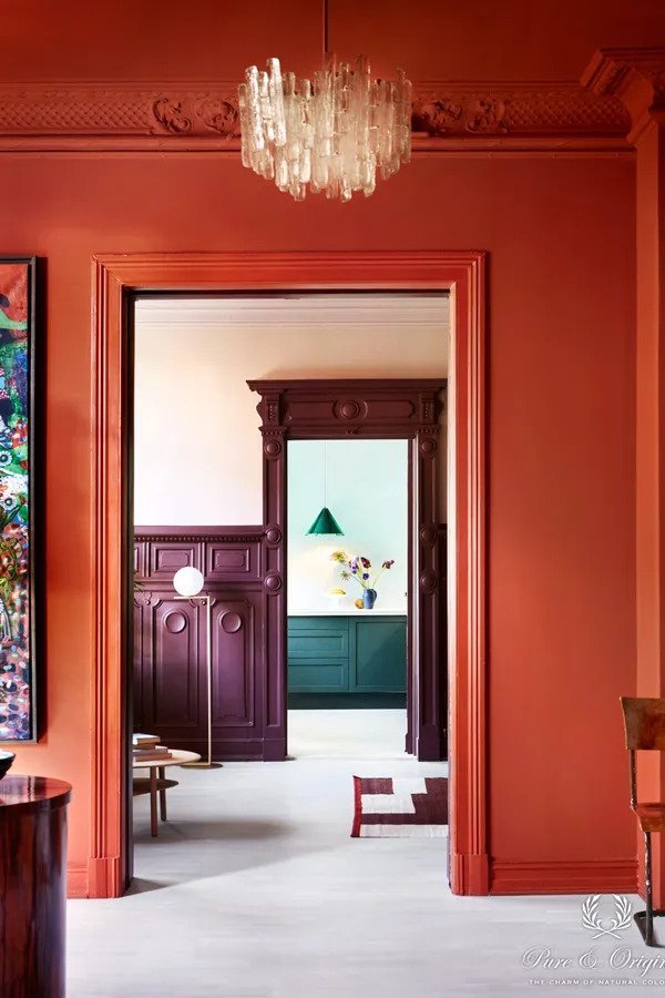
Image via Pure Original
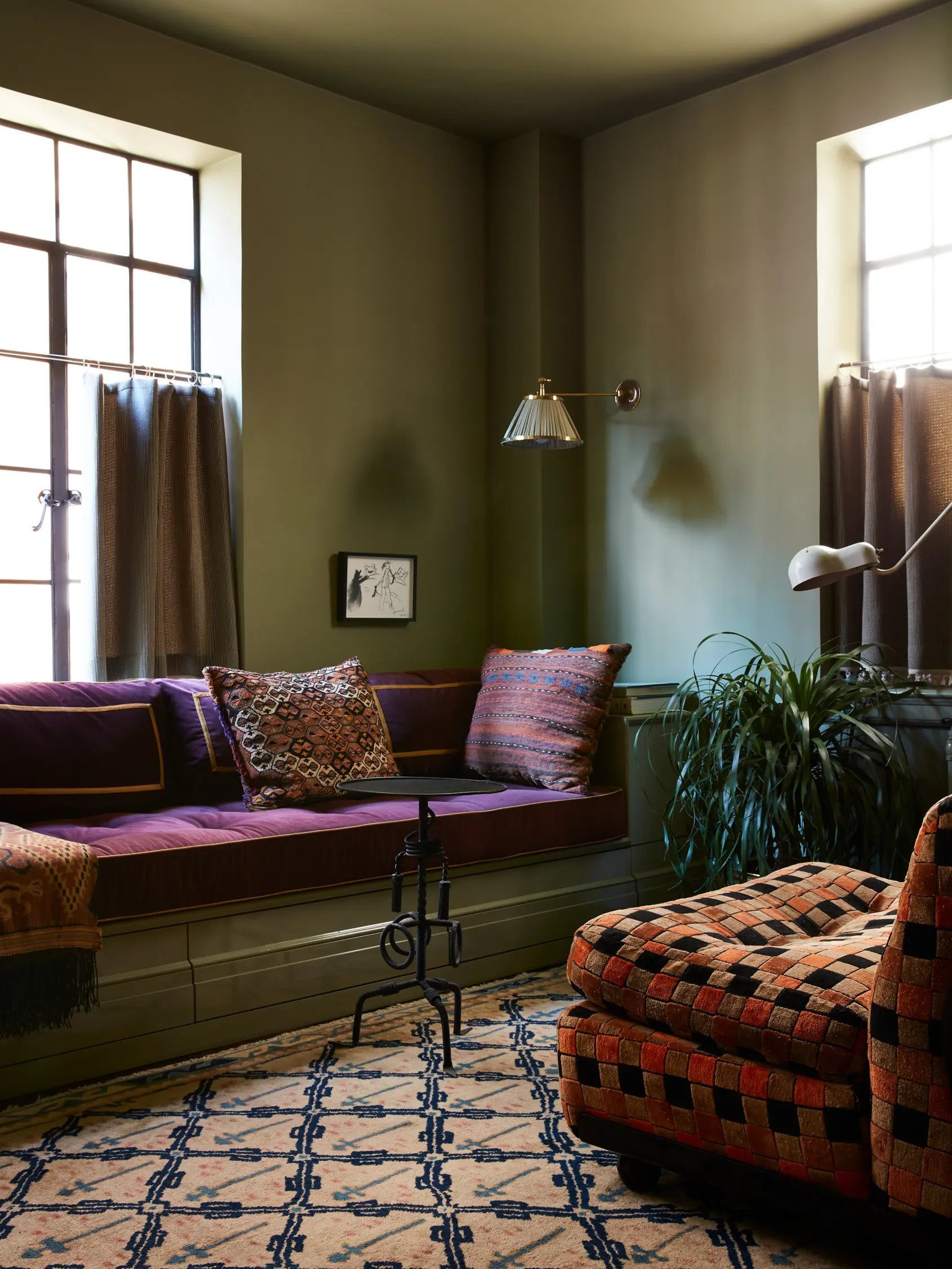
Design by Billy Cotton
Shop Orange, Green, & Violet

You may have noticed through the examples above that generally a room will feature one dominant color. This may be a paint color, wallpaper, or furniture. Then you can incorporate an accent color through arm chairs, rugs, or curtains. And finally, for a small pop of color, add in the third color of your triadic palette. Perhaps pillows, a lamp, or artwork on the wall.
Frida Ramstedt explains it so well in her book, The Interior Design Handbook. She suggests the 60/30/10 rule:
60% of the room features one main color. 30% of the room features a subtle, harmonious (i.e. not contrasting) accent color. And 10% of the room will be spiced up with one or two contrasting colors.” Then add one or two small black or white elements to ground the space.
With a triadic color palette, you have three colors to work with. It’s just a matter of deciding which color will fill each role in the 60/30/10 rule.
Do either of these color palettes spark a bit of joy within you? Can you see yourself incorporating these color schemes into your home? At the very least, I hope this inspired you to appreciate color and unconventional palettes.
Looking for more color inspiration?

5 Complementary Color Palettes…With A Twist

Learn About The Art Of A Monochromatic Color Palette
Leave a Reply Cancel reply
Where behind the scenes, exclusive advice, and candid conversations are sent straight to your inbox every week.



Love this series! It’s very helpful! Would you consider gray, black, or white as a color? For example, a large gray sectional, would that go into the 30% subtle, non contrasting color category? Thank you!
Hi! So for the 60/30/10 rule, white and black actually get their own category! Three colors fall into the 60/30/10 categories, and then you can incorporate several black and white (or gray and cream) elements in addition to ground the space.