Last month I told my email subscribers that I didn’t have any plans in writing for the laundry room…just a few ideas scribbled in my mind. Sometimes my design process doesn’t involve renderings, moodboards, or even photos saved for inspiration. Just ideas stored in my brain and the laundry was looking like it was going in that direction. BUT….
I could picture each element that I wanted to incorporate in the laundry room, but I was struggling to picture them together. Envisioning little pockets of the room was no problem, but seeing the room as a whole is where I got stuck.
I needed a better visual so I made some renderings of our initial design layout and plans. After 2 hours of tinkering around it CLICKED! I love the plan. I love the concept. I love the layout and the feel of the room! (And because I know you’ll ask, I created these renderings on Foyr.)
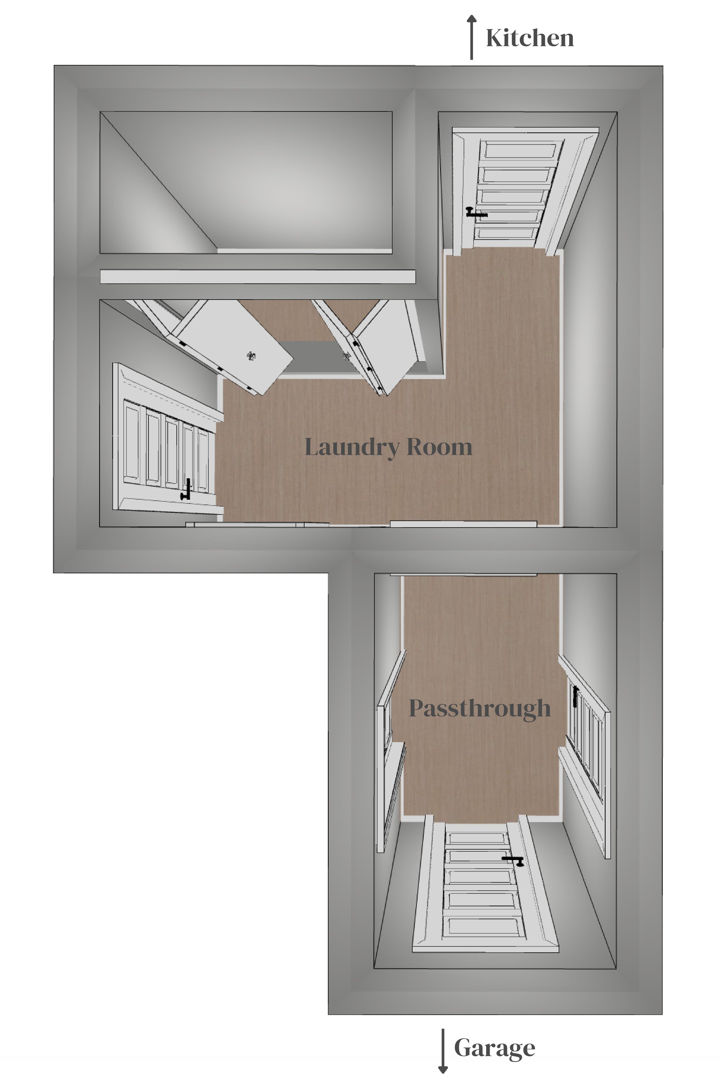
Let’s start with the floor plan –
Original Floor Plan

New Floor Plan
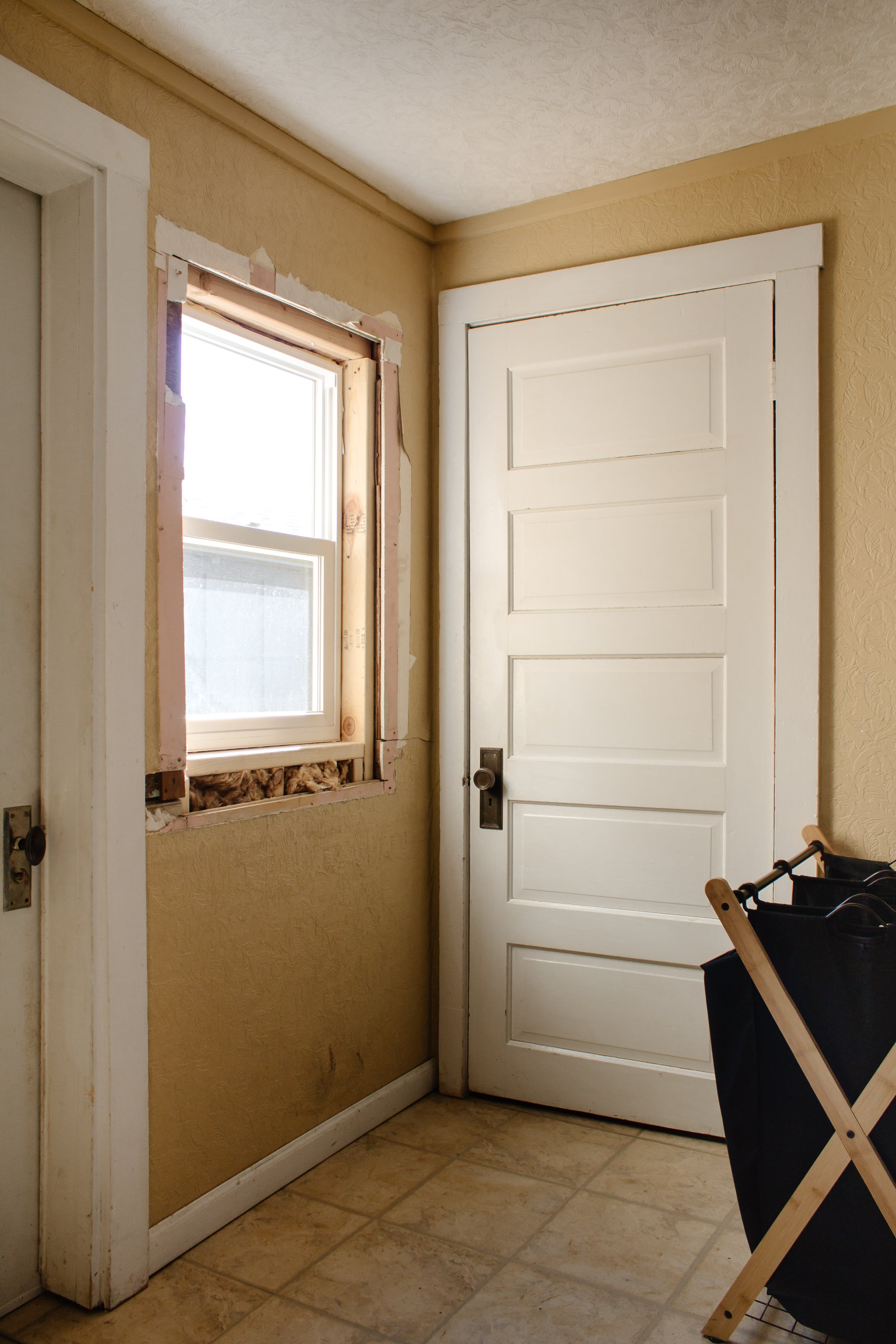
The original floor plan includes two rooms – the laundry room and the passthrough. Honestly, these rooms are more walkways than defined spaces. In this 90 sq ft space there were 6….SIX doors leading to our kitchen, garage, basement, front yard, back yard, and passthrough. It felt like a maze of doors our first order of business was to remove 3 doors. One between the laundry room and kitchen, and the two leading to our front and back yard. This project took place a couple years ago and that’s where we’re at today – a semi-demoed room.
Our new floor plan involves removing the dividing wall between the laundry room and passthrough to make this one space. That change alone will bring in so much natural light from the window in the passthrough. This room has no overhead lights and the ceiling is low just like our bedroom is.
(NOTE: there is a step between the two rooms which I didn’t include in the rendering for time’s sake, but that will be staying and we’ll need to work around that.)
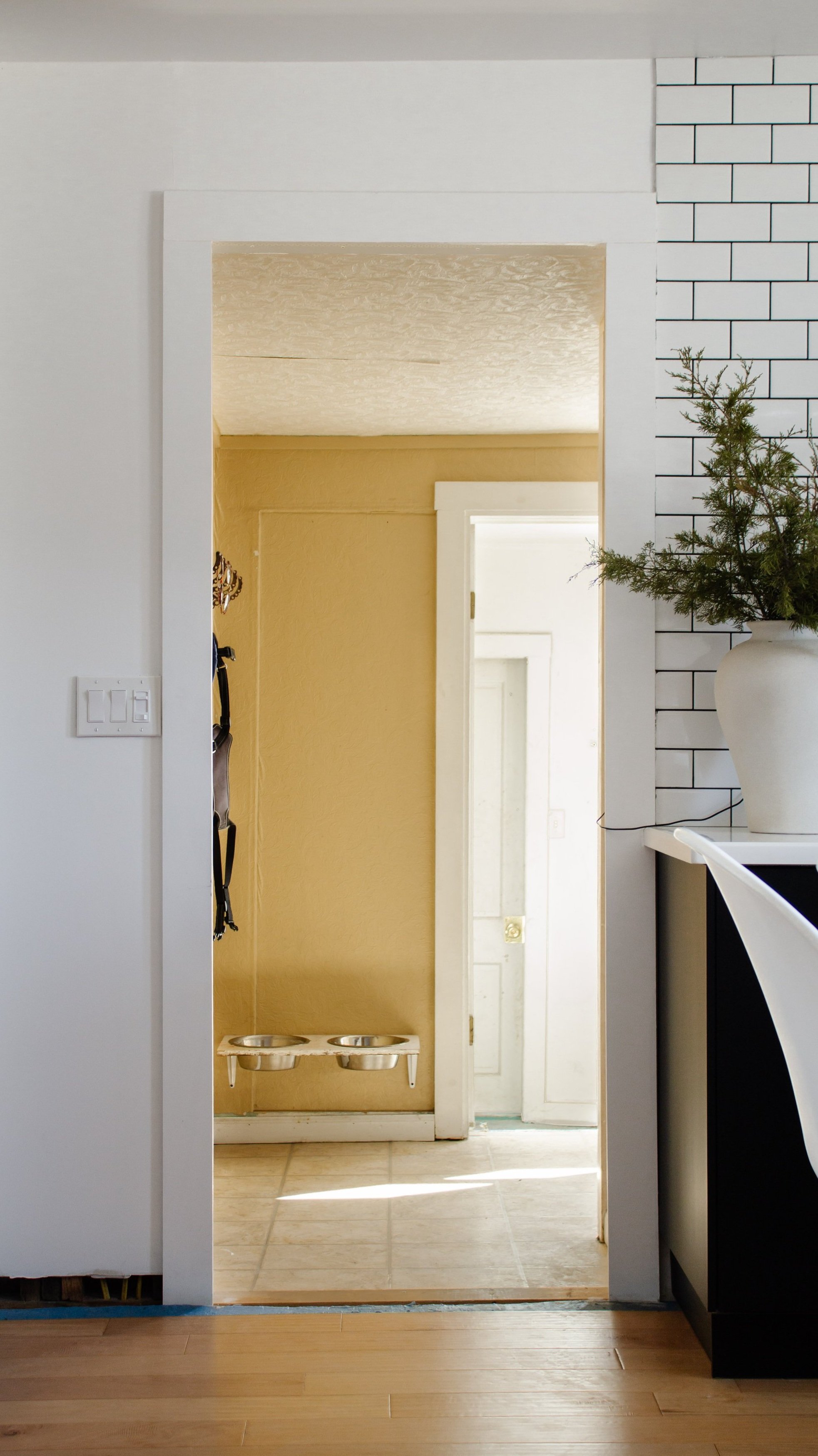
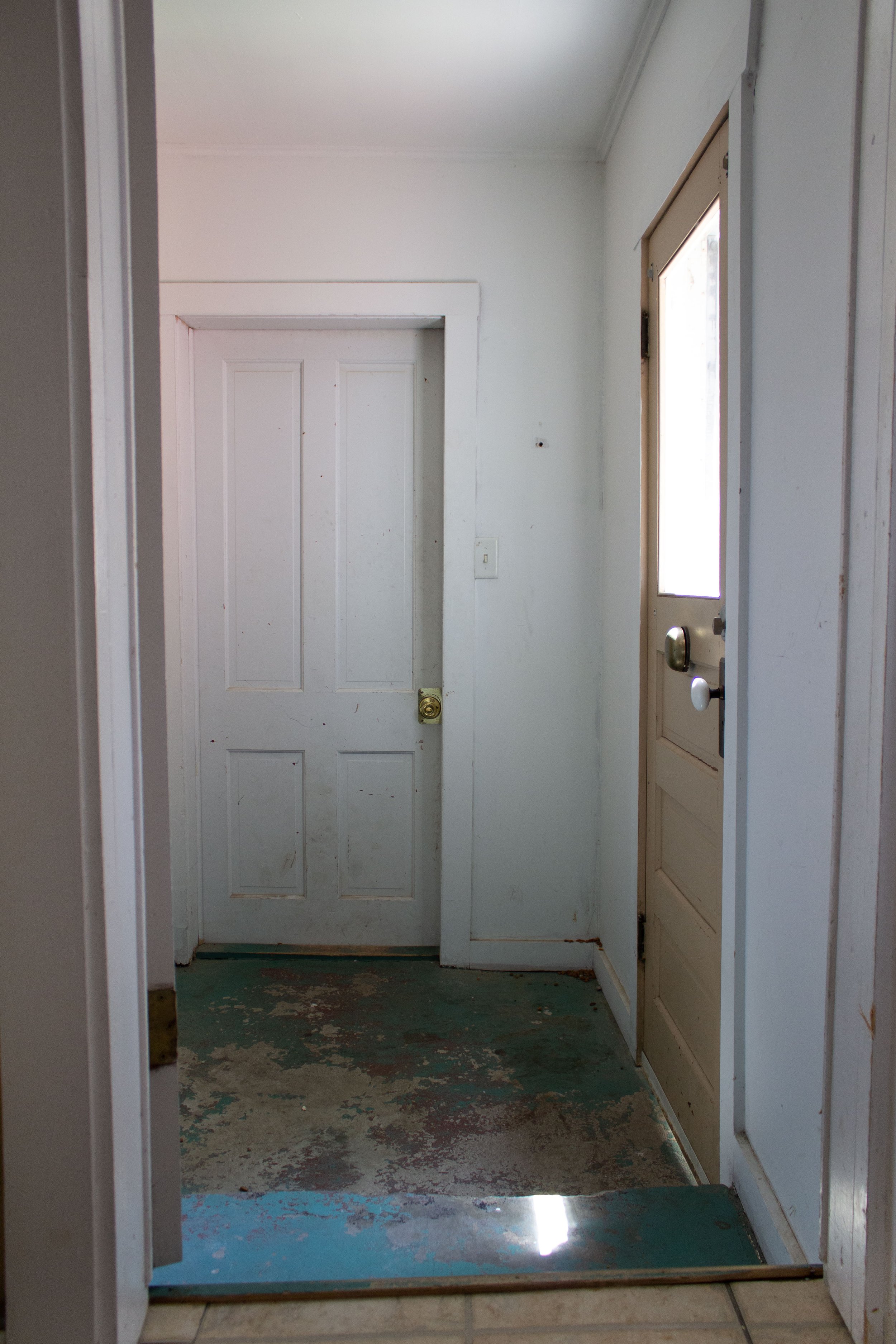
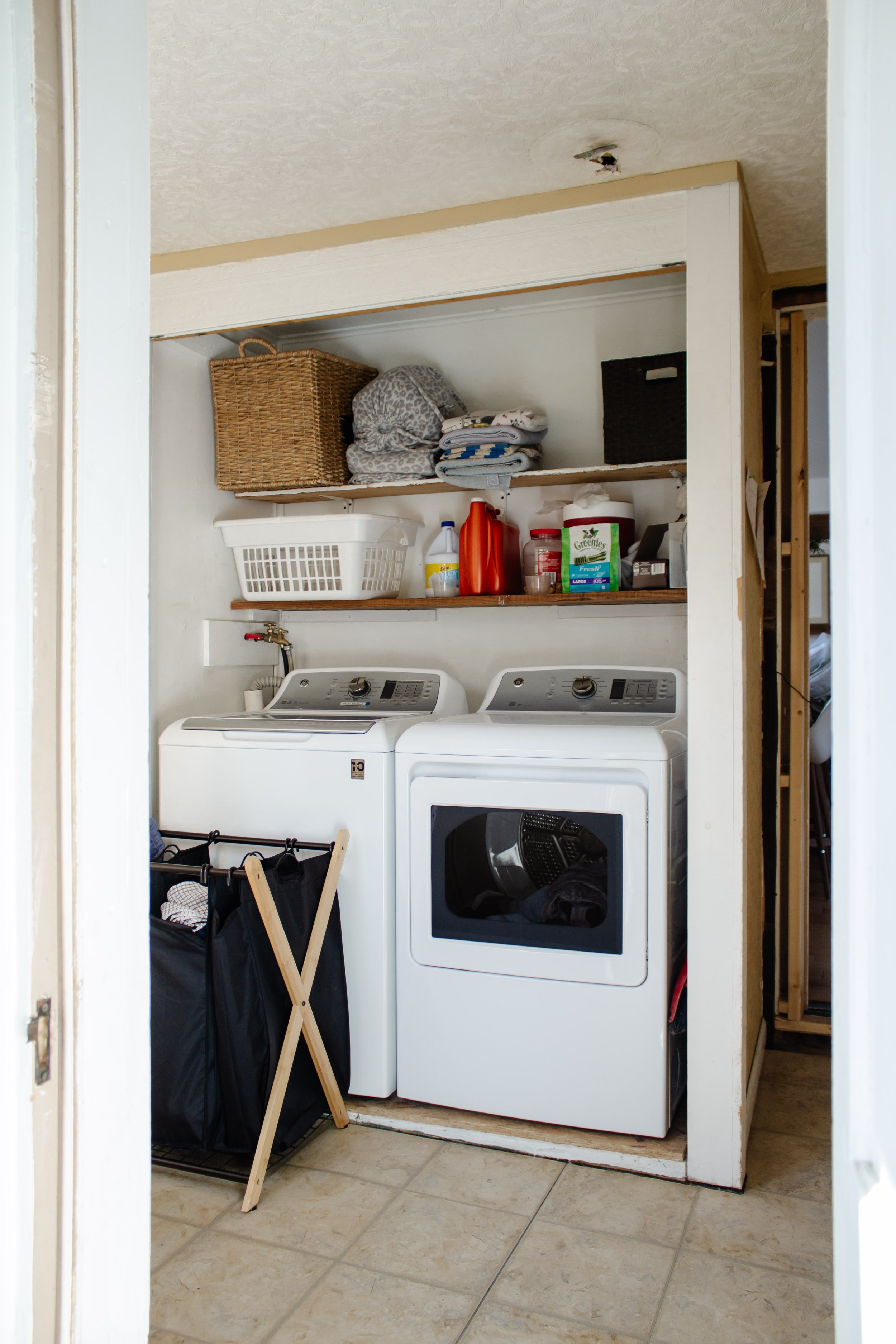
Currently
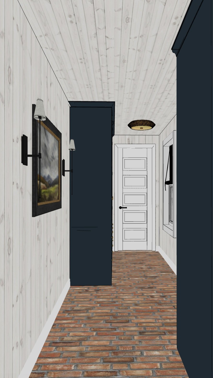
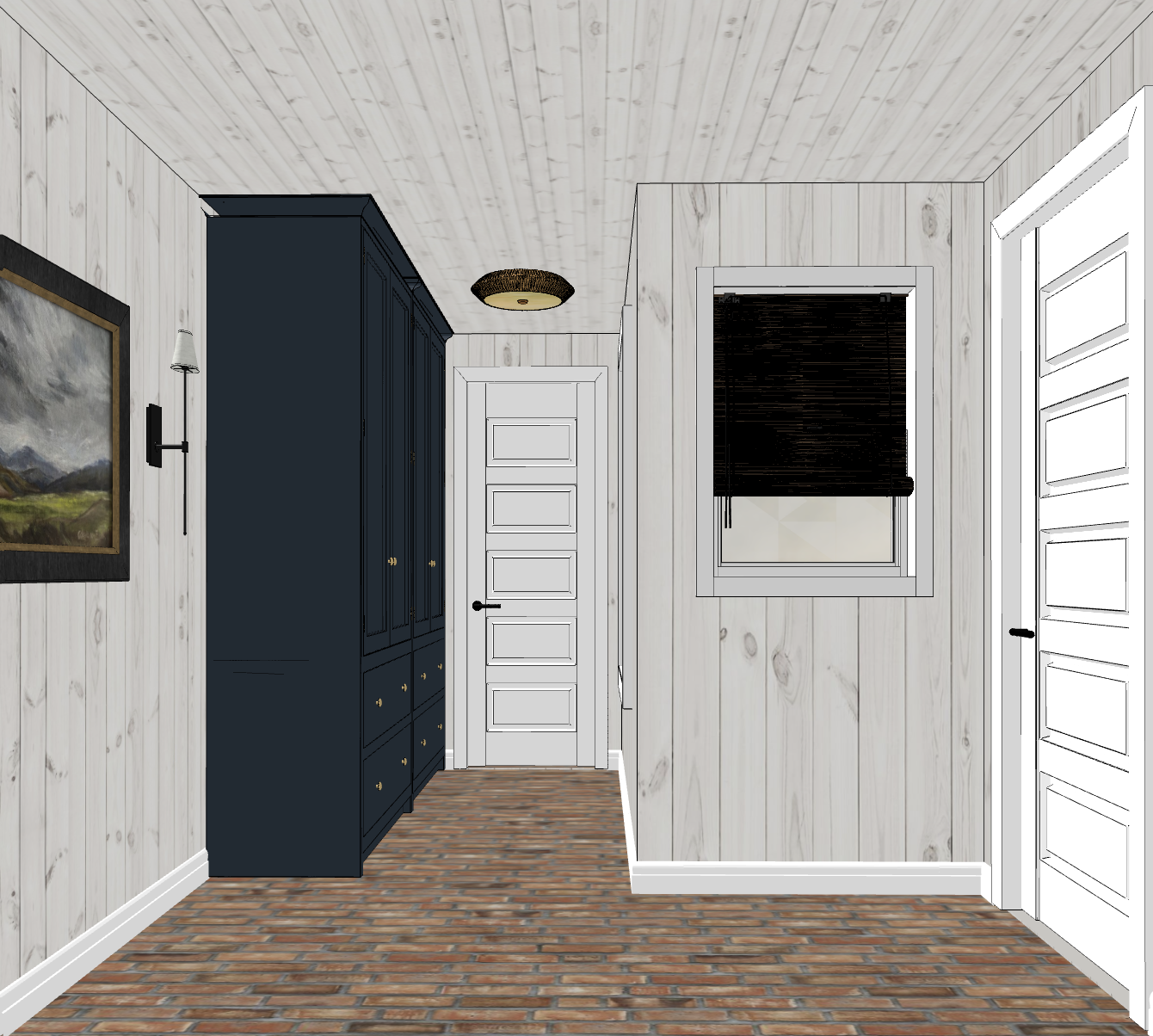
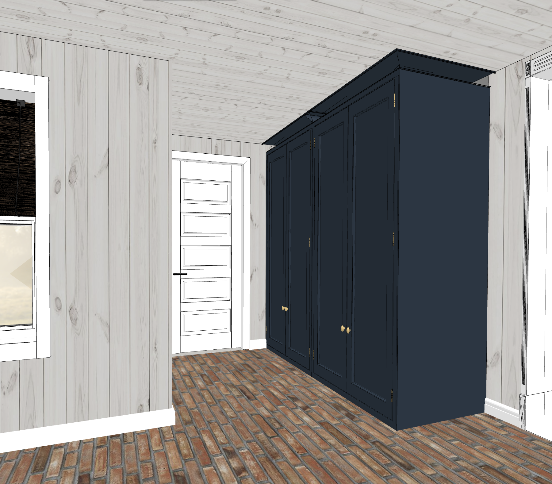
Design Plan
The view from the kitchen.
This is my first time designing a room that has no furniture, which puts a lot of focus on the architectural elements of the room – built in closets, lighting, flooring, wall treatments, and hardware.
I decided long ago that I want the same wood planked ceiling in the laundry room as we did in our bedroom. The character is perfection! As for the walls, I want it to feel like a refined rustic room so painted wood planks in varying widths is my plan. The key is texture…lots and lots of texture.
The floor took months of contemplation and I finally landed on a product that both fits the style of our home and my personal preferences – brick veneers!
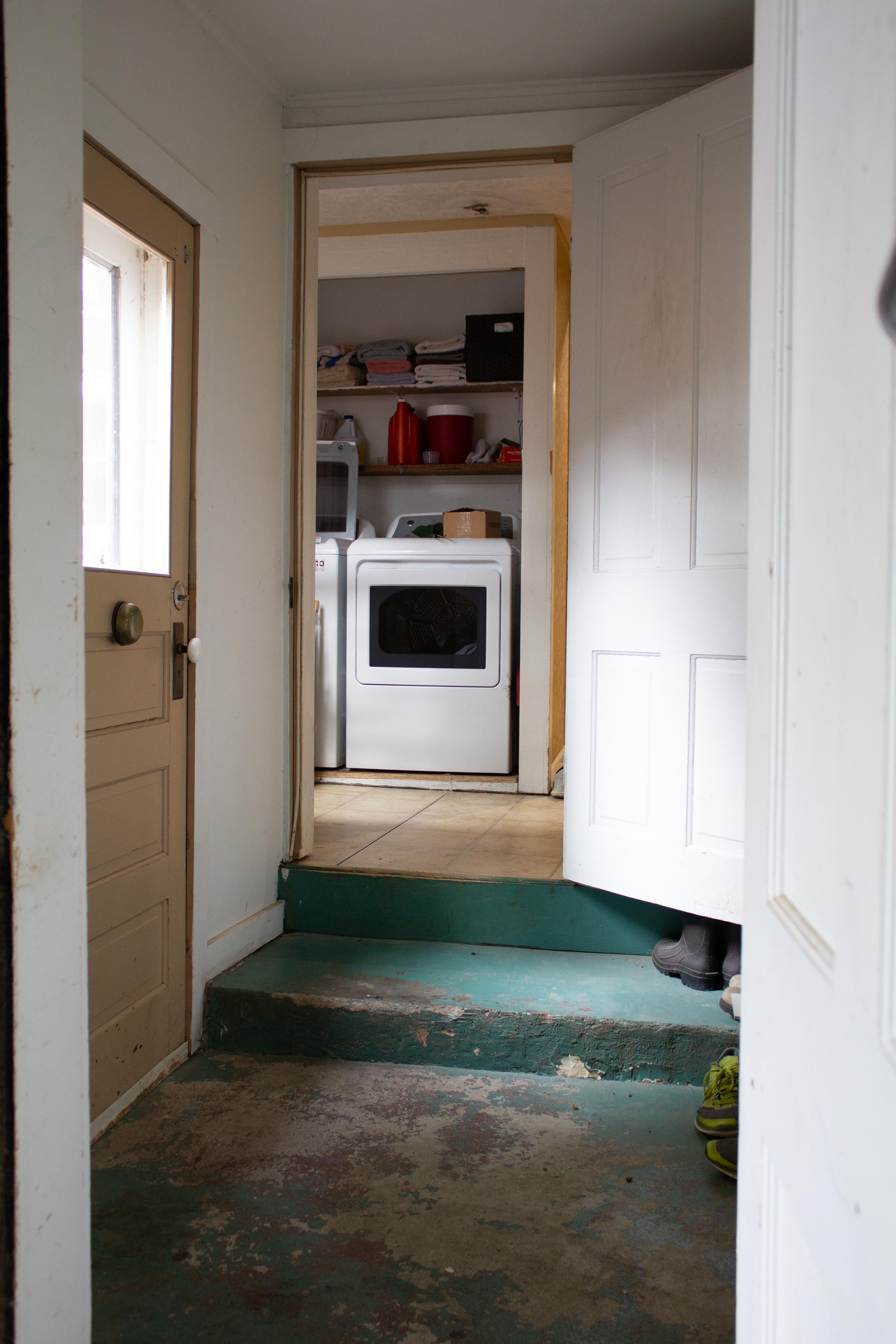
Currently
Take a few steps in the room and this is a better view of the layout.
The door you see straight ahead is the entrance to our garage and in order to make room for a closet, we’ll move it as far to the right as possible. That should give us ample space to build a custom closet. It’ll be tight, but we’ve come to the conclusion that we’d rather have at least one closet in our house than a wide hallway.
Since this will be our only closet – I’m putting a lot of focus on making sure it’ll be as functional as possible for coats, cleaning supplies, gloves, linens, etc. Because of the step in the middle of the room, I think we’ll have to build the closet from scratch over the step and I’m already puzzled about how we’ll tackle that.
Currently
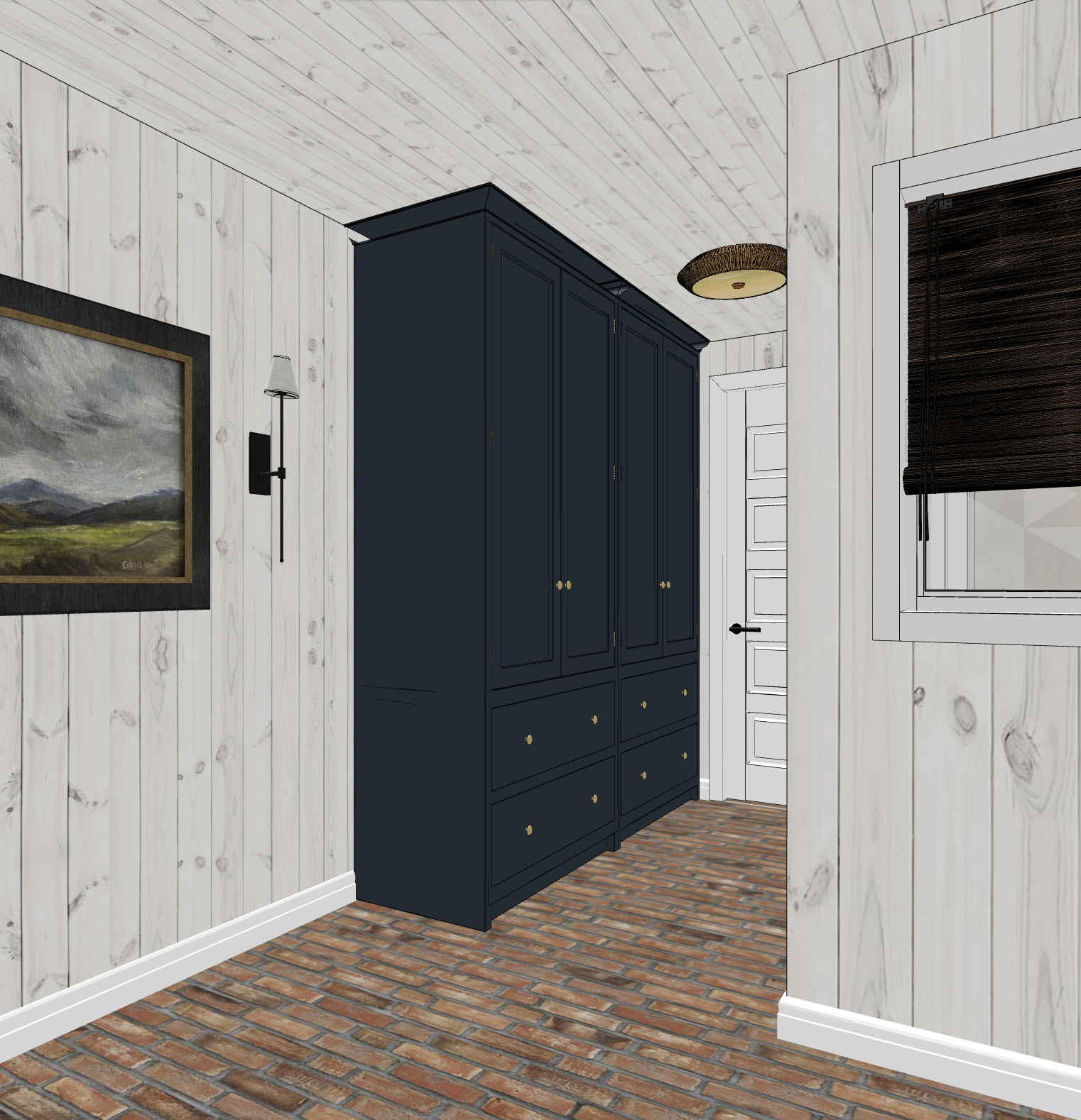
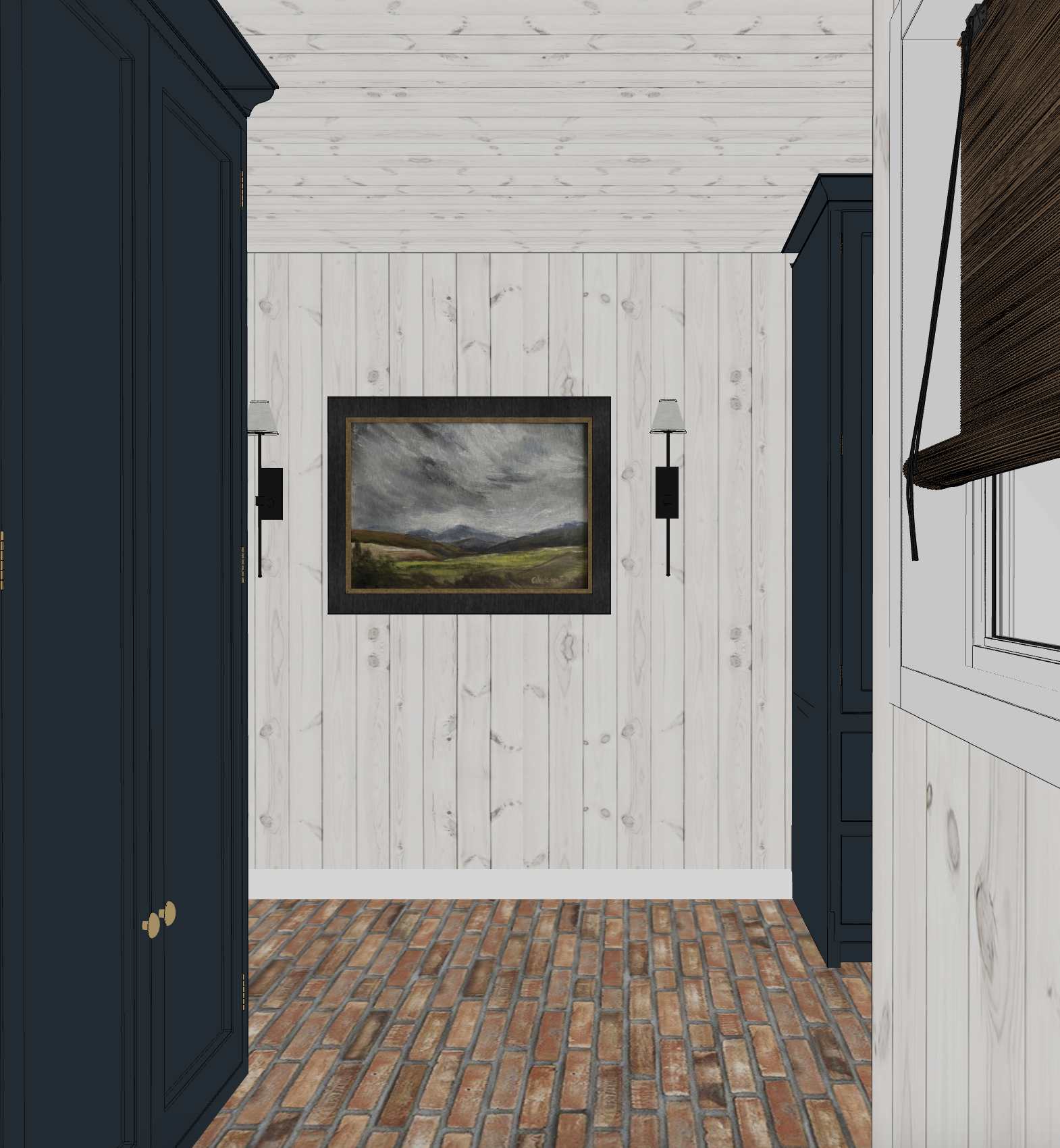
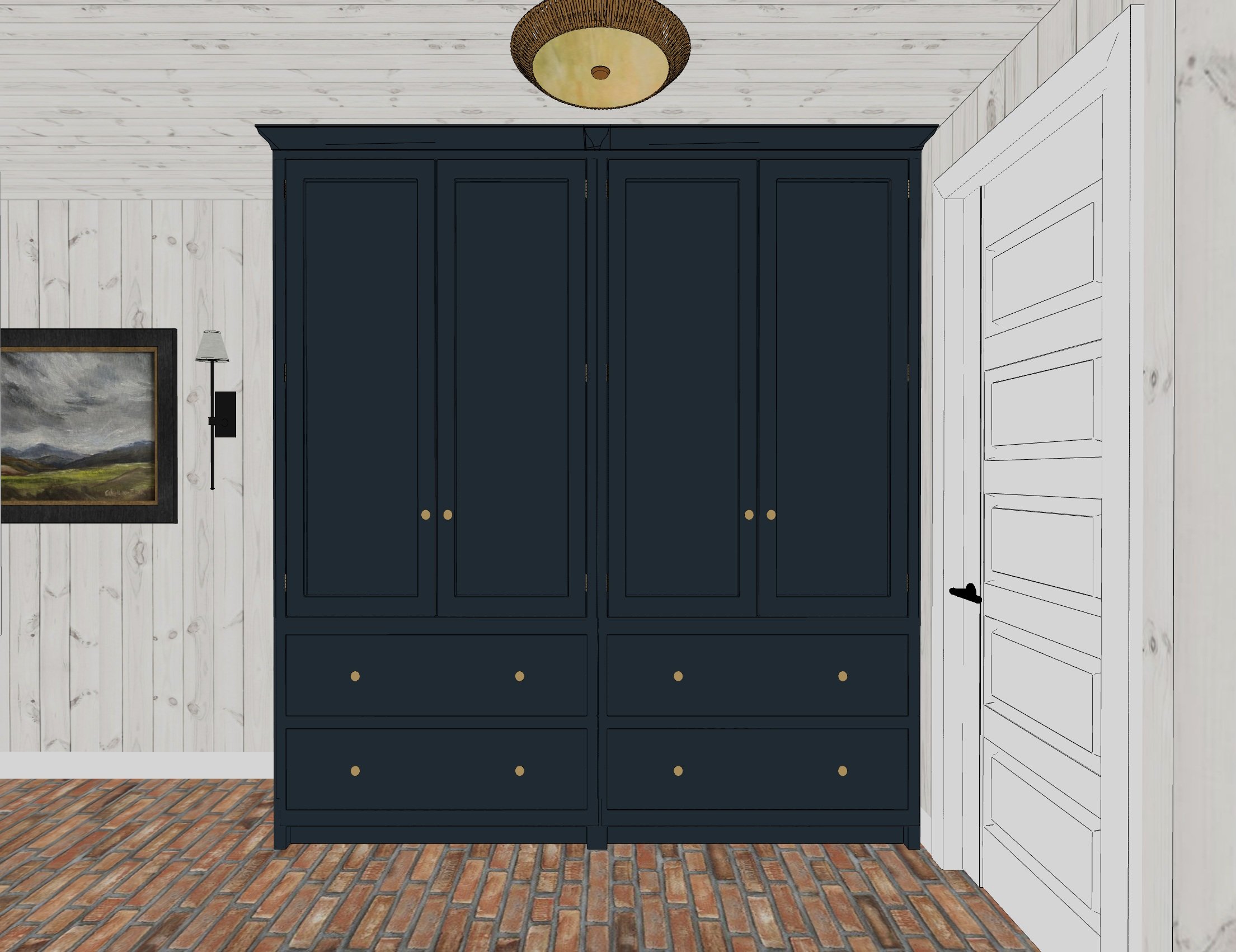
Design Plan
If you flip around, this is the view of the closet that will hold our washer and dryer. Again, maximizing the space available is crucial so we’ll add shelving within the closet above the washer and dryer. But I want all that to be tucked away behind closed doors because this room is open to the kitchen. I have a feeling this will be another complicated custom closet build. To the left of the closet is a door to our basement.
There’s one big open wall and we have options for this space. Initially I thought of adding hooks, but I know how that goes… Because this view is so visible from the kitchen, I fear that hooks will only look cluttered 90% of the time. A pair of wall sconces and an oversized piece of art is what I’ve settled on at the moment.
What has me most excited is the color palette. The red/orange brick veneers will pair so beautifully with navy closets. The wall/ceiling color is still up for debate but I’m thinking either white or beige to soften the contrast.
This is our current plan and seeing it makes me so excited! But I know how projects like this go and I’m fully expecting changes to happen as we dive into this. We’re set to start this weekend so come hang out with me on Instagram as we tackle this room.
Leave a Reply Cancel reply
Where behind the scenes, exclusive advice, and candid conversations are sent straight to your inbox every week.

Hi Nadine,I love your plans. And I’m excited about your choice of flooring. I’ve been wanting to install brick for my sunroom floor. I’ll be waiting until you do yours so I can learn from your advice & reviews of the brick veneers.Great story in your newsletter about your dad’s cabin.
We’re excited to install brick for the first time!! I’m sure we’ll have plenty of lessons to share! 🙂