This post is sponsored by Foyr Neo and contains affiliate links.
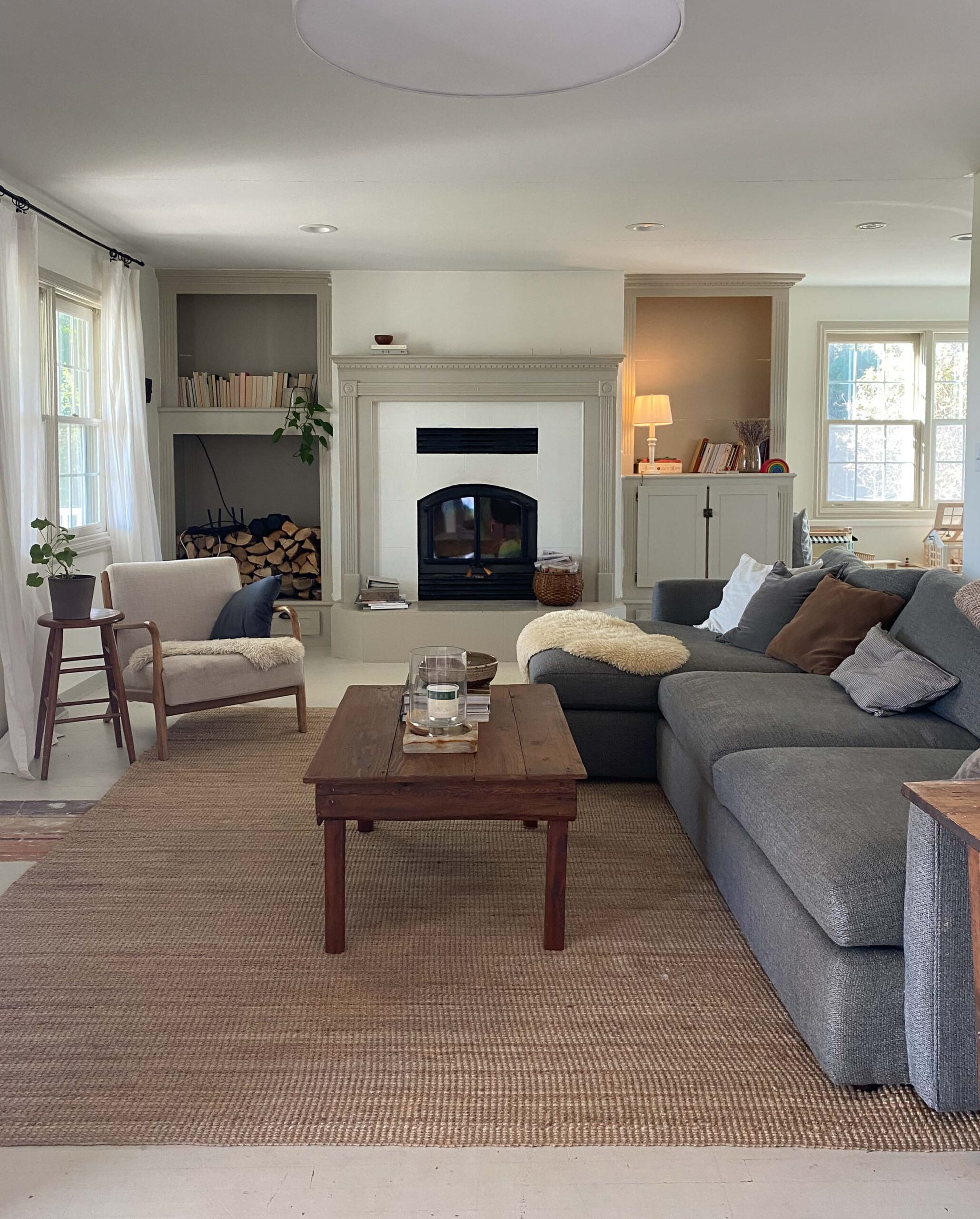
I absolutely love dreaming up ideas for spaces and it’s even more fun when I can do it with real spaces in your homes! Last week I asked my Instagram followers to submit photos of a room in your home that you want to see how I would design it. It was so fun to see your spaces! I got “start from scratch” spaces and “help me work with what I’ve got” rooms but when @bshug3 submitted photos of his living room, I couldn’t stop thinking about that massive window…I mean look at it!
To clarify, there is nothing wrong with this living room as is and I love so many aspects of what is already here. But in the spirit of this Reader Room Virtual Makeover series, I’m gonna share how I would design this living room.
Because I believe visuals help bring a concept together and showcase ideas in a much more understandable way, I partnered with Foyr Neo to make my 3D renderings! Foyr Neo is a web based interior design software company that provides the tools you need to make your own 3D renderings! I’ve used this software for a couple months now and it is honestly the only platform I’ve used that’s BOTH user friendly and highly customizable! I 100% recommend to designers and homeowners and I think once you see the visuals below you understand why! 🙂
So here is my vision for the space –
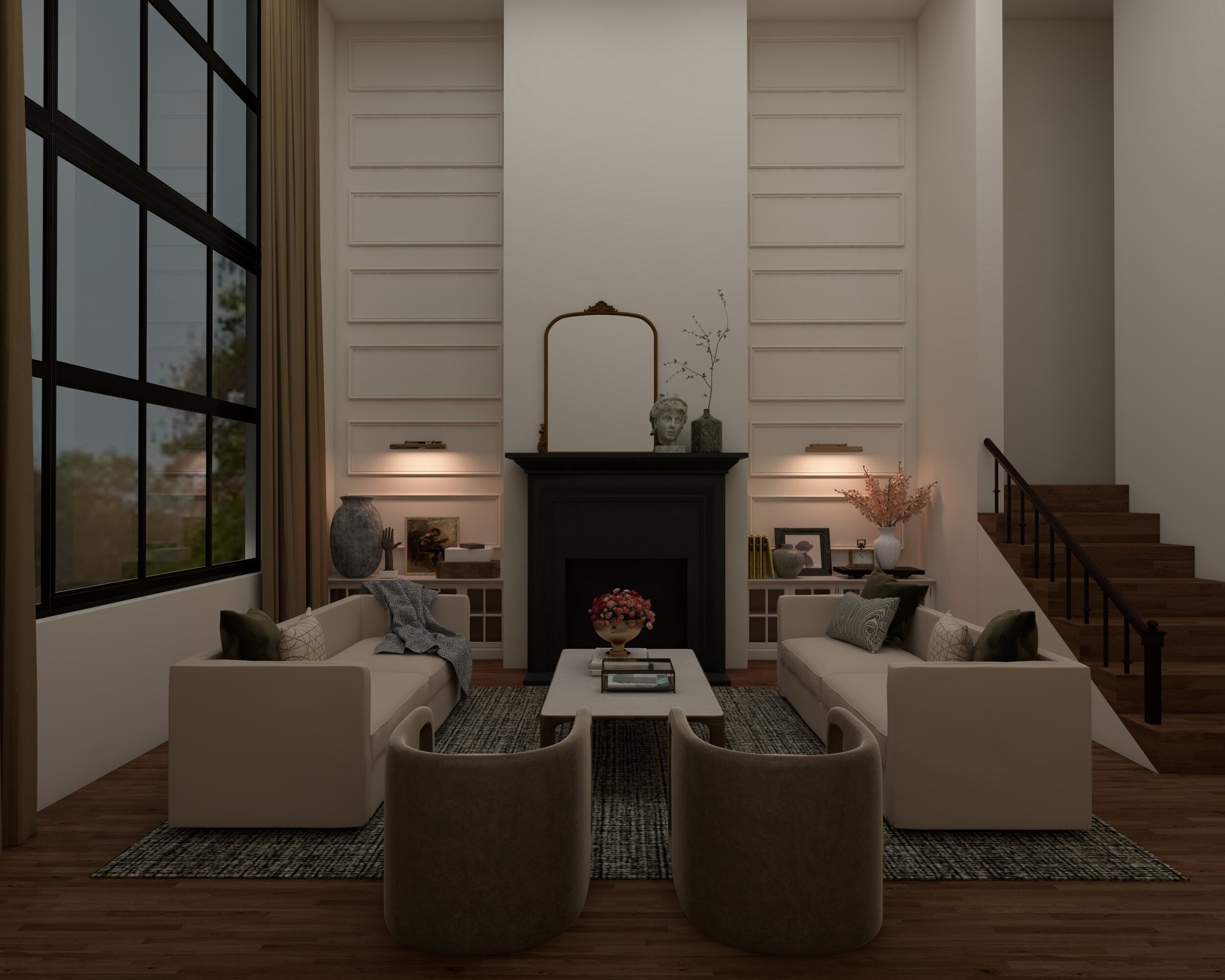
Designed by Nadine Stay using Foyr Neo.
The homeowner said he liked “moody and masculine” so that’s the vibe I’m going for. Starting with the window which is the most obvious feature wall, I would paint the frame black. I love an industrial style window and black muntins (the grids between each window) are a quick way to get a masculine feel. Plus it would make the window stand out even more!
(Note: You may be wondering if this means you’d need to paint the rest of your windows black too and the answer is, it’s up to you! You certainly can, but because this window is so obviously a statement window, you can get away with painting just this window black and leave the rest white.)
Designed by Nadine Stay using Foyr Neo.
Moving over to the fireplace wall, I’d simplify the lines. In order to draw the eye up and highlight the incredibly tall ceilings, I’d eliminate any lines that cause the eye to stop short of the ceiling. To do this, there are three things I’d change that require a bit of construction. 1) If you look just above the fireplace in the original photo above, you’ll notice that the wall cuts in. Instead, I’d bring the wall straight up to the ceiling for a clean line. 2) To further help draw your eyes up, I’d also remove the bookshelves on either side of the fireplace and replace them with shorter built in cabinets. The top of the bookshelves created an invisible ceiling that the brain subconsciously views as the height of the room, but when you lower the cabinet, the room feels much taller! 3) The wall to the right of the room hides a staircase and stops at the stair landing. Again, to bring your eyes up, I would bring the partial wall all the way to the ceiling and add railings to the lower portion of the stairs.
Designed by Nadine Stay using Foyr Neo.
I love a dark fireplace so I would paint the brick and the surround satin black. This would also contrast beautifully against a creamy white wall. I love creamy white/super light beige walls because it creates warmth but it’s still light and neutral allowing for lots of color options in furniture and decor. Plus this living room appears to be connected to several other rooms so this color would most likely get painted in the adjoining rooms too…best to keep it neutral. I “painted” the walls Shoji White by Sherwin Williams…(Thanks Foyr Neo for offering real Sherwin Williams colors! All the hand claps for that!)
Designed by Nadine Stay using Foyr Neo.
The box trim mouldings on the either side of the fireplace further highlight the tall ceilings and create a subtle statement when painted the same color as the wall. Now let’s decorate! A warm gray, green, and black textured rug is a great moody foundation to work with. I’d pair a set of off-white sofas on either side of the fireplace and two modern barrel chairs in a brown velvet fabric to add both dimension and another layer of texture.
I played around with curtain panel colors (which Foyr Neo actually makes incredibly easy to swap between their 100’s of fabric choices) and I had to go with a tone on tone look. I’d bring in floor to ceiling curtains in a brown linen fabric and for an extra luxe look, you could let the panels puddle on the floor! (Bonus: the brown fabric brings more of that moody factor we’re going for.)
And this concludes what I would do with this reader’s living room! What do you think guys?? Is this vibe something you could copy in your home?!
COPY THIS LOOK –
Scroll to see more →

Curious to know more about Foyr Neo, the 3D rendering program I used to create this virtual makeover!? You guys…it’s soo good! Hopefully this info will help –
Is Foyr Neo for homeowners or interior designers?
Both! Because this software is so incredibly easy to use, you don’t need to be a trained professional to create your own renderings. My husband Chris tested it and created some of his own beautiful renderings in just a few hours! But it is also highly customizable with TONS of furniture, decorative objects, and wall art so if you’re a designer, you can create a look with pieces that actually look like the products you’ll use.
Do I need to download software onto my computer?
Nope! Foyr Neo is entirely web based meaning you don’t need to download anything in order to use the program! You can work on multiple projects at once and you can save all your work to the dashboard for future reference.
Where can I learn more about Foyr Neo?
Check out their website! They have all their services and pricing listed online!
Start your 14 day free trial and create your own 3D renderings at foyr.com! It’s the best I’ve tried yet and I only recommend programs that I have used and love!
Where behind the scenes, exclusive advice, and candid conversations are sent straight to your inbox every week.


