It was just a few months ago (the end of February to be exact) that we decided to open a podcast recording studio! Over the last 5 months we’ve worked tirelessly to prepare this studio space.
Our initial studio finishing day was supposed to be June 1st and…well needless to say we didn’t meet that deadline. But now we are done and ready to share the reveal!
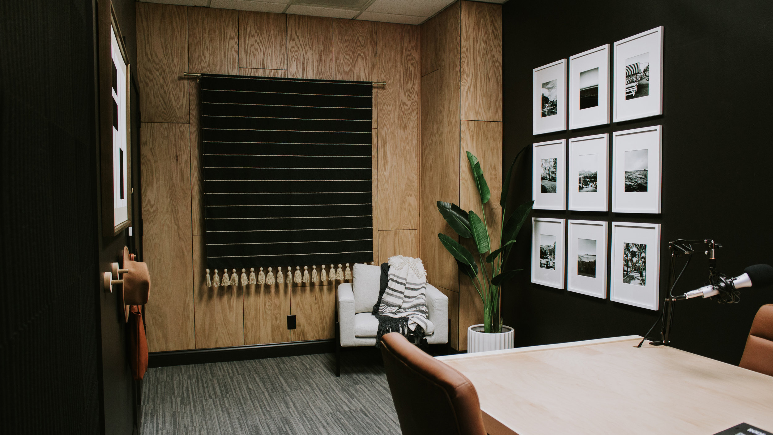
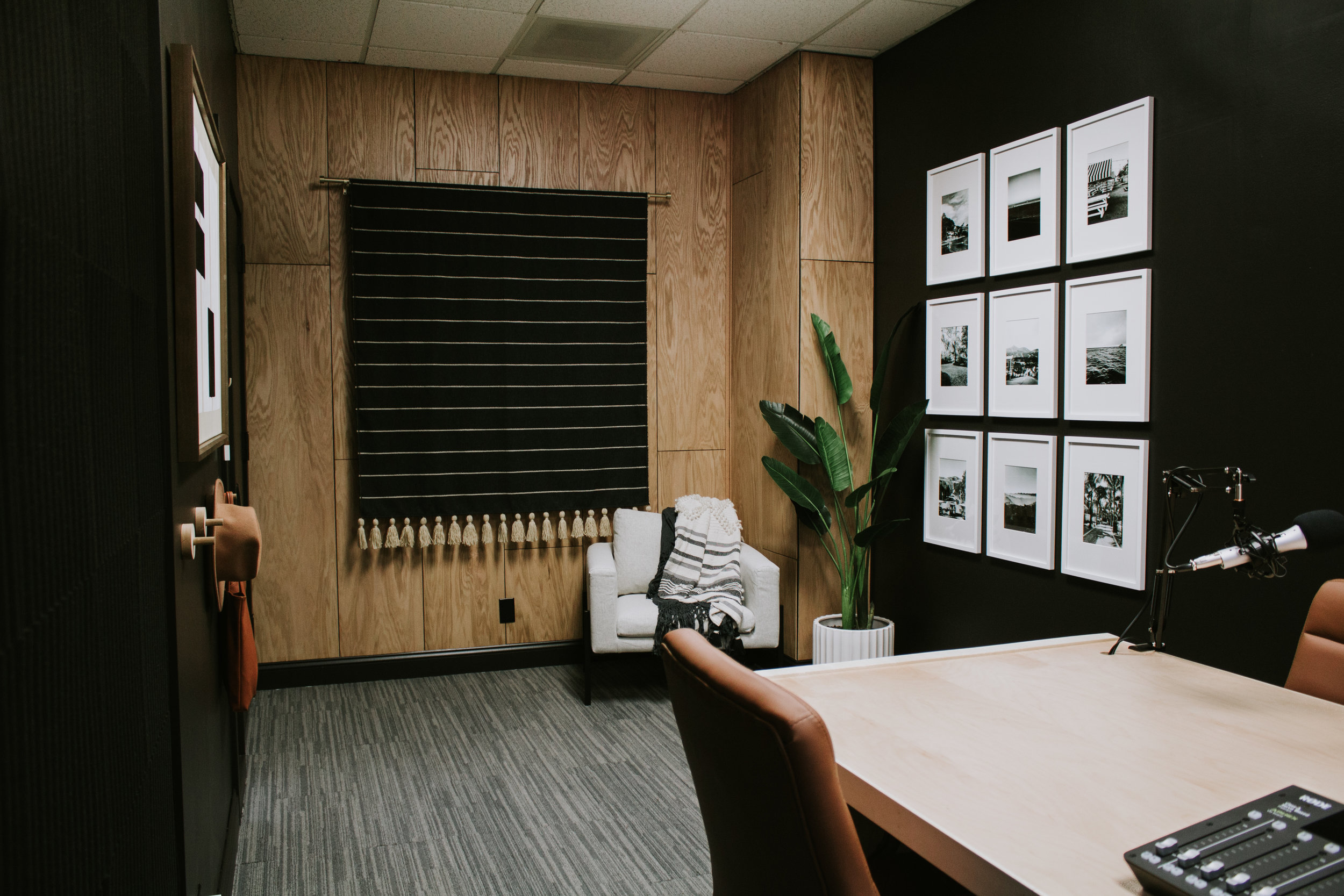
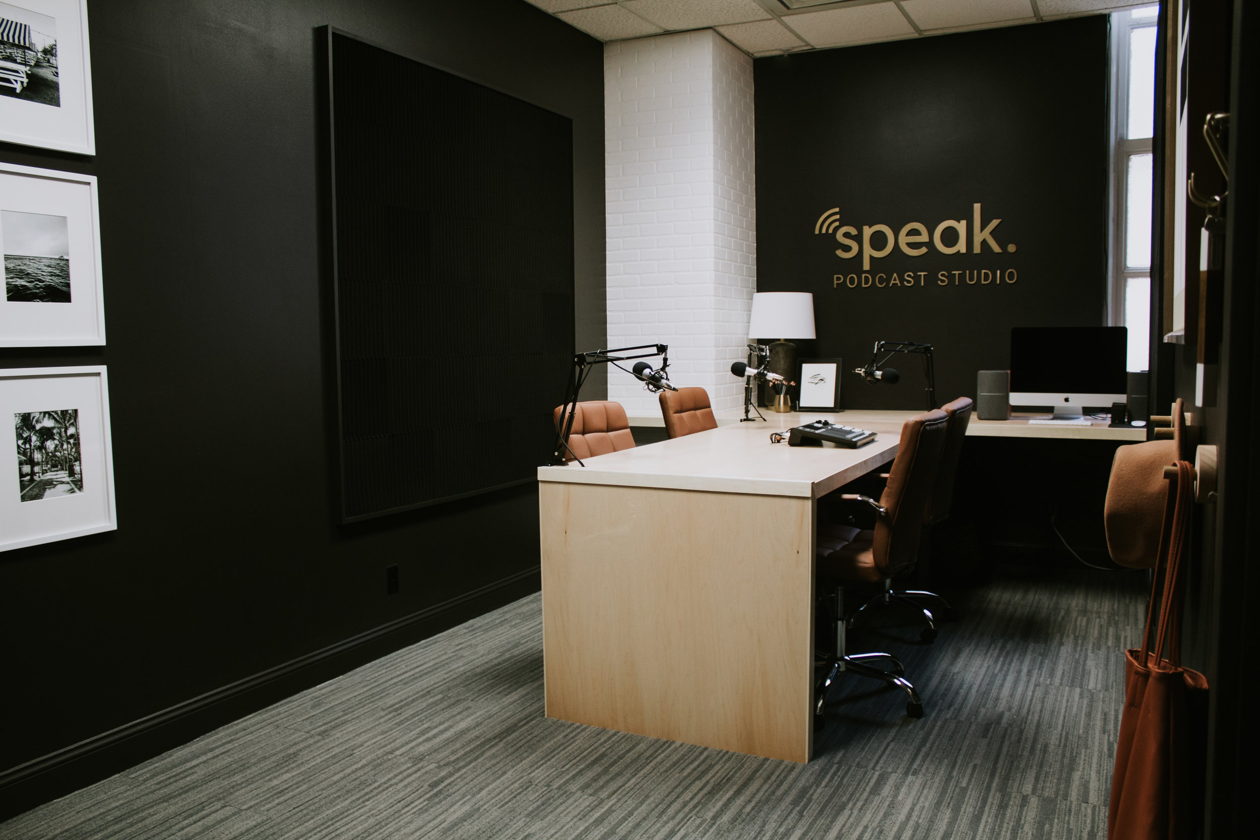
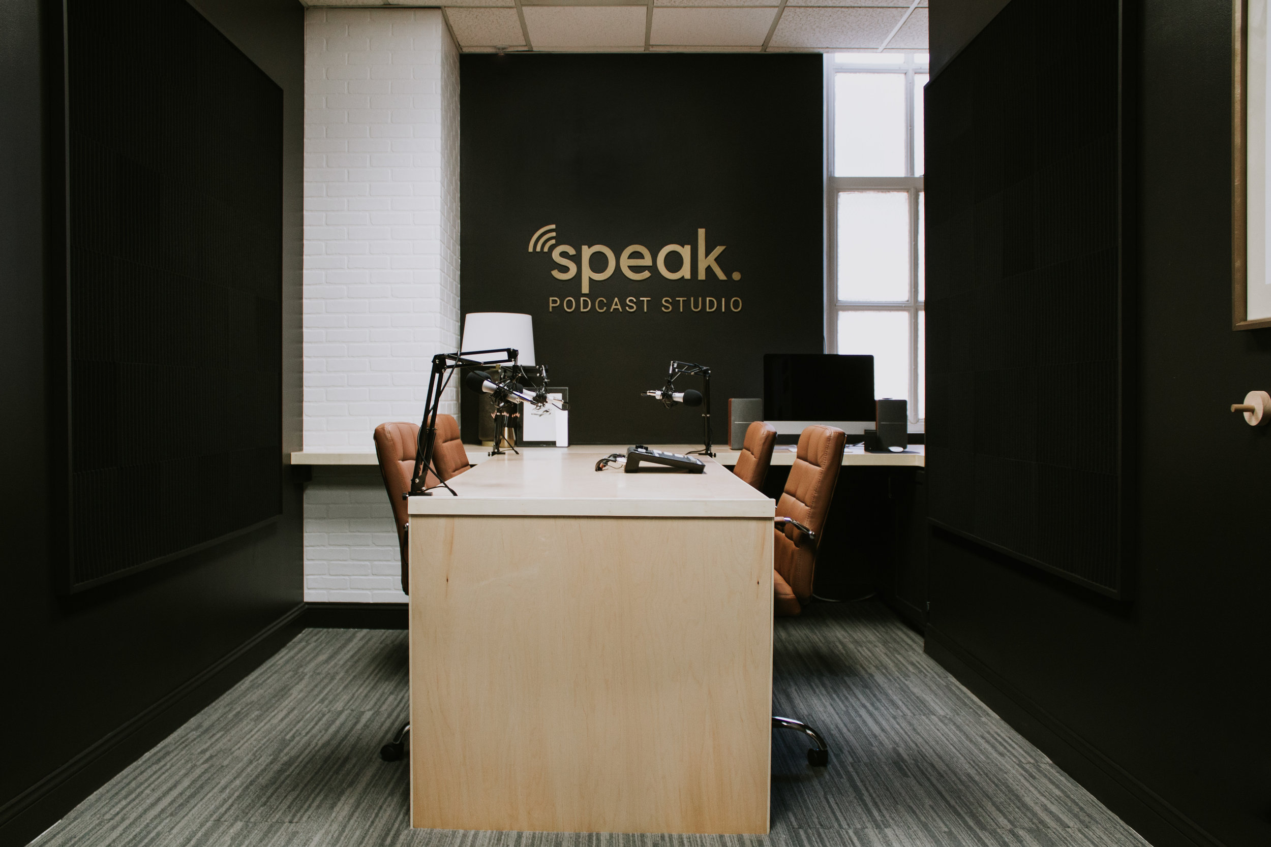
When it came to the studio, we were very intentional about making this space feel warm, inviting, and comfortable so that we would be able to have real, free-flowing conversations in a relaxed environment. With some new paint, a few feature accents, and gorgeous furnishings, we were able to put together a functional and comfortable podcast recording studio!
Let’s take a look at the transformation!
BEFORE
AFTER
BEFORE
AFTER
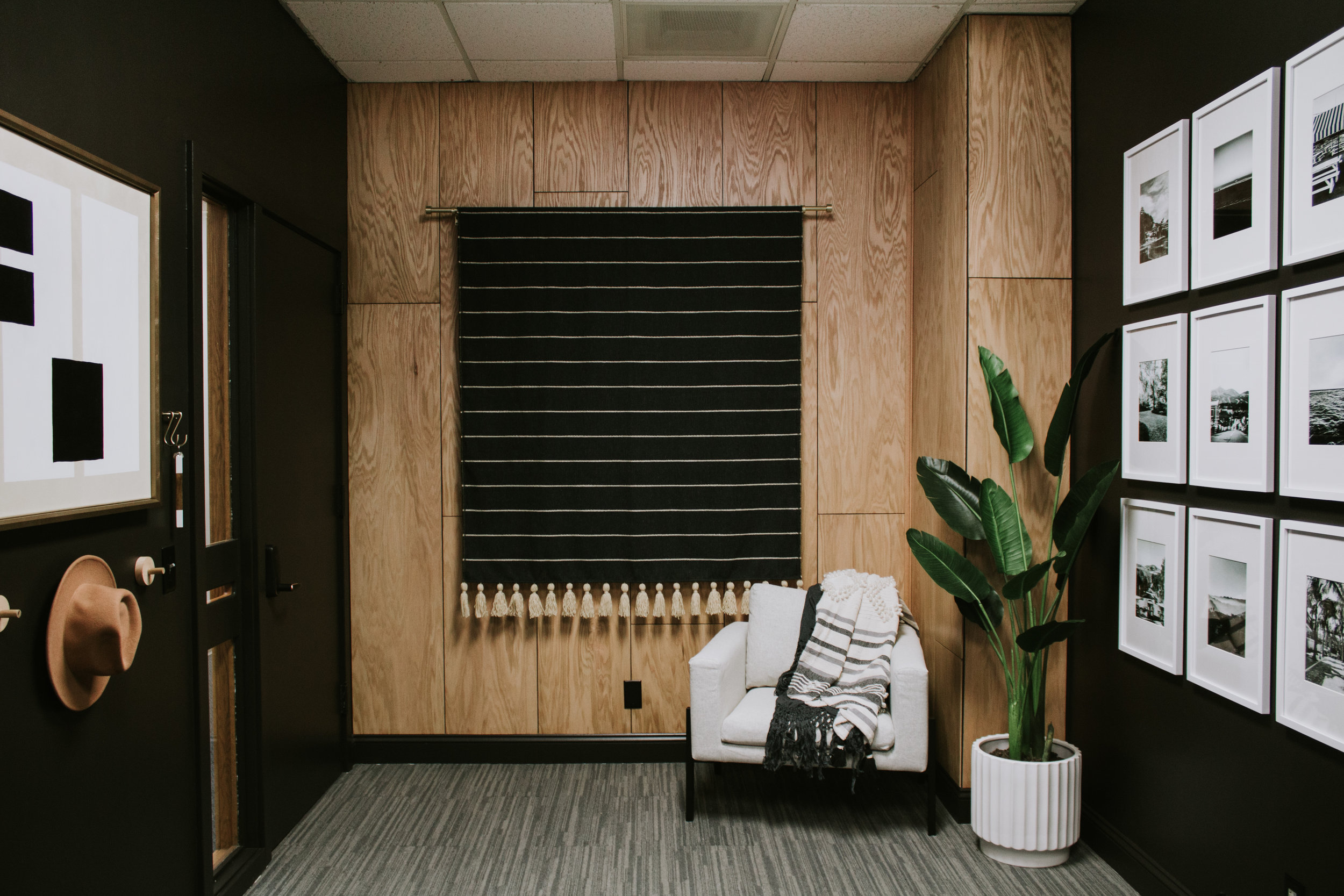
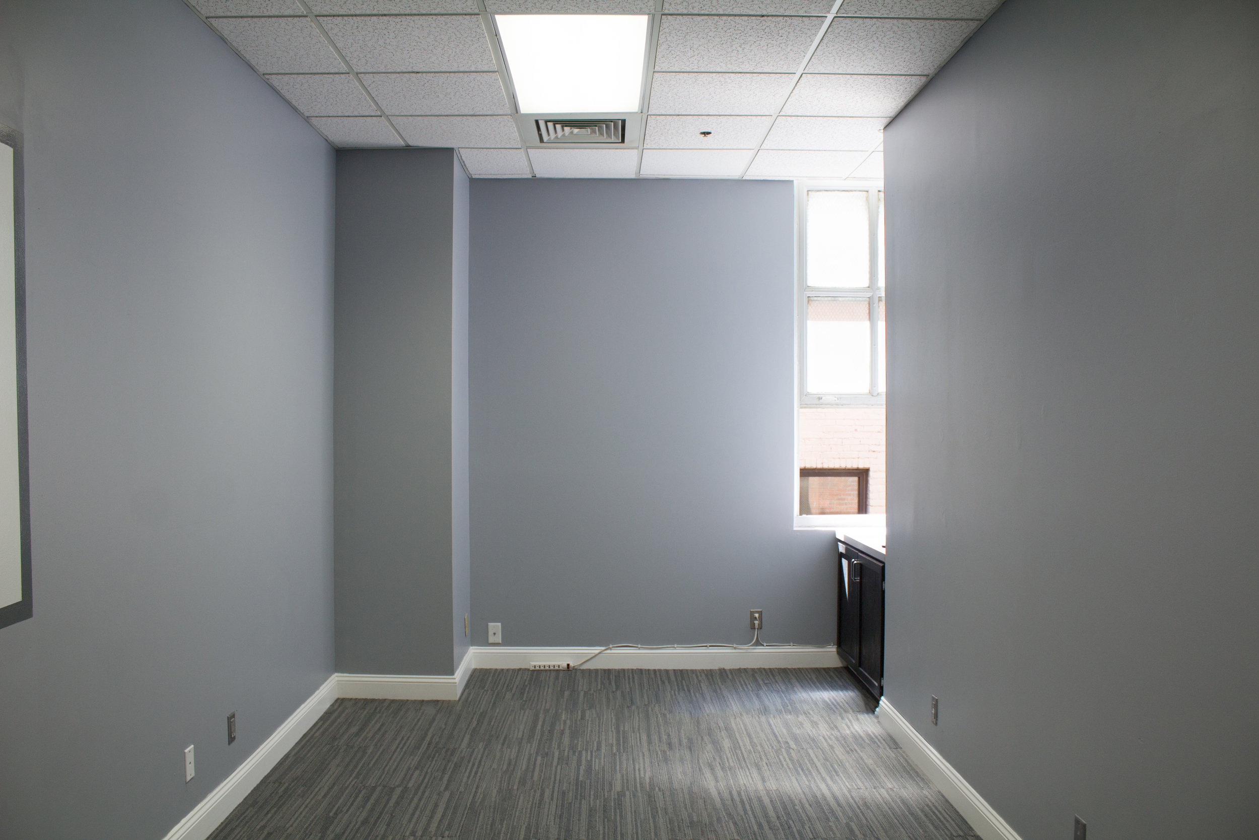
It’s crazy how a coat (or 3) of paint can transform a room all on its own. The blue walls just were not the vibe we were going for so we went for a moody look with black paint on the walls, trim, and doorway.
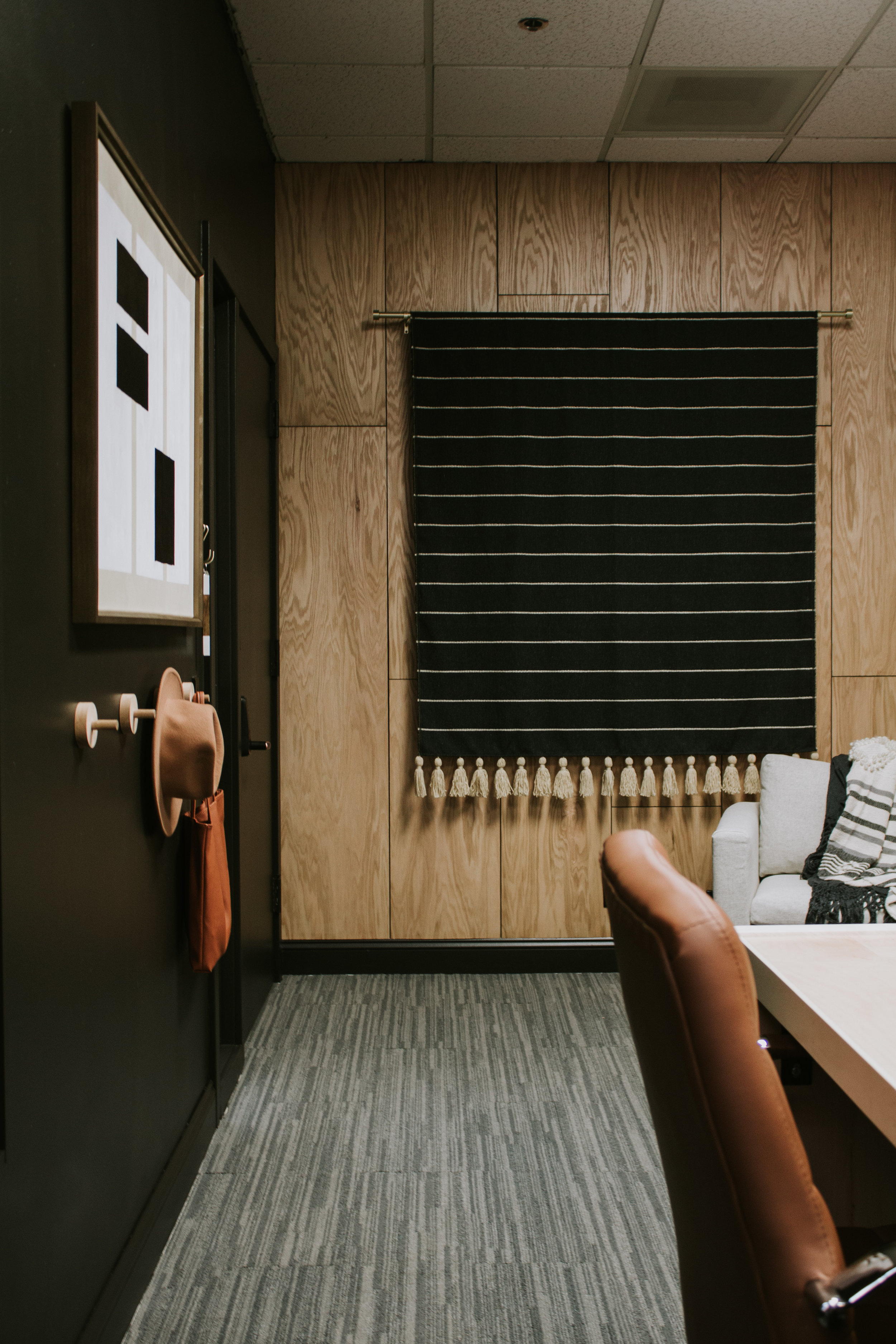
I knew we were going to have a large wood desk on one side of the room, so in order to balance the visual weight of the room I decided to create a feature wood wall on the other side of the room. It really warmed up the room and kept the space from feeling like a black hole. (See the plywood accent wall tutorial here)
To be honest, we almost didn’t pick this space when we were touring offices because there was no natural place to put a large desk for clients to record from. There was an awkward bump out in one corner of the room and a cabinet in the other corner. After a little brainstorming, I decided to turn the bump out into a faux brick chimney. Suddenly that awkward corner felt right; as if it was supposed to be there all along. (Read the full DIY faux brick chimney tutorial here)
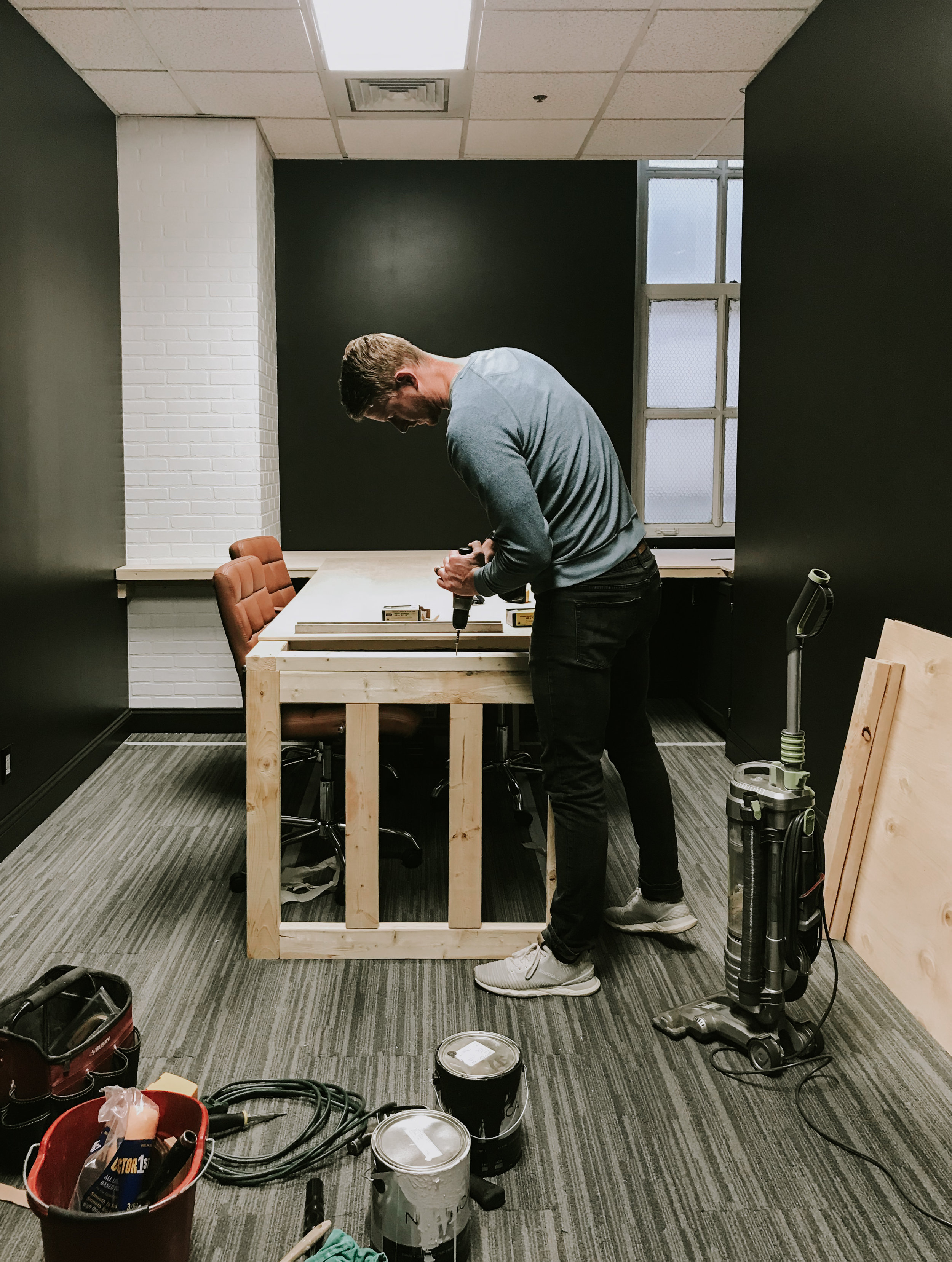
As for the cabinet under the window, we decided to build the desk right over top of it! It’s actually quite convenient having a little hidden storage.
Since we needed a custom desk to fit around the chimney and cabinet, we ended up building it ourselves. After a few days of debating, we decided on a T-shaped desk with a waterfall edge. This shape gives us plenty of work space and the waterfall edge hides those unsightly cords that seem to multiply by the day!
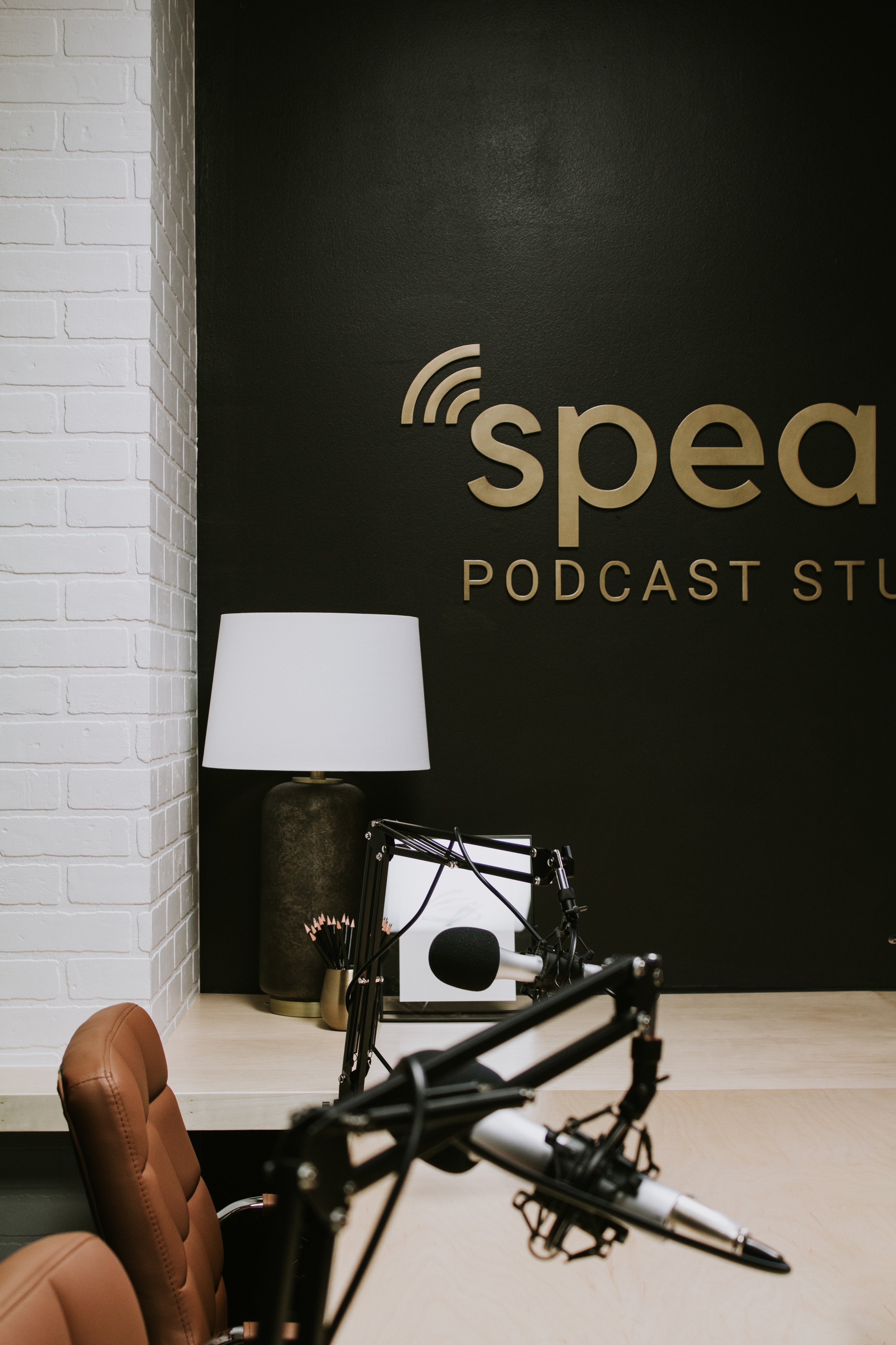
From there it was simply filling in the space with artwork, tapestries, sound panels, decor, and our endless pile of podcast equipment. We mounted black foam panels on either side of the desk to absorb sound and we hung a tapestry on the wood wall which serves as another layer of sound absorption.
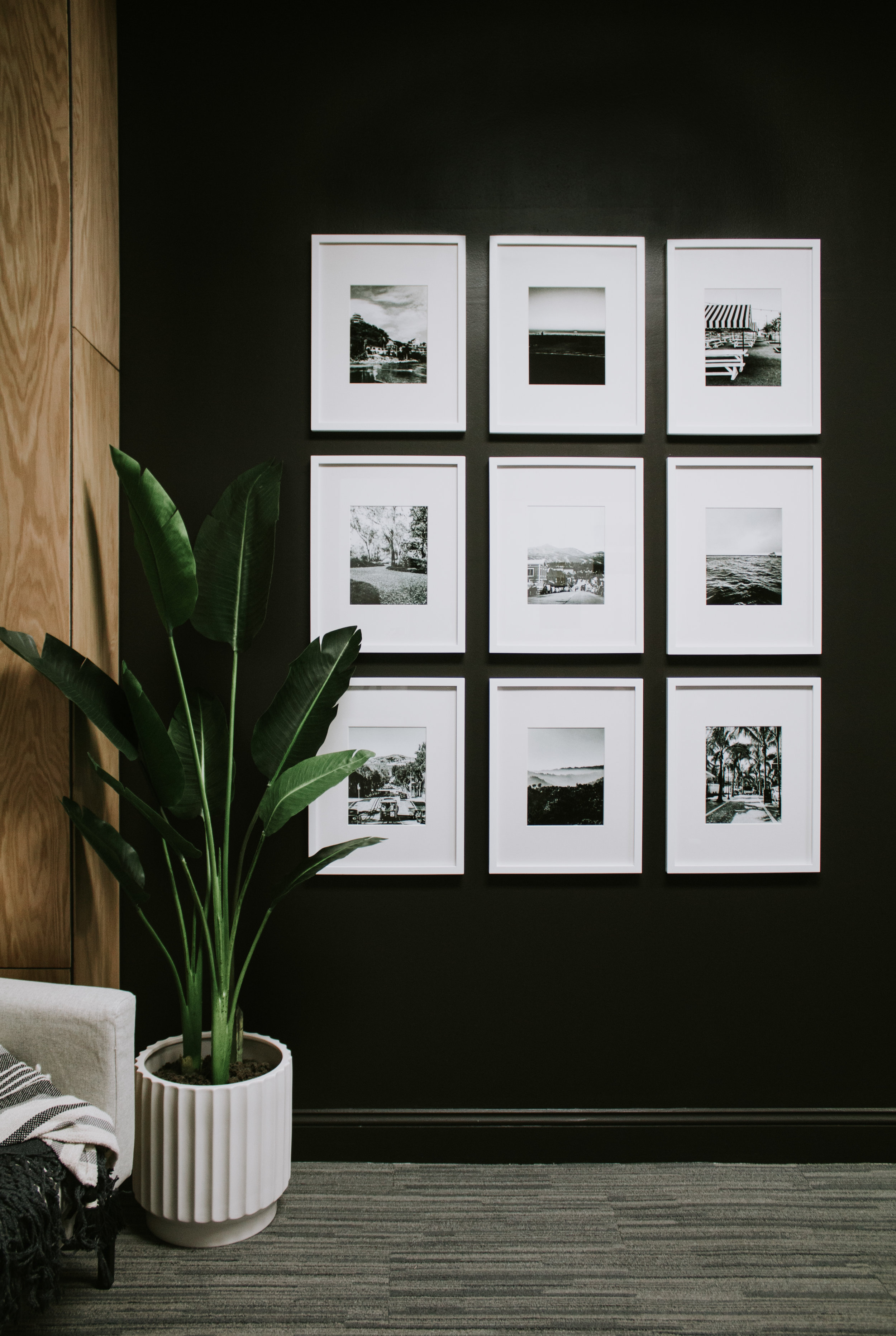
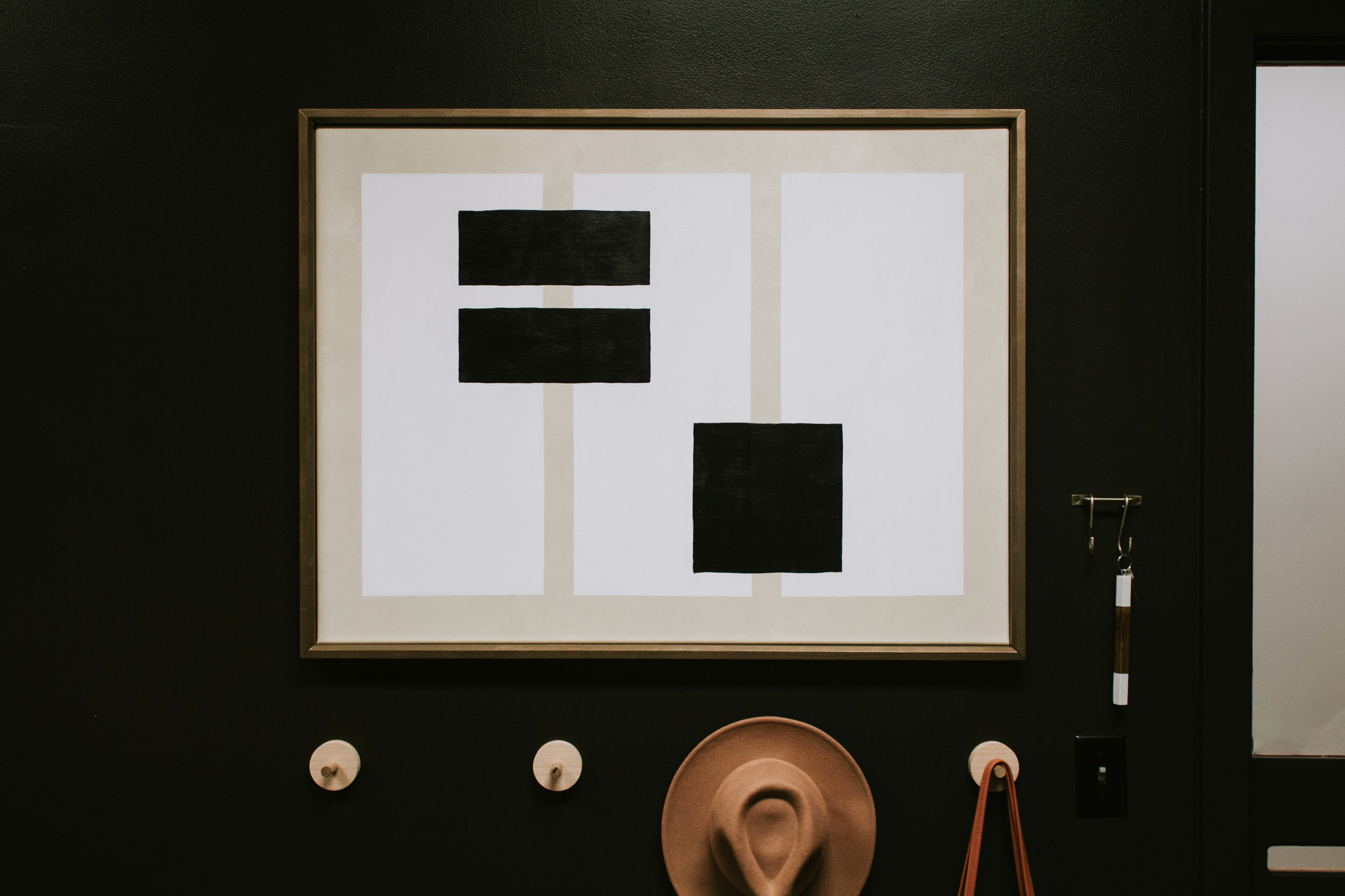
We kept it simple with the artwork and accents.
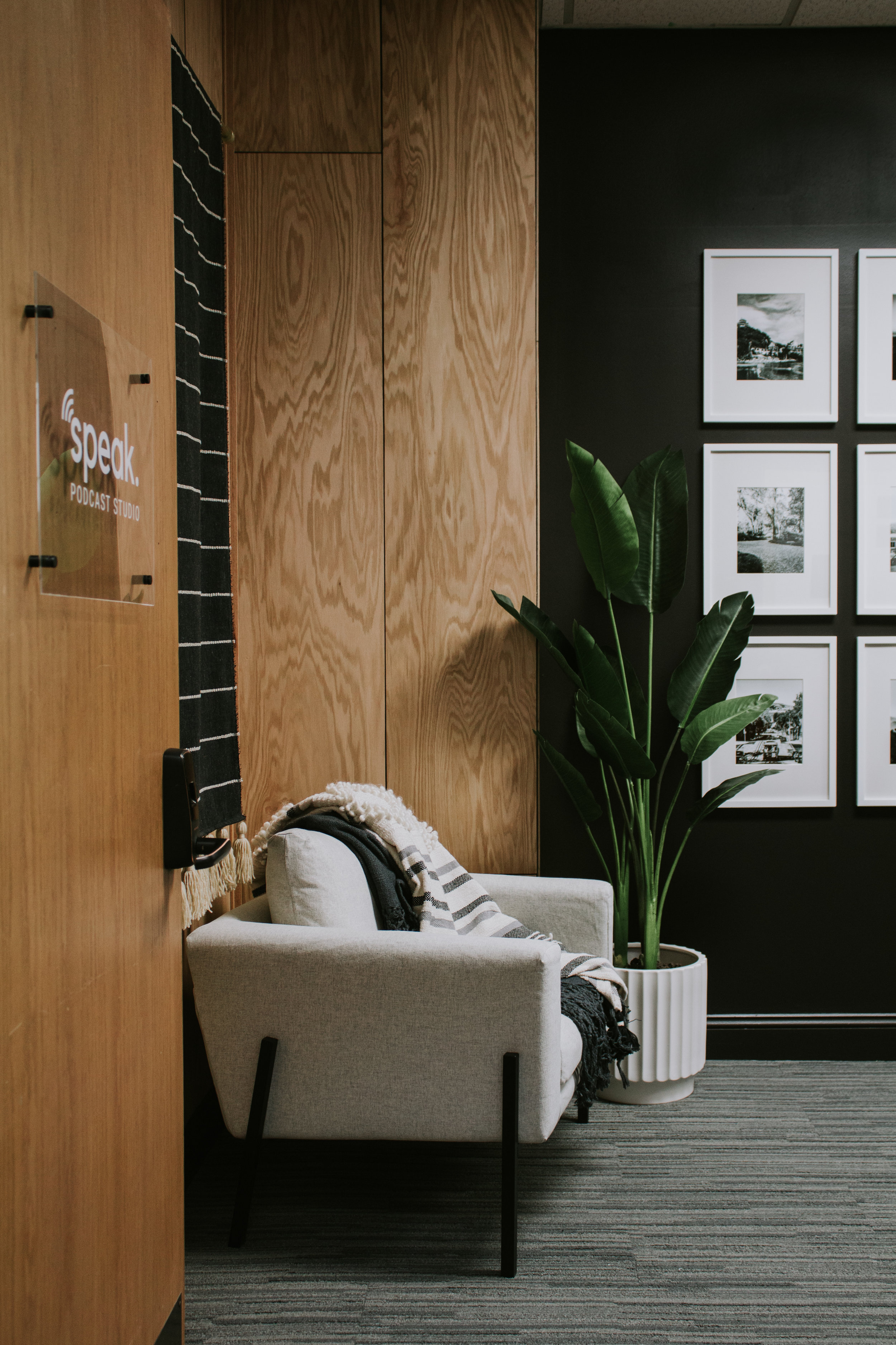
Our bird of paradise plant is the perfect colorful addition to this black and white room.
The grid gallery wall features black and white photos from our favorite trips.
The geometric painting (made by yours truly) features black, white, and light beige shapes. DIY tutorial coming soon.
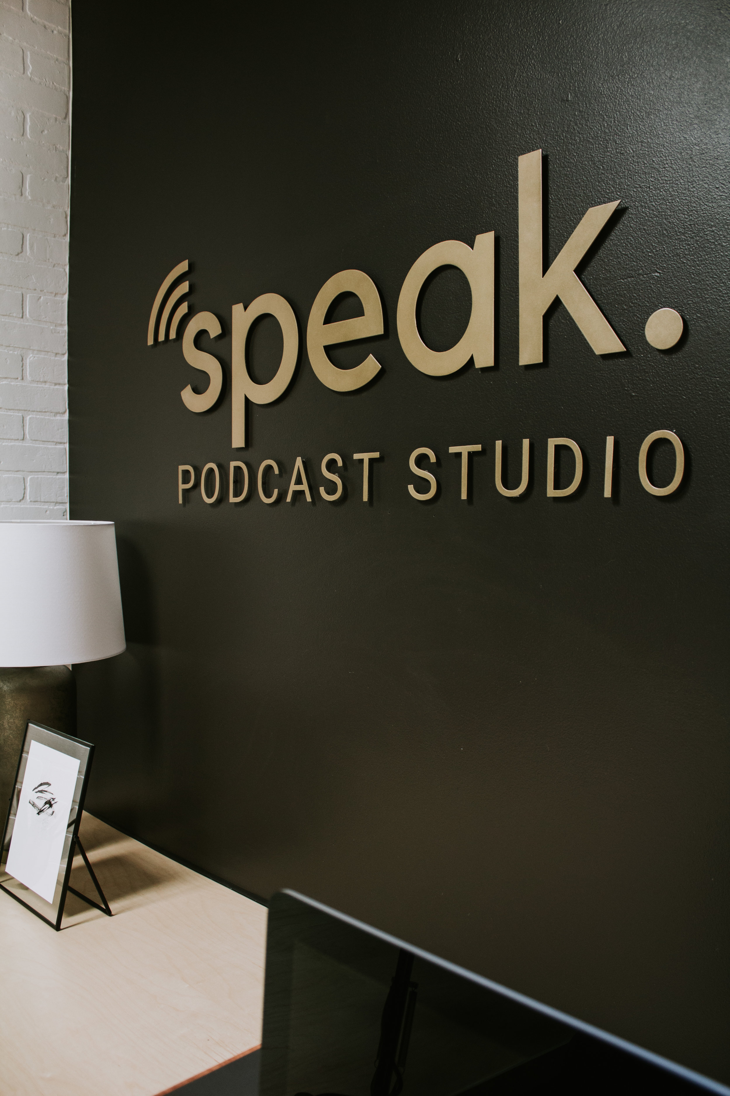
Of course we couldn’t complete this space without a killer logo! I designed the logo myself and I found a local company (T&S Metalworks) who could make it! I love the look of antique brass against a stark black wall and I was more than happy with the finished look! I wanted each letter to sit 1/4″ off the wall which meant that installation and glue dry time took 24 hours long (roughly 22 hours longer than we anticipated). But SO worth the extra work!
And that’s the full tour of Speak Podcast Studio! Tackling this project was such a fun challenge because we had to work with the existing space and couldn’t make too many alterations. (The joys of rented space) But honestly, sometimes it’s those awkward spaces that turn into the most stunning features because you had to get creative and think outside the box!
STUDIO SOURCES:
Geometric Artwork (painted by yours truly – DIY tutorial here)
Leave a Reply Cancel reply
Where behind the scenes, exclusive advice, and candid conversations are sent straight to your inbox every week.









Really nice work. I’m thinking of doing a custom desk. What did you use for the desk top and front side panel
Hi Kevin, we just used oak veneer plywood!
Which color paint did you use for the walls? It’s a beautiful black color.
Somehow I forgot to write down the color unfortunately!
This is so inspiring
loved it!!! thank you for the tutorial. Very nice! greatings from Chile
Thank you! So glad you like it! 🙂
Hi, what was the approximate cost of this?
What is Speak for? Is this a company and are you guys still running the studio?
What a stunning job you did. I love it!! Thank you for a great tutorial. I’ve been looking for inspiration and found it here. Best of luck!
I’m so glad to hear this! Thank you so much!
The studio looks fantastic! Great job!
Thank you so much! 🙂