Last time I did a room makeover with a budget breakdown, you requested more like that and I’m so happy you did because these are some of my favorite posts to create! I love designing a room with a budget in mind and giving you links to everything so you can literally just copy and paste.
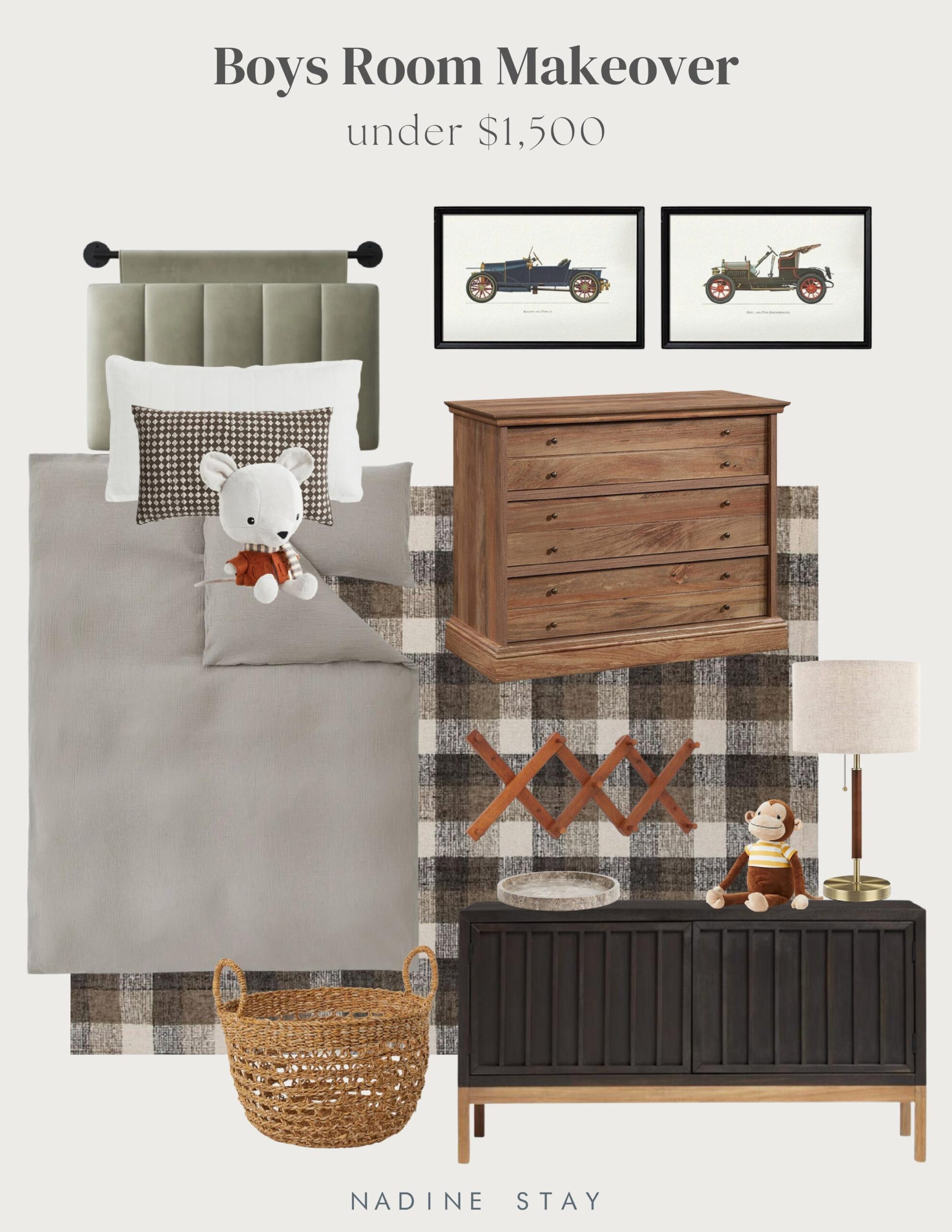
Today I’m designing a room I’ve never done before – a kid’s room! I wanted to create an elevated boys room that still felt young and playful. Something that both you and your child will enjoy looking at. But more importantly, I made it budget friendly because we all know how quickly kids grow out of things and how rough they can be on a room. Quality pieces that are easy on the budget was my focus with this makeover.
Phase 1 of a room makeover starts with a rug. The color palette, the feel, and the size all helps me make decisions moving forward. This plaid rug has a stunningly warm color palette that leaves a lot of room to add color if you’d like. Check out this rug guide to see what size rug you should get. The next thing I like to pick out is the headboard. This channel tufted hanging headboard is so unique and soft for bedtime stories.
I like to keep bedding pretty neutral so that it ages well and a taupe duvet cover paired with an ivory windowpane pillow and a diamond patterned lumbar is perfectly simple, but certainly not boring! These pieces alone would be a perfect mini refresh! A new rug and new bedding makes such a big impact.

I love a functional nightstand and a three drawer dresser is my go to. The price of this one is actually SO good! If you’ve got two kids sharing a room, add a second bed and tuck the nightstand right in between the beds! If you need a dresser, I always recommend checking out thrift stores or facebook marketplace and paint it or sand and stain it to your liking. That will be a MUCH cheaper route than anything new and you won’t feel quite as sad when it inevitably gets dinged up.
But if you need a stylish solution for hiding toys, books, shoes, or even clothes, this black media cabinet is everything! It’s the best price I could find for something this beautiful and it hides the mess behind closed doors!

For another $200, you can start to fill in the room with all the cute decorative pieces. A stuffy or two for the bed. A basket to throw toys or blankets in. A pair of vintage car prints that I think think would be absolutely adorable hung above the bed or the media cabinet. And an accordion coat rack for all the miscellaneous things.
It’s not too cutesy, but it doesn’t feel too adult either and that’s exactly how I like kids’ rooms! I’ve linked everything I included in this makeover below. Enjoy!

Leave a Reply Cancel reply
Where behind the scenes, exclusive advice, and candid conversations are sent straight to your inbox every week.


Hi! LOVE this look for a little boys refresh! May I ask what ‘color’ the rug is? It looks more brown/blue in your picture and in the link the only thing compared would be khaki? Is this right?
Oh good catch, it looks like the original color isn’t listed on that site anymore. Try this link instead – https://rstyle.me/+5jgSkeYJu5aolivr-_6e7A
This is exactly what I’ve been looking for ! Do you think black brown bookshelves would fit with it?
Definitely! That’d tie in with the nightstand and black would fit in seamlessly.
This room is AMAZING! Already purchased the rug, not I’m struggling to find curtains that would work with my white walls – green, brown, linen?
Danica! This is amazing! I have two little boys and I always love to see budget yet cool ideas for them that are elevated and not "themey". You would think it would be easy … it’s not always. I love this scheme. I’m also in the process of doing my sons’ shared bedroom and this has come just at the right time. Thank you x
Thank you!! I know exactly what you mean…I love a "themeless" kids room! Hopefully this gives you some ideas for your sons’ room!
This is SO good! And perfect timing…refreshing my fourth grader’s room as we speak! I always love your application of light and dark in these designs. Keeps things just a bit edgy, which I prefer. Thanks for another great design board!
Gosh thank you! I hope this sparks some ideas for you!! 🙂