This article contains affiliate links.
I’ve been in design for 9 years now and the most frequent questions I receive are hands down about color. Whether it be “how can I add color to my neutral home?” or “what colors look good together?” Incorporating color into your home is either the most exhilarating part of design or the most daunting part of the process depending on who you ask. For those of you who struggle with picking colors that go well together, I’m on a mission to make color selection simpler.
Today I’m thrilled to start a new series that will be a deep dive into how to create a color palette for your home. This will be an extended series over the next couple of months and together we’ll learn what colors work best together, how to narrow down your color preferences, and how to incorporate those colors into your home.
There are 5 main color schemes that you can pick for you home and they each have a name:
- Complementary colors
- Analogous colors
- Split-Complementary colors
- Triadic colors
- Monochromatic colors
I’ll cover each color scheme category in the coming months, but today I’m focussing on complimentary colors and the 3 most common color palettes you can incorporate in your home. But first…what are complementary colors?
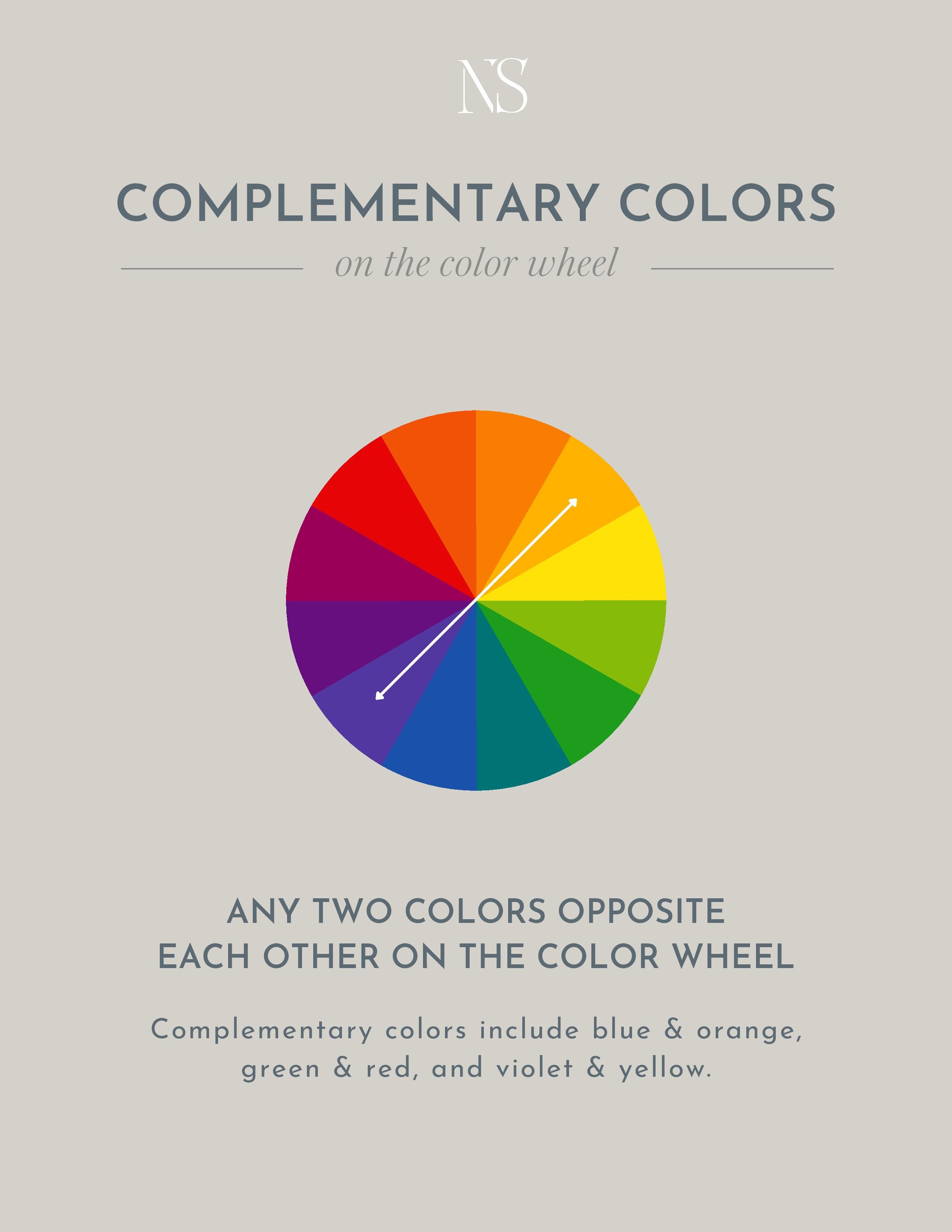
In the simplest of terms, complementary colors are any two colors opposite each other on the color wheel. They are the highest level of contrast. This mean that blue & orange, green & red, and violet & yellow are complimentary colors. But this also means that mixed colors like blue-green and red-orange are also complimentary.
If you’re new to color, complementary colors are a great place to start. They’re the easiest of the color combinations to create because you’re only working with two colors.
Let’s cover the three most popular complementary colors we see in design –
Blue & Orange
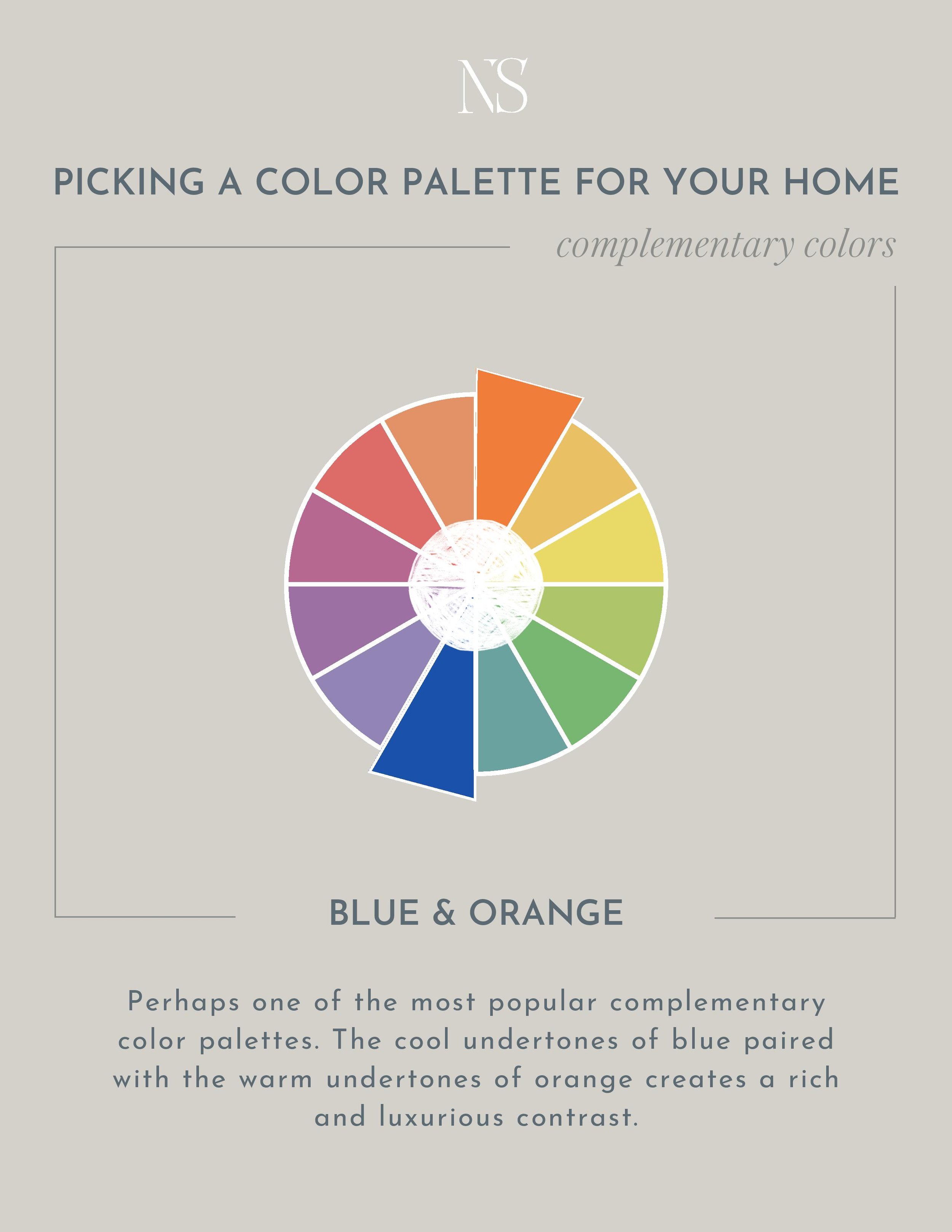
Blue is very welcoming and calming which is contrasted beautifully against orange’s energetic force. While you can implement this color palette with full vibrancy into your home, we often see this complementary color scheme with muted tones or tinted/shaded hues. For example, a navy sofa paired with a rusty orange rug.
The beauty of this complementary color combo is that orange can be represented in many ways. Whether it be paint colors, fabrics, leather, or even wood furniture and floors. And because orange can be incorporated so subtly through leathers and wood, this color combination is perhaps the most approachable first step to adding color to your home as it can still feel somewhat neutral.
TO GO BOLD: Pick one color to be the dominant color – the color that is most prevalent in the room. Generally that would be the wall color or wallpaper. Then, use the complementary color as an accent. A sofa, a rug, a throw pillow, or a side chair. Repeat both complementary colors in various patterns and textures throughout the space and add pops of white, beige, and black to ground the space.
TO BE SUBTLE: If your space is primarily neutral, you can still incorporate complementary colors as accents. Throw a pair of blue and rusty orange pillows on your beige sofa. Or get a set of rusty brown arm chairs to contrast against your navy sofa.
Blue & Orange In Designer Homes
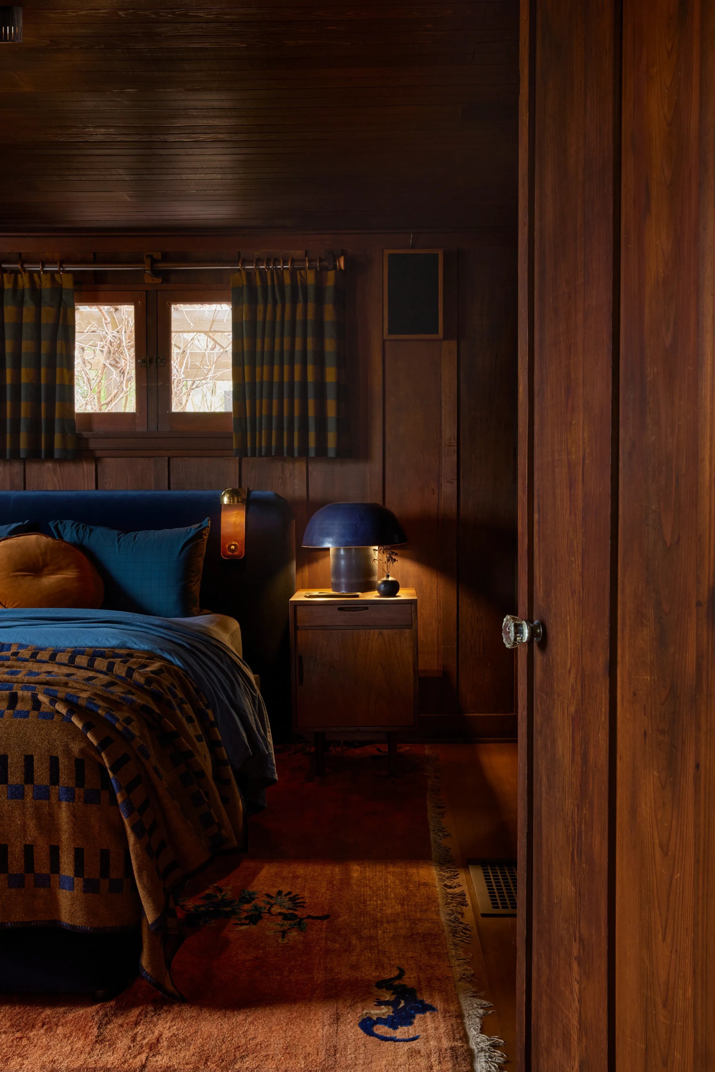
Above: Design by Hammer & Spear. Source: Architectural Digest
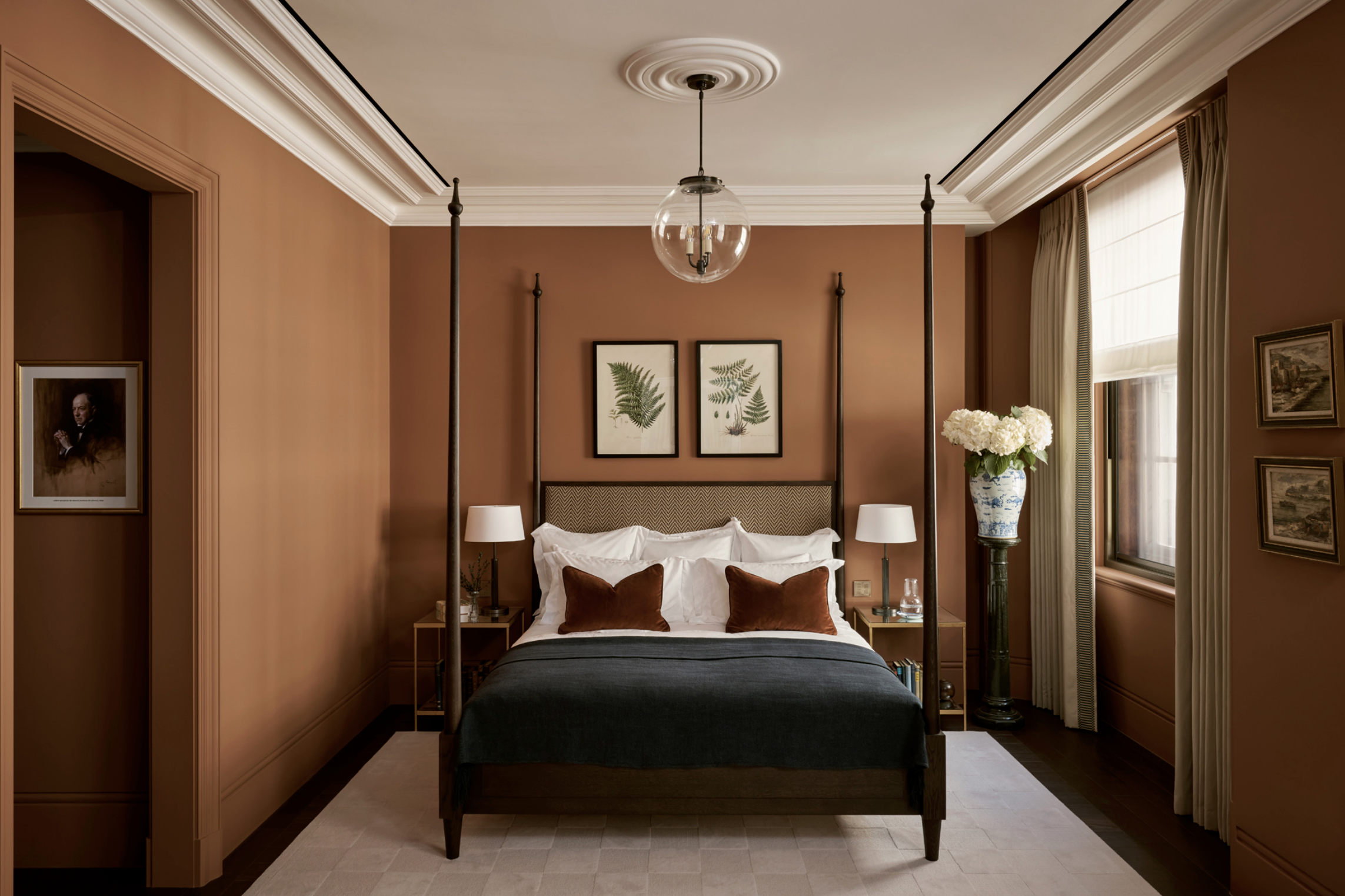
Above: Design by Albion Nord
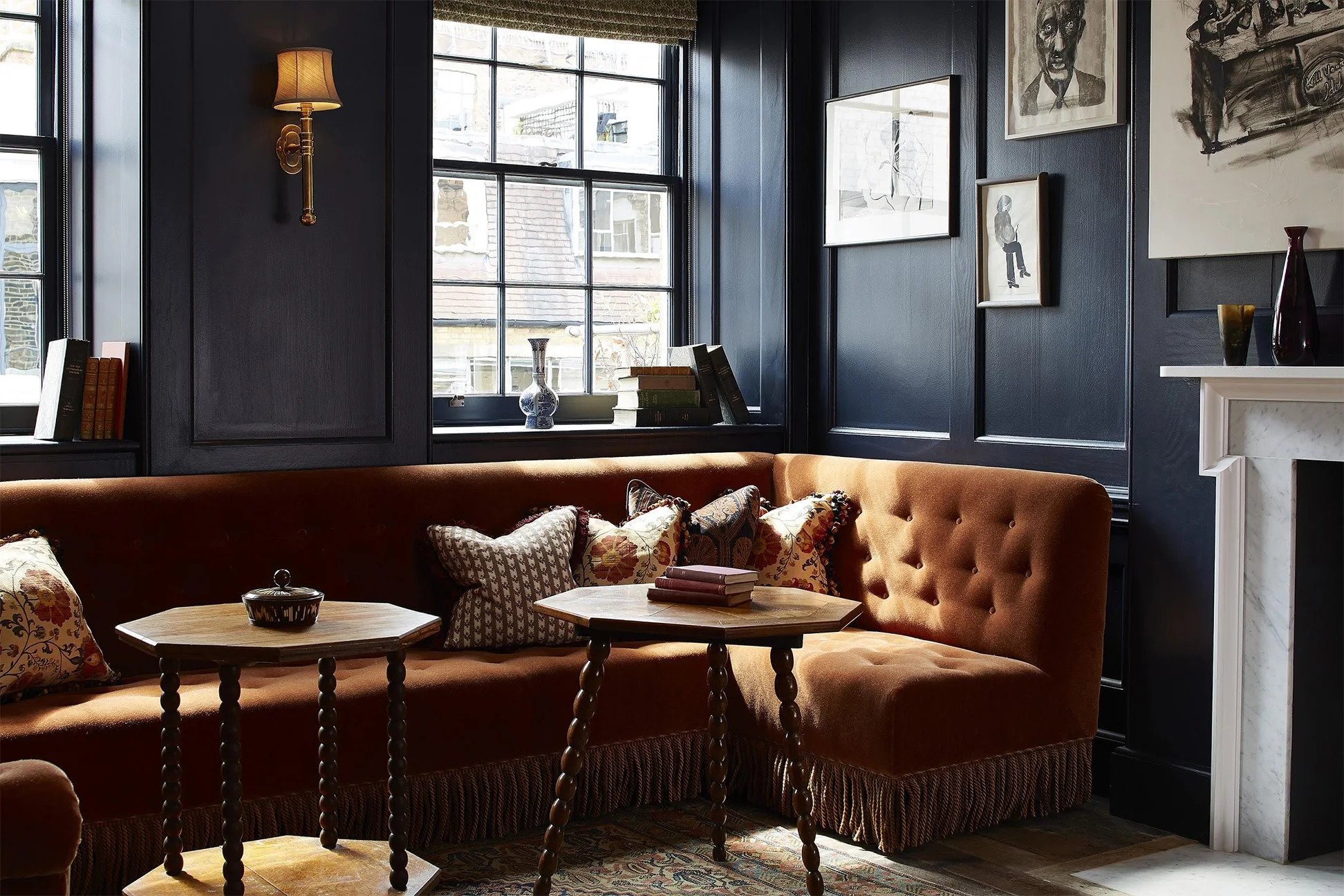
Above: Image via Domino of Soho House
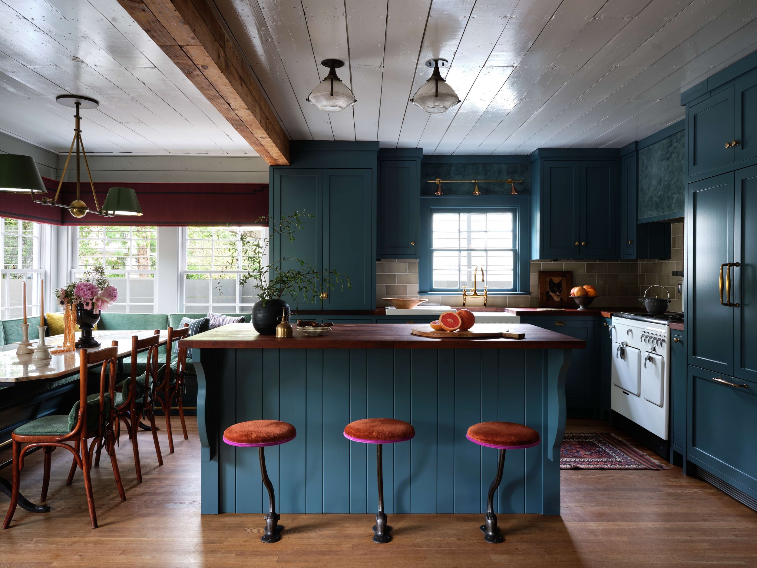
Above: Design by Avery Cox. Photography By Lindsay Brown
Red & Green
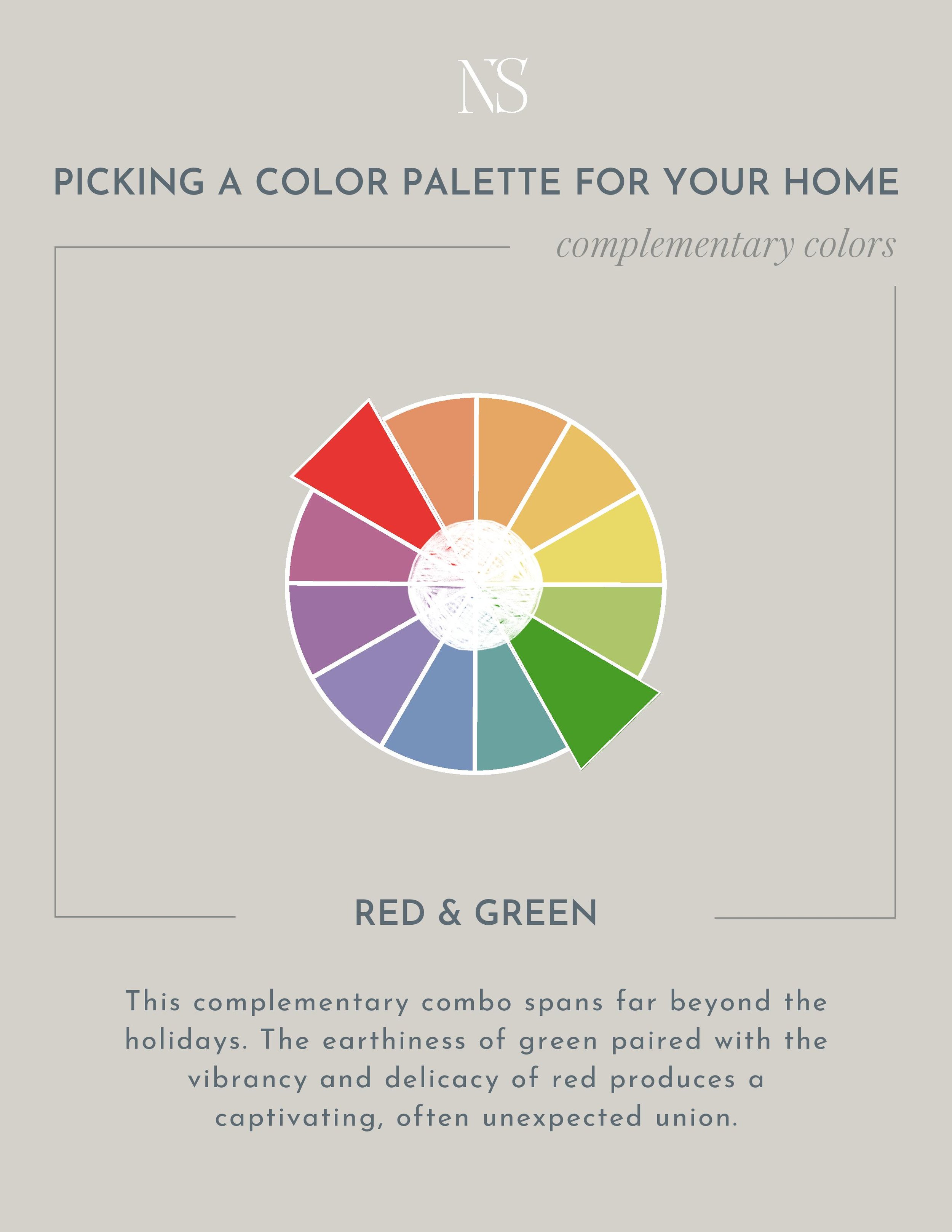
I’m not sure if this color combo is suddenly rising in popularity or if I’m just noticing it more because I’m looking for it, but green and red are everywhere…and I love it! In fact, it’s quite possibly my favorite palette at the moment. Of course when I say green and red, 90% of you are thinking Christmas. But I promise there are a million and 1 ways to design a green and red palette without it looking festive.
They key is to avoid using pure hues, but rather shades and tints of each.
TINT = A color with white added to make it lighter.
SHADE = A color with black added to make it darker.
Truthfully most colors you see in the paint store are either shades, tints, or tones of a pure color so it’s not hard to find that.
Red and green is the most intentional color palette because unlike orange, there are few metals or wood tones that naturally carry a green or red tone. (Aside from stark red wood and aged copper I suppose.) Most every time one of these colors is incorporated, it is intentional and apparent. And perhaps that’s why I like this complementary color combination so much.
I pulled together a handful of examples so you can see the many ways you can incorporate this color palette in your home.
Green & Red In Designer Homes
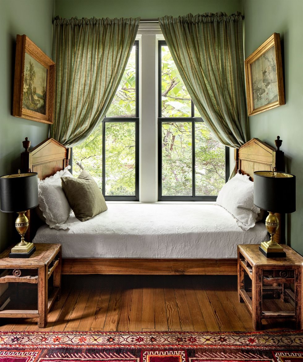
Above: Design by Thomas Woltz. Source: Elle Decor

Above: Design By Hadley Wiggins. Photography by Tim Lenz
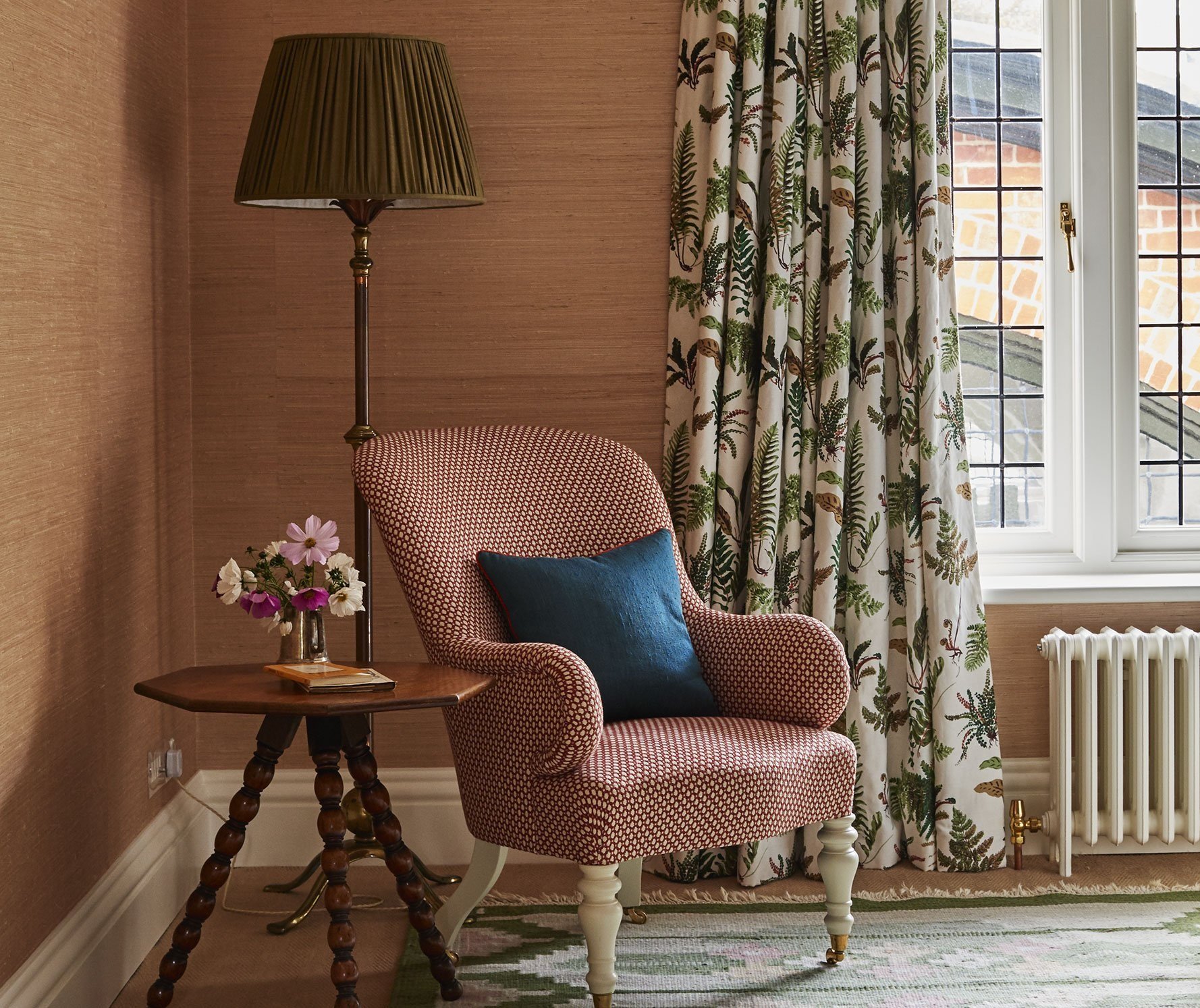
Above: Design by Ben Pentreath
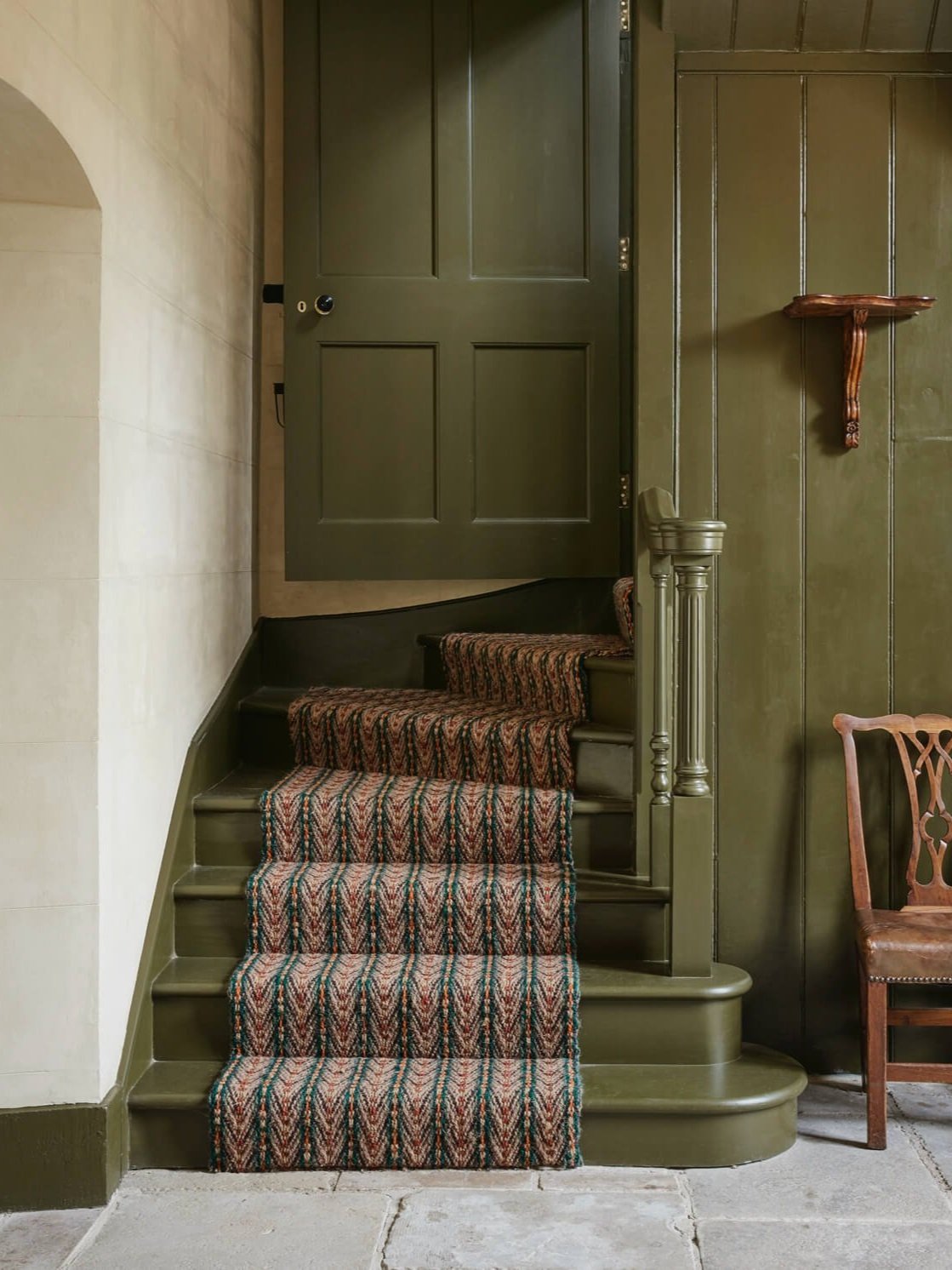
Above: Design by Ben Pentreath
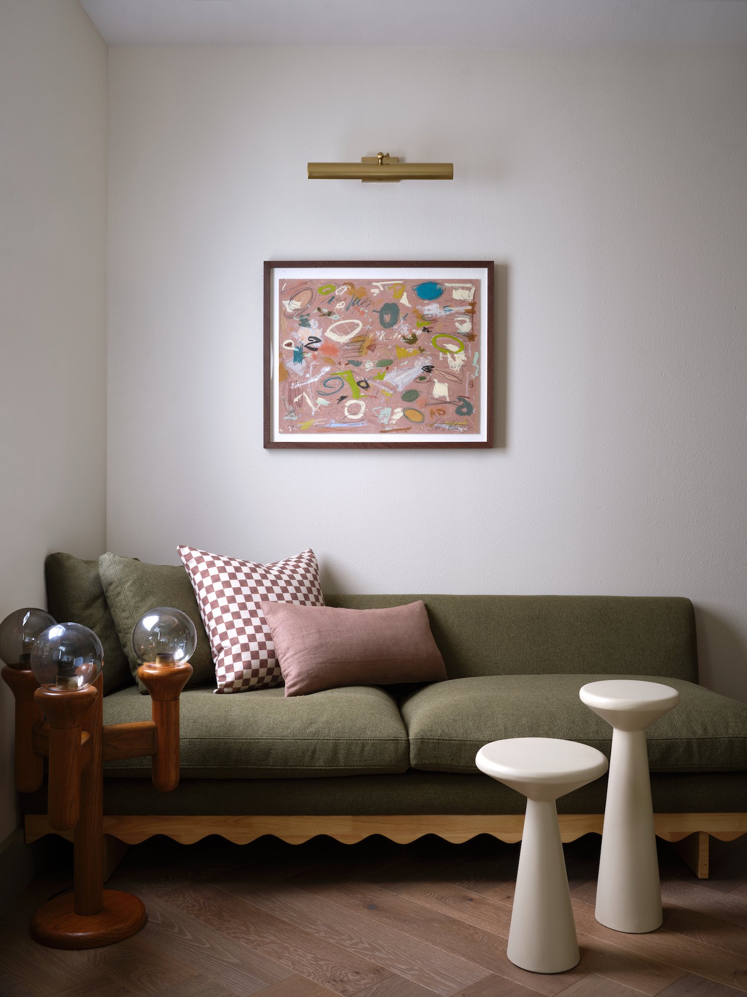
Above: Design by Anastasia Casey. Photography by Lindsay Brown
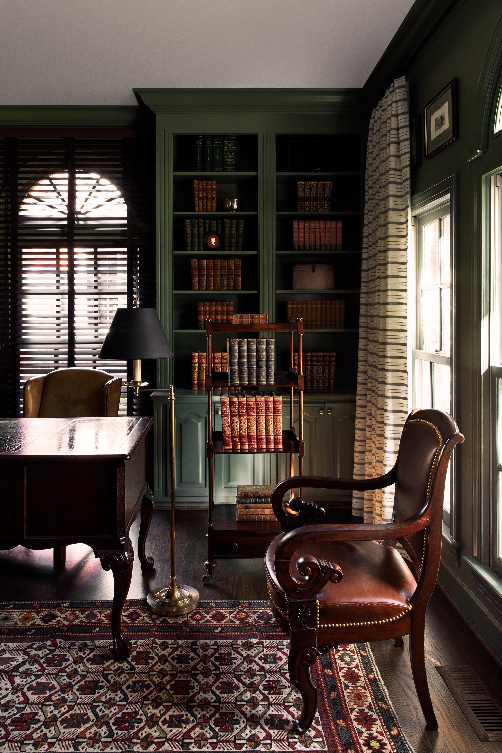
Above: Design by LK Studio
Shop Red & Green

Violet & Yellow
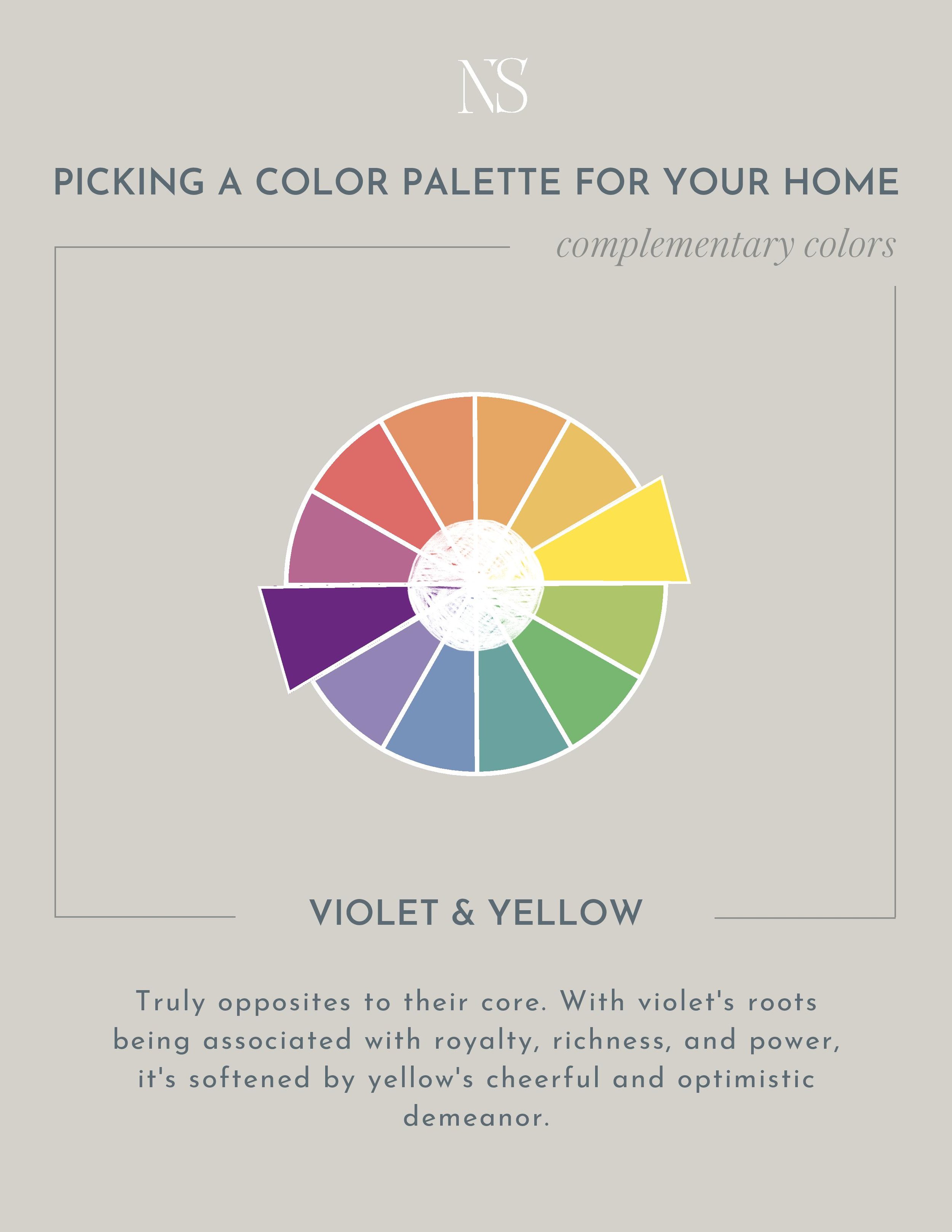
While this color palette may not be the most popular at the moment, I would argue that purple is making a comeback. When I see a room featuring purple, it’s often a red-violet or lavender hue. Meanwhile yellow can be integrated in various bold or subtle ways. Bold being a yellow tufted seat cushion. Subtle being brass hardware or a brass light.
Gold metals naturally have a yellow hue and that’s a great way to throw a splash or “color” in a purple room without going overboard. That being said, if you’re painting a room purple, you’re probably not afraid of going overboard and I love you for that!
Violet & Yellow In Designer Homes
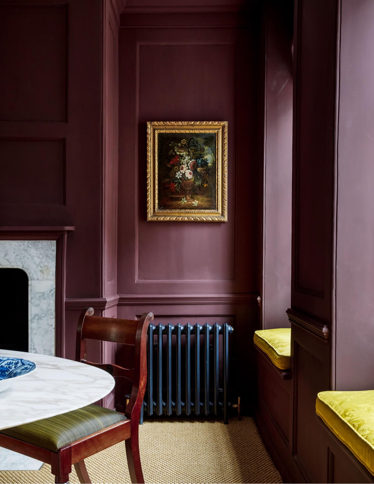
Above: Design by Ben Pentreath
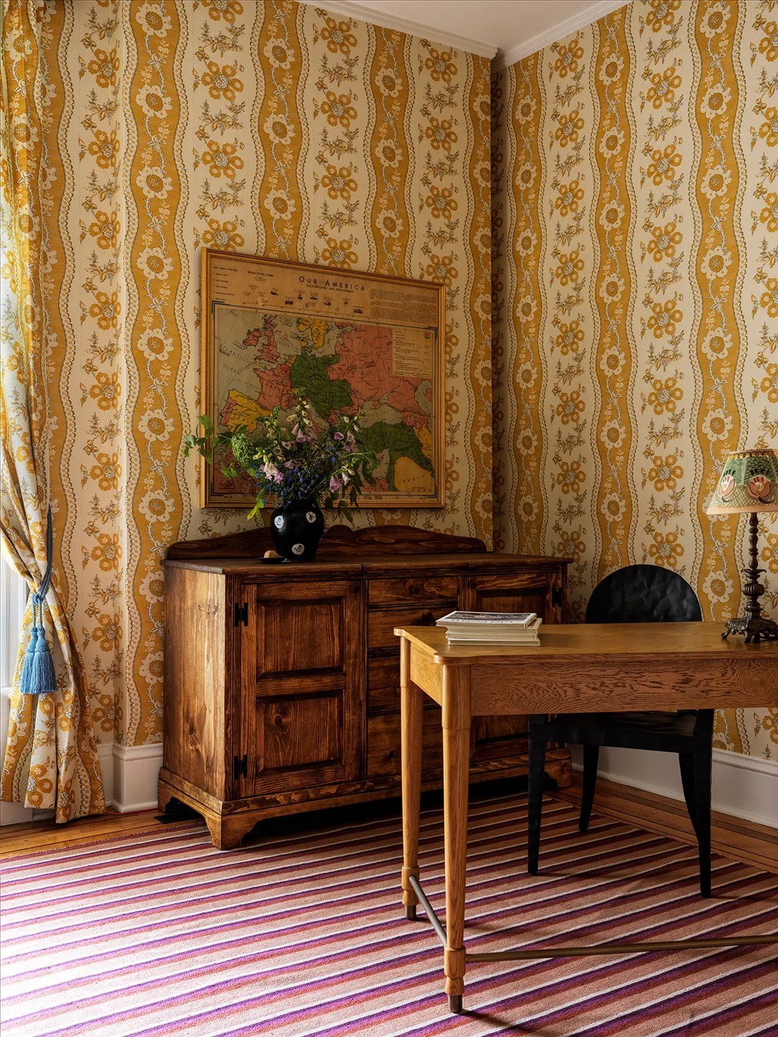
Above: Design by Victoria Sass. Photography by Chris Mottalini. Image via Architectural Digest
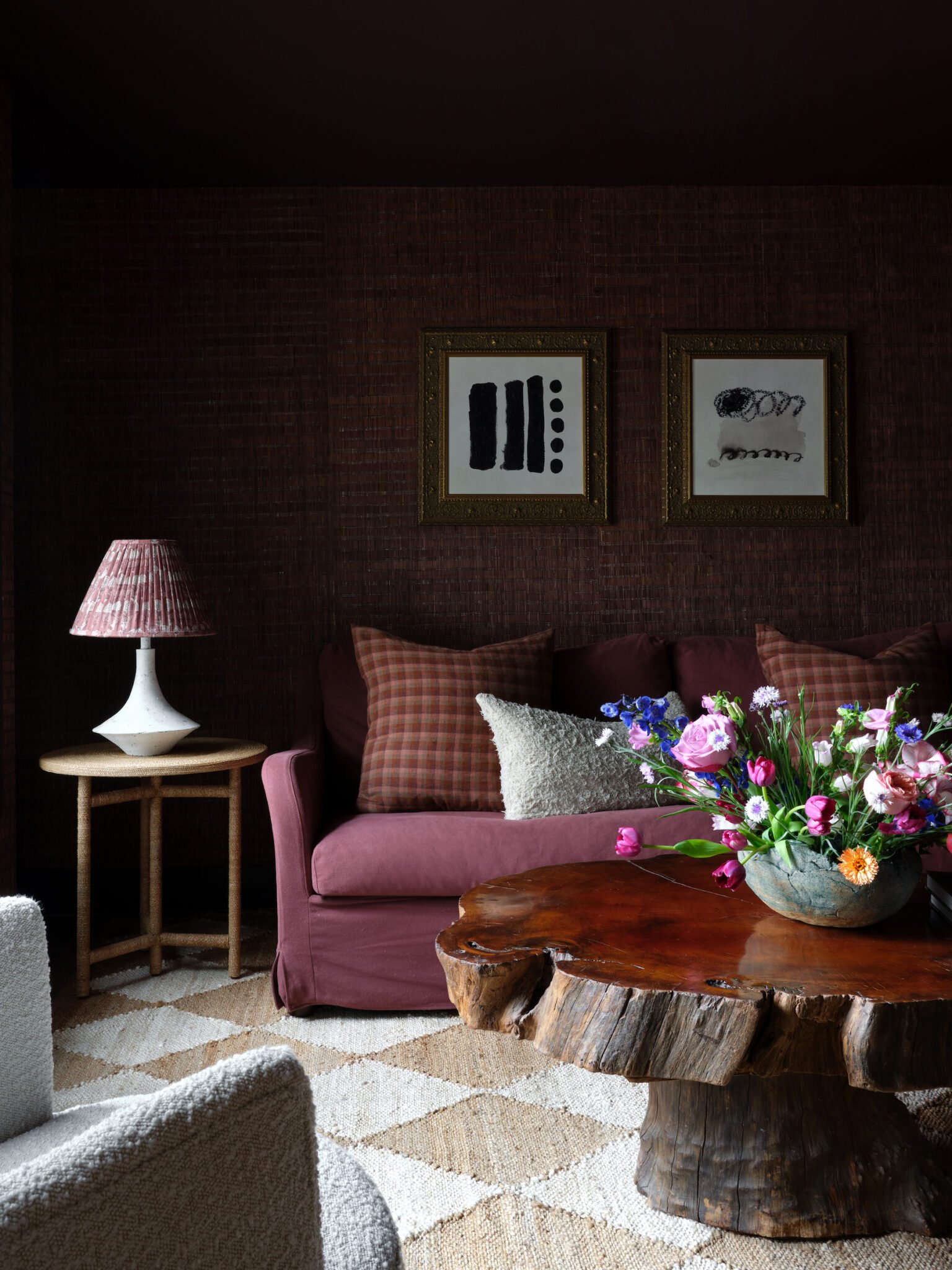
Above: Design by Anastasia Casey. Photography by Lindsay Brown
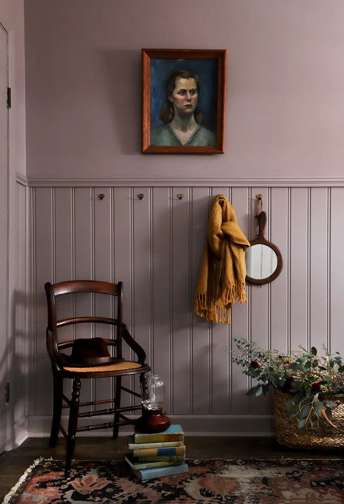
Above: Design by I Spy DIY
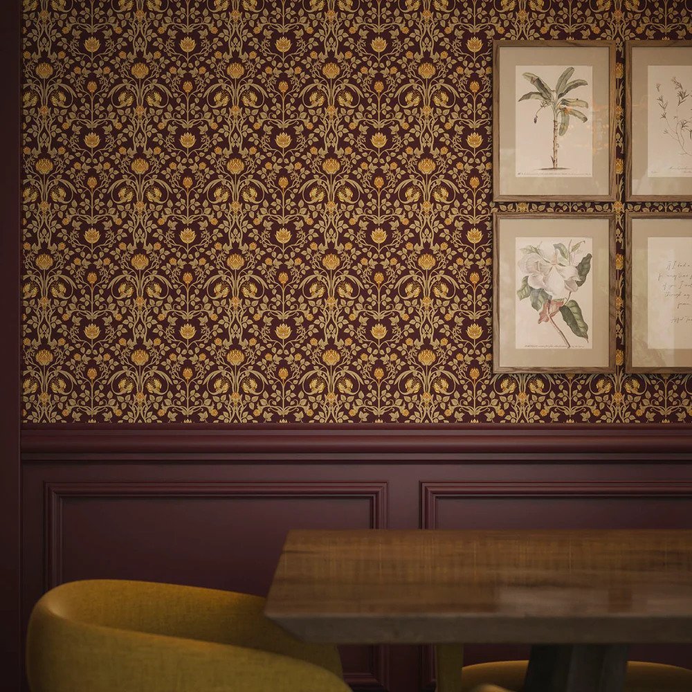
Above: Image via Lucie Annabel
Shop Violet & Yellow

Which complementary color palette speaks to you the most?! If none yet, browse all the color combinations that you can try here!

Triadic Color Palettes That Designers Love

Unconventional Color Combinations
Leave a Reply Cancel reply
Where behind the scenes, exclusive advice, and candid conversations are sent straight to your inbox every week.
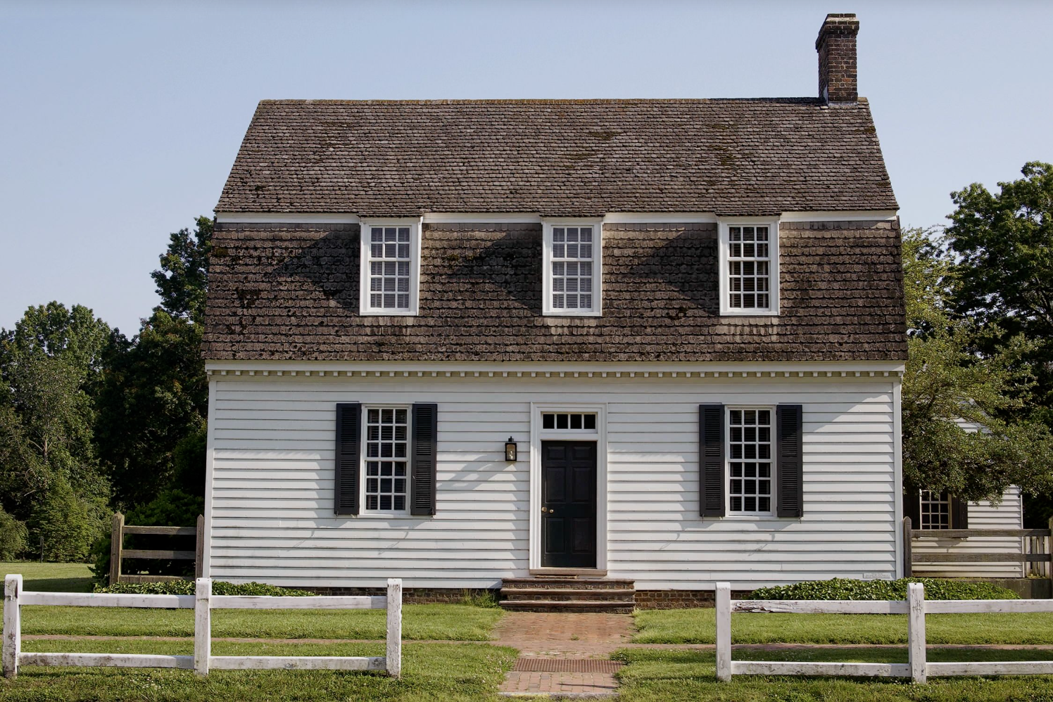
My living room walls are blush with purple undertone. I love putting yellow in the living room also. What color should I have our front door painted? Exterior and interior? Our 1920 small house is white with black shutters and we have a big deck on the front of the house. I appreciate any advice you can give me. Thank you!!!
Thank you for taking the time to tell me! Means the world to me 🙂
Thanks so much for all of this useful information! I love your blog and your style.
Thank you for taking the time to tell me! Means the world to me 🙂
Thank you Nadine. This series will be so helpful in my journey to update my 22 year old house with a new loo , while maintaining my favorite furniture pieces.
I’m so glad!! Hopefully it sparks lots of ideas for you!
I love the blue & orange palette. That’s what I have in my living room. Blue rug, lighter blue walls, nutmeg velvet sofa. It’s so easy to decorate with a mix of other colors with my accessories.
You’re a pro with putting together a color palette!