One of my absolute favorite things to do when designing a space is to create a feature wall. Every room (in my opinion) should have a focal point that your eye is naturally drawn to. It’s the one wall/corner/nook in the room that grabs your attention and creates that wow factor.
In fact, creating a feature wall is usually the first thing I do when designing a room. Figuring out that focal point gives me direction and guides my decision making for the rest of the room.
My thought process for picking the feature wall goes something like this – I first find the wall that has the most potential to create a focal point. Sometimes this wall already has something that grabs my attention (like a fireplace or a wall of windows). Other times I’m staring at 4 blank walls with zero character in any corner. When this happens, I often pick the wall that I first see when I walk into the room. This then becomes my feature wall.
From here, I design a feature wall that compliments the existing features in the room and flows easily from one wall to the next. This feature wall then determines the style for the rest of the room as everything else (i.e. furniture, artwork, decor) should compliment and correlate with the focal point.
With that being said, below are a few of my favorite ways to create stunning feature walls!
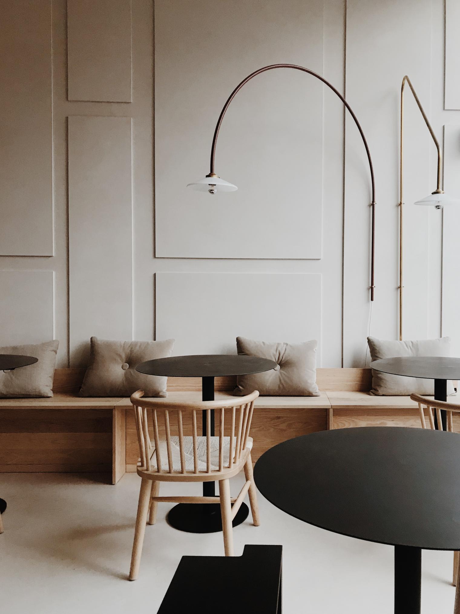
1. 3D MONOCHROME WALL
I absolutely love when I see a well designed monochromatic living space. It’s one of the more difficult looks to accomplish as it can easily look dull or uninteresting. What I love even more is when I see a wall with dimension that’s painted in one unifying color. The solid color and the 3D aspects accentuate the shapes and shadows making the shadows more of the “artwork” and focal point than the 3D objects themselves.
Business – Coffee Sometime | Photographer – Silvia Falcomer
2. WAINSCOTING
There’s a wide range of wainscoting that you could do from beadboard to board & batten. Pick a height for your wainscoting and paint it in a contrasting color to instantly add a dramatic effect. Honestly you don’t need much else to create a stunning focal point.
Photography by Landon Vonderschmidt + Maxwell Tielman | Article by Front + Main
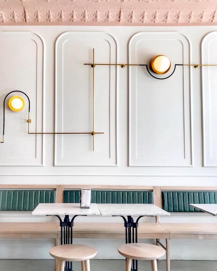
3. REVERSE WAINSCOTING
I’m sure there’s a more professional interior design term for what I’m talking about, but for simplicity sake (and because I don’t have a clue what the professional name is called) I’m calling this reverse wainscoting. Aka picture frame wainscoting on the upper half of the wall. Look how stunning this is!! It’s an unexpected character boost that mimics architectural arches and I’m here for it!
Business – True True Diner | Photography by Girls Just Know
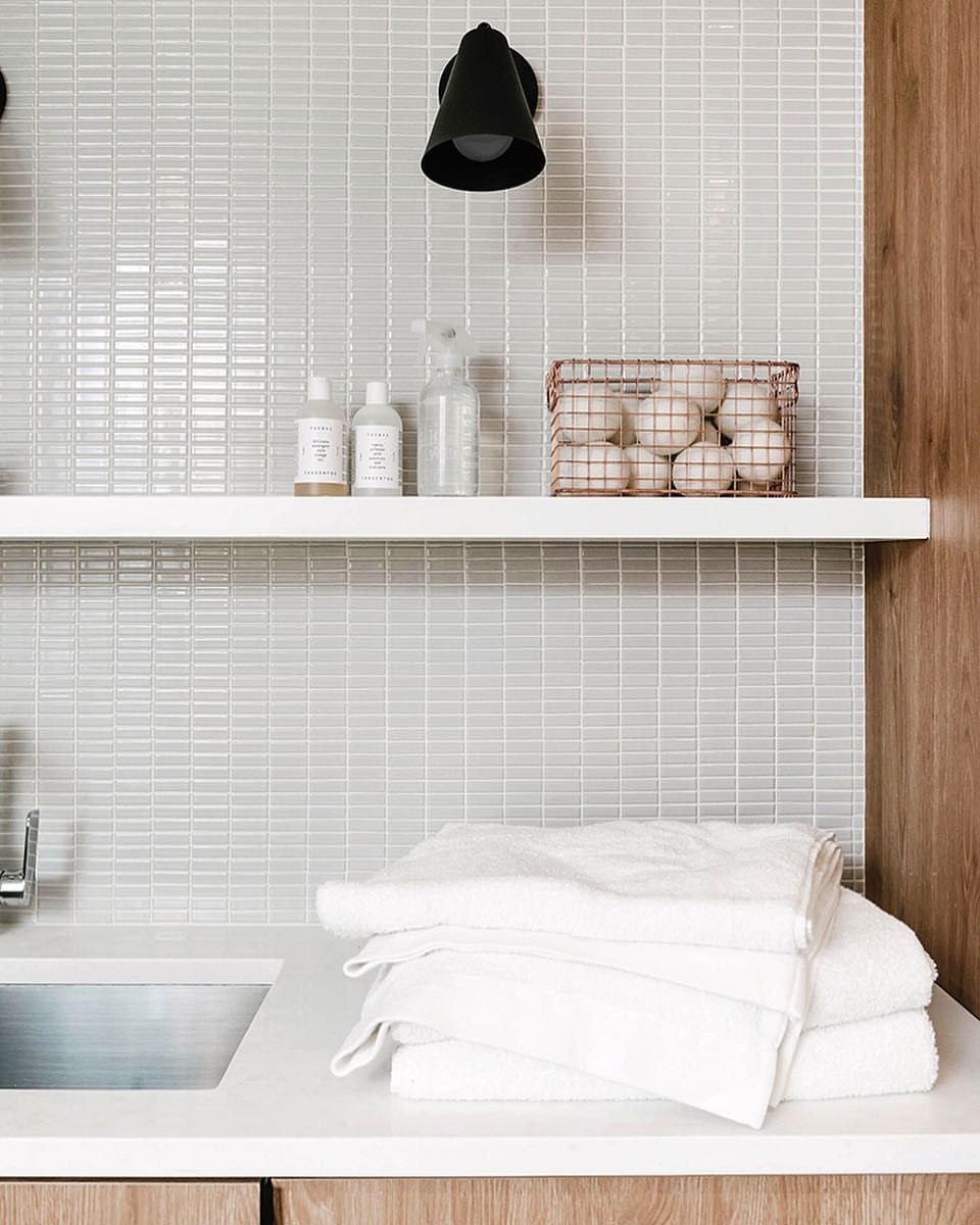
4. TILE WALL
Whether you like a heavy patterned tile or mini mosaics, you can create a stunning focal point with tile! The most natural place for tile is in the kitchen, bathroom, and laundry room, but there’s a time and place for tile in other spaces too. If you’re like me and you prefer simpler designs, I love a modern mosaic tile that lines the whole wall!
Home of Annabode | Photography by Kelli Kroneberger
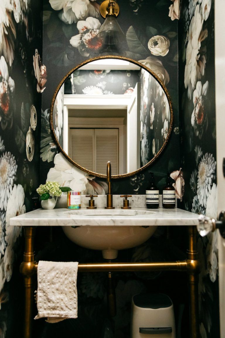
5. WALLPAPER
Remember when wallpaper was all the rage? And then it wasn’t…and then it was again! Ya, I can’t keep up with this trend either. Currently wallpaper is in…removable wallpaper I should say! Please no more super glue, permanent, scrape it till you can’t feel your fingers anymore wallpaper!! I have to admit, I don’t gravitate towards wallpaper for my own home but I do enjoy looking at wallpaper in other people’s homes!
Home of Emily Schuman | Design by Amber Interiors | Article by Camille Styles
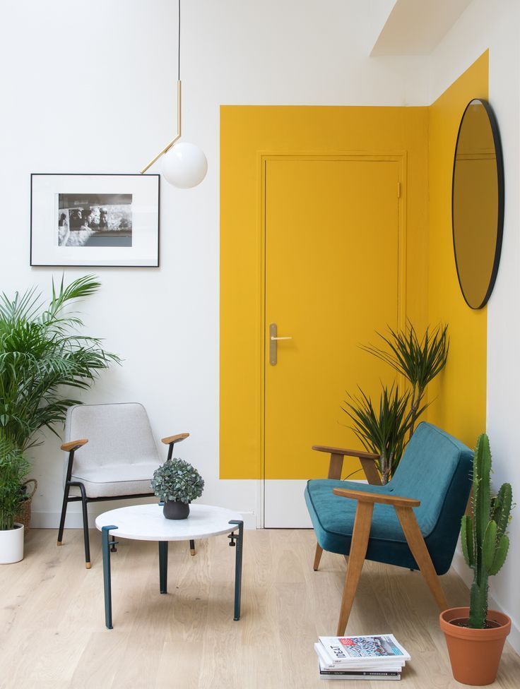
6. PAINT
One of the cheapest ways you can create a feature wall is with paint. And no, I’m not talking about painting just one wall in your room a different color. I challenge you to think outside the box and create focal points out of paint with unique patterns, shapes, and designs.
Photo Source Unknown
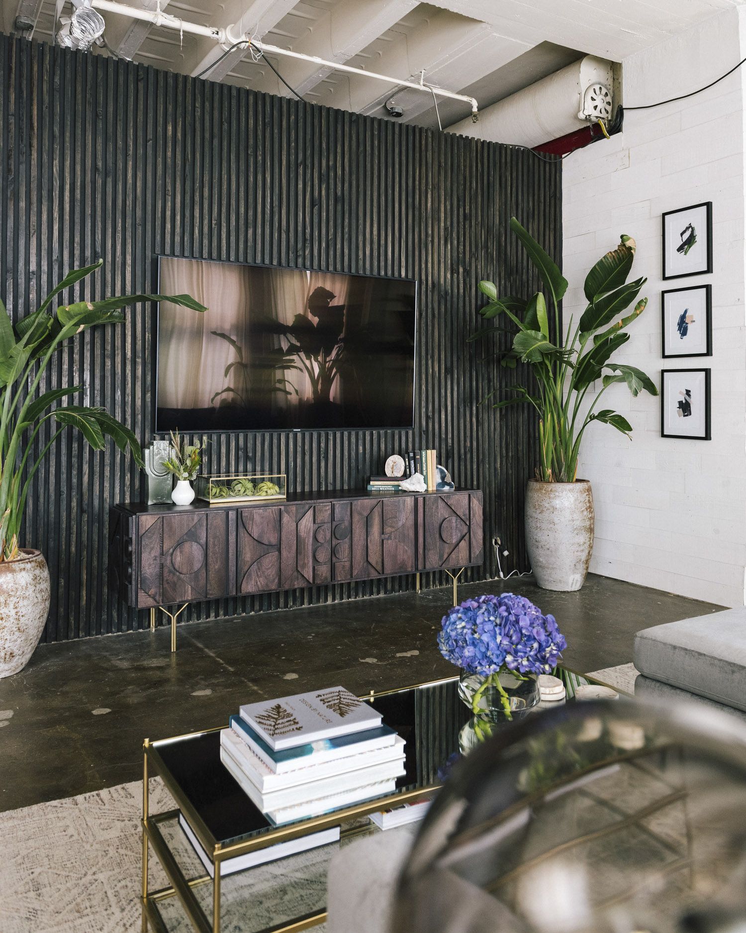
7. VERTICAL WOOD SLATS
I have seen a plethora of shiplap walls and honestly I’m ready for something new. These vertical wood slats lean more on the modern side and they also elongate the wall making the ceiling feel taller than it actually is. Win win! Whether you keep the wood as is, stain, or paint it, this is an instant character boost for you home!
Design by Bobby Berk | Photography by Landon Vonderschmidt | Article by Front + Main
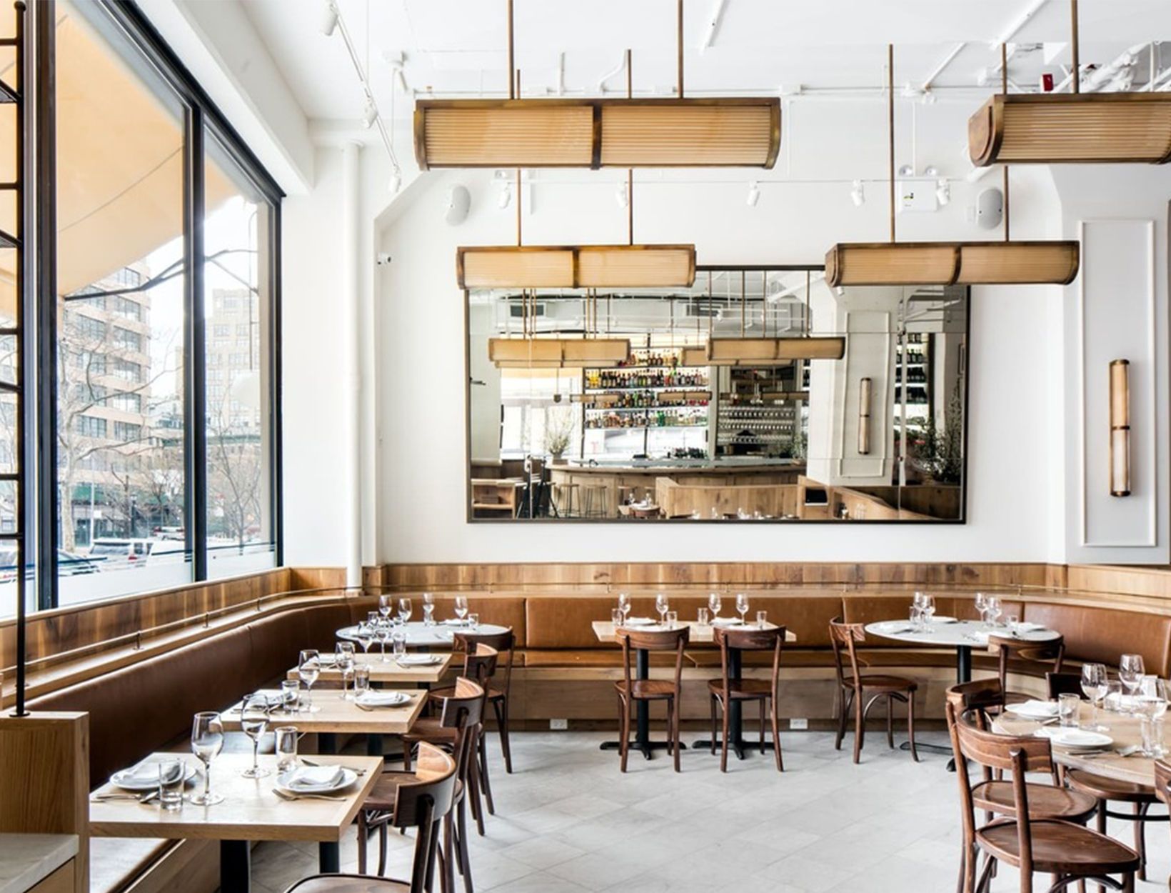
8. OVERSIZED MIRROR
Sometimes all you need is a big mirror that takes up all the attention! Not only do mirrors demand attention but they also make the room feel bigger so honestly we need a mirror in all the rooms!
Business – Cafe Altro Paradiso | Article by Goop
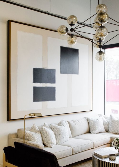
9. OVERSIZED ARTWORK
So you’re not into mirrors? Ok, go with a large piece of artwork instead! You don’t need fancy patterns, colorful walls, or dramatic furniture if you have an oversized piece of art grabbing all the attention.
Design by Pencil & Paper Co | Photography by Lauren Bradshaw | Business – Nashville Dentistry Co
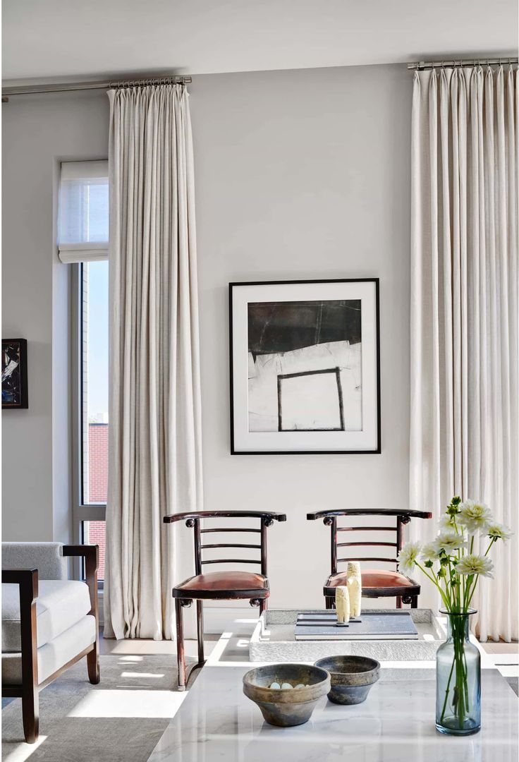
10. FLOOR TO CEILING CURTAINS
If you’re going for drama, go with floor to ceiling curtains! The luxurious fabric, the height it adds to the ceilings, and the dimension it brings to a space makes curtains feature worthy! If you have a wall of windows, this is especially a good idea! Just be sure to hang the curtain rod close to the ceiling and not directly above the window trim! I’ve got more info and advice on curtains here, here & here.
Design by Andrea Goldman
Leave a Reply Cancel reply
Where behind the scenes, exclusive advice, and candid conversations are sent straight to your inbox every week.


Wondering what to do with an open floor plan living room and kitchen. Vaulted ceilings with antique white paint all over. One wall having to large windows and a 6 foot slider door with plantation shutters. Shutters are white. Would one accent wall color be OK on the wall with the shutters?
thanks! do you think I can use mirror and oversized art on the same wall? or it would be too much?