Why *Some* White Houses Never Go Out Of Style & Others Do (This Is The Key Difference)
·
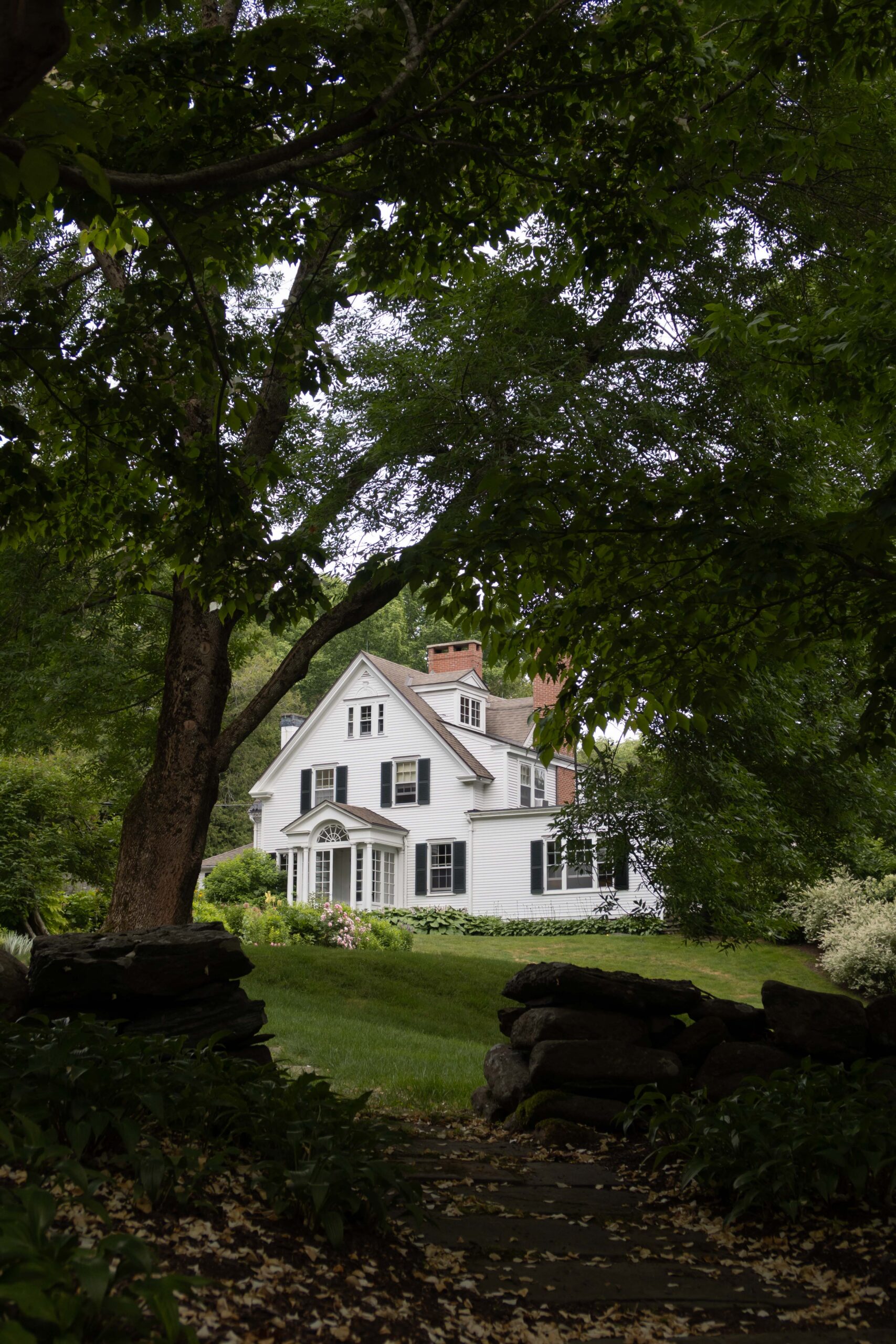

I originally planned on writing an article about whether or not white exteriors are timeless, but the answer felt too obvious. OF COURSE white homes are timeless! I mean…a white house with a white picket fence is the American dream after all. But not *every* white house is timeless, which begs the question: why? Why does the quintessential white Colonial Revival house in Father of the Bride, with its green shutters and climbing roses, look just as magical today as it did in 1913? And why do some white houses, built only 10 years ago, already look dated? See the answer below.
This post contains affiliate links.

The History Of White Paint
I know…the history of white paint sounds incredibly boring to most, but there are a few pieces to the story that I find incredibly important to take notice of.
“In the nineteenth century, paint was often mixed on site by blending linseed oil, lead powder, and pigments,” says the New Hampshire Preservation Alliance. Colors were derived from natural pigments during the Colonial era, resulting in muted and earthy tones such as white, red, ochre, green, and blue. Some vibrant colors can be found inside the homes of wealthy families who could afford such luxury. “Color was treasured back then, it was much more special and status-driven,” says Amanda Keller – Colonial Williamsburg’s historic interiors and associate curator of household accessories.
In terms of exteriors, many of the earliest houses were left unpainted. When color was used, it was often ochre yellow or iron oxide (barn red). “With American independence, colors went lighter, with the most common shades being white and creamy white,” says Sally Zimmerman, senior preservation-services manager at Historic New England.
Historically speaking, white paint wasn’t a clean white. “Natural [pigments] just couldn’t provide a bright white finish, and so “white” paint had more of an off-white, or even yellowish, tinge,” says NHPA. It wasn’t until 1921, when titanium dioxide became commercially available, that an affordable and consistent bright white was an option.
All this to say, white exteriors, whether a clean white or a creamy yellow, are rooted in history. White was used repeatedly for hundreds of years, and when we see something used repeatedly throughout history – it is, by definition, timeless.

White Reflects Changing Light Beautifully
There’s nothing more beautiful than the warm glow of the setting sun washing over a white house. Because white paint reflects light so well, it captures the changing colors of the sky throughout the day. While darker exteriors also respond to shifting light, the golden, amber tones of a sunset are especially striking against a white facade, giving it a warmth that’s difficult to replicate with deeper colors.

White Paint Accentuates Architectural Interest (Or The Lack Thereof)
A bright white allows shadows to create contrast. This, in turn, accentuates trim profiles, enhances intricate cornices, and highlights the texture of the clapboard formed by layers of paint. Because of this, white is an excellent color choice for homes with substantial architectural details. Those details would be lost with a dark color.
Keep in mind, if your home doesn’t have significant architectural interest, white may not be the right choice. White exteriors need architectural details to look good. Without proper trim profiles, proportionate window casings, muntins, wood siding, door surrounds, and architectural interest, a white paint color can come across as builder-grade. White itself isn’t magical. White simply allows the architecture to become the focal point. When the proportions, trim, windows, roofline, and materials are beautiful, white highlights them. When they’re not, white exposes every shortcut. The color is only as good as the architecture it graces.
This is often why white on a new build just doesn’t have the same staying power that an old home has. Homes today aren’t built with the same attention to detail and shadow lines are minimal, making white look flat and lifeless.


Exterior White Paint Colors I Love
If you’ve established that your home would thrive with a white paint color, picking the right shade becomes the next challenge. The perfect white color is entirely subjective to your location, the direction your home faces, and your surroundings. Paint a large section on every side of your house to get a full sense of how the color truly looks.
A few of my favorite bright whites with warm undertones include White Dove, Swiss Coffee, and Simply White. (See a few pure white color options here.)
Off-whites with stronger yellow undertones that suit historic homes include Jewett White, Navajo White, and Sparkling Wine. And I love Oyster White and School House White when I’m looking for a neutral off-white.
If your home is old, browse through the Historic Colors of America collection by California Paints and read this article to see which color is best suited for your home’s age and architecture.
For a timeless color palette, paint the siding, trim, and window sashes all the same color of white. (A satin sheen is my preference.) Then choose an accent color or two for the shutters and front door, as shown below!

Where behind the scenes, exclusive advice, and candid conversations are sent straight to your inbox every week.
The Inside Scoop
DO YOU WANT