This post contains affiliate links.
I’ve been diving deep into color theory over the past couple of months in hopes that you’ll discover new ways to pick a color palette for you home. We’ve already talked about the easiest color palette you can incorporate in your home and we discussed the one thing you can do to make that palette a little more layered.
Today I’m introducing a third color palette option that’s slightly more advanced than the first two – analogous colors. First, let’s discuss what analogous colors are –
What are analogous colors?

Analogous colors are any three colors next to each other on the color wheel. An extended analogous color scheme can include a fourth and fifth color directly next to the others. This vibrant combination of colors creates a captivating scene…one that’s unexpected and outside of the norm.
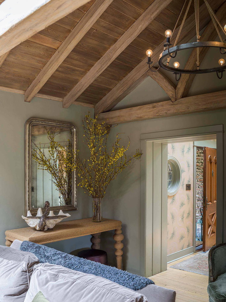
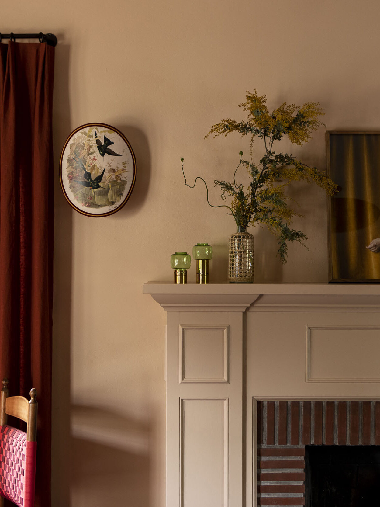
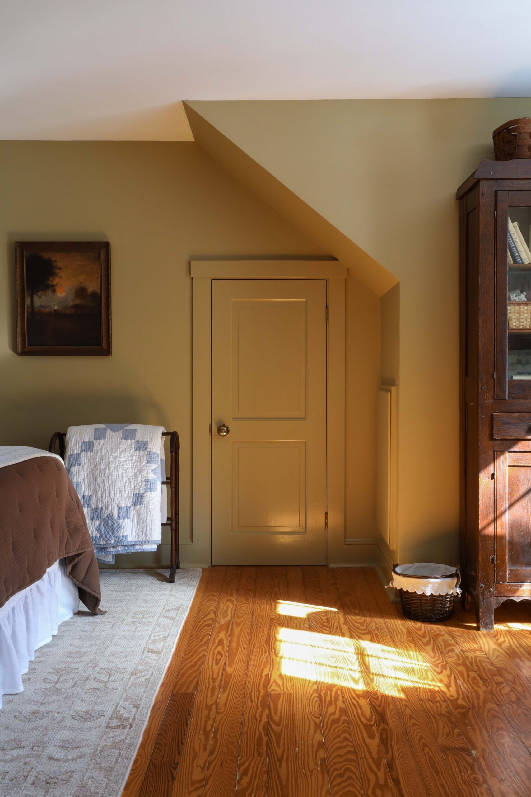
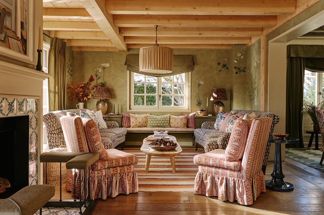
It’s one thing to know the definition, it’s another to see analogous color schemes in real life. Let’s take inspiration from the following homes that have an analogous color palette.
6 HOMES WITH AN ANALOGOUS COLOR PALETTE


Both photos above incorporate variations of red, orange, yellow, and pink. And both spaces follow the “60/30/10 + B/W” rule.
WHAT IS THE 60/30/10 + B/W RULE?
The “60/30/10 + B/W” rule is a formula for incorporating a color palette within your home. 60% of the room features one color. 30% of the room showcases a second color. And 10% of the room features a pop of color. To balance the palette, add either black or white elements.


The color palette doesn’t have to be a bold, all encompassing scheme. It can be incorporated through a more subtle approach. For example, the living room above by Anastasia Casey has creamy white walls. But the blue sofa, the pop of green in the velvet ottoman, and the hint of yellow in the pillow creates a soft, yet noticeable analogous color palette.


The beauty of color palettes is that they can be used in a number of different ways. Perhaps you use a palette to pick paint colors from one room to the next. Or perhaps you use a palette within a single object, like a mural wallpaper for example.
Can you see yourself incorporating an analogous color palette in your home? If you like originality and an unexpected approach to design, this color scheme is for you!
Start Your Analogous Color Journey

Leave a Reply Cancel reply
Where behind the scenes, exclusive advice, and candid conversations are sent straight to your inbox every week.


I’m seeing lots of the Analogous color play in commercials lately. I love this color method. Learning more extensively in articles from the blog will help keep the method on point. Thank you
So fascinating and so true now that I think about it! It’s definitely an attention grabbing palette which makes sense for commercials!
I am loving this series! The info is fascinating and the photos helpful and inspiring. Thank you
I’m so glad to hear that! I’ve absolutely loved creating this series!