I’m noticing a shift in the design world….maybe it’s the “new year new me” vibe, but there seems to be a desire for more color in the home! We (aka most of us) have been neutral smitten for the past 5(ish) years and although I still love a neutral color palette, I can see color starting to pop into our homes again.
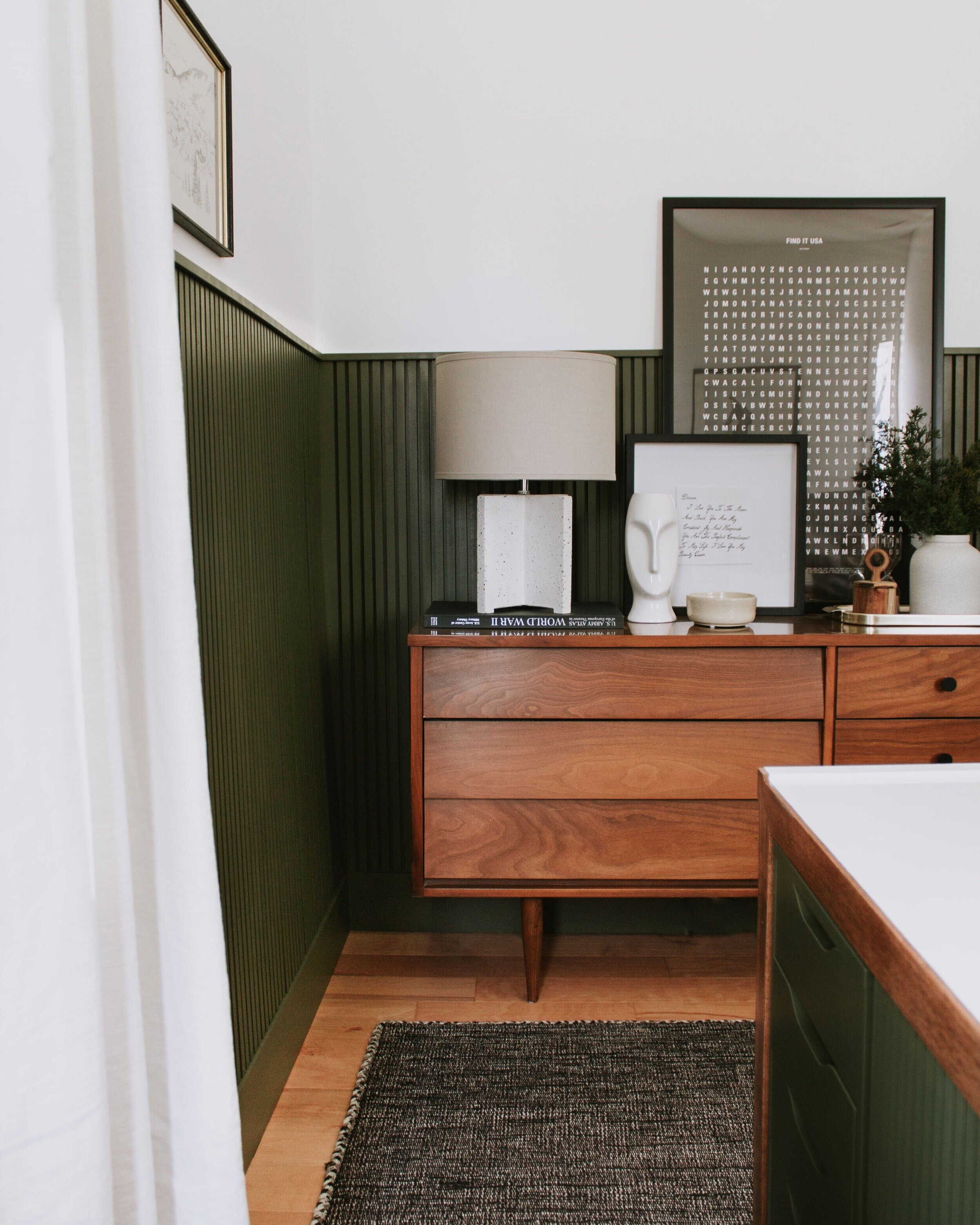
When Chris and I added vertical slat wainscoting to our home office, I knew I needed a smidge of color and honestly the only color that I felt comfortable slapping on the wall was hunter green. Aside from white, black, and wood tones, green has been the only steady color in my life.
And I don’t seem to be the only one feeling this way. I’ve seen countless neutral loving people who are slowly adding green to their walls and I can’t help but wonder if green is the gateway to all the colors being reintroduced into our homes again. Maybe….time will tell.
This is the hunter green wainscoting that I mentioned above in our home office. The perfect shade of green in a cozy, well lit room!
(Photography by Jenah Piwanski for Fete Magazine.)
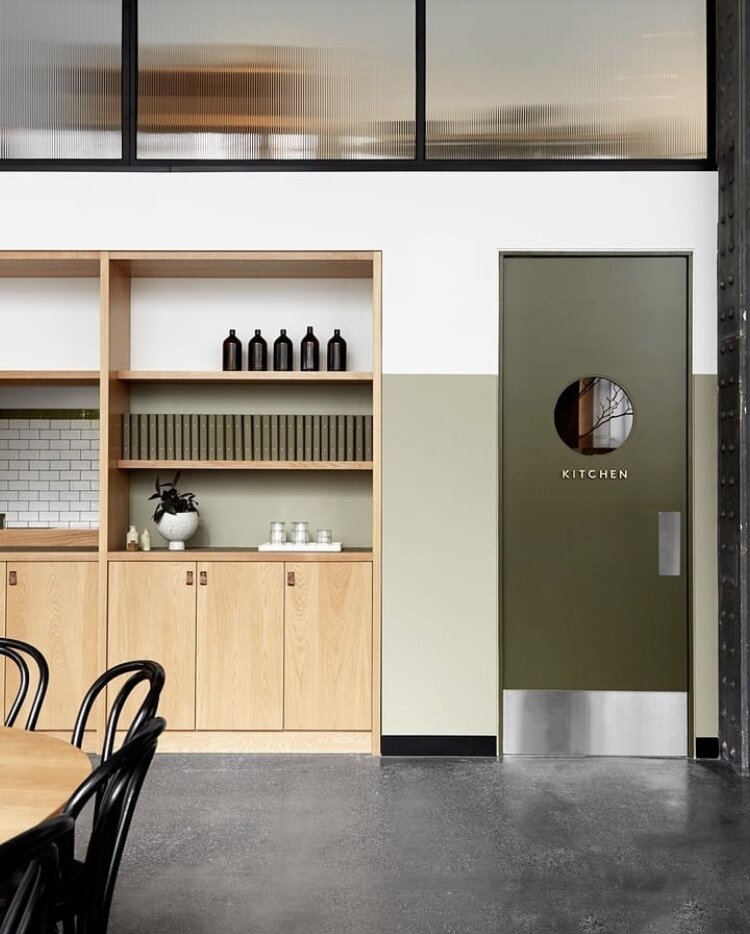
I’m obsessed with this space by @gatheredcafe…the reeded glass, the circle window in the hunter green door, and the warmth of the wood built ins. It just all works effortlessly!
(Photography by Itay Benit | Design by Yael Baruch + Ree)
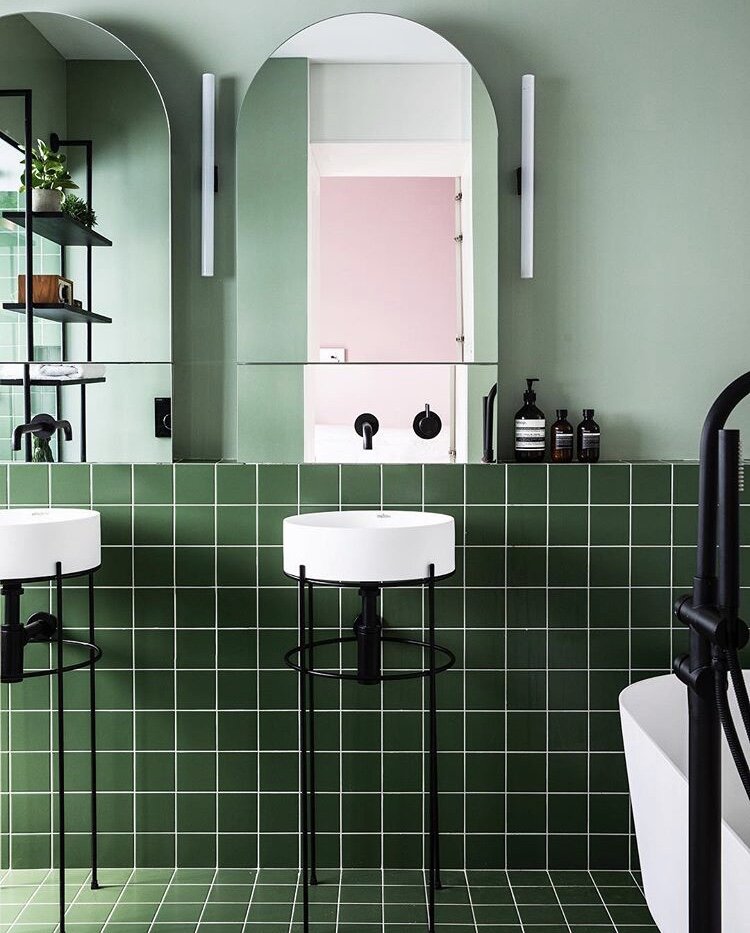
This bathroom just screams for attention with the monochromatic color scheme. In this case…more is more!
(Home of Room For Tuesday)
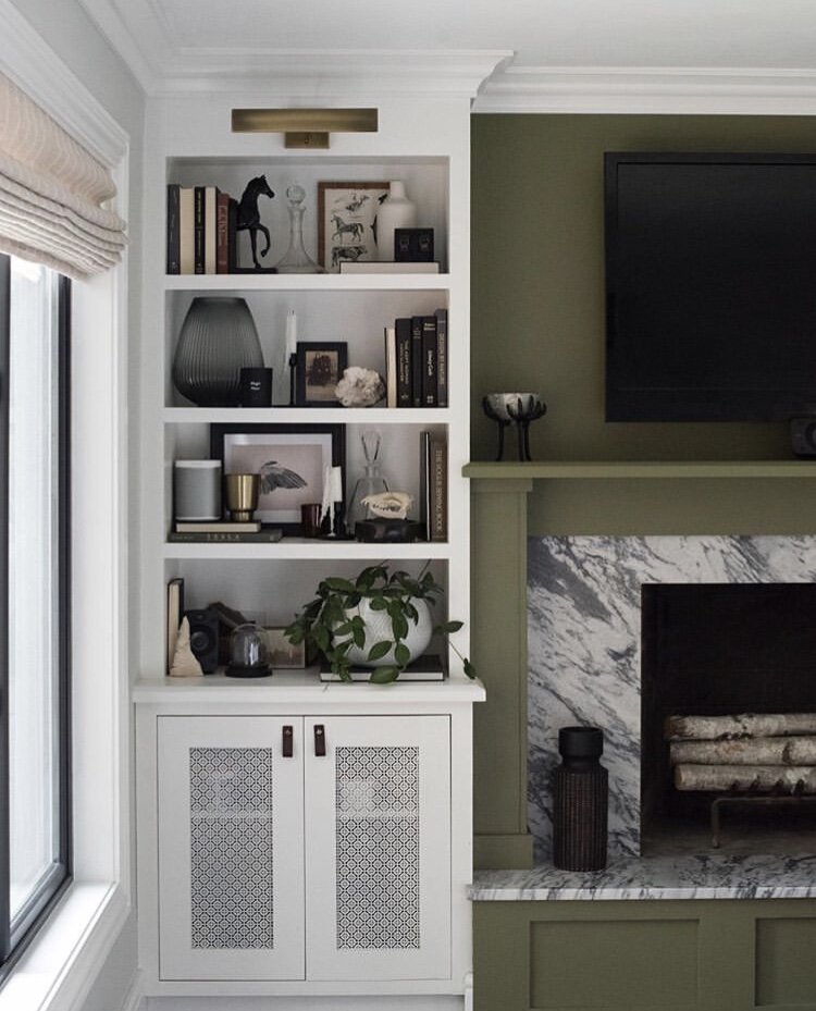
Brass, white, and green…you really can’t go wrong with that color palette!
(Photo from Juniper Home)
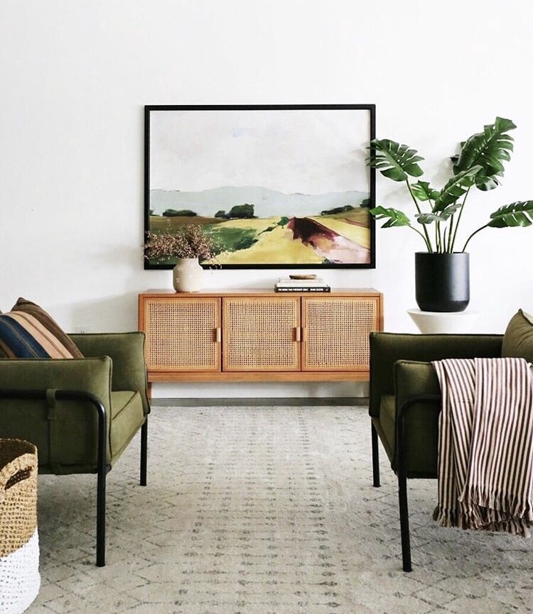
Of course we see a pair of stunning green side chairs, but what I’m noticing is the prairie green artwork with a hint of maroon and pink. Notice the maroon blanket on the chair and the rosy florals on the buffet that coordinate perfectly with the artwork? I like to think the artwork color palette served as a starting point and made maroon decor a less scary color choice for the rest of the room!
(Photo from Studio Claire Delmar)
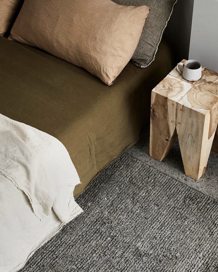
You don’t have to paint your walls green or find the brightest green tile to add a pop of color to your home. Bedding is a perfect place to try colors outside of your comfort zone! And that muted salmon pillow case works so well with the olive green!
MY GO-TO GREEN PAINT
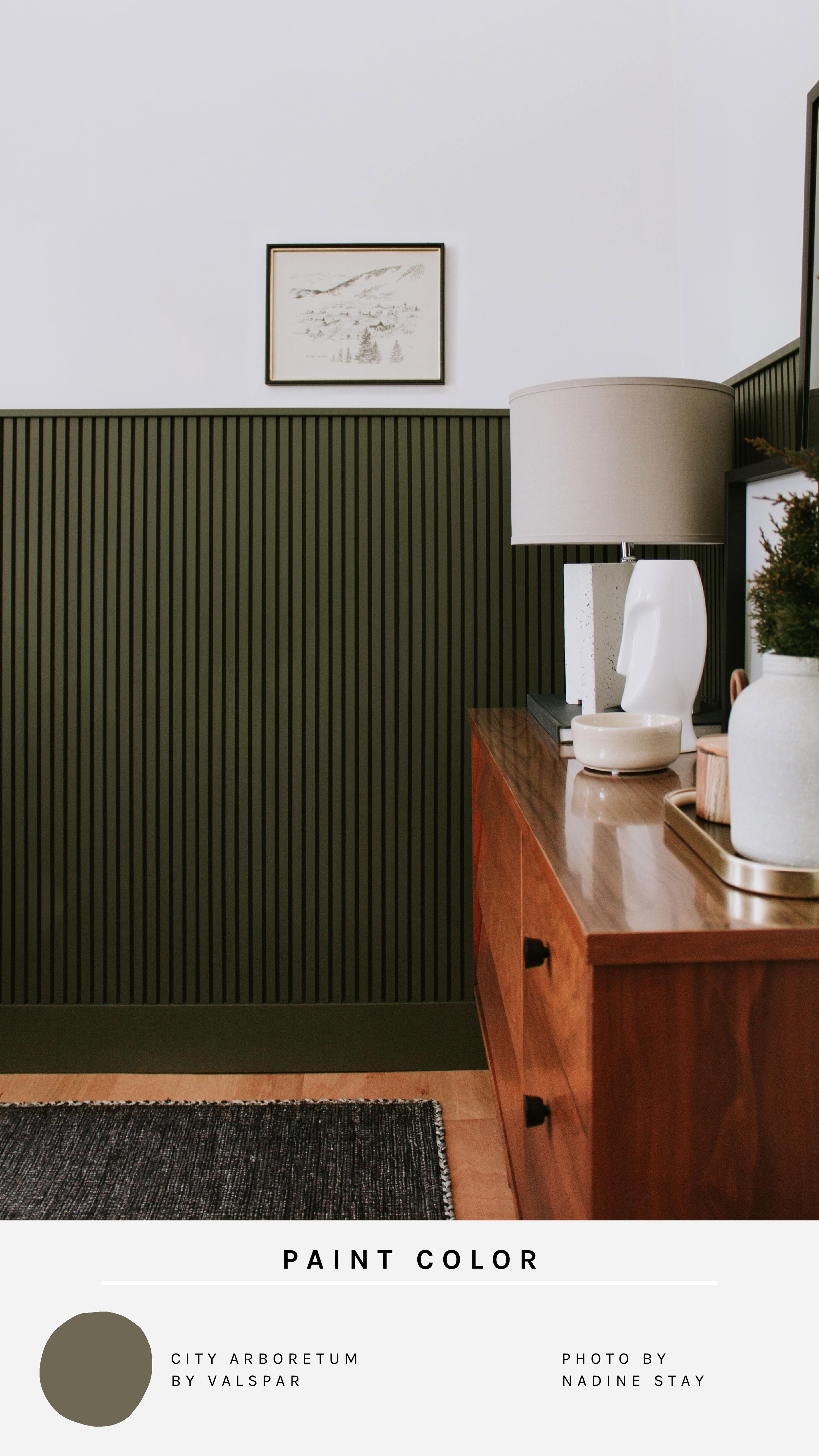
“City Arboretum” by Valspar at Lowe’s is my go-to green paint color. I’ve used it several times in my home (including the wainscoting in our office) and I have yet to get tired of it! It’s a warm hunter green that stays true to color from morning till night. My only caveat to this paint color is that it needs a solid 2 coats before the color shows accurately. I was worried after my first coat that it was going to look like a puke green, but after the second coat (and a few hours to dry) it’s true color was shown!
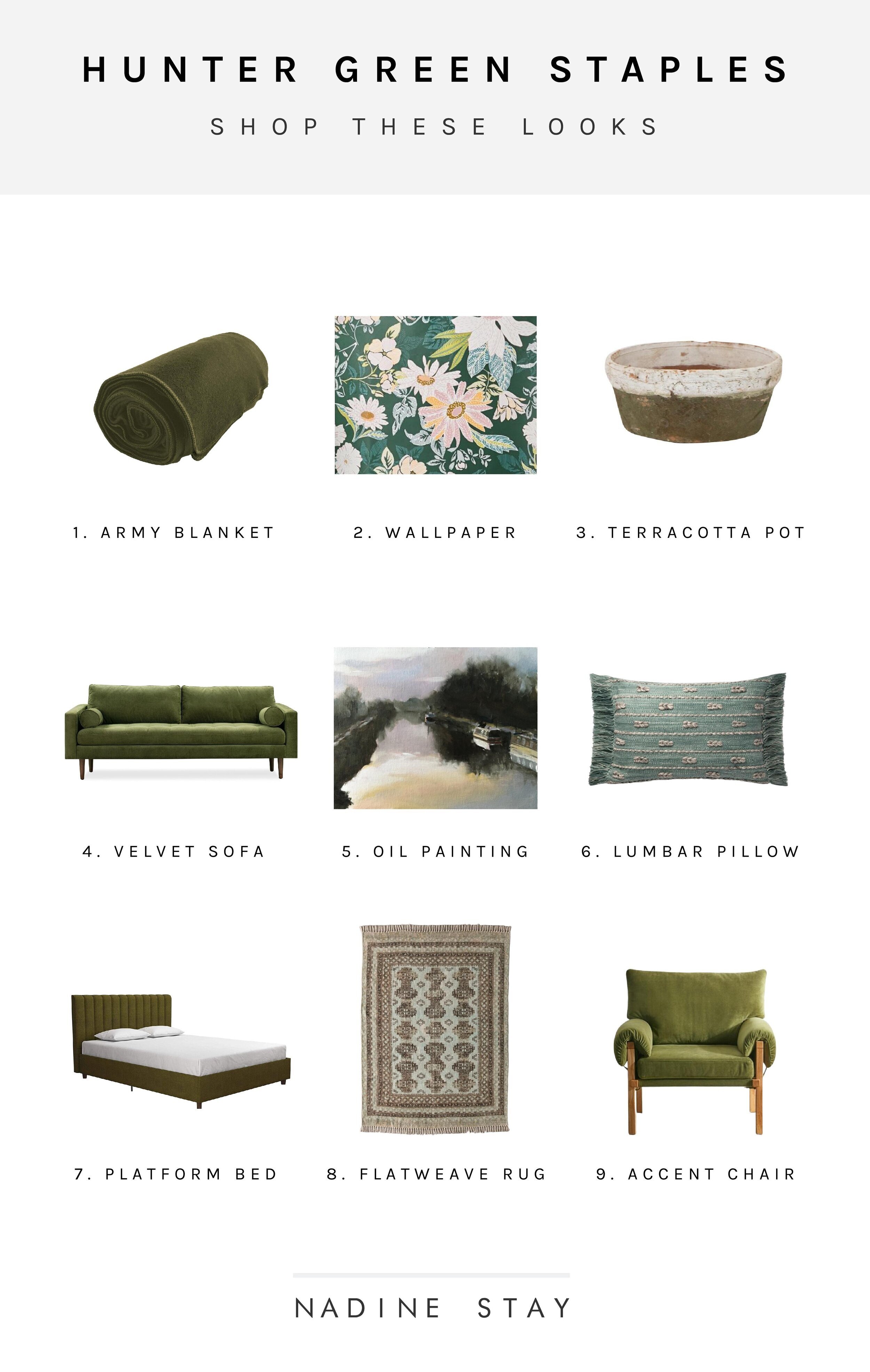
ADD SOME GREEN TO YOUR HOME
Leave a Reply Cancel reply
Where behind the scenes, exclusive advice, and candid conversations are sent straight to your inbox every week.

Awessome blog you have here