“I just don’t know where to start or how to pull a look together…” Does this sound familiar? I’ve been asked this question too many times to count and I understand why. If decorating doesn’t come naturally to you, it can feel totally overwhelming. But that’s what I’m here for – to give you the inspiration, advice, tools, and resources you need to confidently tackle your own home design!
So consider this post your official guideline for interior decorating basics – the fundamentals if you will.
I’ve touched on some of the following “design rules” in previous posts so I apologize if this is repetitive for some of you. But I think it’s nice to have all the ground rules in one post for easy learning. Shall we get started?
I’m starting a room design from scratch, where do I start?
According to the 5 interior designers that I asked this very question to, the resounding answer was “start with the rug.” It’s the most difficult aspect of the room to select and it’s even more difficult if you pick it last (after all the other pieces are in place). Pick a rug with a color palette that you feel comfortable with and go from there. Next, select the main fixtures – sofa, furniture, chairs, etc and work your way down to the little things like lamps, artwork, and paint. Yes, paint is one of the last things you pick because it’s far easier to match a paint color to a rug color than it is to match a rug to a paint color. You feel me?
Create a focal point
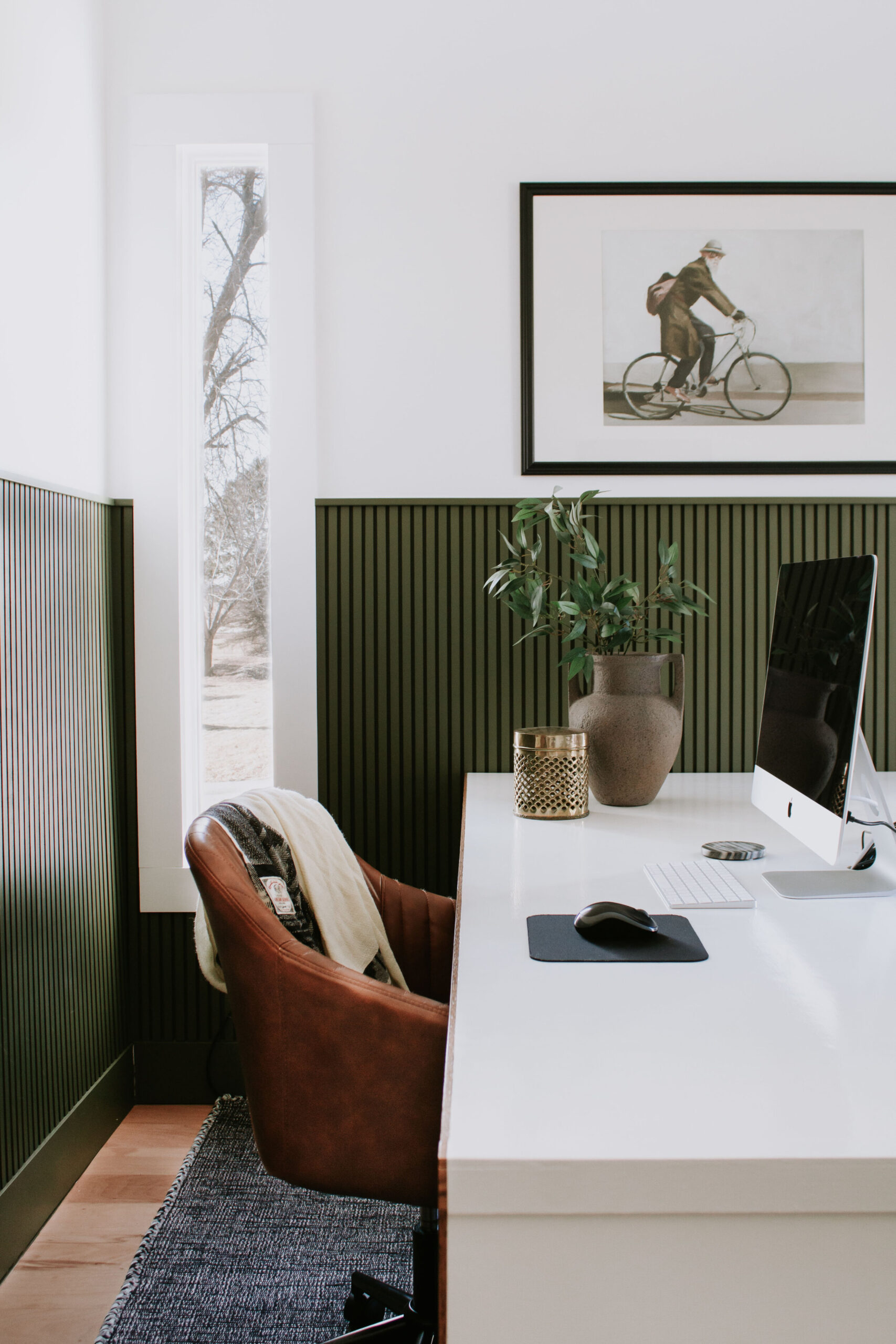
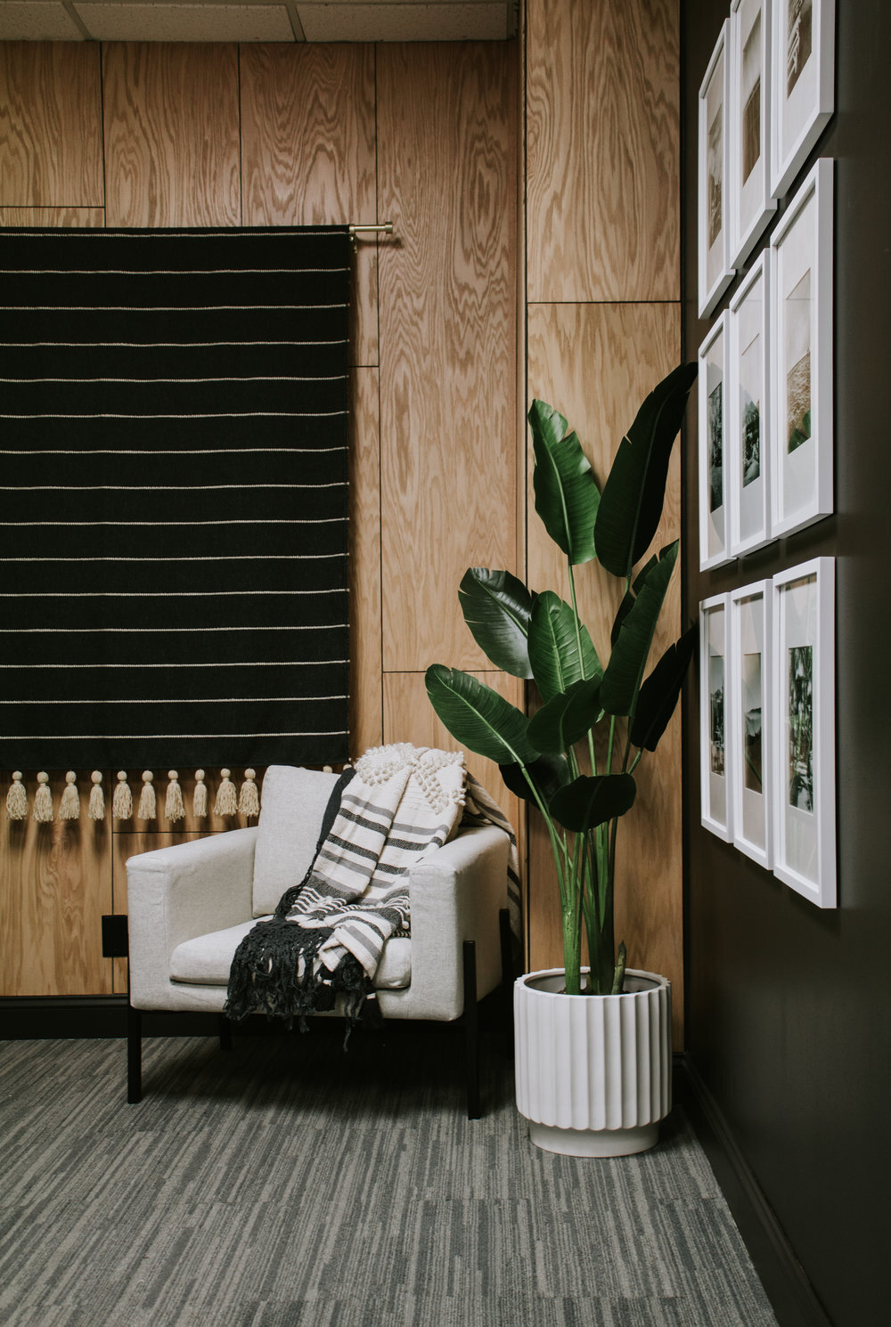
In every room, I like to create a focal point that the eye is naturally drawn to. In fact, before I make any major decisions about the room’s layout or furniture placement, I pick a wall that will become my focal point for the room. This doesn’t mean I just paint one wall a different color. The focal point can be a fireplace, an oversized piece of artwork, a feature wall with oak plywood planks or painted wainscoting, a wall of windows with floor to ceiling curtains, or anything that demands attention. Once I pick a focal point/feature wall, my furniture layout is determined based off of that. My furniture should aid in moving the eyes to the focal point. (i.e. don’t position all your furniture facing away from the focal point and don’t block your view of the feature wall.)
Here are some focal points ideas →
Avoid furniture sets
It may be easier to select a living room or bedroom furniture set that all matches, but let’s think beyond that! Find pieces that compliment each other without matching. If you’re nervous about matching or pairing wood tones, I have a few easy tips on that here. And if you already own a set of matching furniture, I recommend you disperse the set between a few rooms.
Consider visual balance
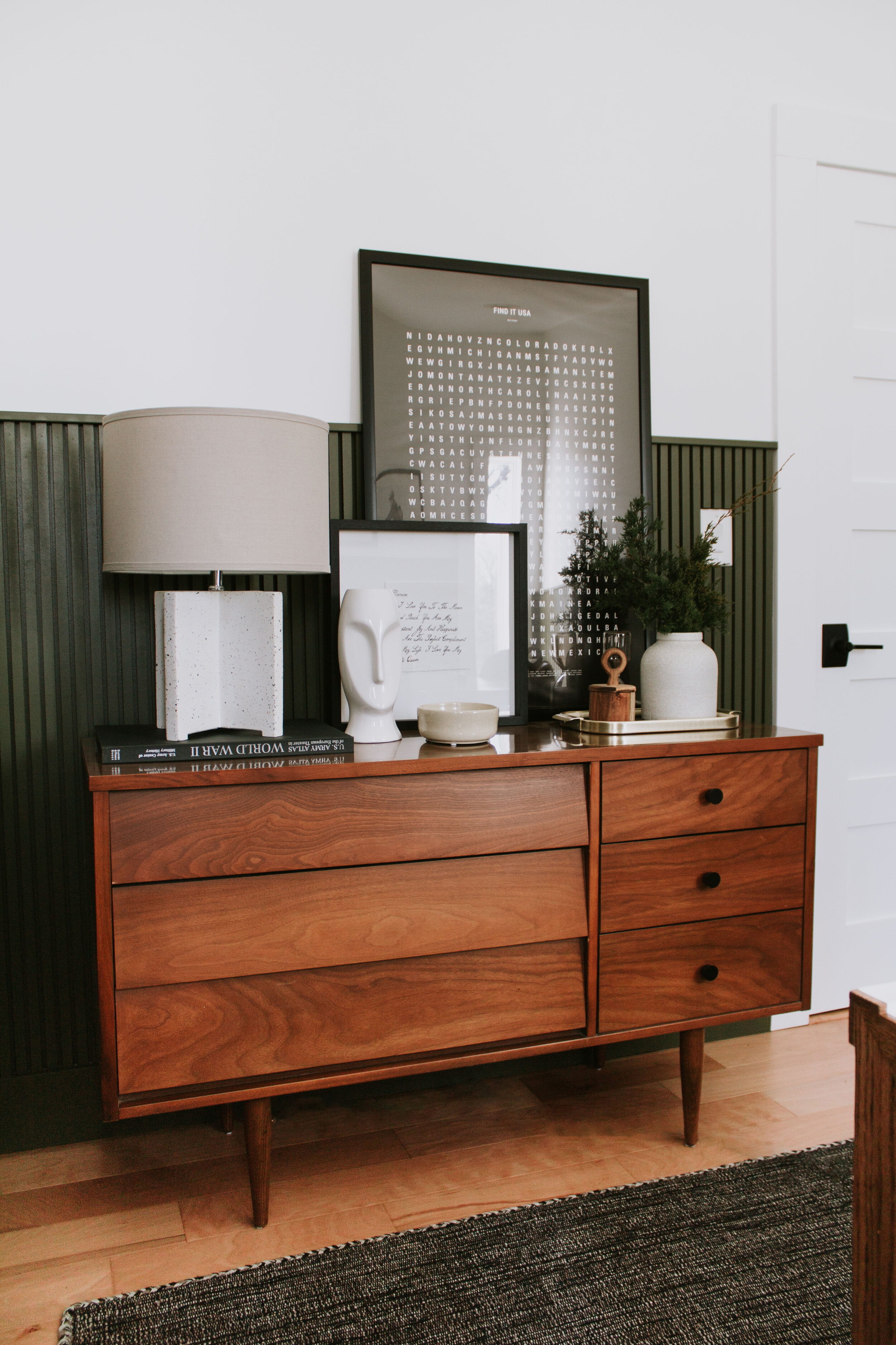
Designing a room is all about visual balance. Whether you prefer symmetry (i.e. two lamps on both ends of the dresser) or asymmetry (a lamp on one side and artwork on the other), it’s all about leveling out the visual weight. Think of it like a see-saw. You need equal weights on either end of the see-saw to stay balanced. If one side of the room has a lot of heavy furniture, the other side of the room would feel imbalanced with just a small chair. If one side of the room displays a lot of wood, the other side needs some wood characteristics as well to balance out the visual weight. Make sense?
Paint color selection
Picking a paint color can feel intimidating but there are some simple tricks to help the selection process. First, when looking at paint swatches, always view them in the room you will be painting. And look at the swatches upright vs looking down at them – the lighting can drastically change how the color looks when it’s not parallel with the wall.
Test paint swatches by ordering samples and paint them on your wall. This is an ideal way to get an accurate view of the color and again, do this in the room you will actually be painting. I like to paint 24″ squares on a white wall because a pure white backdrop allows me to see the samples’ true colors. Anything other than a pure white backdrop will effect the undertones and how your eyes see the colors. I love “Nautica White” by the Nautica paint line (which can be found at Menards).
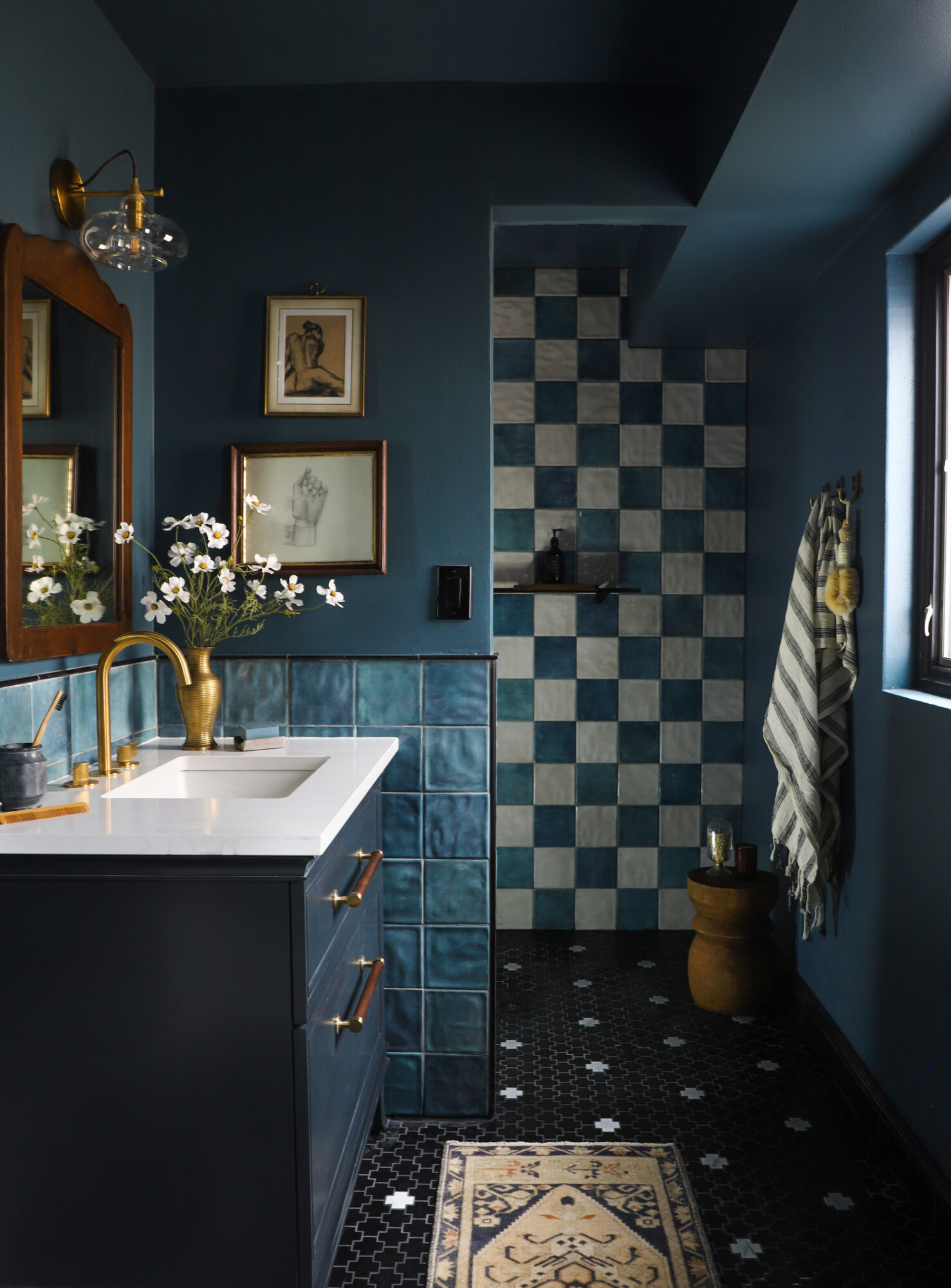
If you’re going bold and painting an actual color (not just neutrals) I recommend going for muted tones. Highly saturated colors look even more saturated on the wall. I wanted hunter green wainscoting in our office so I picked a somewhat washed out brown-green paint swatch (City Arboretum by Valspar). However, on the wall it became more vibrant and appears to be a true hunter green.
Fun fact! If you fall in love with a color but it feels too dark, consider ordering the paint at a lower strength. For example, I found a beige paint color I loved (Accessible Beige by Sherwin Williams) but it was a smidge too dark so I ordered it at 75% strength to lighten the color. Decreasing the percentage will make the color value lighter without changing the undertones. This is different than simply picking a lighter beige color swatch because every paint swatch has different undertones and some may appear more pink, blue or yellow.
Rug size and placement is everything!
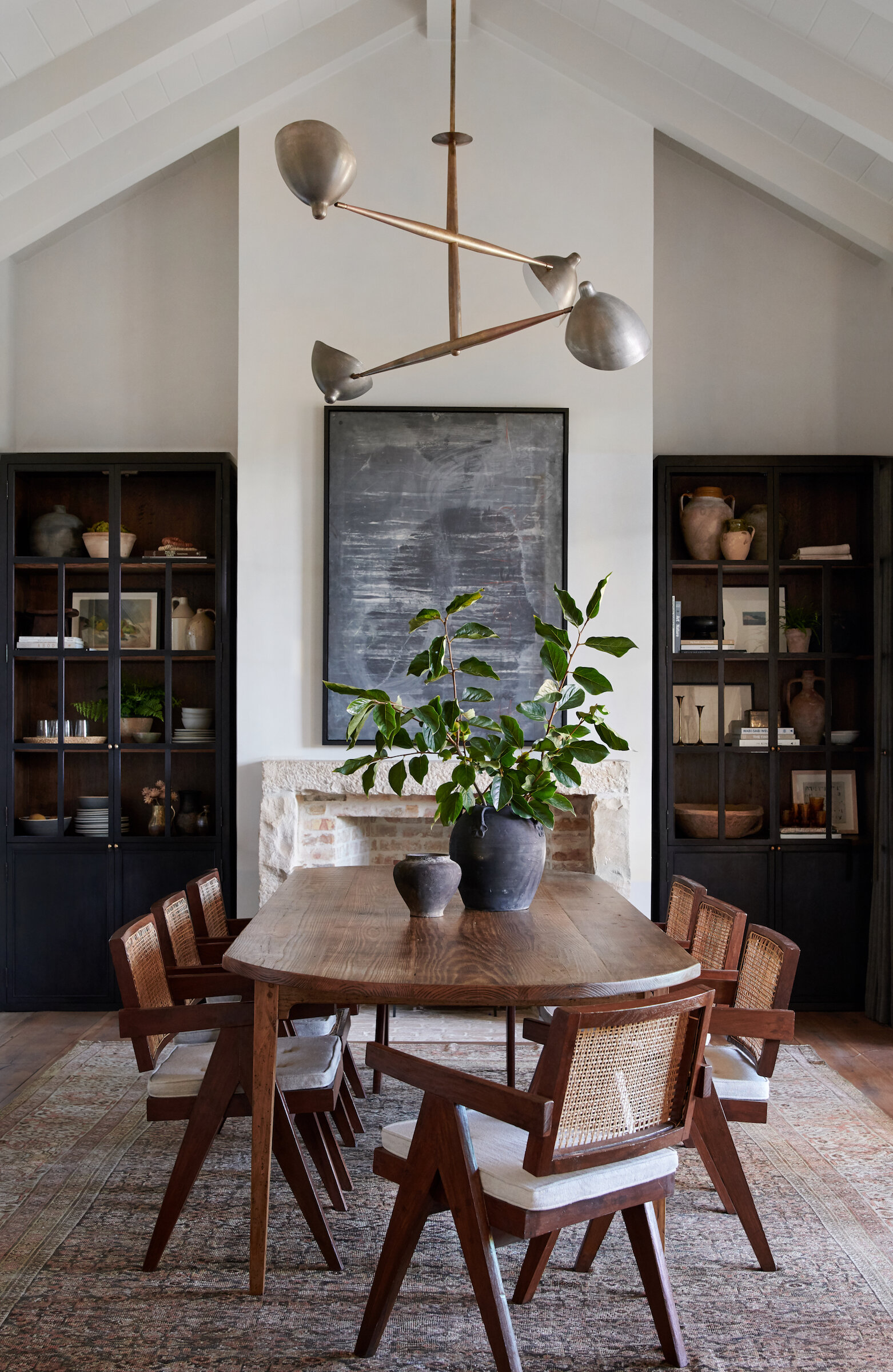
The rug is such an important aspect of the room design. Placement and sizing really is everything! In the living room – the front legs (or preferably all the legs) of your furniture should sit on the rug. A small rug that floats in the middle of the room is a no-no. In the dining room – you want your rug to be large enough that when you pull the chairs out, the legs are still on the rug. And in the bedroom – the rug should extend 24-36″ from the sides and foot of the bed.
More rug size and placement guides here →
Let’s talk curtains
Curtains are one of my favorite finishing touches to a room! It’s an easy way to add warmth and grandeur to a room. I love back tab and pinch pleated curtains personally but there are a bunch of styles to pick from. A few “rules” to note:
-
The curtain rod should be positioned at least 4-6″ above the window frame or preferably all the way to the ceiling. This elongates your walls giving the illusion of taller ceilings.
-
Your curtains should reach the floor. Avoid a short curtain situation.
-
Extend the rod beyond the window frame so that when your drapes are open, they don’t cover the window. This will bring in more light and give the illusion of a wider window.
-
Hang drapes on both sides of the window, even single windows! And don’t be afraid to double up on curtain panels for an even fuller look.
-
Consider incorporating both curtains and shades for a layered look. The shades can serve as your privacy and the curtains give a finished look.
Artwork on the walls
One of the most common design “mistakes” is artwork placement. Let’s go over the basics –
-
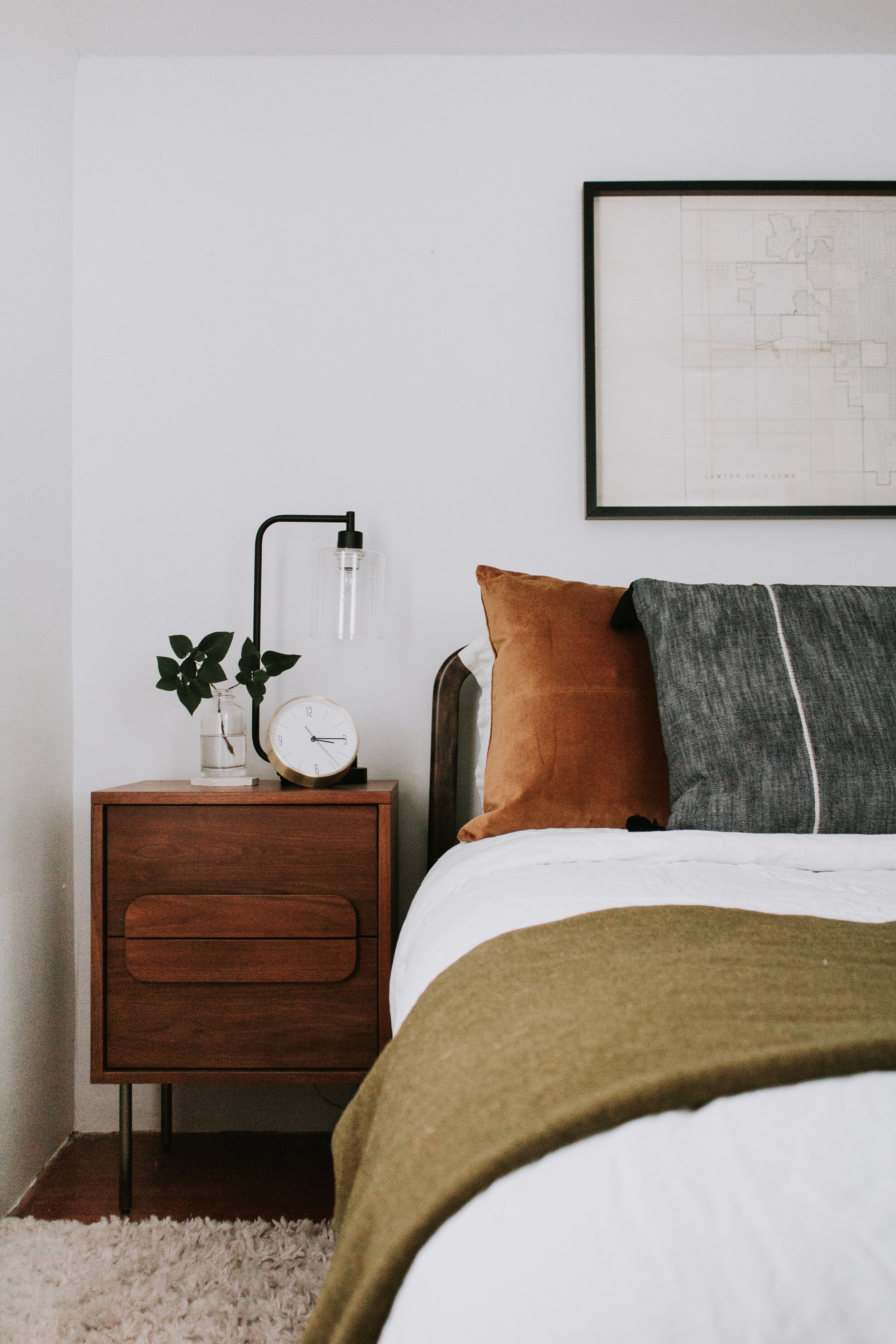
If hanging art above furniture, position it roughly 6-8 inches above the furniture. The goal is to make it feel connected to the object(s) below it.
-
When hanging artwork on an empty wall, the center of the art should hang approximately 57-60″ from the floor. Or if you’re an average height woman, an easier way to measure is to hang it at eye level.
-
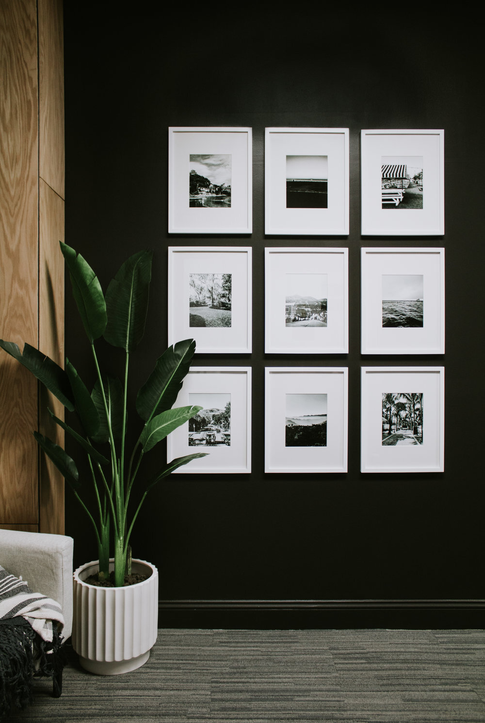
If you’re pairing more than one frame, hang them 3-4″ apart. Keeping the frames close helps the eye see all the art as one unit.
-
Think about scale – when hanging artwork above furniture, it should fill 2/3 the width of the furniture below it.
Leave a Reply Cancel reply
Where behind the scenes, exclusive advice, and candid conversations are sent straight to your inbox every week.




Interior design basics focus on creating balanced, functional, and visually appealing spaces within a home. It starts with understanding layout, color schemes, lighting, and furniture placement. Good design blends beauty with practicality, ensuring every room serves its purpose comfortably. Using textures, patterns, and décor accents can add depth and personality to interiors.
Outstanding.. your outlook on that is amazing
Helpful. Easy to understand. Practical.
Great introduction to interior design basics! The clear and practical advice makes it easy to start designing a beautiful and cohesive home.
Fantastic introduction to interior design basics! It’s great to have a clear understanding of foundational elements like color theory, layout, and balance. These principles are essential for creating spaces that are not only aesthetically pleasing but also functional and comfortable. I especially appreciate the emphasis on how small changes can make a big difference—sometimes, it’s the little details that tie a room together. Thanks for breaking down these concepts so clearly; they’re invaluable for anyone looking to enhance their home’s design!
I’m so glad you found them helpful Alice! ☺️
These are such great tips! I’m following you on IG ❤️
Hi Nadia, ohh I’m so happy to hear that! 🙂
Thank you! Helpful regarding rugs and drapery.Sectional couches, any rules to know: example both walls behind each length should be same color? I’ve done a focal wall but when sectional is put in each part is in diff color ..
Hi, I really like your blog Nadine. It was refreshing. I recently re-decorated my room and bought the curtains and blinds from Dubai. I think that curtains and blinds are the essence of the room and transform the room from simple to stylish within a moment. Definitely advise people to find the correct curtains and blinds that suit your rooms.
Really enjoyed your article! Thank you for the hanging art work measurements.
So glad you found it helpful! 🙂
Nice! your posts are amazing
Thank you! So glad you enjoyed it!